Threaded post support for NodeBB
-
Hmm problem, incognito mode and on your screen = not thread mode with Threadinf ON
 (see my last self post/last post)
And I see this rest of thread ON border-radius on vanilla :

Seem very hard to understand
-
Hmm problem, incognito mode and on your screen = not thread mode with Threadinf ON
 (see my last self post/last post)
And I see this rest of thread ON border-radius on vanilla :

Seem very hard to understand
@DownPW This one?
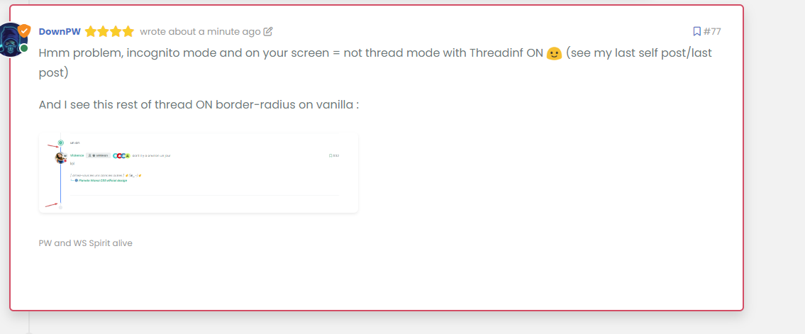
Seems fine to me?
For the radius issue on highlight, this will fix it (I updated your CSS already)
.page-topic .topic .posts.timeline .timeline-event.highlight, .page-topic .topic .posts.timeline > [component="post/placeholder"].highlight, .page-topic .topic .posts.timeline > [component=post].highlight {
    border-left: 2px solid #0d6efd !important;
    margin-left: 22px;
    transition: transform 0.3s ease !important;
    border-radius: 0px;
}
-
nope we have top and bottom left border radius. On vanilla harmony, we have not
-
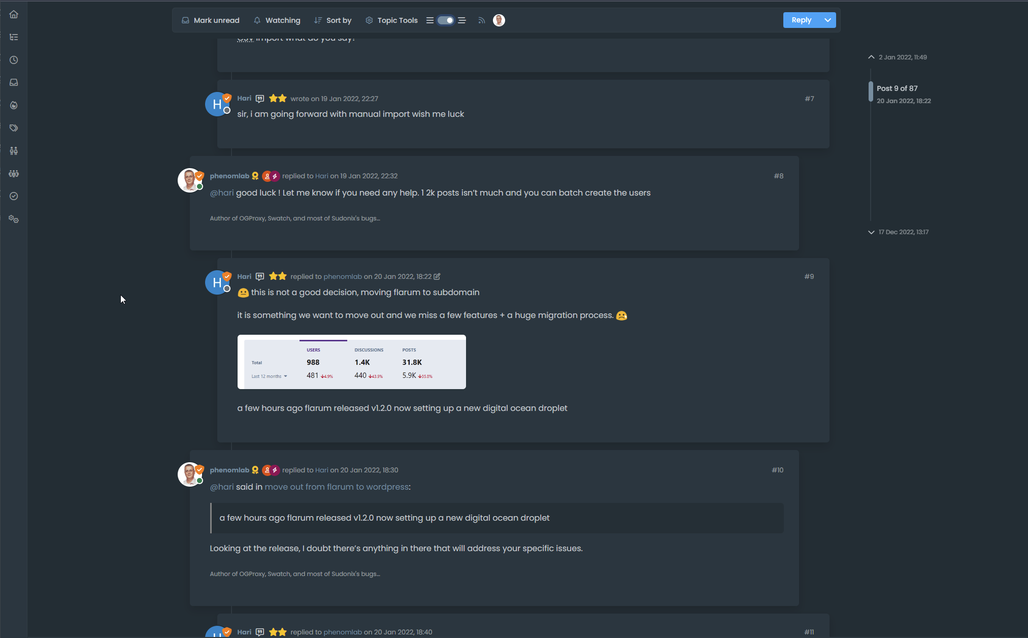
but the most important thing for now is that we lost the Threading effect
-
@DownPW said in Threading support for NodeBB:
nope we have top and bottom left border radius. On vanilla harmony, we have not
No, you don’t - see my screenshot…
-
ah ok you just edited
-
@DownPW said in Threading support for NodeBB:
but the most important thing for now is that we lost the Threading effect
Nope. I see this as working correctly in standard and incognito mode.
-
Arf yes sorry. Apologies
But it’s seem we have lost margin-left
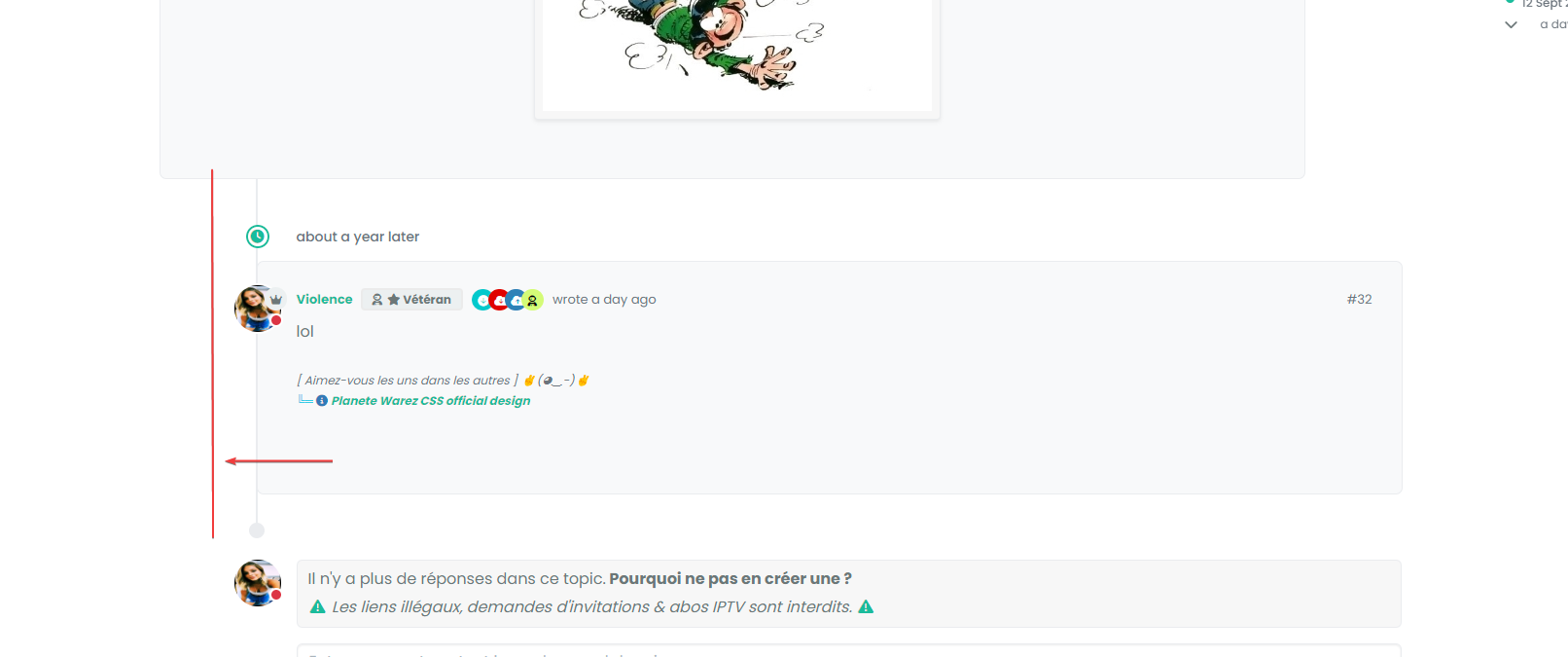
you have same things ?
-
Arf yes sorry. Apologies
But it’s seem we have lost margin-left

you have same things ?
@DownPW Can you provide the URL for that specific thread?
-
And this margin :

I have added before a margin between the topic and the timeline icon.
we’ll come to an understanding

But I admit that I don’t really understand.
-
And this margin :

I have added before a margin between the topic and the timeline icon.
we’ll come to an understanding

But I admit that I don’t really understand.
@DownPW said in Threading support for NodeBB:
But I admit that I don’t really understand.
Neither do I !

-
For this we can use in Threading ON :
.page-topic .topic .posts.timeline .timeline-event:last-child, .page-topic .topic .posts.timeline>[component="post/placeholder"]:last-child, .page-topic .topic .posts.timeline>[component=post]:last-child {
    margin-left: 0.5rem !important;
}
And this :
.page-topic .topic .posts.timeline [component="topic/event"].timeline-event, .page-topic .topic .posts.timeline [component="topic/necro-post"].timeline-event {
    margin-bottom: 10px !important;
}
RESULT :

-
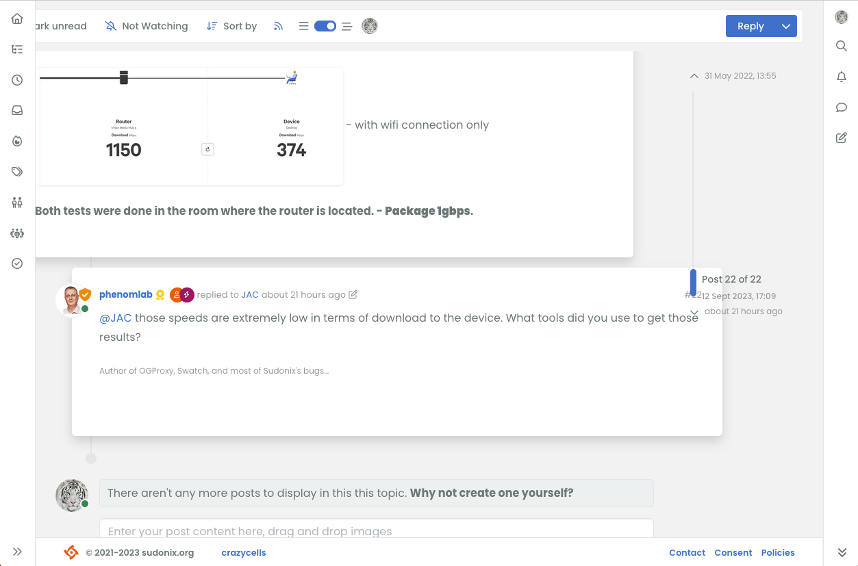
hi @phenomlab , it is nice that the switch only appears when the screen can be changed however, when the screen size is around 1250 pixels, I guess it does not produce the intended view, maybe you should increase the screen size further to make sure this switch is only available when the screen can accommodate nice thread view?
-
It looks like I got something working by adding this code
li.pt-4.self-post:not(.self-post .topic-owner-post).threaded { margin-left: 0rem; } li.pt-4.self-post.threaded { margin-left: 0rem; } li.necro-post.text-muted.timeline-event.d-flex.gap-2.pt-4.threaded { background: transparent !important; margin-bottom: 10px !important; } -
Better for me now @phenomlab .
I have just seen this bug (see the video below)
EXPLAIN:
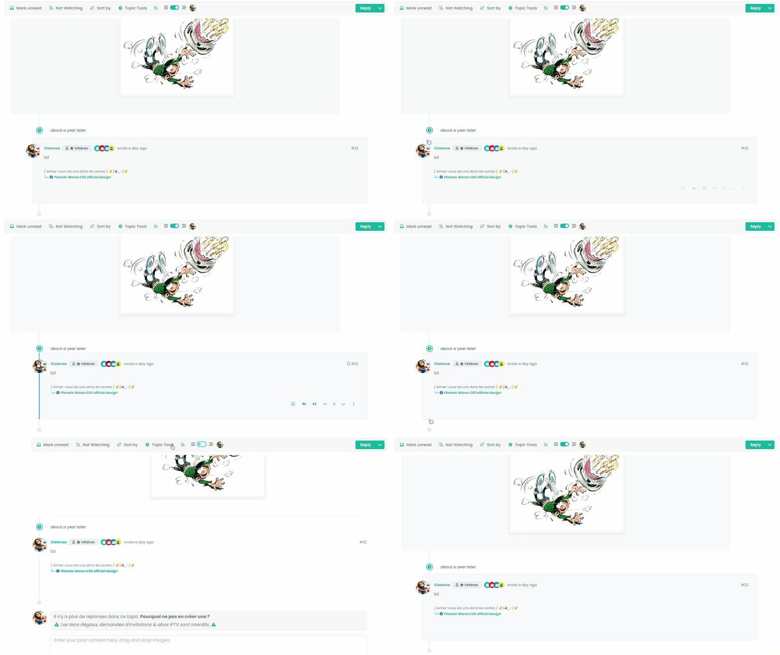
I have Threading mode ON, Space bettween timeline event and topic is good. I refresh the page with CTRL + F5.
The last post is displayed highlighted then the div moves to its original place (too bad, it’s long) with the desired margin and then the beetween timeline event and topic space is no longer the same. To find the correct space that we had before refreshing the page, I have to deactivate Thread mode and reactivate it
- It’s a shame to wait until the last message is highlighted for the margin to take effect.
- It’s also a shame to deactivate/reactivate the mode to find the correct margin.
VIDEO FOR BETTER EXPLAIN :
Other things, I deactivate threadeChat function in function.js because don’t work for now now

-
Better for me now @phenomlab .
I have just seen this bug (see the video below)
EXPLAIN:
I have Threading mode ON, Space bettween timeline event and topic is good. I refresh the page with CTRL + F5.
The last post is displayed highlighted then the div moves to its original place (too bad, it’s long) with the desired margin and then the beetween timeline event and topic space is no longer the same. To find the correct space that we had before refreshing the page, I have to deactivate Thread mode and reactivate it
- It’s a shame to wait until the last message is highlighted for the margin to take effect.
- It’s also a shame to deactivate/reactivate the mode to find the correct margin.
VIDEO FOR BETTER EXPLAIN :

Other things, I deactivate threadeChat function in function.js because don’t work for now now

@DownPW thanks. Let me review
@crazycells good point. 1200 is a bit too generic I think and perhaps we need to only execute on a more forgiving resolution.
-
Better for me now @phenomlab .
I have just seen this bug (see the video below)
EXPLAIN:
I have Threading mode ON, Space bettween timeline event and topic is good. I refresh the page with CTRL + F5.
The last post is displayed highlighted then the div moves to its original place (too bad, it’s long) with the desired margin and then the beetween timeline event and topic space is no longer the same. To find the correct space that we had before refreshing the page, I have to deactivate Thread mode and reactivate it
- It’s a shame to wait until the last message is highlighted for the margin to take effect.
- It’s also a shame to deactivate/reactivate the mode to find the correct margin.
VIDEO FOR BETTER EXPLAIN :

Other things, I deactivate threadeChat function in function.js because don’t work for now now

@DownPW Having reviewed this, it looks like layout shift is causing this - let me have a look at the most efficient way to counter this.
-
Better for me now @phenomlab .
I have just seen this bug (see the video below)
EXPLAIN:
I have Threading mode ON, Space bettween timeline event and topic is good. I refresh the page with CTRL + F5.
The last post is displayed highlighted then the div moves to its original place (too bad, it’s long) with the desired margin and then the beetween timeline event and topic space is no longer the same. To find the correct space that we had before refreshing the page, I have to deactivate Thread mode and reactivate it
- It’s a shame to wait until the last message is highlighted for the margin to take effect.
- It’s also a shame to deactivate/reactivate the mode to find the correct margin.
VIDEO FOR BETTER EXPLAIN :

Other things, I deactivate threadeChat function in function.js because don’t work for now now

@DownPW Not layout shift in fact, but a lack of CSS being added during the
ajaxify.end- in other words, this class is not being added on page loadli.necro-post.text-muted.timeline-event.d-flex.gap-2.pt-4.threaded { background: transparent !important; margin-bottom: 10px !important; }I believe this is because this component type is being added after the page loads, so in fact, it is not in the
DOMwhen the page loads initially, so it is skipped. I have the same issue on Sudonix, but work around it using the below additional CSS.page-topic .topic .posts.timeline [component="topic/event"].timeline-event, .page-topic .topic .posts.timeline [component="topic/necro-post"].timeline-event { margin-bottom: 10px; }I’ve added this to the CSS on your site, which “fixes” (albeit dirty) the problem
-
@phenomlab said in Threading support for NodeBB:
@DownPW Not layout shift in fact, but a lack of CSS being added during the
ajaxify.end- in other words, this class is not being added on page loadli.necro-post.text-muted.timeline-event.d-flex.gap-2.pt-4.threaded { background: transparent !important; margin-bottom: 10px !important; }I believe this is because this component type is being added after the page loads, so in fact, it is not in the
DOMwhen the page loads initially, so it is skipped. I have the same issue on Sudonix, but work around it using the below additional CSS.page-topic .topic .posts.timeline [component="topic/event"].timeline-event, .page-topic .topic .posts.timeline [component="topic/necro-post"].timeline-event { margin-bottom: 10px; }I’ve added this to the CSS on your site, which “fixes” (albeit dirty) the problem
Don’t see this directive on ACP/CSS. I add it myself seems that work.
Currently, the last message is highlighted (in blue on the gif) and then the reply block shifts to the left (using the margin)
Is there a possibility that the block will move to the margin directly rather than waiting for the blue indicator to disappear?
It’s a shame to wait until the blue border-left disappears and then the block shifts to the left.
It would have to shift directly without waitingedit :
thats seems to work here, no delay :

@DownPW yes, because I don’t use a border, but a box shadow to avoid the layout shift. If you add the
highlightclass I any of the posts here you can capture the CSS.
Hello! It looks like you're interested in this conversation, but you don't have an account yet.
Getting fed up of having to scroll through the same posts each visit? When you register for an account, you'll always come back to exactly where you were before, and choose to be notified of new replies (either via email, or push notification). You'll also be able to save bookmarks and upvote posts to show your appreciation to other community members.
With your input, this post could be even better 💗
Register Login