Chevron up before & after
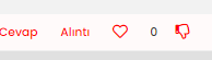
-
@cagatay this will be a simple state change based on CSS. Do you want a different colour for downvote and upvote ?
Mark Cutting also advises organisations as a Fractional CIO, Fractional CISO and Executive Advisor, helping boards improve technology governance, cyber resilience and executive decision making. Learn more at Gratmore Ltd
-
@cagatay this will be a simple state change based on CSS. Do you want a different colour for downvote and upvote ?
@phenomlab i want that for example the heart will red color mean all inside when uptoved.
-
@phenomlab i want that for example the heart will red color mean all inside when uptoved.
@cagatay you want the heart to become red filled when someone upvotes ? CSS on its own won’t be enough for this. It’ll require a
jsbased trigger to accomplish this.Mark Cutting also advises organisations as a Fractional CIO, Fractional CISO and Executive Advisor, helping boards improve technology governance, cyber resilience and executive decision making. Learn more at Gratmore Ltd
-
@cagatay you want the heart to become red filled when someone upvotes ? CSS on its own won’t be enough for this. It’ll require a
jsbased trigger to accomplish this.@phenomlab said in Chevron up before & after:
@cagatay you want the heart to become red filled when someone upvotes ? CSS on its own won’t be enough for this. It’ll require a
jsbased trigger to accomplish this.maybe something like this might work?
This is what we use for “thumbs up” and “thumbs down” icons…
span.votes { .fa-chevron-up:before { content: "\f164"; font-weight: 400; padding-right: 5px; margin-left: 20px; } .upvoted .fa-chevron-up:before { content: "\f164"; font-weight: 900; padding-right: 5px; margin-left: 20px; } .fa-chevron-down:before { content: "\f165"; font-weight: 400; padding-left: 5px; } .downvoted .fa-chevron-down:before { content: "\f165"; font-weight: 900; padding-left: 5px; } } -
@phenomlab i want that for example the heart will red color mean all inside when uptoved.
@cagatay actually, I just realised you’re using the heart icon for upvote - apologies - I thought that this was the reactions plugin.
In this case, CSS would in fact work.
-
@phenomlab said in Chevron up before & after:
@cagatay you want the heart to become red filled when someone upvotes ? CSS on its own won’t be enough for this. It’ll require a
jsbased trigger to accomplish this.maybe something like this might work?
This is what we use for “thumbs up” and “thumbs down” icons…
span.votes { .fa-chevron-up:before { content: "\f164"; font-weight: 400; padding-right: 5px; margin-left: 20px; } .upvoted .fa-chevron-up:before { content: "\f164"; font-weight: 900; padding-right: 5px; margin-left: 20px; } .fa-chevron-down:before { content: "\f165"; font-weight: 400; padding-left: 5px; } .downvoted .fa-chevron-down:before { content: "\f165"; font-weight: 900; padding-left: 5px; } }@crazycells i use them (I want the heart and hand sign to have a red color inside after they are empty, with a hollow red edge before being pressed, and a full red when pressed)
[Mod change - please post in English - translated]
span.tag:before { content: "\f02c"; font-family: "Font Awesome 5 Free"; margin-right: 3px; margin-left: 2px; font-weight: 600; font-size: 9px; vertical-align: 0; } .fa-chevron-up:before { font-family: 'Font Awesome 5 Free'; font-weight: 300; font-size: 16px; content: '\f004'; margin-right: 4px; vertical-align: -1px; color: red; } .topic [component="post/upvote"].upvoted i::before { content: "\f004"; color: red; } .fa-chevron-down:before { font-family: 'Font Awesome 5 Free'; font-weight: 300; font-size: 16px; content: '\f165'; margin-right: 4px; vertical-align: -1px; color: red; } -
@crazycells i use them (I want the heart and hand sign to have a red color inside after they are empty, with a hollow red edge before being pressed, and a full red when pressed)
[Mod change - please post in English - translated]
span.tag:before { content: "\f02c"; font-family: "Font Awesome 5 Free"; margin-right: 3px; margin-left: 2px; font-weight: 600; font-size: 9px; vertical-align: 0; } .fa-chevron-up:before { font-family: 'Font Awesome 5 Free'; font-weight: 300; font-size: 16px; content: '\f004'; margin-right: 4px; vertical-align: -1px; color: red; } .topic [component="post/upvote"].upvoted i::before { content: "\f004"; color: red; } .fa-chevron-down:before { font-family: 'Font Awesome 5 Free'; font-weight: 300; font-size: 16px; content: '\f165'; margin-right: 4px; vertical-align: -1px; color: red; }@cagatay please try this:
span.votes { .fa-chevron-up:before { content: "\f004"; font-weight: 400; } .upvoted .fa-chevron-up:before { content: "\f004"; font-weight: 900; color: red; } } -
@cagatay please try this:
span.votes { .fa-chevron-up:before { content: "\f004"; font-weight: 400; } .upvoted .fa-chevron-up:before { content: "\f004"; font-weight: 900; color: red; } }@crazycells up is working but i used same code changed as down type but the image is hidden while voted.
span.votes { .fa-chevron-down:before { content: "\f165"; font-weight: 400; } .upvoted .fa-chevron-down:before { content: "\f165"; font-weight: 900; color: red; } } -
@crazycells up is working but i used same code changed as down type but the image is hidden while voted.
span.votes { .fa-chevron-down:before { content: "\f165"; font-weight: 400; } .upvoted .fa-chevron-down:before { content: "\f165"; font-weight: 900; color: red; } }@cagatay I believe the bottom
.upvotedshould be.downvoted -
@cagatay I believe the bottom
.upvotedshould be.downvoted@crazycells you are right
 thank you.
 -
 undefined cagatay has marked this topic as solved on


Hello! It looks like you're interested in this conversation, but you don't have an account yet.
Getting fed up of having to scroll through the same posts each visit? When you register for an account, you'll always come back to exactly where you were before, and choose to be notified of new replies (either via email, or push notification). You'll also be able to save bookmarks and upvote posts to show your appreciation to other community members.
With your input, this post could be even better 💗
Register LoginDid this solution help you?
Related Topics
-
-
Spam spam spam
Solved Configure -
-
-
-
-
Nvidia shield & router
Solved Configure -