New "messenger style" conversation view
-
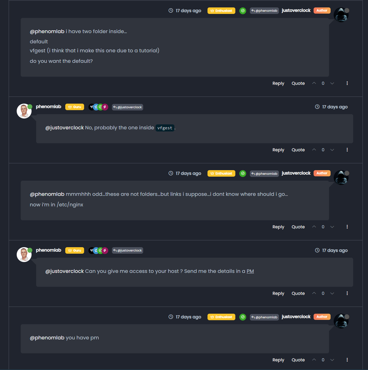
Based on an idea from @crazycells (thank you for this), I’ve implemented a new “messenger” type view which hopefully makes the logical flow of discussion easier to follow. Here’s a screenshot of what that looks like

This didn’t take long to achieve, and in my view, looks really appealing.
-
Based on an idea from @crazycells (thank you for this), I’ve implemented a new “messenger” type view which hopefully makes the logical flow of discussion easier to follow. Here’s a screenshot of what that looks like

This didn’t take long to achieve, and in my view, looks really appealing.
@phenomlab thanks @phenomlab , this looks cool.
Do you think your own messages should look slightly different? to be able to distinguish your comments from others?
-
@phenomlab thanks @phenomlab , this looks cool.
Do you think your own messages should look slightly different? to be able to distinguish your comments from others?
@crazycells Good idea. That’s easily done (will need another class which also needs to be added to the swatches)
-
@crazycells Good idea. That’s easily done (will need another class which also needs to be added to the swatches)
@phenomlab maybe the background color of my speech bubble should be the same as the general background (white)?
and others should be grey, so my eyes can catch the different ones more easily?

-
@phenomlab maybe the background color of my speech bubble should be the same as the general background (white)?
and others should be grey, so my eyes can catch the different ones more easily?

@crazycells Ok, I think I’ve finally got this working. This was way more complex than I expected it to be, and I nearly disappeared into a black hole with the CSS I had to write.
However, it appears to be working well from what I can see, and with the regression checks I’ve performed. However, I do expect there to be bugs with the CSS needing to be as complex as it is. Oh, and let’s not forget the
jQueryfunction I’ve had to write because there is a class missing$(document).ready(function () { $(window).on('action:ajaxify.end', function (data) { if (!$('li[component="post"]').hasClass('.topic-owner-post') || (!$('li[component="post"]').hasClass('.self-post'))) { $('li[component="post"]').addClass('topic-response-post'); } }); });Essentially, we are looking for
.topic-owner-classand if it does not exist, add new class.topic-response-postwith associated CSS.If anyone is looking to replicate this layout for their own forums, it’s not a trivial affair - nor is it for the faint-hearted - and I can assure you that you will mess up your layout so do it in DEV first

-
 undefined phenomlab referenced this topic on
-
@crazycells Ok, I think I’ve finally got this working. This was way more complex than I expected it to be, and I nearly disappeared into a black hole with the CSS I had to write.
However, it appears to be working well from what I can see, and with the regression checks I’ve performed. However, I do expect there to be bugs with the CSS needing to be as complex as it is. Oh, and let’s not forget the
jQueryfunction I’ve had to write because there is a class missing$(document).ready(function () { $(window).on('action:ajaxify.end', function (data) { if (!$('li[component="post"]').hasClass('.topic-owner-post') || (!$('li[component="post"]').hasClass('.self-post'))) { $('li[component="post"]').addClass('topic-response-post'); } }); });Essentially, we are looking for
.topic-owner-classand if it does not exist, add new class.topic-response-postwith associated CSS.If anyone is looking to replicate this layout for their own forums, it’s not a trivial affair - nor is it for the faint-hearted - and I can assure you that you will mess up your layout so do it in DEV first

@phenomlab said in New "messenger style" conversation view:
Essentially, we are looking for .topic-owner-class and if it does not exist, add new class .topic-response-post with associated CSS.
If anyone is looking to replicate this layout for their own forums, it’s not a trivial affair - nor is it for the faint-hearted - and I can assure you that you will mess up your layout so do it in DEV firstIt’s very good and definitively better.
Nice job Mark!!Could you provide your JS+CSS code so that I can test it and appropriate it on my dev environment?
-
@phenomlab said in New "messenger style" conversation view:
Essentially, we are looking for .topic-owner-class and if it does not exist, add new class .topic-response-post with associated CSS.
If anyone is looking to replicate this layout for their own forums, it’s not a trivial affair - nor is it for the faint-hearted - and I can assure you that you will mess up your layout so do it in DEV firstIt’s very good and definitively better.
Nice job Mark!!Could you provide your JS+CSS code so that I can test it and appropriate it on my dev environment?
@DownPW said in New "messenger style" conversation view:
Could you provide your JS+CSS code so that I can test it and appropriate it on my dev environment?
I was dreading anyone asking for this
 Let me put it together. Glad it’s well recieved.
 -
@DownPW said in New "messenger style" conversation view:
Could you provide your JS+CSS code so that I can test it and appropriate it on my dev environment?
I was dreading anyone asking for this
 Let me put it together. Glad it’s well recieved.
@phenomlab said in New "messenger style" conversation view:
@DownPW said in New "messenger style" conversation view:
Could you provide your JS+CSS code so that I can test it and appropriate it on my dev environment?
I was dreading anyone asking for this
 Let me put it together. Glad it’s well recieved.
looking forward to seeing the codes
 but not urgent.
especially I am wondering how you achieved making user info (including the avatar) lean to the right side of the page… This is something we can implement as well…
-
@phenomlab said in New "messenger style" conversation view:
@DownPW said in New "messenger style" conversation view:
Could you provide your JS+CSS code so that I can test it and appropriate it on my dev environment?
I was dreading anyone asking for this
 Let me put it together. Glad it’s well recieved.
looking forward to seeing the codes
 but not urgent.
especially I am wondering how you achieved making user info (including the avatar) lean to the right side of the page… This is something we can implement as well…
@crazycells that’s a simple
float- but not as complex as it sounds and actually happens automatically because you are targeting the parent<div>. -
@crazycells that’s a simple
float- but not as complex as it sounds and actually happens automatically because you are targeting the parent<div>.@phenomlab said in New "messenger style" conversation view:
@crazycells that’s a simple
float- but not as complex as it sounds and actually happens automatically because you are targeting the parent<div>.do you think the same strategy can be used to fix the problem we were mentioning here with the default core NodeBB theme (rather than the boxed version)…
https://sudonix.com/topic/273/ineffecient-use-of-space-on-mobile
-
@phenomlab said in New "messenger style" conversation view:
@crazycells that’s a simple
float- but not as complex as it sounds and actually happens automatically because you are targeting the parent<div>.do you think the same strategy can be used to fix the problem we were mentioning here with the default core NodeBB theme (rather than the boxed version)…
https://sudonix.com/topic/273/ineffecient-use-of-space-on-mobile
@crazycells Do you mean in a messenger type view ? Yes, of course, but the conversation would all be one way woudn’t it ?
-
@DownPW said in New "messenger style" conversation view:
Could you provide your JS+CSS code so that I can test it and appropriate it on my dev environment?
I was dreading anyone asking for this
 Let me put it together. Glad it’s well recieved.
 -
@DownPW Not at all. Just that it’s quite complex and I’ll need to put together concise steps etc. Should have worded that better
 This is more popular than I expected it to be !
 -
anyone can help to me for this style?
-
@cagatay said in New "messenger style" conversation view:
anyone can help to me for this style?
That’ll be me
 I will provide a write up, but it’s not a simple affair. You should try this in a dev environment first.
 -
@cagatay said in New "messenger style" conversation view:
anyone can help to me for this style?
That’ll be me
 I will provide a write up, but it’s not a simple affair. You should try this in a dev environment first.
@phenomlab yes i know that is you
 i dont have dev
  but i think that you know my css and js type coz of fixed iframely.
-
@phenomlab yes i know that is you
 i dont have dev
  but i think that you know my css and js type coz of fixed iframely.
@cagatay I do know it, yes, but this code contains breaking changes so I would not recommend for this to be deployed in live without thorough testing first. It’s possible to inject and test CSS code on the fly, but it’s not reliable and if the site is reloaded, you lose your changes.
You really should consider a DEV environment for things like this.
-
@cagatay I do know it, yes, but this code contains breaking changes so I would not recommend for this to be deployed in live without thorough testing first. It’s possible to inject and test CSS code on the fly, but it’s not reliable and if the site is reloaded, you lose your changes.
You really should consider a DEV environment for things like this.
@phenomlab got the point thank you.
-
@crazycells Do you mean in a messenger type view ? Yes, of course, but the conversation would all be one way woudn’t it ?
@phenomlab said in New "messenger style" conversation view:
@crazycells Do you mean in a messenger type view ? Yes, of course, but the conversation would all be one way woudn’t it ?
oh yes sorry, let me further explain what I meant…
In a normal NodeBB Persona theme, the main problem on pages containing posts lists such as:
/posts
/best
/controversialis that avatar is forced to be on the right side of the page, and since the username and timestamp come after the avatar, there is a dead space created on the right side of the avatar on the mobile version of the website.
I was wondering if this re-ordering that you have just made with the messenger-style theme can be applied to these pages, so the username and timestamp can come before the avatar, just like how I see my posts on a regular thread here under this title…
I guess, in a sense, this is also compatible with your new theme since people will see their posts always with their avatar being on the right side of the page?
And on these posts list pages like
/best,/controversialyou look at your own posts lists anyways… -
by the way, we have to come up with another solution with the background of own posts… because this white background eliminates “quotes” as well… I cannot distinguish quotes in my post… Do you think keeping the gray border of the quote but not the background will solve the issue?
Hello! It looks like you're interested in this conversation, but you don't have an account yet.
Getting fed up of having to scroll through the same posts each visit? When you register for an account, you'll always come back to exactly where you were before, and choose to be notified of new replies (either via email, or push notification). You'll also be able to save bookmarks and upvote posts to show your appreciation to other community members.
With your input, this post could be even better 💗
Register Login


