icon is missing for alternative logins

-
@phenomlab said in icon is missing for alternative logins:
@crazycells Odd - 1850 x ?
Oh yes, it is an external monitor; I measured it approximately…
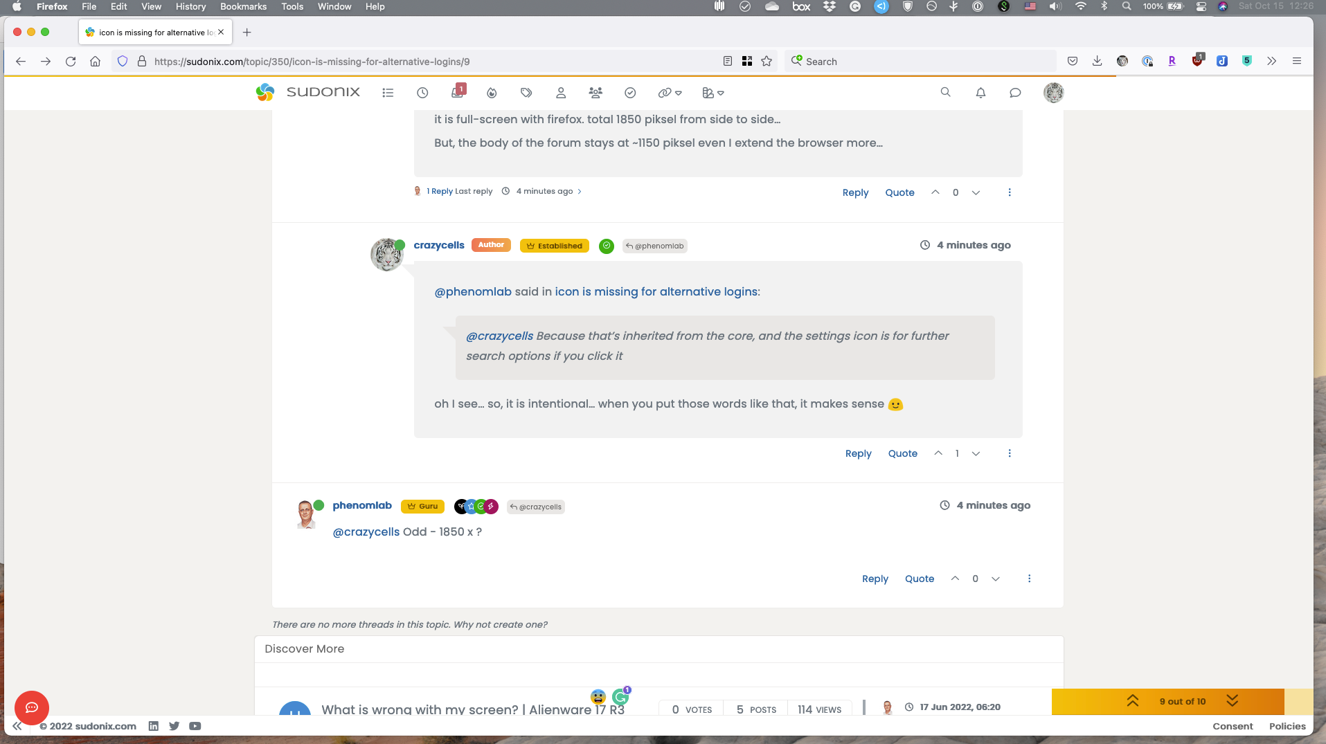
additionally, I see my replies as indented in all threads, there is dead space on the left side that bothers me a lot
 is it possible to adjust that so I can see all replies as full sized…
If I want to see the replies specifically, I can click the arrow, but without that, I would prefer to see everything full sized. I could not see any option on the settings, so any help is appreciated

@crazycells The indentation you are seeing is part of the theme. Is this what you are referring to?
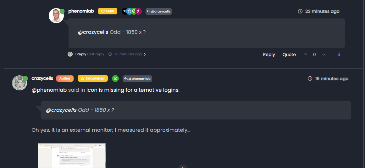
Note, the first post from me, which of course is indented. This generates a conversation flow, and I’ve no plans to change or remove this.
Mark Cutting also advises organisations as a Fractional CIO, Fractional CISO and Executive Advisor, helping boards improve technology governance, cyber resilience and executive decision making. Learn more at Gratmore Ltd
-
@crazycells The indentation you are seeing is part of the theme. Is this what you are referring to?
Note, the first post from me, which of course is indented. This generates a conversation flow, and I’ve no plans to change or remove this.
@phenomlab yes, this is what I was talking about.
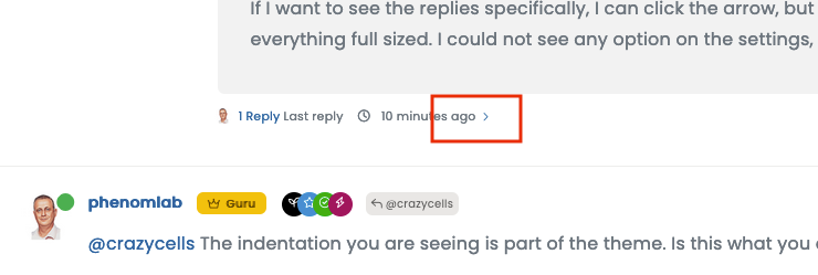
If that is intended, then no problem. But I feel, the arrow in the red box already does a very similar job, so it was different for me.
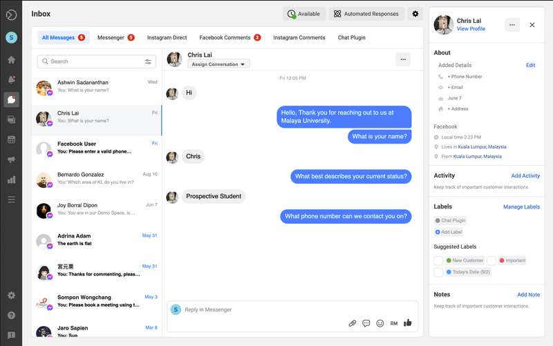
After you said this, I understand what you are trying to do, but without putting my avatar on the right side of the page, I am not sure if that is giving people a natural conversation feel. This is how we got used to it from messaging apps.
-
@phenomlab yes, this is what I was talking about.
If that is intended, then no problem. But I feel, the arrow in the red box already does a very similar job, so it was different for me.
After you said this, I understand what you are trying to do, but without putting my avatar on the right side of the page, I am not sure if that is giving people a natural conversation feel. This is how we got used to it from messaging apps.
@crazycells said in icon is missing for alternative logins:
but without putting my avatar on the right side of the page, I am not sure if that is giving people a natural conversation feel. This is how we got used to it from messaging apps.
Hmm - yes, that’s a really good point actually - and a fantastic idea which I’m highly likely to implement. Obviously, this wouldn’t be the case on mobile as the screen estate doesn’t permit this, but I really like the concept, and it would certainly make it feel more like a messaging app.
Mark Cutting also advises organisations as a Fractional CIO, Fractional CISO and Executive Advisor, helping boards improve technology governance, cyber resilience and executive decision making. Learn more at Gratmore Ltd
-
@crazycells said in icon is missing for alternative logins:
but without putting my avatar on the right side of the page, I am not sure if that is giving people a natural conversation feel. This is how we got used to it from messaging apps.
Hmm - yes, that’s a really good point actually - and a fantastic idea which I’m highly likely to implement. Obviously, this wouldn’t be the case on mobile as the screen estate doesn’t permit this, but I really like the concept, and it would certainly make it feel more like a messaging app.
maybe, you can also lean the full-sized posts to the left side (by creating a dead space on the right side of the post?)… these zigzag conversation bubbles are what we are seeing in all messaging apps these days…
-
@crazycells I’ve been playing with some concepts, which are enclosed below. I think you’re right - this does look much better
Example 1 - fixed width content
Mark Cutting also advises organisations as a Fractional CIO, Fractional CISO and Executive Advisor, helping boards improve technology governance, cyber resilience and executive decision making. Learn more at Gratmore Ltd
-
@crazycells I’ve been playing with some concepts, which are enclosed below. I think you’re right - this does look much better
Example 1 - fixed width content
-
@crazycells hmm. That’s odd - works for me. Are you able to right click and save as ?
They are
webmformat so should work natively. I can makegifversions but these will be much larger in size.Mark Cutting also advises organisations as a Fractional CIO, Fractional CISO and Executive Advisor, helping boards improve technology governance, cyber resilience and executive decision making. Learn more at Gratmore Ltd
-
@crazycells I went ahead and added the custom CSS. I think you’ll like it, but you probably need to reload the browser to pick up the new code.
Mark Cutting also advises organisations as a Fractional CIO, Fractional CISO and Executive Advisor, helping boards improve technology governance, cyber resilience and executive decision making. Learn more at Gratmore Ltd
-
@crazycells hmm. That’s odd - works for me. Are you able to right click and save as ?
They are
webmformat so should work natively. I can makegifversions but these will be much larger in size.@phenomlab said in icon is missing for alternative logins:
@crazycells hmm. That’s odd - works for me. Are you able to right click and save as ?
They are
webmformat so should work natively. I can makegifversions but these will be much larger in size.I cannot see them on Firefox or Safari… Fyi…
I tried to save it as a video, but nothing happens when I click it. -
@phenomlab said in icon is missing for alternative logins:
@crazycells hmm. That’s odd - works for me. Are you able to right click and save as ?
They are
webmformat so should work natively. I can makegifversions but these will be much larger in size.I cannot see them on Firefox or Safari… Fyi…
I tried to save it as a video, but nothing happens when I click it.@crazycells No need now - if you reload the page, you’ll see the CSS implemented anyway
-
@crazycells I went ahead and added the custom CSS. I think you’ll like it, but you probably need to reload the browser to pick up the new code.
@phenomlab said in icon is missing for alternative logins:
@crazycells I went ahead and added the custom CSS. I think you’ll like it, but you probably need to reload the browser to pick up the new code.
wow, that feels nice
now it is more like a conversation. But your account is not always on the right side, right? only the “author” looks on the right side, everyone else is on the left ?
-
@phenomlab said in icon is missing for alternative logins:
@crazycells I went ahead and added the custom CSS. I think you’ll like it, but you probably need to reload the browser to pick up the new code.
wow, that feels nice
now it is more like a conversation. But your account is not always on the right side, right? only the “author” looks on the right side, everyone else is on the left ?
@crazycells That’s correct. The HTML layout is limited to specific classes, so you have to follow them unless you fancy hacking the underlying HTML. To me, this is a nice compromise, and could easily be expanded with some clever
jQuery -
@phenomlab said in icon is missing for alternative logins:
@crazycells I went ahead and added the custom CSS. I think you’ll like it, but you probably need to reload the browser to pick up the new code.
wow, that feels nice
now it is more like a conversation. But your account is not always on the right side, right? only the “author” looks on the right side, everyone else is on the left ?
@crazycells said in icon is missing for alternative logins:
But your account is not always on the right side, right? only the “author” looks on the right side, everyone else is on the left ?
Just re-reading this, and I think I see your point. Do you think that “you” should always be on the right-hand side (based on the screenshot from META you provided) ?
Mark Cutting also advises organisations as a Fractional CIO, Fractional CISO and Executive Advisor, helping boards improve technology governance, cyber resilience and executive decision making. Learn more at Gratmore Ltd
-
@crazycells said in icon is missing for alternative logins:
But your account is not always on the right side, right? only the “author” looks on the right side, everyone else is on the left ?
Just re-reading this, and I think I see your point. Do you think that “you” should always be on the right-hand side (based on the screenshot from META you provided) ?
@phenomlab said in icon is missing for alternative logins:
@crazycells said in icon is missing for alternative logins:
But your account is not always on the right side, right? only the “author” looks on the right side, everyone else is on the left ?
Just re-reading this, and I think I see your point. Do you think that “you” should always be on the right-hand side (based on the screenshot from META you provided) ?
yeah, I believe this is what chat apps do… They always put you on the right side, and change colors, so you can focus on what others write…
-
@phenomlab said in icon is missing for alternative logins:
@crazycells said in icon is missing for alternative logins:
But your account is not always on the right side, right? only the “author” looks on the right side, everyone else is on the left ?
Just re-reading this, and I think I see your point. Do you think that “you” should always be on the right-hand side (based on the screenshot from META you provided) ?
yeah, I believe this is what chat apps do… They always put you on the right side, and change colors, so you can focus on what others write…
@crazycells Got it. Leave it with me. I like this idea, and will probably implement, but need to review the HTML structure first.
-
@phenomlab said in icon is missing for alternative logins:
@crazycells said in icon is missing for alternative logins:
But your account is not always on the right side, right? only the “author” looks on the right side, everyone else is on the left ?
Just re-reading this, and I think I see your point. Do you think that “you” should always be on the right-hand side (based on the screenshot from META you provided) ?
yeah, I believe this is what chat apps do… They always put you on the right side, and change colors, so you can focus on what others write…
-
@crazycells I’ve been playing with some concepts, which are enclosed below. I think you’re right - this does look much better
Example 1 - fixed width content
@phenomlab said in icon is missing for alternative logins:
@crazycells I’ve been playing with some concepts, which are enclosed below. I think you’re right - this does look much better
Example 1 - fixed width content
Hi @phenomlab , I can see these videos on Google Chrome right now
sorry, I did not realize Firefox was the problem before…I think both version 1 and version 2 have different feelings. Is it easy to switch between the two?
-
@phenomlab said in icon is missing for alternative logins:
@crazycells I’ve been playing with some concepts, which are enclosed below. I think you’re right - this does look much better
Example 1 - fixed width content
Hi @phenomlab , I can see these videos on Google Chrome right now
sorry, I did not realize Firefox was the problem before…I think both version 1 and version 2 have different feelings. Is it easy to switch between the two?
@crazycells sadly, no. It’s one or the other. As this leverages global CSS it would mean maintaining individual classes that are necessary to create the different view types.
Mark Cutting also advises organisations as a Fractional CIO, Fractional CISO and Executive Advisor, helping boards improve technology governance, cyber resilience and executive decision making. Learn more at Gratmore Ltd
-
@crazycells sadly, no. It’s one or the other. As this leverages global CSS it would mean maintaining individual classes that are necessary to create the different view types.
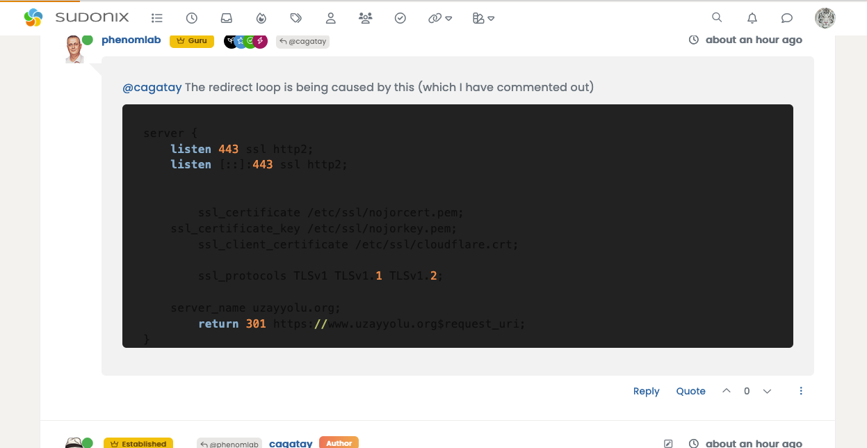
hi @phenomlab , I am having a hard time seeing what is written in code boxes… I believe that is not intended?
This is how it looks, and actually taking a screenshot made the codes more visible… it normally does not even look as good.
-
hi @phenomlab , I am having a hard time seeing what is written in code boxes… I believe that is not intended?
This is how it looks, and actually taking a screenshot made the codes more visible… it normally does not even look as good.
@crazycells That’s a caching issue - it should look like this
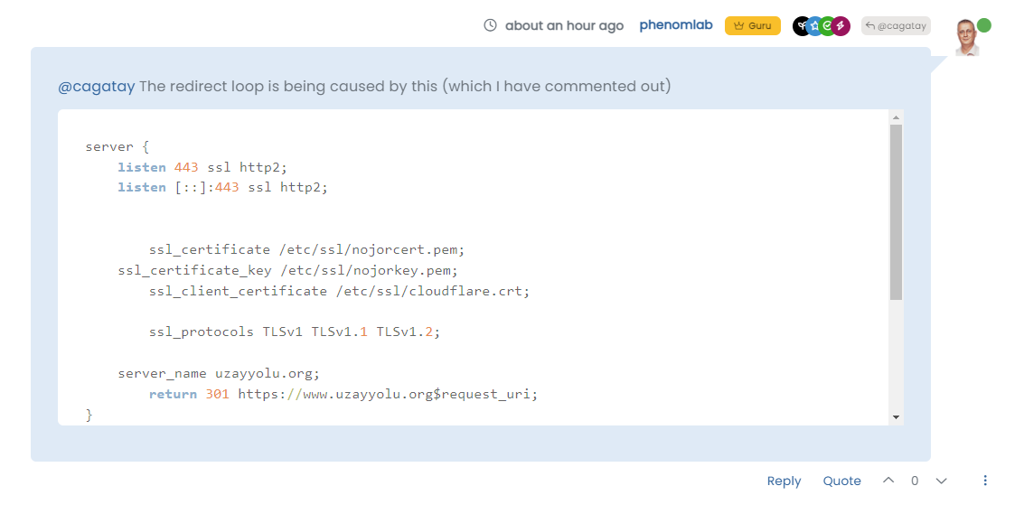
And in an incognito session
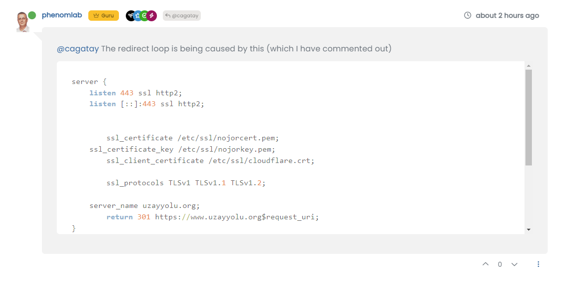
Can you clear your browser cache and try again?
Thanks
Mark Cutting also advises organisations as a Fractional CIO, Fractional CISO and Executive Advisor, helping boards improve technology governance, cyber resilience and executive decision making. Learn more at Gratmore Ltd


Hello! It looks like you're interested in this conversation, but you don't have an account yet.
Getting fed up of having to scroll through the same posts each visit? When you register for an account, you'll always come back to exactly where you were before, and choose to be notified of new replies (either via email, or push notification). You'll also be able to save bookmarks and upvote posts to show your appreciation to other community members.
With your input, this post could be even better 💗
Register LoginRelated Topics
-
-
-
-
-
-
-
-
Debian 11 root Login
Solved Linux