[NODEBB] Help for my custom CSS
-
– The modification for resolve cache problem/CSS number version is very great

– I have just change the CSS class for change icon on JS Script here :
var panel = $('<li id="switcher" class="dropdown text-center"> \
<label for="theme-control-list-check" class="dropdown-toggle" data-toggle="dropdown" id="theme_dropdown" title="" role="button" data-original-title="Theme" aria-expanded="false"> \
<a class="btn-link" title="Theme Switcher" href="#"><i id="ticon" class="fa fa-fw fa-toogle-o"></i><span class="visible-xs-inline">Theme Switcher</span></a> \
– I have light and dark theme, so I prefer a universal button like toogle ON/OFF
-
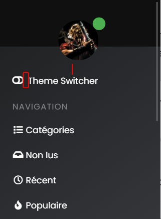
Toogle Off icon on Default Theme :

-
Toogle On icon on each other theme :

– ACP/CSS :
/*Switch toogle Off (Off:204 - On:205*/
.fa.fa-toogle-o:before {
    content: "\f204";
    font-size: 16px;
}
– Each theme CSS :
/*Switch toogle Off (Off:204 - On:205*/
.fa.fa-toogle-o:before {
    content: "\f205";
    font-size: 16px;
}
I have trad comment line too !!
I put the topic on solved status but it’s not excluded that I return here to ask questions about CSS that I will have trouble finding for future themes if it does not bother !

-
-
 undefined DownPW has marked this topic as solved on
-
– The modification for resolve cache problem/CSS number version is very great

– I have just change the CSS class for change icon on JS Script here :
var panel = $('<li id="switcher" class="dropdown text-center"> \
<label for="theme-control-list-check" class="dropdown-toggle" data-toggle="dropdown" id="theme_dropdown" title="" role="button" data-original-title="Theme" aria-expanded="false"> \
<a class="btn-link" title="Theme Switcher" href="#"><i id="ticon" class="fa fa-fw fa-toogle-o"></i><span class="visible-xs-inline">Theme Switcher</span></a> \
– I have light and dark theme, so I prefer a universal button like toogle ON/OFF
-
Toogle Off icon on Default Theme :

-
Toogle On icon on each other theme :

– ACP/CSS :
/*Switch toogle Off (Off:204 - On:205*/
.fa.fa-toogle-o:before {
    content: "\f204";
    font-size: 16px;
}
– Each theme CSS :
/*Switch toogle Off (Off:204 - On:205*/
.fa.fa-toogle-o:before {
    content: "\f205";
    font-size: 16px;
}
I have trad comment line too !!
I put the topic on solved status but it’s not excluded that I return here to ask questions about CSS that I will have trouble finding for future themes if it does not bother !

@downpw some really nice enhancements there !
-
-
I forgot this.
– On position text and icon of theme switcher, I have added padding-top to ventilate the surrounding area and align all icon :
/*Smartphone*/
@media all and (max-width: 1024px)
{
/*VIOLENCE: BUGFIX: Placement du "Theme Switcher" */
    #switcher {
    list-style: none;
    margin-left: -80px;
    padding-top: 15px;
}
}
– And I also improved the space between the icon and the text :
@media all and (max-width: 1024px)
{
#switcher .fa-fw {
    text-align: center;
    width: 1.25em;
    padding-right: 25px;
}
}
– Result:

@downpw another great addition

-
-
@downpw Can you expand on that ?
-
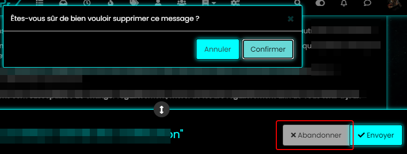
color, background color and after a click on the abandon button
-
@downpw Ok. Do you have a mock-up in terms of what you’d be looking for ? I think I understand, but it will require jQuery
-
@downpw Ok. Do you have a mock-up in terms of what you’d be looking for ? I think I understand, but it will require jQuery
I don’t think so JQuery are necessary becausei hav not that on other themes. Maybe a focus button ?
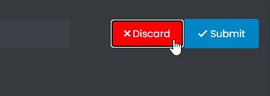
I want to fix this color background after a click on “Discard” Button when I reply to a topic.
For example you don’t have this on sudonix.com
Just to find the correct CSS code i guess

I have the same problem on login button
-
I don’t think so JQuery are necessary becausei hav not that on other themes. Maybe a focus button ?
I want to fix this color background after a click on “Discard” Button when I reply to a topic.
For example you don’t have this on sudonix.com
Just to find the correct CSS code i guess

I have the same problem on login button
-
Very odd @phenomlab

-
Very odd @phenomlab

@downpw Expected, because the CSS class is
:focusso onmouseoutevent, the focus is lost and the CSS will no longer apply. This is why you (probably) need jQuery -
Nope, I don’t think so because I haven’t got the problem on an another themes and here too
-
Nope, I don’t think so because I haven’t got the problem on an another themes and here too
@downpw Can you provide the same example with another theme ?
-
-
@downpw So (for example) do you want the Discard button to turn red if you you click Confirm, or am I off track here ? Not entirely sure what you’re after

-
@downpw So (for example) do you want the Discard button to turn red if you you click Confirm, or am I off track here ? Not entirely sure what you’re after

@phenomlab Never mind already found the right CSS property would be nice

-
@phenomlab Never mind already found the right CSS property would be nice

@downpw Do you mean this one
button.btn.btn-default.composer-discard:focus { background: red; }Or another ?
-
@downpw Do you mean this one
button.btn.btn-default.composer-discard:focus {
    background: red;
}
Or another ?
@phenomlab Another I think
-
It seem to be a btn-default problem
Hello! It looks like you're interested in this conversation, but you don't have an account yet.
Getting fed up of having to scroll through the same posts each visit? When you register for an account, you'll always come back to exactly where you were before, and choose to be notified of new replies (either via email, or push notification). You'll also be able to save bookmarks and upvote posts to show your appreciation to other community members.
With your input, this post could be even better 💗
Register LoginDid this solution help you?
Related Topics
-
-
-
NodeBB: Creating pages
Solved Configure -
-
NodeBB 1.19.3
Solved Performance -
-
NodeBB Footer
Solved Customisation -


