[NODEBB] Help for my custom CSS
-
@DownPW After spending a lot of time on the theme switcher (see referenced post above), I re-wrote some of it as found that there were caching issues with CSS as it always calls the same version number. The new function below resolves that issue.
I also removed the website prefix, as with relative paths, this is not required
")
// ------------------------------------------
// Theme Switcher
// ------------------------------------------
// On choisit une chaine de caractère aléatoire pour affecter un numéro de version au fichier CSS.
// The function below creates a random string which we use for CSS versioning to prevent cache conflicts
function generateRandomString(length) {
    var text="";
    var possible="ABCDEFGHIJKLMNOPQRSTUVWXYZabcdefghijklmnopqrstuvwxyz0123456789";
    for (var i=0;
    i < length;
    i++) {
        text+=possible.charAt(Math.floor(Math.random() * possible.length));
    }
    return text;
}

$(document).ready(function () {
    var string=generateRandomString(10);
    $("#random_string").text(string);
    // This variable gets the theme ID
    // Cette variable obtient l'ID du thème
    var whichTheme=localStorage.getItem("theme");
    // This variable gets the active theme's actual URL
    //Cette variable obtient l'URL réelle du thème actif
    var activeTheme=localStorage.getItem("activeTheme");
    // This variable appends the dropdown list to the existing panel
    // Cette variable ajoute la liste déroulante au panneau existant
    var panel=$('<li id="switcher" class="dropdown text-center"> \
<label for="theme-control-list-check" class="dropdown-toggle" data-toggle="dropdown" id="theme_dropdown" title="" role="button" data-original-title="Theme" aria-expanded="false"> \
<a class="btn-link" title="Theme Switcher" href="#"><i id="ticon" class="fa fa-fw fa-lightbulb-o"></i><span class="visible-xs-inline">Theme Switcher</span></a> \
</label> \
<ul id="theme" class="dropdown-menu"> \
<li><a id="default" href="#" rel="/assets/client.css?v=e02phpkima0">Default</a></li> \
<li><a id="default dark" href="#" rel="/assets/customcss/default_dark.css">Default Dark</a></li> \
<li><a id="Light Flat" href="#" rel="/assets/customcss/testflat.css">Light Flat</a></li> \
<li><a id="Dark Flat" href="#" rel="/assets/customcss/testflat.css">Dark Flat</a></li> \
<li><a id="Dark Neon Aqua" href="#" rel="/assets/customcss/dark_neon_aqua.css">Dark Neon Aqua</a></li> \
<li><a id="Dark Neon Blue" href="#" rel="assets/customcss/dark_neon_blue.css">Dark Neon Blue</a></li> \
<li><a id="Dark Neon Green" href="#" rel="/assets/customcss/dark_neon_green.css">Dark Neon Green</a></li> \
<li><a id="Dark Neon Solary" href="#" rel="/assets/customcss/dark_neon_solary.css">Dark Neon Solary</a></li> \
<li><a id="Dark Neon White" href="#" rel="/assets/customcss/dark_neon_white.css"">Dark Neon White</a></li> \
<li><a id="Eva 00" href="#" rel="/assets/customcss/eva_00.css">Eva.00</a></li> \
<li><a id="Eva 01" href="#" rel="/assets/customcss/eva_01.css">Eva.01</a></li> \
<li><a id="Eva 01 Purple Green"href="#" rel="/assets/customcss/eva_01_purple_green.css">Eva.01: Purple-Green</a></li> \
<li><a id="Eva 02" href="#" rel="/assets/customcss/eva_02.css">Eva.02: Red-Orange</a></li> \
</ul> \
</div> ');
    // See if there is an active theme selected in localStorage. If none selected, use the default. If there is a theme in localStorage, use that and apply it
    // Regarde s'il y a un thème actif sélectionné dans "localStorage". Si aucun n'est sélectionné, utilise la valeur par défaut.
    // S'il y a un thème dans localStorage, on l'utilise et on l'applique.
    if (whichTheme) {
        $("head").append("<link href='" + activeTheme + '?version=' + string + "' type=\"text/css\" rel=\'stylesheet\' />");
    }
    else {
        // No need to include anything here as there's no CSS to add.
        // Pas besoin d'inclure quoi que ce soit ici car il n'y a pas de CSS à ajouter.
    }
    $('ul#logged-in-menu').prepend(panel);
    $('ul#logged-out-menu').prepend(panel);
    if (utils.findBootstrapEnvironment()==='xs') {
        $('#menu').prepend(panel);
    }
    $(document).ready(function () {
        // Listen to the NAV dropdown for any changes
        // Écoute la liste déroulante NAV pour tout changement de thème
        $("#theme li a").on("click change", function () {
            // If we detect a change, append the selected CSS file into the DOM
            // Si un changement est détecté, on ajoute le fichier CSS sélectionné dans le DOM (Document Object Model)
            var thishref=$(this).attr('rel');
            $("link[rel=stylesheet]").attr('href', thishref + "?version=" + string + "");
            //location.reload();
            //$("head").append("<link href='" + $(this).attr("rel") + $(this).attr("id") + " type=\'text/css\' rel=\'stylesheet\' />");
            location.reload();
            // This variable stores the selected theme ID
            // Cette variable stocke l'ID du thème sélectionné
            var selected=$(this).attr("id");
            // This variable stores the selected theme link
            // Cette variable stocke le lien du thème sélectionné
            var theTheme=$(this).attr("rel");
            // This variable updates the selected theme ID
            // See if "default" has been selected. If it has, then...
            // Cette variable met à jour l'ID du thème sélectionné
            // Regarde si "default" a été sélectionné. Si c'est le cas, alors...
            if (selected==='default') {
                localStorage.setItem("theme", "");
                // This variable will strip the current appeneded theme ID
                // Cette variable supprimera l'ID du thème actuellement ajouté
                localStorage.setItem("activeTheme", "");
                // This variable will strip the current appeneded theme URL (HREF)
                // Finally, we have to reload the page to effect the changes
                // Cette variable supprimera l'URL actuelle du thème ajouté (HREF)
                // Enfin, on recharge la page pour effectuer les modifications
                location.reload();
            }
            // If any other theme is selected, carry on as normnal, and update localStorage
            // Si un autre thème est sélectionné, continuez normalement et mettez à jour localStorage
            else {
                localStorage.setItem("theme", selected);
                // This variable updates the actual href of the CSS file
                // Cette variable met à jour le href réel du fichier CSS
                localStorage.setItem("activeTheme", theTheme);
                //window.location.href = window.location.href
            }
            // We use return false to prevent the browser from reloading or following any HREF links
            // On utilise la fonction "return false" pour empêcher le navigateur de recharger ou de suivre les liens HREF
            //return false;
        }
        );
    }
    );
}

);
// When hovering over the #switcher element, target the i class and add 'themeoff'
// Lorsque du  survol de l'élément #switcher, on cible la classe CSS "i" et on ajoute le CSS "themeoff"
$(document).on('mouseenter', '#switcher', function() {
    $('#switcher i').addClass("themeoff");
}

);
// When leaving the however state, target the i class and remove 'themeoff'
// Lorsque l'on quitte l'état, on cible la classe CSS "i" et on supprime le CSS "themeoff"
$(document).on('mouseleave', '#switcher', function() {
    $('#switcher i').removeClass("themeoff");
}

);
Mark – Founder, Phenomlab Ltd
Executive IT & Security Leadership
Phenomlab Ltd -
– The modification for resolve cache problem/CSS number version is very great
– I have just change the CSS class for change icon on JS Script here :
var panel = $('<li id="switcher" class="dropdown text-center"> \
<label for="theme-control-list-check" class="dropdown-toggle" data-toggle="dropdown" id="theme_dropdown" title="" role="button" data-original-title="Theme" aria-expanded="false"> \
<a class="btn-link" title="Theme Switcher" href="#"><i id="ticon" class="fa fa-fw fa-toogle-o"></i><span class="visible-xs-inline">Theme Switcher</span></a> \
– I have light and dark theme, so I prefer a universal button like toogle ON/OFF
-
Toogle Off icon on Default Theme :
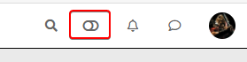
-
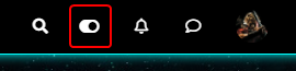
Toogle On icon on each other theme :
– ACP/CSS :
/*Switch toogle Off (Off:204 - On:205*/
.fa.fa-toogle-o:before {
    content: "\f204";
    font-size: 16px;
}
– Each theme CSS :
/*Switch toogle Off (Off:204 - On:205*/
.fa.fa-toogle-o:before {
    content: "\f205";
    font-size: 16px;
}
I have trad comment line too !!
I put the topic on solved status but it’s not excluded that I return here to ask questions about CSS that I will have trouble finding for future themes if it does not bother !
")
PW and WS Spirit alive
-
-
 undefined DownPW has marked this topic as solved on
-
– The modification for resolve cache problem/CSS number version is very great
– I have just change the CSS class for change icon on JS Script here :
var panel = $('<li id="switcher" class="dropdown text-center"> \
<label for="theme-control-list-check" class="dropdown-toggle" data-toggle="dropdown" id="theme_dropdown" title="" role="button" data-original-title="Theme" aria-expanded="false"> \
<a class="btn-link" title="Theme Switcher" href="#"><i id="ticon" class="fa fa-fw fa-toogle-o"></i><span class="visible-xs-inline">Theme Switcher</span></a> \
– I have light and dark theme, so I prefer a universal button like toogle ON/OFF
-
Toogle Off icon on Default Theme :
-
Toogle On icon on each other theme :
– ACP/CSS :
/*Switch toogle Off (Off:204 - On:205*/
.fa.fa-toogle-o:before {
    content: "\f204";
    font-size: 16px;
}
– Each theme CSS :
/*Switch toogle Off (Off:204 - On:205*/
.fa.fa-toogle-o:before {
    content: "\f205";
    font-size: 16px;
}
I have trad comment line too !!
I put the topic on solved status but it’s not excluded that I return here to ask questions about CSS that I will have trouble finding for future themes if it does not bother !
@downpw some really nice enhancements there !
-
-
I forgot this.
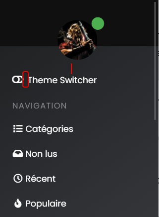
– On position text and icon of theme switcher, I have added padding-top to ventilate the surrounding area and align all icon :
/*Smartphone*/
@media all and (max-width: 1024px)
{
/*VIOLENCE: BUGFIX: Placement du "Theme Switcher" */
    #switcher {
    list-style: none;
    margin-left: -80px;
    padding-top: 15px;
}
}
– And I also improved the space between the icon and the text :
@media all and (max-width: 1024px)
{
#switcher .fa-fw {
    text-align: center;
    width: 1.25em;
    padding-right: 25px;
}
}
– Result:
PW and WS Spirit alive
-
I forgot this.
– On position text and icon of theme switcher, I have added padding-top to ventilate the surrounding area and align all icon :
/*Smartphone*/
@media all and (max-width: 1024px)
{
/*VIOLENCE: BUGFIX: Placement du "Theme Switcher" */
    #switcher {
    list-style: none;
    margin-left: -80px;
    padding-top: 15px;
}
}
– And I also improved the space between the icon and the text :
@media all and (max-width: 1024px)
{
#switcher .fa-fw {
    text-align: center;
    width: 1.25em;
    padding-right: 25px;
}
}
– Result:
@downpw another great addition

Mark – Founder, Phenomlab Ltd
Executive IT & Security Leadership
Phenomlab Ltd -
PW and WS Spirit alive
-
@downpw Can you expand on that ?
-
color, background color and after a click on the abandon button
PW and WS Spirit alive
-
@downpw Ok. Do you have a mock-up in terms of what you’d be looking for ? I think I understand, but it will require jQuery
Mark – Founder, Phenomlab Ltd
Executive IT & Security Leadership
Phenomlab Ltd -
@downpw Ok. Do you have a mock-up in terms of what you’d be looking for ? I think I understand, but it will require jQuery
I don’t think so JQuery are necessary becausei hav not that on other themes. Maybe a focus button ?
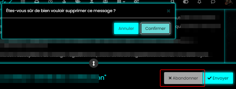
I want to fix this color background after a click on “Discard” Button when I reply to a topic.
For example you don’t have this on sudonix.com
Just to find the correct CSS code i guess
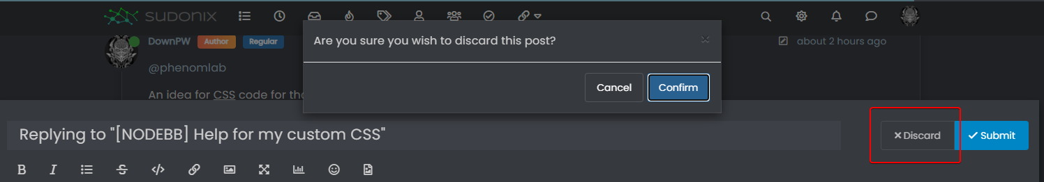
I have the same problem on login button
PW and WS Spirit alive
-
I don’t think so JQuery are necessary becausei hav not that on other themes. Maybe a focus button ?
I want to fix this color background after a click on “Discard” Button when I reply to a topic.
For example you don’t have this on sudonix.com
Just to find the correct CSS code i guess
I have the same problem on login button
-
-
Very odd @phenomlab

@downpw Expected, because the CSS class is
:focusso onmouseoutevent, the focus is lost and the CSS will no longer apply. This is why you (probably) need jQuery -
Nope, I don’t think so because I haven’t got the problem on an another themes and here too
PW and WS Spirit alive
-
Nope, I don’t think so because I haven’t got the problem on an another themes and here too
@downpw Can you provide the same example with another theme ?
Mark – Founder, Phenomlab Ltd
Executive IT & Security Leadership
Phenomlab Ltd -
-
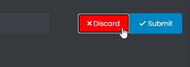
@downpw So (for example) do you want the Discard button to turn red if you you click Confirm, or am I off track here ? Not entirely sure what you’re after
Mark – Founder, Phenomlab Ltd
Executive IT & Security Leadership
Phenomlab Ltd -
@downpw So (for example) do you want the Discard button to turn red if you you click Confirm, or am I off track here ? Not entirely sure what you’re after
-
@phenomlab Never mind already found the right CSS property would be nice
@downpw Do you mean this one
button.btn.btn-default.composer-discard:focus { background: red; }Or another ?
Mark – Founder, Phenomlab Ltd
Executive IT & Security Leadership
Phenomlab Ltd -
@downpw Do you mean this one
button.btn.btn-default.composer-discard:focus {
    background: red;
}
Or another ?
@phenomlab Another I think

Hello! It looks like you're interested in this conversation, but you don't have an account yet.
Getting fed up of having to scroll through the same posts each visit? When you register for an account, you'll always come back to exactly where you were before, and choose to be notified of new replies (either via email, or push notification). You'll also be able to save bookmarks and upvote posts to show your appreciation to other community members.
With your input, this post could be even better 💗
Register LoginDid this solution help you?
Related Topics
-
-
-
-
-
-
[NODEBB] CSS Style Sheets SelectBox
Locked Solved Customisation -
NodeBB Discord Plugins
Unsolved Customisation -