[NODEBB] Help for my custom CSS
-
So actually after research I was using as this was used in old core code.
By removing the “Filter” directive it works for the black background on the hover of the close button: cool !!
But for the color of the cross icon itself (In fact it is not an icon but an image) it is black for light themes, no problem but it remains black for dark themes so it becomes invisible !!!
So here is my solution :
.btn-close { background: var(--bs-node-btn-close-bg) !important; }- for light theme:
--bs-node-btn-close-bg: transparent url("data:image/svg+xml,%3csvg xmlns='http://www.w3.org/2000/svg' viewBox='0 0 16 16' fill='%23000'%3e%3cpath d='M.293.293a1 1 0 0 1 1.414 0L8 6.586 14.293.293a1 1 0 1 1 1.414 1.414L9.414 8l6.293 6.293a1 1 0 0 1-1.414 1.414L8 9.414l-6.293 6.293a1 1 0 0 1-1.414-1.414L6.586 8 .293 1.707a1 1 0 0 1 0-1.414z'/%3e%3c/svg%3e") center/1em auto no-repeat;- for dark themes :
--bs-node-btn-close-bg: transparent url("data:image/svg+xml,%3csvg xmlns='http://www.w3.org/2000/svg' viewBox='0 0 16 16' fill='%23fff'%3e%3cpath d='M.293.293a1 1 0 0 1 1.414 0L8 6.586 14.293.293a1 1 0 1 1 1.414 1.414L9.414 8l6.293 6.293a1 1 0 0 1-1.414 1.414L8 9.414l-6.293 6.293a1 1 0 0 1-1.414-1.414L6.586 8 .293 1.707a1 1 0 0 1 0-1.414z'/%3e%3c/svg%3e") center/1em auto no-repeat;I see you have the same problem here on sudonix, test that

@DownPW thanks. I’ll check this.
-
no problem. Always @phenomlab
I want to test your author badge (fa) :

Can you provide CSS for this please ?
Thank you
edit:
tetsing this but i don’t think i’m on the good road
.topic-owner-post [itemprop=author]:before{
    font-family: "Font Awesome 6 pro";
    font-style: normal;
    content: "\e1e4";
    left: 100px !important;
    text-align: left !important;
    position: absolute;
}
PW and WS Spirit alive
-
no problem. Always @phenomlab
I want to test your author badge (fa) :
Can you provide CSS for this please ?
Thank you
edit:
tetsing this but i don’t think i’m on the good road
.topic-owner-post [itemprop=author]:before{ font-family: "Font Awesome 6 pro"; font-style: normal; content: "\e1e4"; left: 100px !important; text-align: left !important; position: absolute; }@DownPW heh, that also needs some
jsto make that work.Edit - add this
jsblockfunction addAuthorBadge() { $(".topic-owner-post").each(function() { var $authorElement = $(this).find(".text-nowrap:first"); // Check if the author badge already exists if (!$authorElement.find(".author").length) { // Prepend the author element $authorElement.append("<span class='author' data-toggle='tooltip' data-placement='left' title='Topic Author'><span class='author-icon'><i class='fa-regular fa-message-quote'></i></span>"); // Add tooltip on hover $authorElement.find(".author").tooltip({ content: "Topic Author", track: true // This enables the tooltip to track the mouse movement }); } }); } $(document).ready(function() { $(window).on('action:posts.loaded', function(data) { addAuthorBadge(); }); }); $(document).ready(function() { $(window).on('action:ajaxify.end', function(data) { addAuthorBadge(); }); }); -
OMG make sense
Thanks dude

-
Hello,
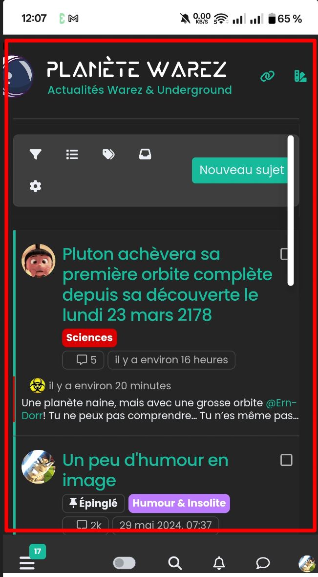
I just changed my smartphone (OnePlus 12R) and I see this which I cannot resolve.
the central body is offset and is not centered on the smartphone. (production server)
Any idea to solve this??
PW and WS Spirit alive
-
Hello,
I just changed my smartphone (OnePlus 12R) and I see this which I cannot resolve.
the central body is offset and is not centered on the smartphone. (production server)
Any idea to solve this??
@DownPW yes, I too see this on your production site. Typically, this is because of one element that is oversized and causing the entire
bodyto shift.Unfortunately, it’s a slow process in terms of finding the culprit, but I’ll have a more detailed look later.
Mark Cutting also advises organisations as a Fractional CIO, Fractional CISO and Executive Advisor, helping boards improve technology governance, cyber resilience and executive decision making. Learn more at Gratmore Ltd
-
@DownPW yes, I too see this on your production site. Typically, this is because of one element that is oversized and causing the entire
bodyto shift.Unfortunately, it’s a slow process in terms of finding the culprit, but I’ll have a more detailed look later.
@phenomlab said in [NODEBB] Help for my custom CSS:
@DownPW yes, I too see this on your production site. Typically, this is because of one element that is oversized and causing the entire
bodyto shift.Unfortunately, it’s a slow process in terms of finding the culprit, but I’ll have a more detailed look later.
OK Thank you. Logo I guess
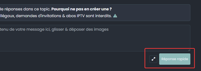
I also noticed that the "answer "button on my DEV platform following the new update is quite large but I can’t find the right CSS target to correct it.
Can you help me with that too?
PW and WS Spirit alive
-
@phenomlab said in [NODEBB] Help for my custom CSS:
@DownPW yes, I too see this on your production site. Typically, this is because of one element that is oversized and causing the entire
bodyto shift.Unfortunately, it’s a slow process in terms of finding the culprit, but I’ll have a more detailed look later.
OK Thank you. Logo I guess
I also noticed that the "answer "button on my DEV platform following the new update is quite large but I can’t find the right CSS target to correct it.
Can you help me with that too?
@DownPW said in [NODEBB] Help for my custom CSS:
OK Thank you. Logo I guess
Sort of.
You can stop most of the overflow with the below CSS
body {
    overflow-x: hidden;
    max-width: 100%;
}
Add the above to the existing
bodyclass you have.For the remainder, it’s much easier to see where elements burst outside of their boundaries by using the global CSS below, which will draw a border around every single element - effectively, making it much easier to see
* {
outline: 1px solid red;
}
This then yields the below
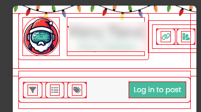
As you can clearly see, the additional navigation buttons you have are flowing outside of their allowed space, which causes the body to expand to accommodate the new size. This produces the undesired effect of scrolling on the entire body.
Then, look at the class of
[data-widget-area=brand-header] {
    justify-content: end;
    display: flex;
}
If you remove
display: flex;from this class, the icons are then stacked vertically, and the problem resolves itself. However, this looks ugly. A better way of getting closer to the result you want is to resize the logo[component="brand/logo"] { max-height: 100px; width: auto; height: 75px; margin-top: -1px; height: 45px; }Here, we’ve dropped the image size from
75pxto45px, which in turn pulls the expandedDIVback into line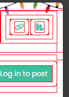
The problem we then have is the site title, but can easily fix that with the below CSS
@media (max-width: 768px) {
    a.text-truncate.align-self-stretch.align-items-center.d-flex h1 {
        height: 55px;
    }
}
This then yields
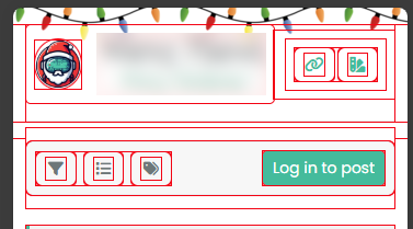
Everything now aligns correctly, and more importantly, the scrolling body is no more.
-
@phenomlab said in [NODEBB] Help for my custom CSS:
@DownPW yes, I too see this on your production site. Typically, this is because of one element that is oversized and causing the entire
bodyto shift.Unfortunately, it’s a slow process in terms of finding the culprit, but I’ll have a more detailed look later.
OK Thank you. Logo I guess
I also noticed that the "answer "button on my DEV platform following the new update is quite large but I can’t find the right CSS target to correct it.
Can you help me with that too?
@DownPW said in [NODEBB] Help for my custom CSS:
I also noticed that the "answer "button on my DEV platform following the new update is quite large but I can’t find the right CSS target to correct it.
Can you help me with that too?
Yes, of course. You can target the
componentdirectly for that[component="topic/quickreply/button"] { height 45px; } -
I will test ASAP
Many thanks my friend
-
Hello @phenomlab
I come back here with a little problem.
I created a donation button in the custom footbar that works well.
It looks like this with the following code:

<div id="floatright"> <div class="d-flex justify-content-center mt-2 mb-2"> <a href="https://ko-fi.com/K3K519RHI6" class="btn btn-primary d-flex align-items-center btn-donation" target="_blank"> <img src="https://storage.ko-fi.com/cdn/logomarkLogo.png" alt="Icône café" class="me-2"> Faire un don </a> </div> <a class="feedback-menu-far-right" target="_blank" href="/politique">Politique </a> ...However, as soon as I go to a profile page, the users page, the group page, it is broken like this :

possible to see it on production server
Any idea to resolve this ?
PW and WS Spirit alive
-
Hello @phenomlab
I come back here with a little problem.
I created a donation button in the custom footbar that works well.
It looks like this with the following code:
<div id="floatright"> <div class="d-flex justify-content-center mt-2 mb-2"> <a href="https://ko-fi.com/K3K519RHI6" class="btn btn-primary d-flex align-items-center btn-donation" target="_blank"> <img src="https://storage.ko-fi.com/cdn/logomarkLogo.png" alt="Icône café" class="me-2"> Faire un don </a> </div> <a class="feedback-menu-far-right" target="_blank" href="/politique">Politique </a> ...However, as soon as I go to a profile page, the users page, the group page, it is broken like this :
possible to see it on production server
Any idea to resolve this ?
@DownPW Looking at the code, it seems to come down to this
<img src="https://storage.ko-fi.com/cdn/logomarkLogo.png" alt="Icône café" class="me-2 img-fluid">
If you remove the
img-fluidclass, it works as intended
The question is where the
img-fluidclass is being added.Mark Cutting also advises organisations as a Fractional CIO, Fractional CISO and Executive Advisor, helping boards improve technology governance, cyber resilience and executive decision making. Learn more at Gratmore Ltd
-
@DownPW Looking at the code, it seems to come down to this
<img src="https://storage.ko-fi.com/cdn/logomarkLogo.png" alt="Icône café" class="me-2 img-fluid">If you remove the
img-fluidclass, it works as intendedThe question is where the
img-fluidclass is being added.@phenomlab said in [NODEBB] Help for my custom CSS:
The question is where the img-fluid class is being added.
I don’t know
Not in the code…I don’t explain why this class is added in these pages
-
I use this CSS code for control the button in the custom bar :
.btn-donation { font-size: 12px; /* Taille du texte */ padding: 2px 5px 2px 5px; /* Marges internes pour agrandir le bouton */ border-radius: 8px; /* Coins arrondis */ margin-top: -8.8px !important; color: #ffffff !important; } .btn-donation img { width: 18px; /* Taille de l’icône */ height: 16px; } -
Find him :

But I use this code for control image on topics and Shoutbox

EDIT: I disabled this code and it seems to be OK
Thanks @phenomlab
-
Hello @phenomlab
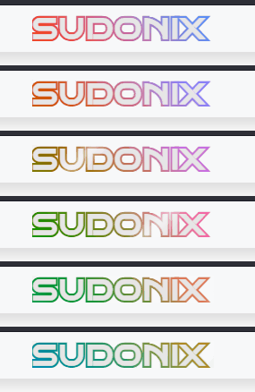
Love your new Glass effect on tittle site.
Possible to adapt it to my site/share the code ?
PW and WS Spirit alive
-
Hello @phenomlab
Love your new Glass effect on tittle site.
Possible to adapt it to my site/share the code ?
@DownPW Possible, yes, although this particular effect uses CSS only for both the text itself, and the shine rollover. It’s actually quite complex in setup and takes several adjustments to get it to look right.
It’s also important to understand if you are using this on a logo, or just text?
Mark Cutting also advises organisations as a Fractional CIO, Fractional CISO and Executive Advisor, helping boards improve technology governance, cyber resilience and executive decision making. Learn more at Gratmore Ltd
-
@DownPW Possible, yes, although this particular effect uses CSS only for both the text itself, and the shine rollover. It’s actually quite complex in setup and takes several adjustments to get it to look right.
It’s also important to understand if you are using this on a logo, or just text?
@phenomlab said in [NODEBB] Help for my custom CSS:
It’s also important to understand if you are using this on a logo, or just text?
just text; logo on the left is separate
PW and WS Spirit alive
-
@phenomlab said in [NODEBB] Help for my custom CSS:
It’s also important to understand if you are using this on a logo, or just text?
just text; logo on the left is separate
@DownPW And the hue animation? Or just the glass effect?
-
I’d like to try it without HUE to start.
But I’m always keen to try lots of things
You could always explain both to me, so I can apply them separately.
PW and WS Spirit alive


Hello! It looks like you're interested in this conversation, but you don't have an account yet.
Getting fed up of having to scroll through the same posts each visit? When you register for an account, you'll always come back to exactly where you were before, and choose to be notified of new replies (either via email, or push notification). You'll also be able to save bookmarks and upvote posts to show your appreciation to other community members.
With your input, this post could be even better 💗
Register LoginDid this solution help you?
Related Topics
-
-
-
Nodebb design
Solved General -
-
NodeBB templates
Locked Chitchat -
-
-