[NODEBB] Help for my custom CSS
-
Yes thnaks it’s a solution but is there another way? Like targeting icons when the dropdown is active rather than changing the background because I already use --bs-dropdown-link-active-bg elsewhere
Otherwise we can cheat by changing the color of the icons at any time but I find it less good.
maybe change html for add specific class
It’s just a question, I can eventually satisfy myself with this solution
PW and WS Spirit alive
-
Yes thnaks it’s a solution but is there another way? Like targeting icons when the dropdown is active rather than changing the background because I already use --bs-dropdown-link-active-bg elsewhere
Otherwise we can cheat by changing the color of the icons at any time but I find it less good.
maybe change html for add specific class
It’s just a question, I can eventually satisfy myself with this solution
@DownPW Try this
a.active i {
    color: #ffffff!important;
}
Mark Cutting also advises organisations as a Fractional CIO, Fractional CISO and Executive Advisor, helping boards improve technology governance, cyber resilience and executive decision making. Learn more at Gratmore Ltd
-
Seems to be definitevely better. Hope have no other effect

Thank you Mark !PW and WS Spirit alive
-
@DownPW there shouldn’t be - it’s a fairly specific target, but if you do experience odd behaviour, let me know.
-
Hello mark,
I would like to change the appearance of deleted messages in topics but I can’t find the target or the component.
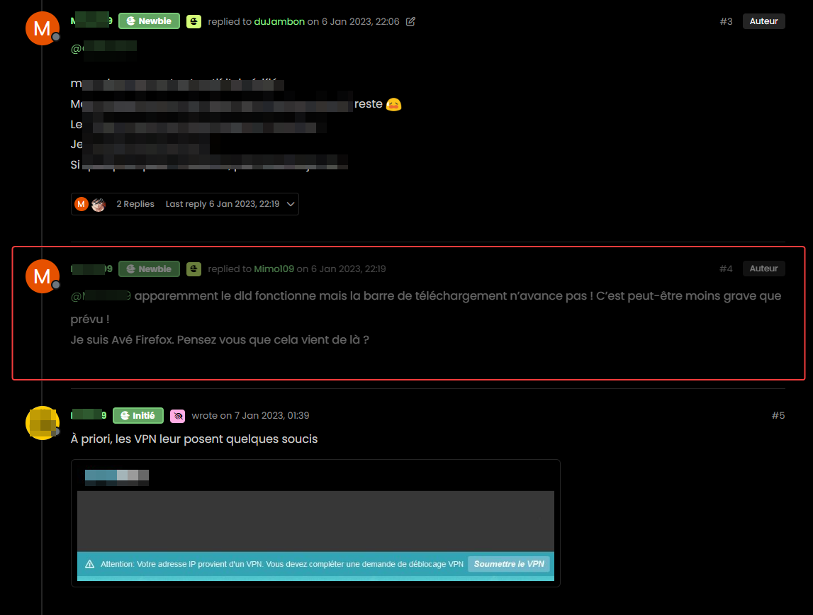
For example, opacity or left timeline color of the deleted post
And I would like the same things for deleted topics
Hard to find these component or class !
Thanks
PW and WS Spirit alive
-
Hello mark,
I would like to change the appearance of deleted messages in topics but I can’t find the target or the component.
For example, opacity or left timeline color of the deleted post
And I would like the same things for deleted topics
Hard to find these component or class !
Thanks
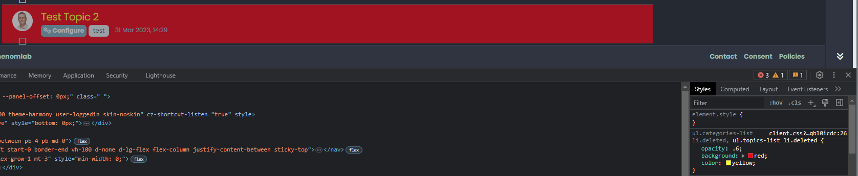
@DownPW The topic CSS for this should be as below (note, I added the background and color)
ul.categories-list li.deleted, ul.topics-list li.deleted {
    opacity: .6;
    background: red;
    color: yellow;
}
Threads for deleted posts in topics are covered by the
.deletedclass (note, I added the background and color).deleted { background: black; color: orange; }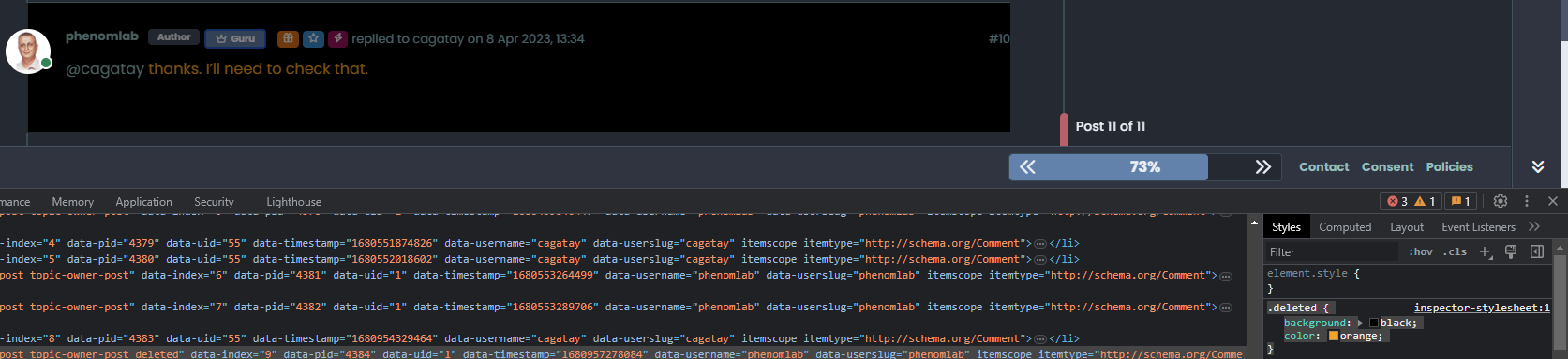
-
Thanks you Mark !
I know why I have don’t find this directive lol : I got my brushes tangled up in the dev console
So for deleted post , I prefer use
li.pt-4.deletedinstead of.deletedbecause.deletedis in conflict withul.categories-list li.deleted, ul.topics-list li.deletedPW and WS Spirit alive
-
Thanks you Mark !
I know why I have don’t find this directive lol : I got my brushes tangled up in the dev console
So for deleted post , I prefer use
li.pt-4.deletedinstead of.deletedbecause.deletedis in conflict withul.categories-list li.deleted, ul.topics-list li.deleted@DownPW yes, fair point. The
.deletedclass is implicit so you need to make it unique using other classes before it to create a chain which you’ve done. -
Hello,
because I use nsembed plugin now, I see the frame are a bit little compared to this forum which uses the same plugin.
How did you handle that Mark?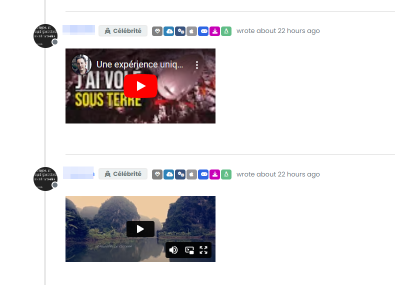
PW and WS Spirit alive
-
Hello,
because I use nsembed plugin now, I see the frame are a bit little compared to this forum which uses the same plugin.
How did you handle that Mark?@DownPW sorry, I’m not entirely sure what you mean?
-
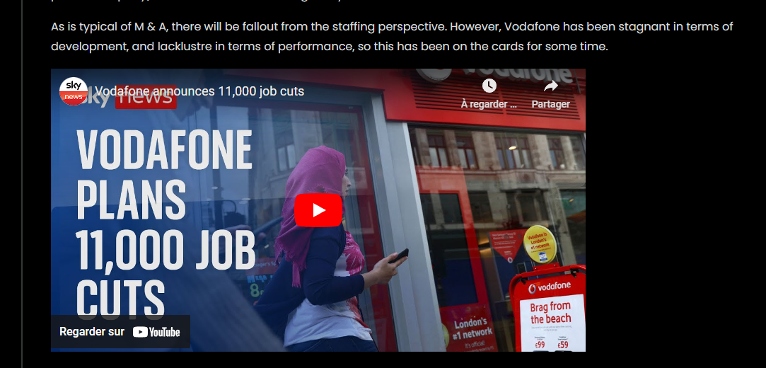
Sorry the player is small compared to here. I would like to enlarge them ^^

– Mine :
– Here on sudonix :
PW and WS Spirit alive
-
Sorry the player is small compared to here. I would like to enlarge them ^^
– Mine :
– Here on sudonix :
@DownPW Try this
.embed-container iframe {
    width: 600px;
    height: 300px;
}
Obviously, adjust
widthandheightas required -
Hmm I have this problem with hover background color on close button on modal chat on my dev instance.
The background color is black :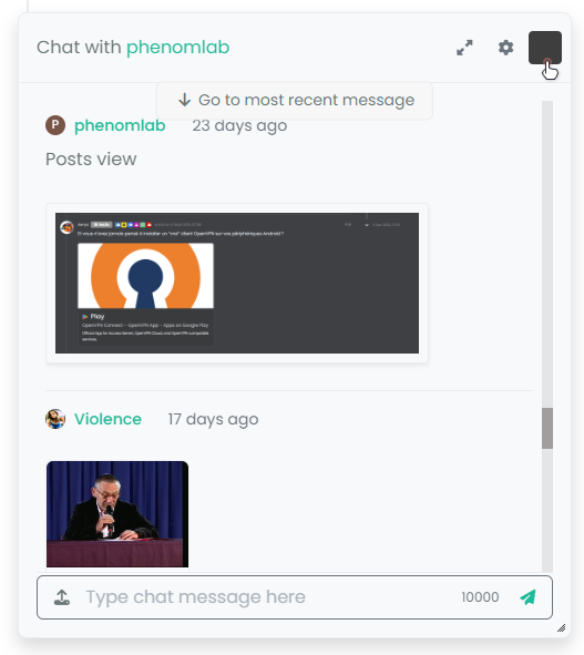
And it seems my code doesn’t work :
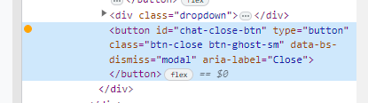
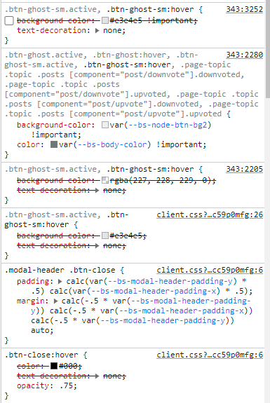
I confess that I do not fully understand why I have black and that my code is not interpreted correctly.
Thanks in advance for your help my friends
PW and WS Spirit alive
-
Hmm I have this problem with hover background color on close button on modal chat on my dev instance.
The background color is black :And it seems my code doesn’t work :
I confess that I do not fully understand why I have black and that my code is not interpreted correctly.
Thanks in advance for your help my friends
@DownPW It’s caused by this css
.btn-close {
    filter: var(--bs-node-btn-close-color) !important;
}
If you remove that filter, the issue will be resolved.
-
Thanks. It’s an error.
Why I have used filter lolPW and WS Spirit alive
-
@DownPW I figured

-
So actually after research I was using as this was used in old core code.
By removing the “Filter” directive it works for the black background on the hover of the close button: cool !!
But for the color of the cross icon itself (In fact it is not an icon but an image) it is black for light themes, no problem but it remains black for dark themes so it becomes invisible !!!
So here is my solution :
.btn-close { background: var(--bs-node-btn-close-bg) !important; }- for light theme:
--bs-node-btn-close-bg: transparent url("data:image/svg+xml,%3csvg xmlns='http://www.w3.org/2000/svg' viewBox='0 0 16 16' fill='%23000'%3e%3cpath d='M.293.293a1 1 0 0 1 1.414 0L8 6.586 14.293.293a1 1 0 1 1 1.414 1.414L9.414 8l6.293 6.293a1 1 0 0 1-1.414 1.414L8 9.414l-6.293 6.293a1 1 0 0 1-1.414-1.414L6.586 8 .293 1.707a1 1 0 0 1 0-1.414z'/%3e%3c/svg%3e") center/1em auto no-repeat;- for dark themes :
--bs-node-btn-close-bg: transparent url("data:image/svg+xml,%3csvg xmlns='http://www.w3.org/2000/svg' viewBox='0 0 16 16' fill='%23fff'%3e%3cpath d='M.293.293a1 1 0 0 1 1.414 0L8 6.586 14.293.293a1 1 0 1 1 1.414 1.414L9.414 8l6.293 6.293a1 1 0 0 1-1.414 1.414L8 9.414l-6.293 6.293a1 1 0 0 1-1.414-1.414L6.586 8 .293 1.707a1 1 0 0 1 0-1.414z'/%3e%3c/svg%3e") center/1em auto no-repeat;I see you have the same problem here on sudonix, test that
PW and WS Spirit alive
-
So actually after research I was using as this was used in old core code.
By removing the “Filter” directive it works for the black background on the hover of the close button: cool !!
But for the color of the cross icon itself (In fact it is not an icon but an image) it is black for light themes, no problem but it remains black for dark themes so it becomes invisible !!!
So here is my solution :
.btn-close { background: var(--bs-node-btn-close-bg) !important; }- for light theme:
--bs-node-btn-close-bg: transparent url("data:image/svg+xml,%3csvg xmlns='http://www.w3.org/2000/svg' viewBox='0 0 16 16' fill='%23000'%3e%3cpath d='M.293.293a1 1 0 0 1 1.414 0L8 6.586 14.293.293a1 1 0 1 1 1.414 1.414L9.414 8l6.293 6.293a1 1 0 0 1-1.414 1.414L8 9.414l-6.293 6.293a1 1 0 0 1-1.414-1.414L6.586 8 .293 1.707a1 1 0 0 1 0-1.414z'/%3e%3c/svg%3e") center/1em auto no-repeat;- for dark themes :
--bs-node-btn-close-bg: transparent url("data:image/svg+xml,%3csvg xmlns='http://www.w3.org/2000/svg' viewBox='0 0 16 16' fill='%23fff'%3e%3cpath d='M.293.293a1 1 0 0 1 1.414 0L8 6.586 14.293.293a1 1 0 1 1 1.414 1.414L9.414 8l6.293 6.293a1 1 0 0 1-1.414 1.414L8 9.414l-6.293 6.293a1 1 0 0 1-1.414-1.414L6.586 8 .293 1.707a1 1 0 0 1 0-1.414z'/%3e%3c/svg%3e") center/1em auto no-repeat;I see you have the same problem here on sudonix, test that
@DownPW thanks. I’ll check this.
-
no problem. Always @phenomlab
I want to test your author badge (fa) :

Can you provide CSS for this please ?
Thank you
edit:
tetsing this but i don’t think i’m on the good road
.topic-owner-post [itemprop=author]:before{
    font-family: "Font Awesome 6 pro";
    font-style: normal;
    content: "\e1e4";
    left: 100px !important;
    text-align: left !important;
    position: absolute;
}
PW and WS Spirit alive
-
no problem. Always @phenomlab
I want to test your author badge (fa) :
Can you provide CSS for this please ?
Thank you
edit:
tetsing this but i don’t think i’m on the good road
.topic-owner-post [itemprop=author]:before{ font-family: "Font Awesome 6 pro"; font-style: normal; content: "\e1e4"; left: 100px !important; text-align: left !important; position: absolute; }@DownPW heh, that also needs some
jsto make that work.Edit - add this
jsblockfunction addAuthorBadge() { $(".topic-owner-post").each(function() { var $authorElement = $(this).find(".text-nowrap:first"); // Check if the author badge already exists if (!$authorElement.find(".author").length) { // Prepend the author element $authorElement.append("<span class='author' data-toggle='tooltip' data-placement='left' title='Topic Author'><span class='author-icon'><i class='fa-regular fa-message-quote'></i></span>"); // Add tooltip on hover $authorElement.find(".author").tooltip({ content: "Topic Author", track: true // This enables the tooltip to track the mouse movement }); } }); } $(document).ready(function() { $(window).on('action:posts.loaded', function(data) { addAuthorBadge(); }); }); $(document).ready(function() { $(window).on('action:ajaxify.end', function(data) { addAuthorBadge(); }); });



Hello! It looks like you're interested in this conversation, but you don't have an account yet.
Getting fed up of having to scroll through the same posts each visit? When you register for an account, you'll always come back to exactly where you were before, and choose to be notified of new replies (either via email, or push notification). You'll also be able to save bookmarks and upvote posts to show your appreciation to other community members.
With your input, this post could be even better 💗
Register LoginDid this solution help you?
Related Topics
-
-
-
NodeBB upgrade now cant post
Solved Bugs -
-
-
-
NodeBB metadata
Solved Configure -