Widget | CSS customization
-
@phenomlab i also believe the video is okay, though the report is still unclear.
-
@phenomlab i also believe the video is okay, though the report is still unclear.
Is this a video issue or its the article image?
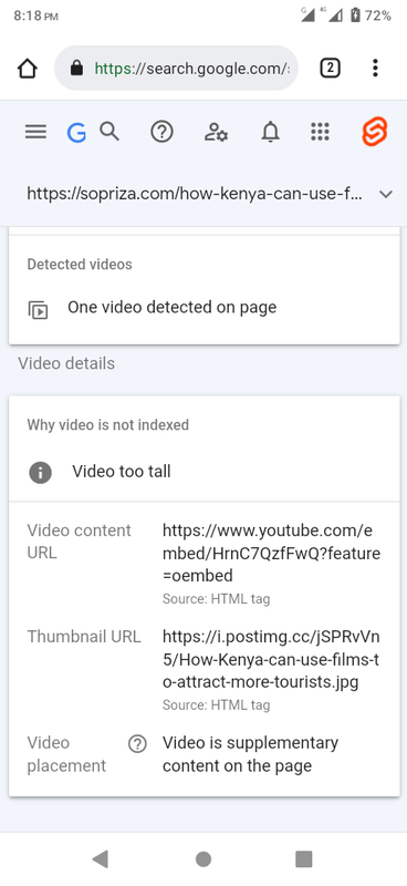
@Sala That’s telling you that the video is too tall, and doesn’t meet Google’s criteria. You should remove the CSS below and be more specific with image sizes
div.text img {
    width: 100%;
    height: 315px;
}
You are targeting all
imgtags with this CSS, which is less than desirable. Let’s first remove this CSS and see if that resolves the Google crawl issue which I’m confident it will. -
@Sala That’s telling you that the video is too tall, and doesn’t meet Google’s criteria. You should remove the CSS below and be more specific with image sizes
div.text img { width: 100%; height: 315px; }You are targeting all
imgtags with this CSS, which is less than desirable. Let’s first remove this CSS and see if that resolves the Google crawl issue which I’m confident it will.@phenomlab sure, let me compose myself, because the css currently is wrapped up. But, what of the height if we remove its going to use the image height which sometime back i saw them occupying a large space.
div.text is affecting even yt video d**n, that brings up the picture

-
@phenomlab sure, let me compose myself, because the css currently is wrapped up. But, what of the height if we remove its going to use the image height which sometime back i saw them occupying a large space.
div.text is affecting even yt video d**n, that brings up the picture

@Sala it will affect that because you are targeting all
imgelements - this is why I said to remove that CSS block -
@Sala it will affect that because you are targeting all
imgelements - this is why I said to remove that CSS block@phenomlab On it sir
-
@Sala it will affect that because you are targeting all
imgelements - this is why I said to remove that CSS block@phenomlab done, its resubmitted on google. I am composing another article so we can clarify if that was the problem. Talk to you later
-
@phenomlab done, its resubmitted on google. I am composing another article so we can clarify if that was the problem. Talk to you later
@Sala Ok. Keep me posted.
-
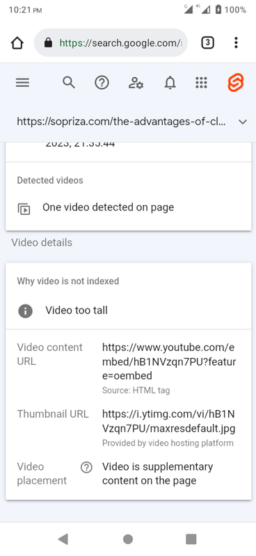
@phenomlab new article has been index though we have the same issue. At least not from article image, this time its the image from the video?
-
@phenomlab new article has been index though we have the same issue. At least not from article image, this time its the image from the video?

-
@phenomlab Hi, thanks for the additional info, it would help people online by comparing. For us we finally found a solution fixing the videos totally in a different way. It was detailed with one of our member. It appears that google has made some changes over these recent days. We’re formulating a plan on how we would save old and future articles. It has been a joy though hell of a ride.
-
@phenomlab Hi, please help us to hide the cap links from crawlers. P - pakistan which is on homepage.
-
@phenomlab Hi, please help us to hide the cap links from crawlers. P - pakistan which is on homepage.
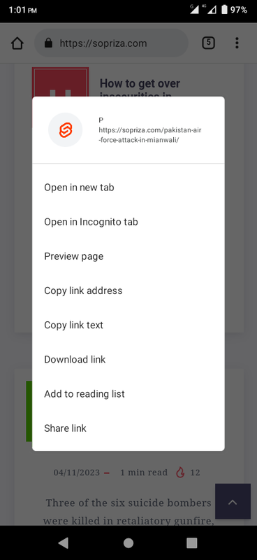
@Sala the only way you can achieve this is to use a
robots.txtfile and disallow access to those links.
Did this solution help you?
Hello! It looks like you're interested in this conversation, but you don't have an account yet.
Getting fed up of having to scroll through the same posts each visit? When you register for an account, you'll always come back to exactly where you were before, and choose to be notified of new replies (ether email, or push notification). You'll also be able to save bookmarks, use reactions, and upvote to show your appreciation to other community members.
With your input, this post could be even better 💗
RegisterLog in

