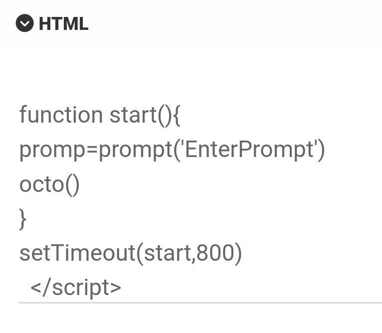
Interesting Widget code, but can't fetch API
-
@Panda are there any errors in the browser console?
-
@phenomlab
Unfortunately cant check, as in France, on mobile.
Ive tried a few methods to view console in mobile browser but none have ever worked!
Maybe you can look?
https://aignite.nodebb.com/category/10/3d
You will see it returns much more quickly than that code normally would, but doesn’t return with error code -
@phenomlab
Unfortunately cant check, as in France, on mobile.
Ive tried a few methods to view console in mobile browser but none have ever worked!
Maybe you can look?
https://aignite.nodebb.com/category/10/3d
You will see it returns much more quickly than that code normally would, but doesn’t return with error code@Panda looking at the code, it fires an alert prompt asking for a parameter to be entered. This script requires interaction, so that it why it returns immediately with nothing.
The widget is executing the script, but without a response, it returns null.
-
@Panda looking at the code, it fires an alert prompt asking for a parameter to be entered. This script requires interaction, so that it why it returns immediately with nothing.
The widget is executing the script, but without a response, it returns null.
@phenomlab
Dont think its any problem with that flow, because the prompt comes firstvar promp holds the entered string, and thats used in the octo() function which calls the API
It works as stand alone codeAre you saying the prompt command wont stop the code flow like it would outside of a widget?
-
@phenomlab
Dont think its any problem with that flow, because the prompt comes firstvar promp holds the entered string, and thats used in the octo() function which calls the API
It works as stand alone codeAre you saying the prompt command wont stop the code flow like it would outside of a widget?
@Panda said in Interesting Widget code, but can’t fetch API:
Dont think its any problem with that flow, because the prompt comes first
That’s correct, but the prompt is interactive in the sense that it waits for user input.
fetch('https://stable-diffusion-demo-8yn9n69web73.octoai.cloud/predict', {
  method: 'POST',
  headers: {
    'Content-Type': 'application/json',
    'Authorization': `Bearer ${apiKey}`
  },
  body: JSON.stringify({
    'prompt': promp,
  // 'num_inference_steps': '30',
    'sheduler': 'DPMSolverMultistep'
  })
})
As you can see from above, the original
prompvalue is passed to theJSONfunction. As that value is never entered, the value is returned NULL. -
@Panda said in Interesting Widget code, but can’t fetch API:
Dont think its any problem with that flow, because the prompt comes first
That’s correct, but the prompt is interactive in the sense that it waits for user input.
fetch('https://stable-diffusion-demo-8yn9n69web73.octoai.cloud/predict', {
  method: 'POST',
  headers: {
    'Content-Type': 'application/json',
    'Authorization': `Bearer ${apiKey}`
  },
  body: JSON.stringify({
    'prompt': promp,
  // 'num_inference_steps': '30',
    'sheduler': 'DPMSolverMultistep'
  })
})
As you can see from above, the original
prompvalue is passed to theJSONfunction. As that value is never entered, the value is returned NULL.@phenomlab
There may be some confusion here as descriptions to AI art generators are called prompts. So that ‘prompt’ value in Json body is set to my variable promp.promp is set by a JS prompt command at the bottom of the code. Its a global variable so available to the octo() function when called.
Function octo() has the API fetch, comes after the prompt is entered

-
@phenomlab
There may be some confusion here as descriptions to AI art generators are called prompts. So that ‘prompt’ value in Json body is set to my variable promp.promp is set by a JS prompt command at the bottom of the code. Its a global variable so available to the octo() function when called.
Function octo() has the API fetch, comes after the prompt is entered

@Panda yes, but if you run the code directly in the browser a popup prompt asks for a value and won’t proceed until one is provided.
-
@Panda yes, but if you run the code directly in the browser a popup prompt asks for a value and won’t proceed until one is provided.
@phenomlab yes exactly, and why would it be any different in a widget?
The JS prompt command is async so will halt the flow till value is entered? -
@phenomlab yes exactly, and why would it be any different in a widget?
The JS prompt command is async so will halt the flow till value is entered?@Panda it’s not. If I visit the page you sent me, the popup appears, but no image is returned. This is why I need the console error as there will be one.
-
@Panda it’s not. If I visit the page you sent me, the popup appears, but no image is returned. This is why I need the console error as there will be one.
@phenomlab ah you mean the nodebb console log, not browser inspect console?
Its nodebb hosted, can you view if you login? -
@phenomlab ah you mean the nodebb console log, not browser inspect console?
Its nodebb hosted, can you view if you login?@Panda no, the browser console. There is likely a JS error there I need to see.
-
@phenomlab
I sent link to the aignite.nodebb.com forum above, its on 3d category
Incidentally a blank prompt string will still generate a random image, so the problems not with the input -
@phenomlab
I sent link to the aignite.nodebb.com forum above, its on 3d category
Incidentally a blank prompt string will still generate a random image, so the problems not with the input@Panda yes, but you are missing the point here. I need to see the output of the browser console or at least insert something like the below to return it
alert(console.log)It’s 1:17am here and I’m not in front of a PC, but will check tomorrow.
-
@Panda yes, but you are missing the point here. I need to see the output of the browser console or at least insert something like the below to return it
alert(console.log)It’s 1:17am here and I’m not in front of a PC, but will check tomorrow.
To eliminate any confusion I made a simpler widget which just does hardcoded API call for image of a cat. No user input etc
Again it runs stand alone, but returns quickly, empty, as a widget
This example sits on aignite.nodebb.com category 8 (‘Diamond’)
First example is still in category 10 (‘3d’) -
To eliminate any confusion I made a simpler widget which just does hardcoded API call for image of a cat. No user input etc
Again it runs stand alone, but returns quickly, empty, as a widget
This example sits on aignite.nodebb.com category 8 (‘Diamond’)
First example is still in category 10 (‘3d’)@Panda the
result=undefinedsays it all. It still returns null and we need to see the error in the browser console. -
To eliminate any confusion I made a simpler widget which just does hardcoded API call for image of a cat. No user input etc
Again it runs stand alone, but returns quickly, empty, as a widget
This example sits on aignite.nodebb.com category 8 (‘Diamond’)
First example is still in category 10 (‘3d’)@Panda Just looking at this, and it seems that the service expects authentication

I also see the below in the console
Failed to load resource: the server responded with a status of 401 (Unauthorized) GET data:image/png;base64,undefined net::ERR_INVALID_URL {"code":401,"message":"error occurred during proxy authentication: no token in request"} -
Yes. There is a key included and the exact code works as stand-alone, thats why Im wonderinging why not working in a widget
-
Yes. There is a key included and the exact code works as stand-alone, thats why Im wonderinging why not working in a widget
@Panda I think this might have something to do with the reverse proxy that
nginxruns for NodeBB. Do you use this, or are you using something else? -
@Panda I think this might have something to do with the reverse proxy that
nginxruns for NodeBB. Do you use this, or are you using something else?@phenomlab ah! Its nodebb hosted site, so they do all that
-
 undefined Panda has marked this topic as solved on
-
@Panda I think this might have something to do with the reverse proxy that
nginxruns for NodeBB. Do you use this, or are you using something else?@phenomlab
Two things-
this particular forum had plans to integrate tools which use API calls into widgets.
Now we reached the point of finding possible reason why API calls dont work, is there anyway round that? -
General forum question: because there were few ‘Red Herrings’ while exploring this issue, I was tempted to tidy up this thread by deleting some of the erroneous comments.
I noticed before this forum has tight restriction times on editing / removing comments. I guess this is intentional. Is your experience that it is better to have this on a forum rather than unlimited edit / delete timer?
-
Hello! It looks like you're interested in this conversation, but you don't have an account yet.
Getting fed up of having to scroll through the same posts each visit? When you register for an account, you'll always come back to exactly where you were before, and choose to be notified of new replies (either via email, or push notification). You'll also be able to save bookmarks and upvote posts to show your appreciation to other community members.
With your input, this post could be even better 💗
Register LoginDid this solution help you?
Related Topics
-
-
-
-
-
-
NodeBB Footer
Solved Customisation -
-