v3 & Harmony diary / thoughts / code snippets
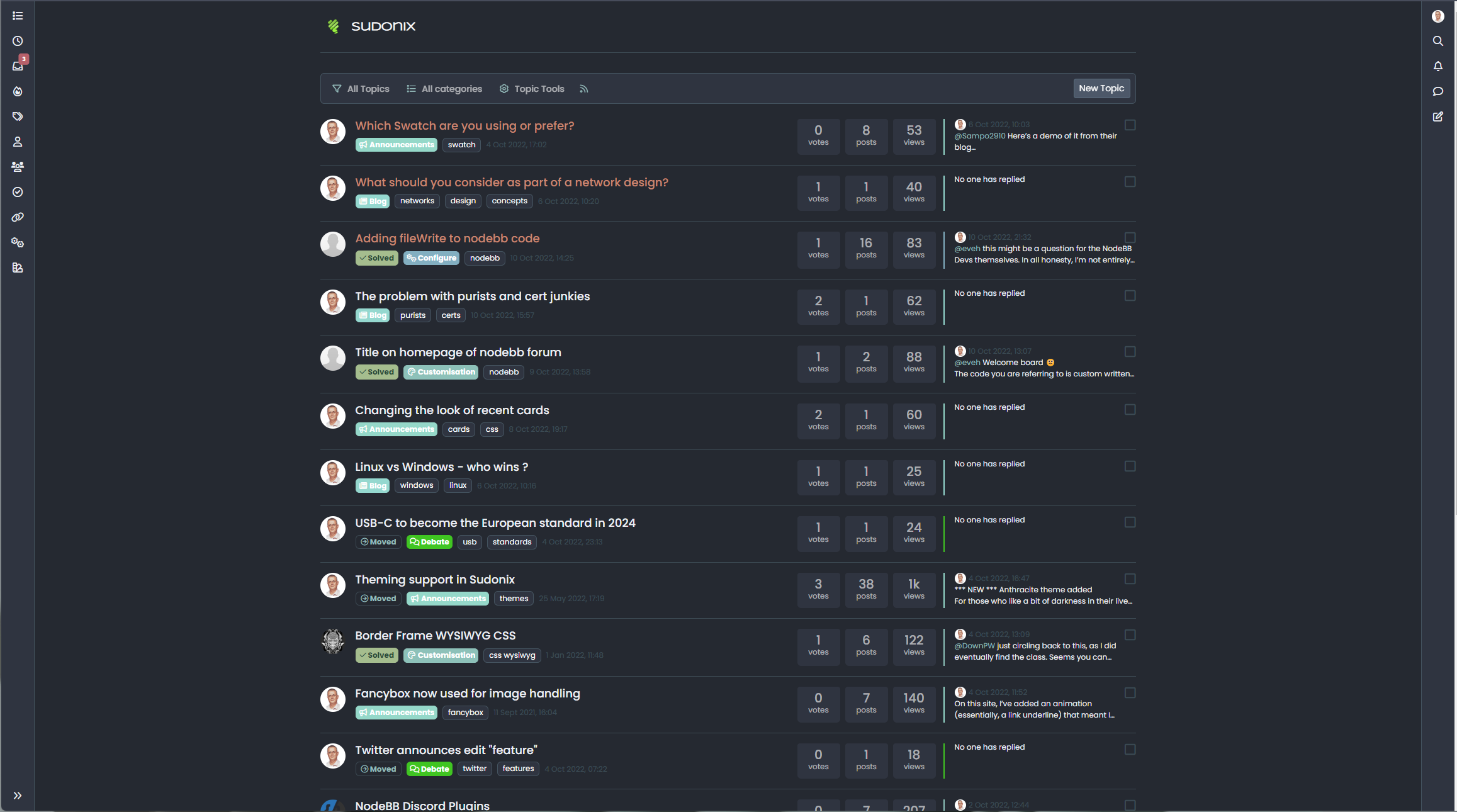
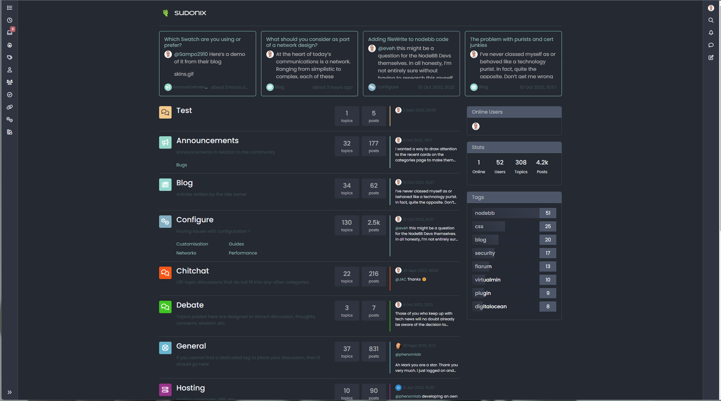
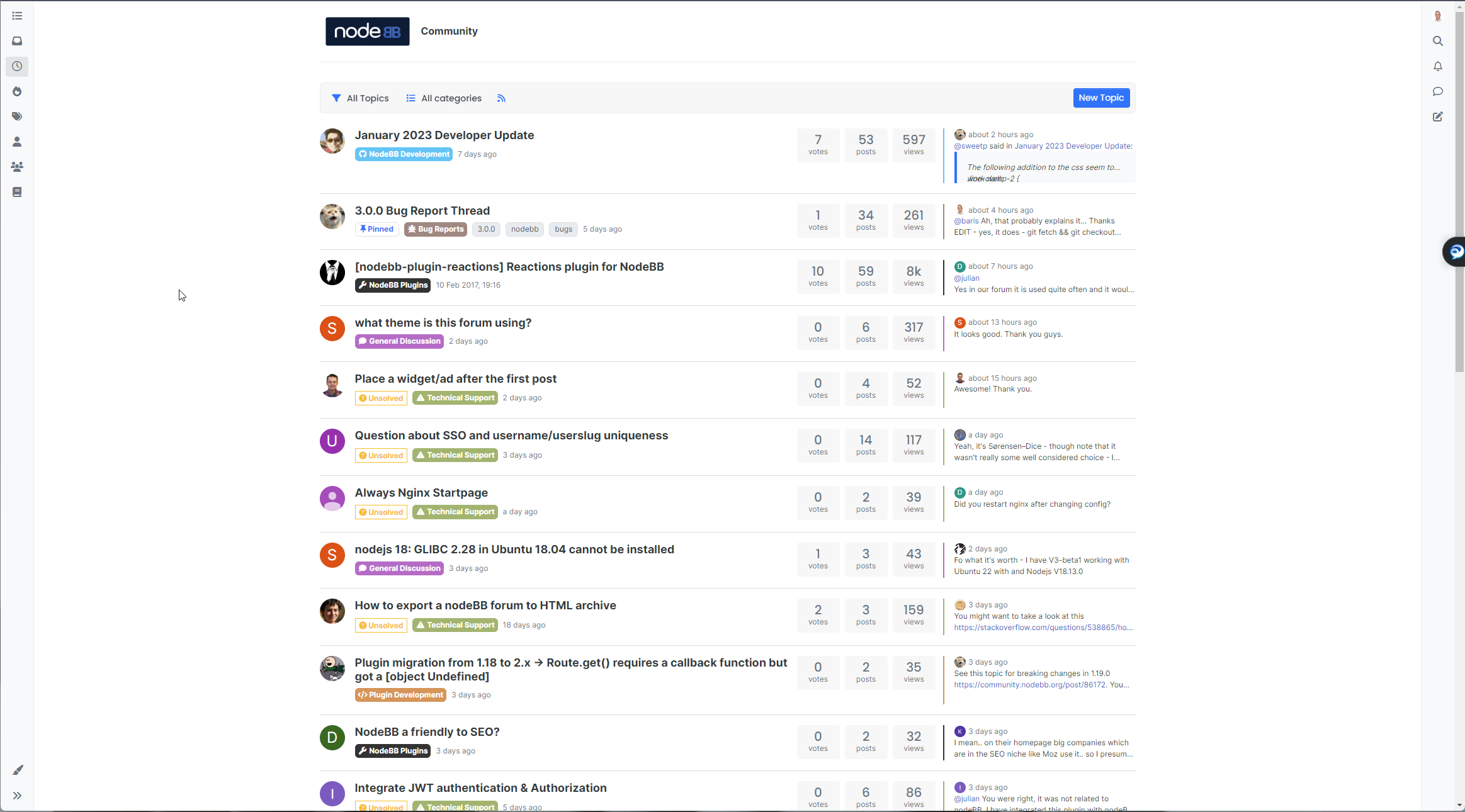
-
Today’s playground


Here’s a video… still needs a bit more work, but…
Notice the newer scroll and progress bar I was talking about earlier…Oh It’s very good. I love it

-
Today’s playground
Here’s a video… still needs a bit more work, but…
Notice the newer scroll and progress bar I was talking about earlier…@phenomlab waiting
-
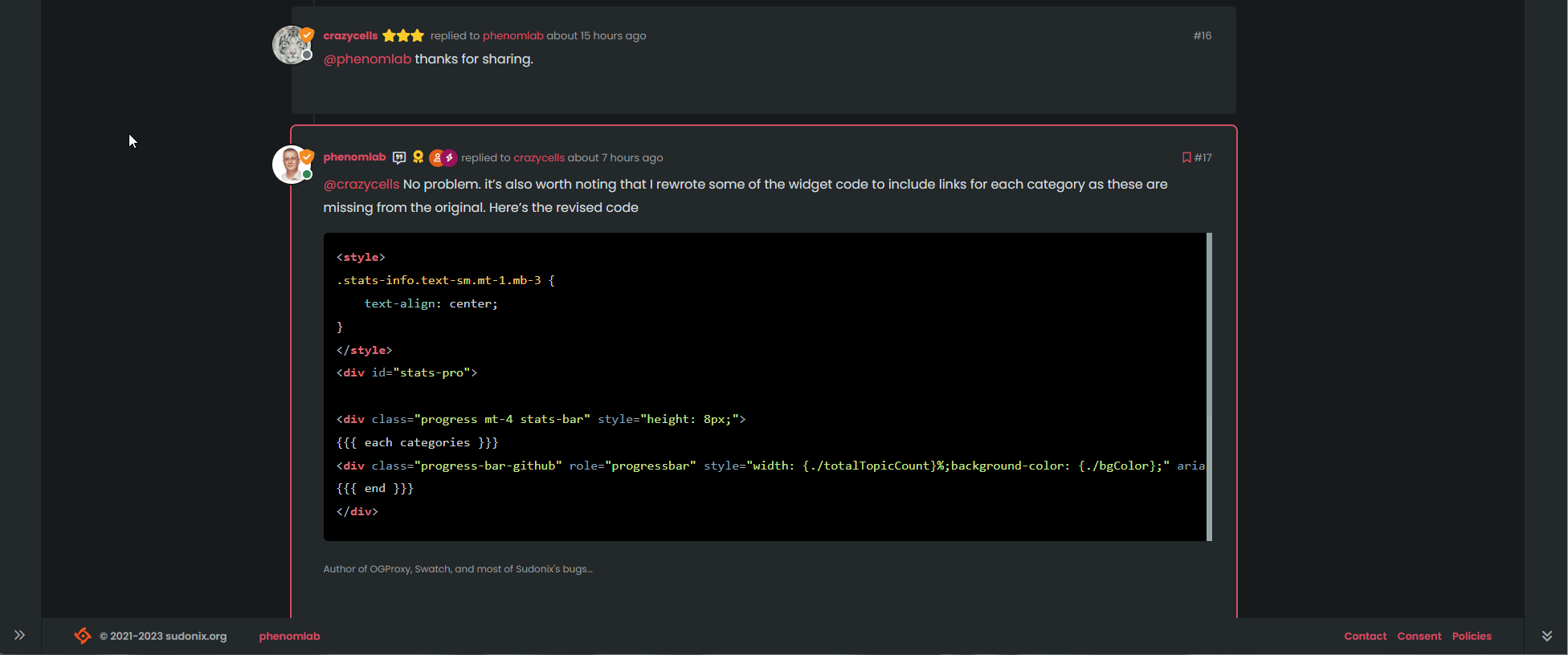
@phenomlab said in v3 / Harmony diary:
Today’s playground
Here’s a video… still needs a bit more work, but…
Notice the newer scroll and progress bar I was talking about earlier…Hello Mark,
I just tested the functioning of the scroll bar and I saw this bug:
https://i.imgur.com/VQw5zw5.mp4
It should be moved to the left so as not to encroach on the collapse button of the custom footer navbar.
Then, when we play with the collapse button of the custom footer navbar we should:
-
When the custom footer navbar is deactivated: it sticks to the bottom right while not encroaching on the right sidebar. All this taking into account the collapse of the right sidebar (not obvious, I don’t know if I’m clear
) -
When the custom footer navbar is activated: it moves just to the left of the floatright block or can be above the floatright block?
The solution may be less difficult to code would be to make a vertical scrollbar inside the right sidebar like in topics. There might be less to manage
Keep the good work my friend

PW and WS Spirit alive
-
-
@phenomlab said in v3 / Harmony diary:
Today’s playground
Here’s a video… still needs a bit more work, but…
Notice the newer scroll and progress bar I was talking about earlier…Hello Mark,
I just tested the functioning of the scroll bar and I saw this bug:
https://i.imgur.com/VQw5zw5.mp4
It should be moved to the left so as not to encroach on the collapse button of the custom footer navbar.
Then, when we play with the collapse button of the custom footer navbar we should:
-
When the custom footer navbar is deactivated: it sticks to the bottom right while not encroaching on the right sidebar. All this taking into account the collapse of the right sidebar (not obvious, I don’t know if I’m clear
) -
When the custom footer navbar is activated: it moves just to the left of the floatright block or can be above the floatright block?
The solution may be less difficult to code would be to make a vertical scrollbar inside the right sidebar like in topics. There might be less to manage
Keep the good work my friend
Edit: [- https://i.imgur.com/VQw5zw5.mp4 -]
-
-
@phenomlab said in v3 / Harmony diary:
Today’s playground
Here’s a video… still needs a bit more work, but…
Notice the newer scroll and progress bar I was talking about earlier…Hello Mark,
I just tested the functioning of the scroll bar and I saw this bug:
https://i.imgur.com/VQw5zw5.mp4
It should be moved to the left so as not to encroach on the collapse button of the custom footer navbar.
Then, when we play with the collapse button of the custom footer navbar we should:
-
When the custom footer navbar is deactivated: it sticks to the bottom right while not encroaching on the right sidebar. All this taking into account the collapse of the right sidebar (not obvious, I don’t know if I’m clear
) -
When the custom footer navbar is activated: it moves just to the left of the floatright block or can be above the floatright block?
The solution may be less difficult to code would be to make a vertical scrollbar inside the right sidebar like in topics. There might be less to manage
Keep the good work my friend
@DownPW fixed in Dev. Have a look. Many improvements and I think you’ll like it. Try it on both desktop and mobile.
-
-
@phenomlab said in v3 / Harmony diary:
Today’s playground
Here’s a video… still needs a bit more work, but…
Notice the newer scroll and progress bar I was talking about earlier…Hello Mark,
I just tested the functioning of the scroll bar and I saw this bug:
https://i.imgur.com/VQw5zw5.mp4
It should be moved to the left so as not to encroach on the collapse button of the custom footer navbar.
Then, when we play with the collapse button of the custom footer navbar we should:
-
When the custom footer navbar is deactivated: it sticks to the bottom right while not encroaching on the right sidebar. All this taking into account the collapse of the right sidebar (not obvious, I don’t know if I’m clear
) -
When the custom footer navbar is activated: it moves just to the left of the floatright block or can be above the floatright block?
The solution may be less difficult to code would be to make a vertical scrollbar inside the right sidebar like in topics. There might be less to manage
Keep the good work my friend
@DownPW said in v3 / Harmony diary:
The solution may be less difficult to code would be to make a vertical scrollbar inside the right sidebar like in topics. There might be less to manage
Nope. The newest version of Harmony appears to have the same pagination as Flarum and Discourse, so it’s been moved into the
contentarea
Mark Cutting also advises organisations as a Fractional CIO, Fractional CISO and Executive Advisor, helping boards improve technology governance, cyber resilience and executive decision making. Learn more at Gratmore Ltd
-
-
@DownPW said in v3 / Harmony diary:
The solution may be less difficult to code would be to make a vertical scrollbar inside the right sidebar like in topics. There might be less to manage
Nope. The newest version of Harmony appears to have the same pagination as Flarum and Discourse, so it’s been moved into the
contentareayessss fixed. Love it

PW and WS Spirit alive
-
yessss fixed. Love it
PW and WS Spirit alive
-
@DownPW it’s definitely there. Won’t work without it
Mark Cutting also advises organisations as a Fractional CIO, Fractional CISO and Executive Advisor, helping boards improve technology governance, cyber resilience and executive decision making. Learn more at Gratmore Ltd
-
I guess, I don’t find it in inspector lol .I will search
PW and WS Spirit alive
-
I guess, I don’t find it in inspector lol .I will search
Can I test it on my dev env ?
EDIT: I test it. If you don’t want tell me Mark
If I have problem, can I ask you @phenomlab ?
PW and WS Spirit alive
-
Can I test it on my dev env ?
EDIT: I test it. If you don’t want tell me Mark
If I have problem, can I ask you @phenomlab ?
@DownPW no problems.
-
@phenomlab said in v3 / Harmony diary:
@DownPW no problems.
Seems I miss something
 @phenomlab but good start
 [- https://i.imgur.com/cN0YeN0.mp4 -]
EDIT: Maybe find
EDIT 2: @phenomlab
Find --> I have forget toAbove and toBottom css directives
It’s better now, just seems toBottom doesn’t work :
.toBottom {
  bottom: 0px !important;
  right: 0px!important;
}

.toAbove {
  bottom: -5px !important;
  right: 400px !important;
}
PW and WS Spirit alive
-
@phenomlab said in v3 / Harmony diary:
@DownPW no problems.
Seems I miss something
@phenomlab but good start [- https://i.imgur.com/cN0YeN0.mp4 -]
EDIT: Maybe find
EDIT 2: @phenomlab
Find --> I have forget toAbove and toBottom css directives
It’s better now, just seems toBottom doesn’t work :.toBottom { bottom: 0px !important; right: 0px!important; } .toAbove { bottom: -5px !important; right: 400px !important; }@DownPW likely you are missing
z-indexon that class. As you are usingposition: absolutethe index is needed to bring that specific element forward. By default, it’ll sit behind the progress bar meaning it cannot be clicked, but can be seen.Mark Cutting also advises organisations as a Fractional CIO, Fractional CISO and Executive Advisor, helping boards improve technology governance, cyber resilience and executive decision making. Learn more at Gratmore Ltd
-
@DownPW likely you are missing
z-indexon that class. As you are usingposition: absolutethe index is needed to bring that specific element forward. By default, it’ll sit behind the progress bar meaning it cannot be clicked, but can be seen.Thanks for your reply my friend
I will test tomorrow and again, it’s a very great job, I like it a lot.
PW and WS Spirit alive
-
Thanks for your reply my friend
I will test tomorrow and again, it’s a very great job, I like it a lot.
@DownPW no problems. Let me know if you have issues and I can take a look. Can’t release the code formally yet as it’s still beta (and does have very minor bugs).
Mark Cutting also advises organisations as a Fractional CIO, Fractional CISO and Executive Advisor, helping boards improve technology governance, cyber resilience and executive decision making. Learn more at Gratmore Ltd
-
@DownPW no problems. Let me know if you have issues and I can take a look. Can’t release the code formally yet as it’s still beta (and does have very minor bugs).
Not sure why, but for a while I’ve been looking at the size of the CSS file that runs the dev site, and I couldn’t understand why it was almost twice the size of what it should be in terms of overall lines.
This eventually got the better of me and I landed up going through the file and removing what appears to be a large amount of duplicated CSS. I primarily work offline using VSCode (my go-to editor), but periodically “fix” things on the fly. The problem with this is that if you make changes online then copy these from the CSS editor in the ACP back to VSCode, they seem to be copied twice - in other words, appended to the existing file despite all text being selected, which should in fact overwrite, but it doesn’t

Just something for everyone else to watch out for. I spent a fair amount of time this afternoon purging duplicate classes, and the end result is a much leaner file.
Mark Cutting also advises organisations as a Fractional CIO, Fractional CISO and Executive Advisor, helping boards improve technology governance, cyber resilience and executive decision making. Learn more at Gratmore Ltd
-
Not sure why, but for a while I’ve been looking at the size of the CSS file that runs the dev site, and I couldn’t understand why it was almost twice the size of what it should be in terms of overall lines.
This eventually got the better of me and I landed up going through the file and removing what appears to be a large amount of duplicated CSS. I primarily work offline using VSCode (my go-to editor), but periodically “fix” things on the fly. The problem with this is that if you make changes online then copy these from the CSS editor in the ACP back to VSCode, they seem to be copied twice - in other words, appended to the existing file despite all text being selected, which should in fact overwrite, but it doesn’t
Just something for everyone else to watch out for. I spent a fair amount of time this afternoon purging duplicate classes, and the end result is a much leaner file.
Thanks to @cagatay for finding a bug with the CSS in relation to tags in DEV. This has been fixed. I also found another bug whilst addressing this one in the sense that the progress bar on mobile (and desktop, but limited intrusion) shows over the tag div when the composer is active.
Changed the scrollbar function so that it does not fire if the composer is visible. Here’s the block of code that detects if it’s active or not
            if ($(window).scrollTop() > 0 && (!$('[component="composer"]').is(":visible"))) {
                bar.addClass('show');
            } else {
                bar.removeClass('show');
            }
Above, we now have 2 conditions. The first is to fire only if the top marker is higher than 0 - for example, hide if we are at the top of the screen. The second condition is that we also only fire if the composer isn’t active - detected by
is(":visible")Keep 'em coming in terms of identified bugs - reporting them is much appreciated.
Mark Cutting also advises organisations as a Fractional CIO, Fractional CISO and Executive Advisor, helping boards improve technology governance, cyber resilience and executive decision making. Learn more at Gratmore Ltd
-
Thanks to @cagatay for finding a bug with the CSS in relation to tags in DEV. This has been fixed. I also found another bug whilst addressing this one in the sense that the progress bar on mobile (and desktop, but limited intrusion) shows over the tag div when the composer is active.
Changed the scrollbar function so that it does not fire if the composer is visible. Here’s the block of code that detects if it’s active or not
            if ($(window).scrollTop() > 0 && (!$('[component="composer"]').is(":visible"))) {
                bar.addClass('show');
            } else {
                bar.removeClass('show');
            }
Above, we now have 2 conditions. The first is to fire only if the top marker is higher than 0 - for example, hide if we are at the top of the screen. The second condition is that we also only fire if the composer isn’t active - detected by
is(":visible")Keep 'em coming in terms of identified bugs - reporting them is much appreciated.
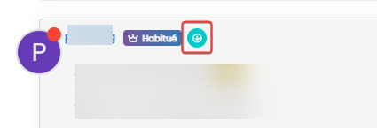
Hello @phenomlab
I keep working on my CSS
On v2, I displayed user groups in topics like this :
but I can’t seem to get any result. I can’t target the right element
Ideas ?
Many thanks
PW and WS Spirit alive
-
Hello @phenomlab
I keep working on my CSS
On v2, I displayed user groups in topics like this :but I can’t seem to get any result. I can’t target the right element
Ideas ?
Many thanks
@DownPW hmm. Haven’t tried this myself (yet) but will have a look later this afternoon.



Hello! It looks like you're interested in this conversation, but you don't have an account yet.
Getting fed up of having to scroll through the same posts each visit? When you register for an account, you'll always come back to exactly where you were before, and choose to be notified of new replies (either via email, or push notification). You'll also be able to save bookmarks and upvote posts to show your appreciation to other community members.
With your input, this post could be even better 💗
Register Login