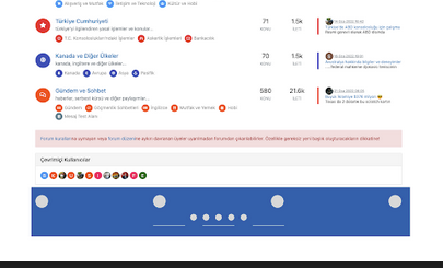
Bottom footer navbar button extend
-
@phenomlab hé hé

-
@phenomlab said in Bottom footer navbar button extend:
@DownPW said in Bottom footer navbar button extend:
We could imagine that it is active by default and if the user does not want it, he hides it. It will simply remain the button on the left or right side
So are you looking for a button on the footer that when clicked will remove from the screen with an animation, but leave just enough so that it can be clicked to make it reappear again with the same animation ?
Exactly

-
clearly that ^^
-
clearly that ^^
@DownPW ok, good. Let me write the code to record the session state (in the same way that the theme engine works) and I’ll release the code, plus CSS.
-
hell yeah

Simple to modify ?Example: put the button on the left or right
-
@DownPW yes, that will be a simple CSS modification
-
@DownPW said in Bottom footer navbar button extend:
Example: put the button on the left or right
Looks better on the left I think - more natural

-
@DownPW said in Bottom footer navbar button extend:
Example: put the button on the left or right
Looks better on the left I think - more natural

@phenomlab yes
-
@DownPW I’ll make some small adjustments to the final code to accommodate this. Just need to write the session cookie data, then I’ll release the code.
-
@DownPW Can you let me know if you used the same code for the footer as what is here ? I think this is the case, but want to check. There needs to be some modifications to this code to support the footer toggle.
-
Updated position of collapse/expand so it’s on the left for a more natural feel
-
Very great

-
@DownPW Can you let me know if you used the same code for the footer as what is here ? I think this is the case, but want to check. There needs to be some modifications to this code to support the footer toggle.
@phenomlab said in Bottom footer navbar button extend:
Can you let me know if you used the same code for the footer as what is here ?
yes Mark, with minor adjustement.
-
Instructions
- Go to
/admin/extend/widgetsand locate the “Global Footer” widget - At the very top of the existing code you have in that widget, add
<div id="console-nav-tab"><i class="fa-solid fa-angles-left"></i></div>- Add this CSS
div#console-nav-tab {
position: fixed;
    bottom: 0px;
    z-index: 900;
    height: 30px;
    left: 0px;
}
div#console-nav-tab i {
    font-size: 16px;
    margin-left: 10px;
    line-height: 2.0 !important;
}
.toBottom {
   bottom: 0px !important;
}
Note, that you probably need to modify the existing CSS ID
floatleftto accommodate the additional DIV and icon. For example#floatleft { float: left; padding-left: 30px; /*additional left padding to support additional DIV and icon */ font-size: 80%; line-height: 2.0; font-weight: 600; display: flex; }- Go to
/admin/appearance/customise#custom-jsand add this block of code (bottom is fine, or wherever you want to place it)
$(document).ready(function() { $(window).on('action:ajaxify.end', function(data) { var getState = localStorage.getItem("footer"); if (getState === "hidden") { $("#console-nav-footer").hide(); $("#console-nav-tab i").addClass("fa-solid fa-angles-right"); $('.pagination-block').addClass("toBottom"); } else { $("#console-nav-tab i").addClass("fa-solid fa-angles-left"); $('.pagination-block').removeClass("toBottom"); } $("#console-nav-tab").click(function() { $("#console-nav-footer").toggle(250, function() { if ($("#console-nav-footer").is(":hidden")) { localStorage.setItem("footer", "hidden"); $("#console-nav-tab i").addClass("fa-solid fa-angles-right"); $('.pagination-block').addClass("toBottom"); } else { localStorage.setItem("footer", "shown"); $("#console-nav-tab i").addClass("fa-solid fa-angles-left"); $('.pagination-block').removeClass("toBottom"); } }); $("i", this).toggleClass("fa-solid fa-angles-left fa-solid fa-angles-right"); }); }); });- Test, and make necessary modifications to suit your own environment
- Go to
-
why deleted ?
-
@DownPW Because it’s not finished. I forgot the session state…
-
ha oki lol

another request but if it’s not possible, it does not matter

Can we imagine when the footerbar is reduced, we descend the pagination block automatically ?

it would be cleaner. what do you think ?
-
ha oki lol

another request but if it’s not possible, it does not matter

Can we imagine when the footerbar is reduced, we descend the pagination block automatically ?

it would be cleaner. what do you think ?
@DownPW that should be possible, yes. Leave it with me
-
@DownPW instructions restored
Fixed:
- Footer does not collapse correctly on reload
- Record session state in session, and not cookies (mostly because cookies can be disabled)
- Pagination bar drops to fill missing footer on collapse
- Correct icon direction displayed when expanding and collapsing
Let me know how you get on.
Note that there may be some cosmetic issues on mobile devices, which I will work through if necessary. In some cases it’s actually better to hide the footer altogether on mobile because of the screen estate.
Here’s what it looks like
-
 undefined phenomlab has marked this topic as solved on
-
Very good job Mark

–> I may have done something wrong but everything is ok except the pagination block which does not go down automatically.
An idea ?
Hello! It looks like you're interested in this conversation, but you don't have an account yet.
Getting fed up of having to scroll through the same posts each visit? When you register for an account, you'll always come back to exactly where you were before, and choose to be notified of new replies (either via email, or push notification). You'll also be able to save bookmarks and upvote posts to show your appreciation to other community members.
With your input, this post could be even better 💗
Register Login


