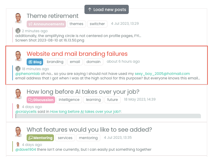
Theme retirement
-
I’ve been looking at reducing the number of themes that I actively support, and as a result, I’ll be skinning these down over the coming days. However, I don’t want to simply “switch off” any themes - you can continue to use what you have selected, and it’ll remain - it just won’t receive any updates going forward.
What I am looking to do is to keep 3 themes per category of “Light”, “Dim” and “Dark”, so we are going from 15 themes (well, 14, as “Default” is in fact “Flatly”) to 9.
I’m looking to find out what the most popular themes are so the remainder can be hidden - they won’t be removed, so if you are using one of the themes slated for removal, everything will still work, but you should change it at some point for a “supported” one (a bit more about this later).
The likely candidates to remain at this point are
Light
Daylight
Flatly
SummertimeDim
Darkly
Greybird
NordDark
Blackout
Midnight
TenebrousThe others are likely to be deprecated.
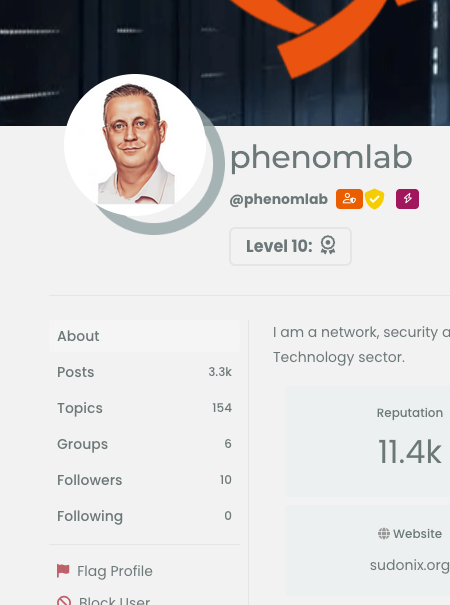
Mark – Founder, Phenomlab Ltd
Executive IT & Security Leadership
Phenomlab Ltd -
I’ve been looking at reducing the number of themes that I actively support, and as a result, I’ll be skinning these down over the coming days. However, I don’t want to simply “switch off” any themes - you can continue to use what you have selected, and it’ll remain - it just won’t receive any updates going forward.
What I am looking to do is to keep 3 themes per category of “Light”, “Dim” and “Dark”, so we are going from 15 themes (well, 14, as “Default” is in fact “Flatly”) to 9.
I’m looking to find out what the most popular themes are so the remainder can be hidden - they won’t be removed, so if you are using one of the themes slated for removal, everything will still work, but you should change it at some point for a “supported” one (a bit more about this later).
The likely candidates to remain at this point are
Light
Daylight
Flatly
SummertimeDim
Darkly
Greybird
NordDark
Blackout
Midnight
TenebrousThe others are likely to be deprecated.
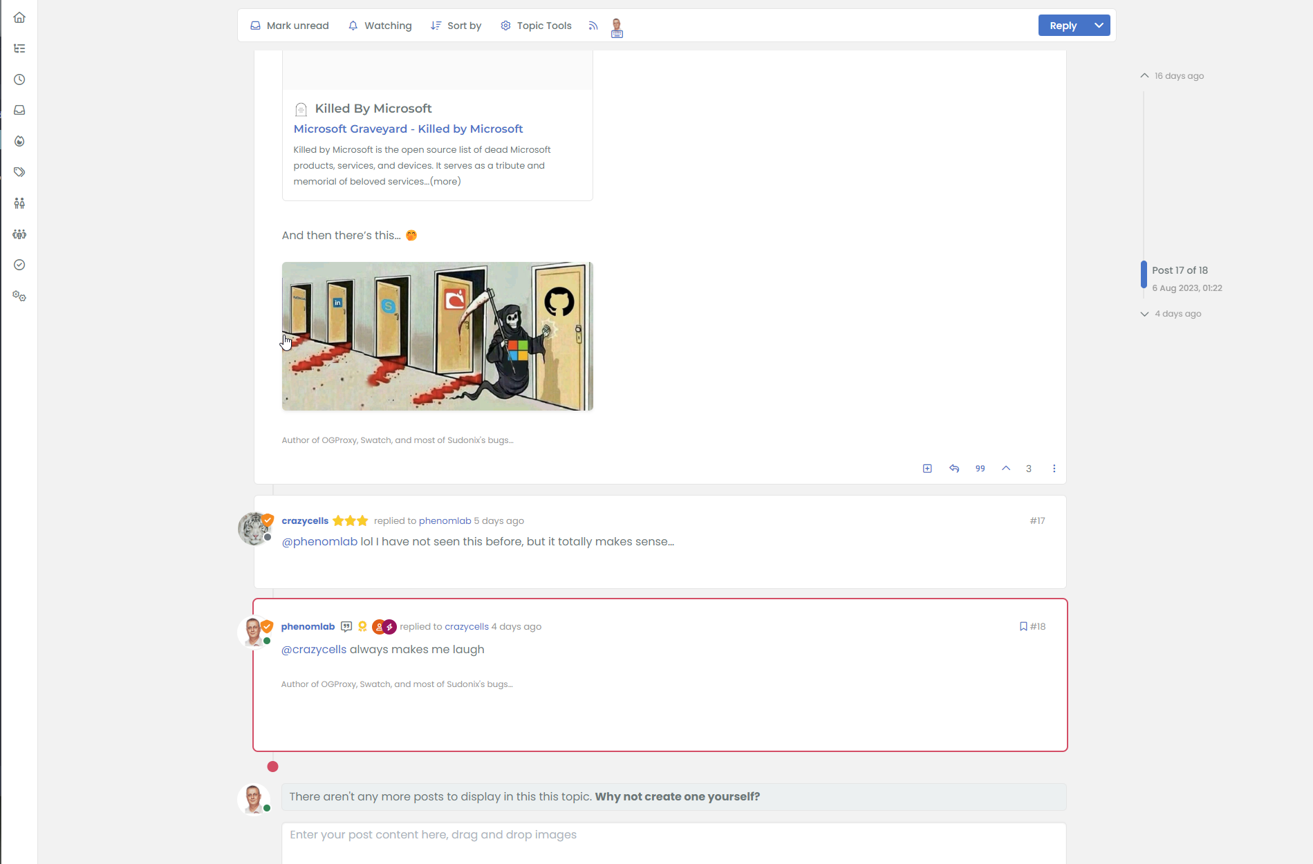
@phenomlab from the start of our NodeBB journey, we have eliminated the theme options and only kept two (light mode, dark mode) options for our users… sometimes more is not merrier

https://en.wikipedia.org/wiki/The_Paradox_of_Choice
I suggest keeping only 1 (maybe 2) from each category for the complete satisfaction of the users. If you have many options, the brain usually cannot be sure if it made the correct decision
")
-
@phenomlab from the start of our NodeBB journey, we have eliminated the theme options and only kept two (light mode, dark mode) options for our users… sometimes more is not merrier
https://en.wikipedia.org/wiki/The_Paradox_of_Choice
I suggest keeping only 1 (maybe 2) from each category for the complete satisfaction of the users. If you have many options, the brain usually cannot be sure if it made the correct decision
@crazycells Yep, you are 1000% right there. I did consider just two, but the problem I have is that I like more than 2 from each category
However, I do agree with the “less is more” mantra here. Sudonix already detects if you are running in Dark mode, and will issue “Nord” as the default theme if so.
Some users didn’t even know that themes existed…
Personally, I’m a huge Dark mode fan, and currently using “Blackout”.
-
Personally I prefer to have the choice and maintaining the themes is even easier than before with the SCSS
Having the choice of only light and dark is a bit gloomy.Personnaly I like less than the others summertime and tenebrous
-
 undefined phenomlab forked this topic on
-
Something of an update here, and I haven’t forgotten about this topic. It’s still very much on the radar, and in fact, I’m working on replacing the theme structure to make it a bit more modern.
It’s going to be based on Google’s Material Design, so something of an industry standard. Taking this approach seems to make more sense and in the process, I’ve been extending the theme capabilities to allow for a better look overall.
The overall impact of this is that I can then use a “skeleton” or framework to create other themes and swatches.
If you want to try the latest theme, it’s “Material” under the light section. However, please be warned that there are a number of bugs that will only show themselves once you flip back to one of the existing ones, and to resolve that, you’ll need to reload the browser (F5 for example).
The downside is that I’ll need to recreate the themes I want to include from scratch…

-
A significant update…
I’ve been working away on the new theme, and would like some testers (those using light themes for now such as flatly are perfect). If you do test, it should be from both mobile and desktop if possible.
There are a number of changes to the architecture of this specific theme as I noted in the previous post, and because of that, switching themes may produce some undesirable results temporarily until the other themes are modified as required.
On that front, I’ve made the decision to retire most of the themes. For those using light themes such as the default, this will be replaced with the material light theme and will be the “stock” theme going forward if you are using a light theme on your device. There will be another two themes, which will be dim and dark in terms of category.
Whilst this might be disappointing for some users, let me explain. Even though the theme switcher handles the changing of colours etc, there is a significant amount of work that goes on in the background in terms of some components that need to be rendered again after the theme changes - this is done in the background so you’ll never see it - the trigger is the loading of a topic for example, so changed are executed against the DOM during the ajax call for data. I don’t know if you’ve noticed, but there is an animation delay when loading data, so I use that as a way of refreshing new elements so the end user never sees it.
However, one drawback is that the stale and unused elements remain in the DOM which increases it’s size, and this will be detrimental to the loading experience if the theme is changed several times in the same session without reloading the browser. Rewriting the theme enabled me to address this issue, and because of that, I’ll be reducing the available themes down to probably three as a result - maybe four if there is a specific theme that is popular (you’ll need to let me know if this is the case).
If you are using the theme switcher code from
gitthen you don’t need to worry about performance on your own site as this code was released well before the changes to the DOM (required by the new themes) and is not impacted at all.I’ve not released the new code and probably won’t until I’m happy with the way it works. Presently, there are a number of issues that need to be resolved before I’ll even consider making it available for use on other forums.
-
Here’s some teaser screenshots. It’s not finished yet, but well, here goes
-
I liked this… is this number of topics?
-
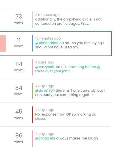
additionally, the amplifying circle is not centered on profile pages, FYI…
-
the person who sends the last post are usually seen as avatar, however in large screen it is lost, is this intentional?
-
I liked this… is this number of topics?
@crazycells yes, it’s actually not my work but someone on the NodeBB forums. I’ll dig out the link.
-
additionally, the amplifying circle is not centered on profile pages, FYI…
@crazycells thanks. I’ve never been able to reproduce this so will have to look at it again.
-
the person who sends the last post are usually seen as avatar, however in large screen it is lost, is this intentional?
@crazycells no. That’s probably the result of me using targeted CSS to disable the appearance of something else and inadvertently over compensating. I’ll take a look.
-
the person who sends the last post are usually seen as avatar, however in large screen it is lost, is this intentional?
@crazycells You’ll notice some odd looking artefacts like borders and inset box shadows being used.
I’m going to be removing the legacy themes tomorrow so this problem will resolve itself, but for the full effect, you should select “Material” in the light section. If you switch back to a previous legacy theme afterwards, you’ll need to reload the browser.
-
I liked this… is this number of topics?
@crazycells here’s the link
https://community.nodebb.org/topic/17339/stats-of-categories-as-a-progress-bars-on-github
Mark – Founder, Phenomlab Ltd
Executive IT & Security Leadership
Phenomlab Ltd -
-
@phenomlab thanks for sharing.
@crazycells No problem. it’s also worth noting that I rewrote some of the widget code to include links for each category as these are missing from the original. Here’s the revised code
<style>
.stats-info.text-sm.mt-1.mb-3 {
    text-align: center;
}
</style>
<div id="stats-pro">

<div class="progress mt-4 stats-bar" style="height: 8px;">
{{{ each categories }}}
<div class="progress-bar-github" role="progressbar" style="width: {./totalTopicCount}%;background-color: {./bgColor};" aria-valuemin="0" aria-valuemax="100"></div>
{{{ end }}}
</div>

<div class="stats-info text-sm mt-1 mb-3">
{{{ each categories }}}
<a href="/category/{./cid}/{./name}"><span class="mb-3 me-2 fw-semibold text-nowrap"><i class="fa fa-fw fa-solid fa-2xs fa-circle" style="color: {./bgColor};font-weight: 900;"></i> {./name}</a><span class="text-xs text-muted">({./totalTopicCount})</span></span>
{{{ end }}}
</div>

</div>
Mark – Founder, Phenomlab Ltd
Executive IT & Security Leadership
Phenomlab Ltd -
@crazycells No problem. it’s also worth noting that I rewrote some of the widget code to include links for each category as these are missing from the original. Here’s the revised code
<style> .stats-info.text-sm.mt-1.mb-3 { text-align: center; } </style> <div id="stats-pro"> <div class="progress mt-4 stats-bar" style="height: 8px;"> {{{ each categories }}} <div class="progress-bar-github" role="progressbar" style="width: {./totalTopicCount}%;background-color: {./bgColor};" aria-valuemin="0" aria-valuemax="100"></div> {{{ end }}} </div> <div class="stats-info text-sm mt-1 mb-3"> {{{ each categories }}} <a href="/category/{./cid}/{./name}"><span class="mb-3 me-2 fw-semibold text-nowrap"><i class="fa fa-fw fa-solid fa-2xs fa-circle" style="color: {./bgColor};font-weight: 900;"></i> {./name}</a><span class="text-xs text-muted">({./totalTopicCount})</span></span> {{{ end }}} </div> </div>@phenomlab thanks, this will be more helpful.
-
@phenomlab thanks, this will be more helpful.
@crazycells Thought it might
-
undefined phenomlab referenced this topic on
-
the person who sends the last post are usually seen as avatar, however in large screen it is lost, is this intentional?
@crazycells said in Theme retirement:
the person who sends the last post are usually seen as avatar, however in large screen it is lost, is this intentional?
That was an unintended bug (thanks) which I’ve just fixed. I was using the below CSS to hide images in the teaser view as below
    .meta.teaser img, .meta.teaser blockquote  {
        display: none;
    }
However, this had the undesired effect of removing the user avatar (which I want to keep obviously), so am now using this CSS
    .meta.teaser img:not(.avatar), .meta.teaser blockquote  {
        display: none;
    }

Hello! It looks like you're interested in this conversation, but you don't have an account yet.
Getting fed up of having to scroll through the same posts each visit? When you register for an account, you'll always come back to exactly where you were before, and choose to be notified of new replies (either via email, or push notification). You'll also be able to save bookmarks and upvote posts to show your appreciation to other community members.
With your input, this post could be even better 💗
Register Login