Permission issues
-
How do I chsnge Theme to blackout, I went to settings, but couldnt ses it
I did see lots of things to change that I thought only Admins can configure! -
@Panda I forked this topic out of the previous thread as it’s an issue in it’s own right. Having checked, I see the reason why
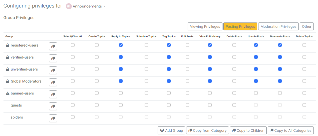
As you can see from the screenshot, category “Announcements” does not permit editing. This specific category was originally read only, which I then changed to members could reply. Looks like I forgot to add the right to edit

Should be fixed now
-
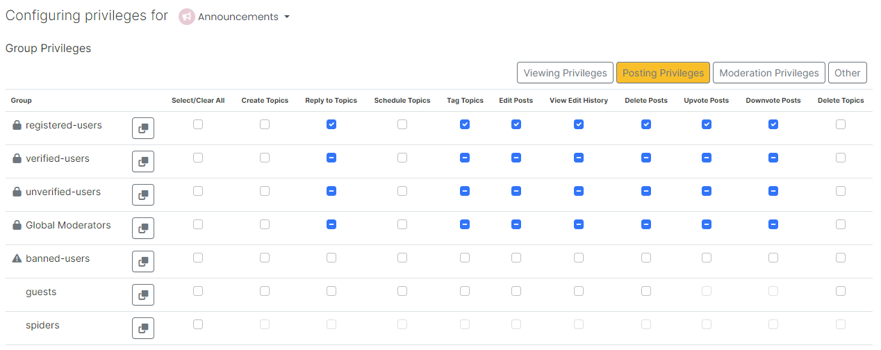
Actually I seem to have more limited options that usual. I tried to edit the above post to correct my typo, but cant.
No edit in list, although only 2mins after I posted -
Is it because my group name changed to ‘Regular’? (thats better than 'collaborator)
Are my permissions messed up? -
Is it because my group name changed to ‘Regular’? (thats better than 'collaborator)
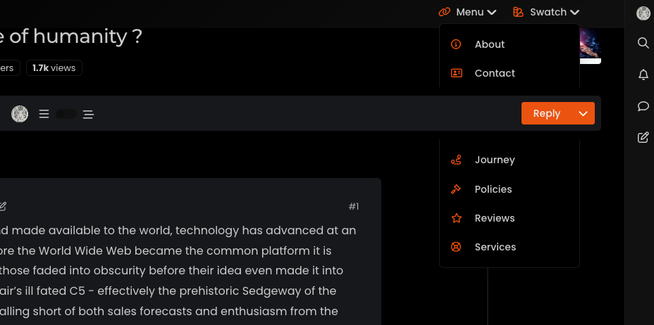
Are my permissions messed up?@Panda no, they aren’t. You’re looking in the wrong place. If you are using a mobile, have a look at the top right hand corner and you’ll see a paint Swatch icon. Press that and you’ll see the theme switcher.
This was written by me, and not NodeBB, so it’s in a different (and logical place).
The post editing should work for 15 minutes. Not sure what’s happened there but I’ll take a look.
-
Is it because my group name changed to ‘Regular’? (thats better than 'collaborator)
Are my permissions messed up?@Panda checked, and the setting below is set to
3600as I thought it would be:Number of seconds a post remains editable (set to 0 to disable)
-
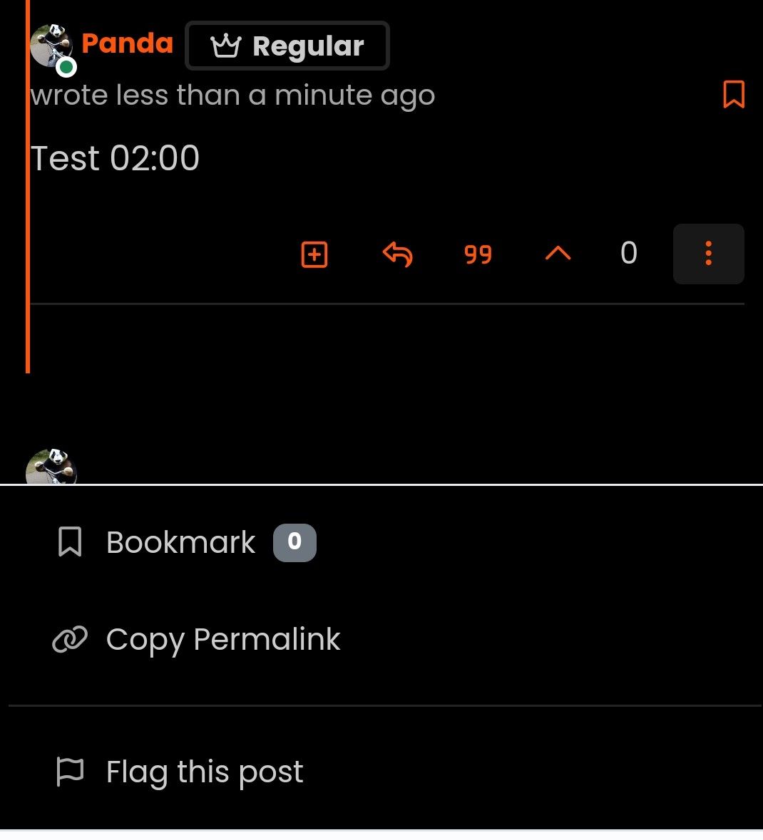
Test 02:00
-
Tried to edit at 02:01 by pressing 3 dot icon, and no edit in list
-
@Panda I forked this topic out of the previous thread as it’s an issue in it’s own right. Having checked, I see the reason why

As you can see from the screenshot, category “Announcements” does not permit editing. This specific category was originally read only, which I then changed to members could reply. Looks like I forgot to add the right to edit

Should be fixed now

-
 undefined phenomlab marked this topic as a question on
-
 undefined phenomlab has marked this topic as solved on
Hello! It looks like you're interested in this conversation, but you don't have an account yet.
Getting fed up of having to scroll through the same posts each visit? When you register for an account, you'll always come back to exactly where you were before, and choose to be notified of new replies (either via email, or push notification). You'll also be able to save bookmarks and upvote posts to show your appreciation to other community members.
With your input, this post could be even better 💗
Register Login