Whitespace fixes in Nodebb

-
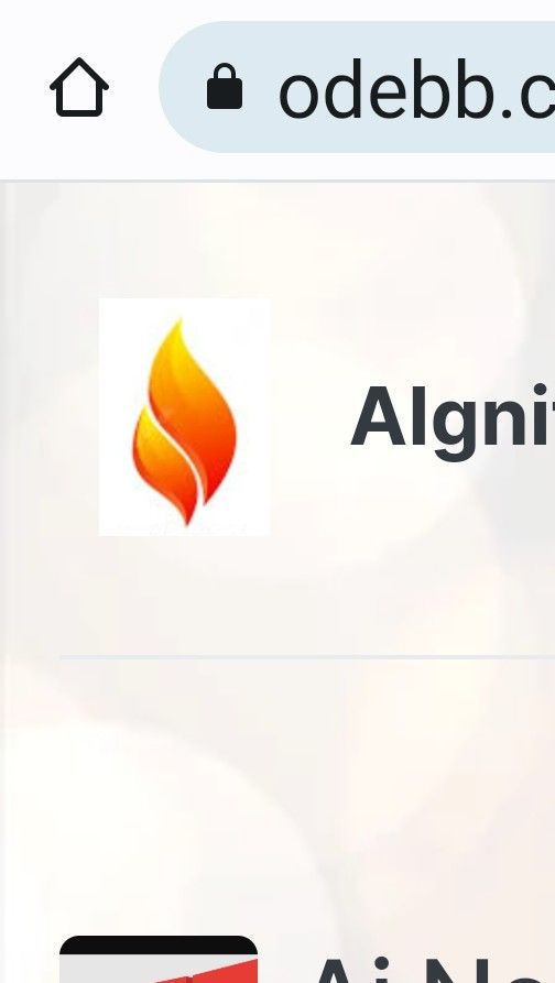
What screen size are you using, and what device? I’m not seeing that issue on my OnePlus 9 Pro
Mark Cutting also advises organisations as a Fractional CIO, Fractional CISO and Executive Advisor, helping boards improve technology governance, cyber resilience and executive decision making. Learn more at Gratmore Ltd
-
What screen size are you using, and what device? I’m not seeing that issue on my OnePlus 9 Pro
@phenomlab Samsung Flip4
3088 high
x 1440 widePerhaps it is my device then, it has narrower screen in comparison to height
-
 undefined Panda has marked this topic as solved on
-
@phenomlab Samsung Flip4
3088 high
x 1440 widePerhaps it is my device then, it has narrower screen in comparison to height
@Panda With a resolution like that, it shouldn’t be an issue. However, there are a number of things you can do with custom CSS. I wouldn’t recommend creating a new theme unless you really have to
-
@Panda just circling back on this based on your list concerning badges overlapping.
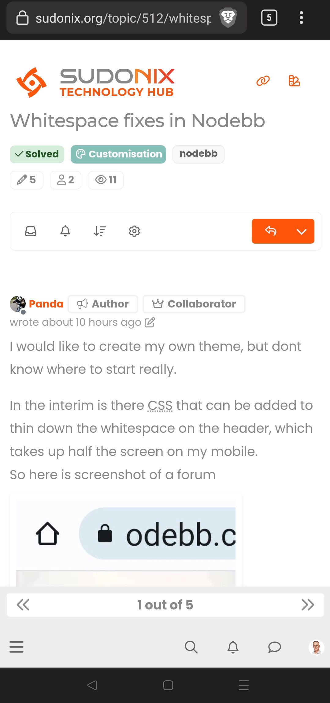
This is what I see on my mobile
-
This is exactly why I never really liked CSS. It can so easily go wrong on different resolution screens!
When I wrote games, I would use Javascript on Canvas, with my own font so that everything was scaled as % of screen width and height.
I had my own library for this. It was the only way to guarantee everything works on all devices.Look at this: its a mess, and Flip4 is not an uncommon device
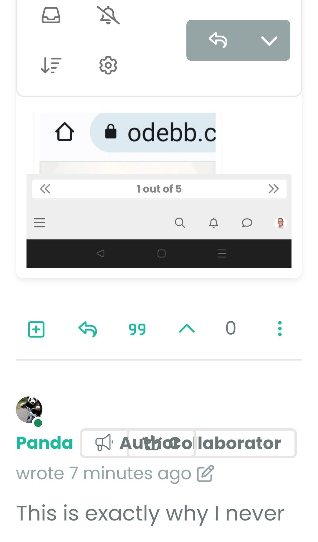
What does having this extra Tag saying Author really add?
I dont want to be critical, but it might be better to have the user group badges as shorter names, then that would reduce overlaps? -
This is exactly why I never really liked CSS. It can so easily go wrong on different resolution screens!
When I wrote games, I would use Javascript on Canvas, with my own font so that everything was scaled as % of screen width and height.
I had my own library for this. It was the only way to guarantee everything works on all devices.Look at this: its a mess, and Flip4 is not an uncommon device
What does having this extra Tag saying Author really add?
I dont want to be critical, but it might be better to have the user group badges as shorter names, then that would reduce overlaps?@Panda it looks to me like you’re using enlarged fonts at least. Can you confirm? You can’t cater for literally every device of course.
Mark Cutting also advises organisations as a Fractional CIO, Fractional CISO and Executive Advisor, helping boards improve technology governance, cyber resilience and executive decision making. Learn more at Gratmore Ltd
-
@Panda it looks to me like you’re using enlarged fonts at least. Can you confirm? You can’t cater for literally every device of course.
@phenomlab yes thats a point that font size is an Android system setting, so another variable.
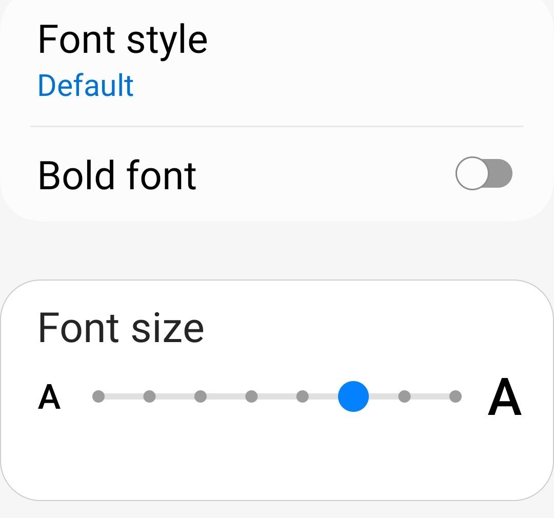
So its not on largest but more than half way up
-
@phenomlab yes thats a point that font size is an Android system setting, so another variable.
So its not on largest but more than half way up
@Panda yes, that will play havoc with rendering. I’m curious to know if setting it to the normal size resolves it.
-
Yes with text 4/8 size its fine.

Athough my suggestion to have shorter group names might be worth taking.
Collaborator is quite a long badge name,
Whats your list of all the group categories? Is Sage top, how did you chose these names? -
Yes with text 4/8 size its fine.
Athough my suggestion to have shorter group names might be worth taking.
Collaborator is quite a long badge name,
Whats your list of all the group categories? Is Sage top, how did you chose these names?@Panda said in Whitespace fixes in Nodebb:
Collaborator is quite a long badge name,
Yes, I need to re-think these names actually.
@Panda said in Whitespace fixes in Nodebb:
Whats your list of all the group categories? Is Sage top, how did you chose these names?
See below
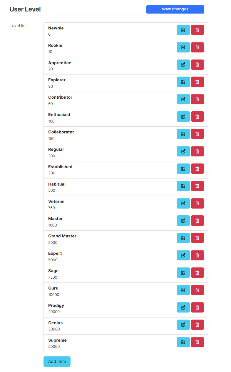
In actual fact, even “Supreme” won’t be the top rank - at 50,000 upvotes, you’d need to be almost god-like

Mark Cutting also advises organisations as a Fractional CIO, Fractional CISO and Executive Advisor, helping boards improve technology governance, cyber resilience and executive decision making. Learn more at Gratmore Ltd
-
@Panda said in Whitespace fixes in Nodebb:
Collaborator is quite a long badge name,
Yes, I need to re-think these names actually.
@Panda said in Whitespace fixes in Nodebb:
Whats your list of all the group categories? Is Sage top, how did you chose these names?
See below
In actual fact, even “Supreme” won’t be the top rank - at 50,000 upvotes, you’d need to be almost god-like
@phenomlab
Interesting. Because it is not obvious which name is what rank, I suggest an alphabetical list.
For example, something like
ACE (highest)
COMMANDER
EXPERT
GURU
ROOKIE
STARTER (lowest) -
@phenomlab
Interesting. Because it is not obvious which name is what rank, I suggest an alphabetical list.
For example, something like
ACE (highest)
COMMANDER
EXPERT
GURU
ROOKIE
STARTER (lowest)@Panda I see your point, but I won’t be changing to an alphabetic system - but would consider stars. I know @crazycells uses ranking like this.
Mark Cutting also advises organisations as a Fractional CIO, Fractional CISO and Executive Advisor, helping boards improve technology governance, cyber resilience and executive decision making. Learn more at Gratmore Ltd
-
@Panda I see your point, but I won’t be changing to an alphabetic system - but would consider stars. I know @crazycells uses ranking like this.
@phenomlab yeap, I like the stars… very intuitive…
we have them from 1 to 5, but I am considering extending it to 7. additionally we have small icons such as a youtube sign for users with youtube channels, etc.
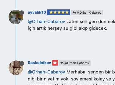
in the past , forums used to have military rankings… captain, major, general etc. that is what the initial recommendation by our users was… sometimes these ranks would have lines and stars next to it… so the idea in the forum evolved to have only stars as ranks… users are happy with this…
-
@phenomlab yeap, I like the stars… very intuitive…
we have them from 1 to 5, but I am considering extending it to 7. additionally we have small icons such as a youtube sign for users with youtube channels, etc.
in the past , forums used to have military rankings… captain, major, general etc. that is what the initial recommendation by our users was… sometimes these ranks would have lines and stars next to it… so the idea in the forum evolved to have only stars as ranks… users are happy with this…
@crazycells You’re both raising really good points here. The wording in all honesty was to get it started, but it’s become much more than that - particularly as original members have much higher rankings. I’ll take a look at this over the weekend.
-
This is exactly why I never really liked CSS. It can so easily go wrong on different resolution screens!
When I wrote games, I would use Javascript on Canvas, with my own font so that everything was scaled as % of screen width and height.
I had my own library for this. It was the only way to guarantee everything works on all devices.Look at this: its a mess, and Flip4 is not an uncommon device
What does having this extra Tag saying Author really add?
I dont want to be critical, but it might be better to have the user group badges as shorter names, then that would reduce overlaps?@Panda said in Whitespace fixes in Nodebb:
What does having this extra Tag saying Author really add?
Missed this question. This specific tag adds “author” to who originally created the topic. It’s a useful way of identifying the original poster throughout a long thread.
-
@phenomlab
Interesting. Because it is not obvious which name is what rank, I suggest an alphabetical list.
For example, something like
ACE (highest)
COMMANDER
EXPERT
GURU
ROOKIE
STARTER (lowest)@Panda Just circling back here with something of an update (which I think you’ll like). I’ve completely restructured the ranking system. There are now less ranks, with a higher point threshold to reach them.
More importantly, if you reload the site, you’ll notice that the ranks are now icons.
I also removed the “Author” badge, and made this a single icon, which (to me) looks much better.


Hello! It looks like you're interested in this conversation, but you don't have an account yet.
Getting fed up of having to scroll through the same posts each visit? When you register for an account, you'll always come back to exactly where you were before, and choose to be notified of new replies (either via email, or push notification). You'll also be able to save bookmarks and upvote posts to show your appreciation to other community members.
With your input, this post could be even better 💗
Register LoginDid this solution help you?
Related Topics
-
-
MogoDB v6 to v7 upgrade
Solved Configure -
Smart Widgets
Solved Configure -
-
-
-
-