Very good like always 😉
Switch between list and card view function
-
I can possibly use this code if you find a solution (or not)
With just a left border on post-content.category-card .lastpost .post-content { border-left: 2px solid grey; }.category-card .lastpost a img { display: none; }.category-card .line-clamp-sm-2 { margin-left: 38px !important; }Result :

-
hmmm, on my website, in fact the elements on the class have not been applied are still displayed


Is there a way to prevent them from showing up either?
-
@DownPW that looks really good!
-
hmm no @phenomlab
it’s ok on your site but not on mine
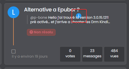
look at the screens above
if I not display this class too, I have no avatar on all the site because it’s the original class .
In fact I can’t do anything. In all cases, avatars with the wrong location are displayed in the same way
or you would have to make sure that this element never appears with card view on this page but I’m not even sure that would work
-
if you have solution for me, I take it
-
@DownPW I’ll need to put something together based on your dev site.
EDIT: If you have a look at sudonix.dev (closed dev site, so you’ll need to login) you’ll see that this is no longer exposed to CF, and works as intended.
-
Yes I believe you that it works without CF

I would just like to see if a solution is possible with CF even if it means deleting this d**n avatar on post-content
-
@DownPW I’m sure we can do something here.
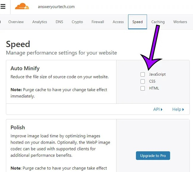
Actually, can you try and remove the minification etc on CSS and JS in CF for your domain and see if this makes any difference?
-
@phenomlab said in Switch between list and card view function:
Actually, can you try and remove the minification etc on CSS and JS in CF for your domain and see if t
Sorry my friend, can you be more specific ?
-
@DownPW this setting

-
hello.
how OK
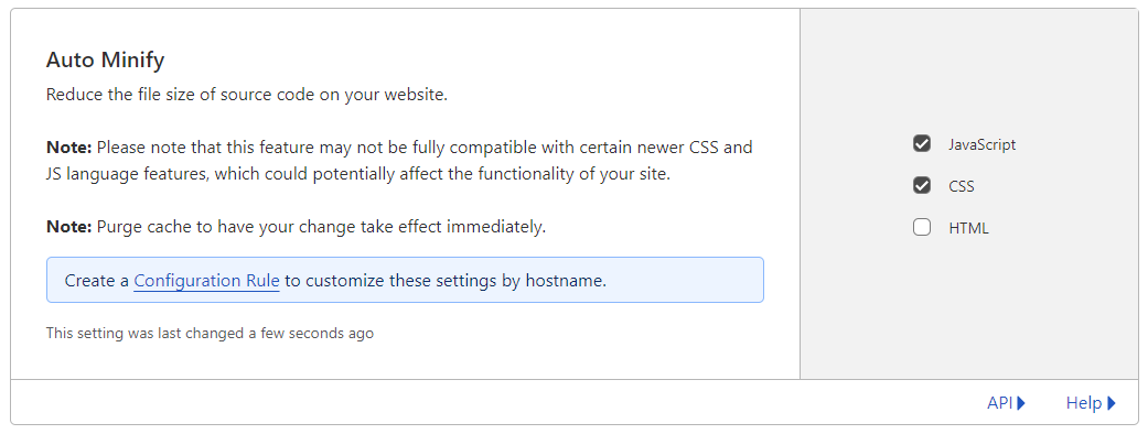
minification etc on CSS and JS in CF is already disabled
-
@DownPW thanks. Just wanted to eliminate a thought I had around the JS being executed in the wrong order.
-
@DownPW said in Switch between list and card view function:
Is there a way to prevent them from showing up either?
You should be able to use the below CSS to hide that specific avatar
.category-card .lastpost a img {
    margin-top: 10px;
    margin-left: -185px;
    display: none;
}
And
.category-card span.avatar.avatar-tooltip.not-responsive.avatar-rounded { display: none; } -
@DownPW said in Switch between list and card view function:
Too bad. I will therefore not be able to use this function or perhaps by just deleting the problematic avatar if that is possible
FIXED: Looks like I was using an incorrect hook
 have rectified that now, so can you please pull the latest
 functions.jsand test?https://github.com/phenomlab/harmony-card-view/blob/main/functions.js
-
I switched my domain back to CF, and all the previous bugs came back
 However, I’ve re-written the code to use custom CSS instead of external CSS, and this so far looks good in test. I want to evaluate this a bit more before I release the updated code, but so far, this looks like it’s going to work.
 -
@DownPW I think I might finally have it - code that works in CF with no bugs…

Can you please test this code (which is running in sudonix.dev) and let me know what you think? It’s not ready for publish just yet but will be once I’ve tidied up a few things.
-
Hello Mark
It looks pretty good on your test platform. I didn’t notice the bug there.
Let’s see what it looks like on another server with CF.
-
@DownPW Great. There is still one small bug I noticed, but I think that might be a caching issue. This new code is refactored, and has structurally changed. I’ll post the new code in the main topic, plus updated instructions.
-
After a significant rewrite of the code plus the CSS, I’m pleased to release this stable version. There are some changes however.
- The external
CSSfile is no longer needed (you can delete it). As a result, the CSS you see in the below file needs to be copied into
/admin/appearance/customise#custom-csshttps://github.com/phenomlab/harmony-card-view/blob/main/card.css
- The
JScode has been refactored, and the code contained in the link below needs to be copied into
/admin/appearance/customise#custom-jsYou need to overwrite existing code if you have it
https://github.com/phenomlab/harmony-card-view/blob/main/functions.js
IMPORTANT
If you use Cloudflare, you MUST disable the HTML minification if you use it

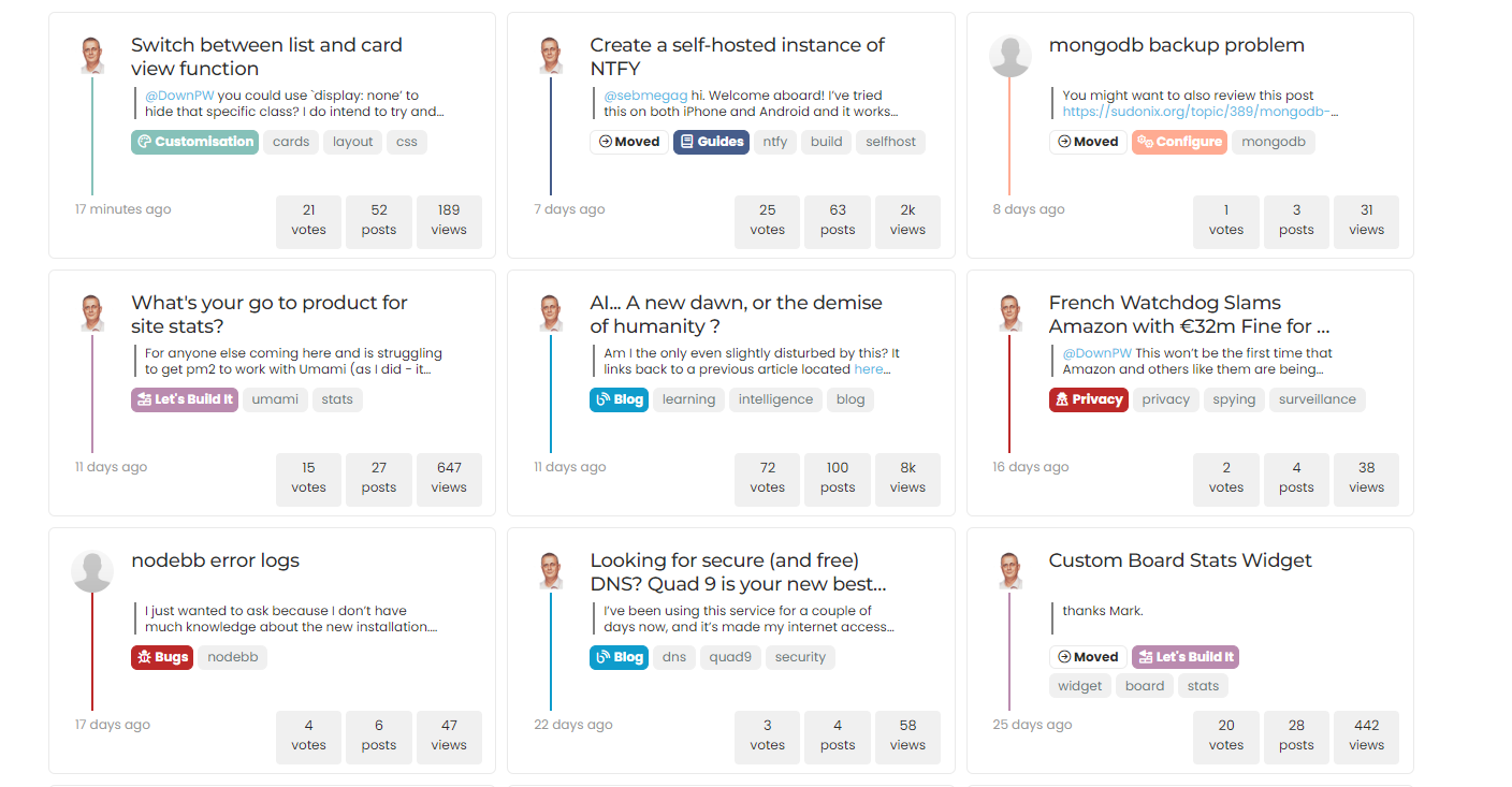
If everything went well, you should see this

If it doesn’t look like the above, the main reason for this is that you are using Cloudflare and have not disabled HTML minification. If this setting is enabled, the JS code will insert additional classes into the
DOMas it should, although CF has a bad habit of changing the execution order meaning the CSS is not correctly applied to the first set of returned topics - an example of that below
If you experience this issue, please ensure that you’ve disabled HTML minification.
Enjoy the new layout. Any issues, let me know.
- The external
-
 undefined phenomlab moved this topic from Customisation on
-
Test ASAP this version on my dev environment with CF my friend.
Thank you so much
Related Topics
-
-
-
-
-
hover link effect
Solved Customisation -
-
-
Bug Navbar CSS
Solved Customisation

