Custom badges

-
@crazycells it’s possible, but would be very complex. Much less hassle to use either a direct image (which probably won’t look very good on scale) or use this SVG from Font Awesome which appears to be free

https://fontawesomeicons.com/svg/icons/twitter-verified-badge
@phenomlab thanks.
-
@crazycells it’s possible, but would be very complex. Much less hassle to use either a direct image (which probably won’t look very good on scale) or use this SVG from Font Awesome which appears to be free
https://fontawesomeicons.com/svg/icons/twitter-verified-badge
@phenomlab since both admin and global moderator badges are close to purple/maroon color, you can change one to green (which I believe was the verified badge color)
-
@phenomlab since both admin and global moderator badges are close to purple/maroon color, you can change one to green (which I believe was the verified badge color)
@crazycells yes, I need to change that here. Was switched out on a whim.
Mark Cutting also advises organisations as a Fractional CIO, Fractional CISO and Executive Advisor, helping boards improve technology governance, cyber resilience and executive decision making. Learn more at Gratmore Ltd
-
@crazycells yes, I need to change that here. Was switched out on a whim.
@crazycells @DownPW something of a “fresher” approach. Have a look at the below
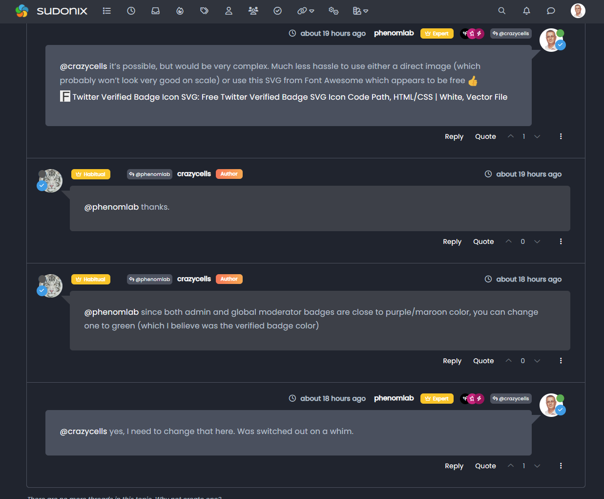
Using the messenger type view I created, it then becomes possible to place the “verified” group according to the style from the same view.
This does mean some new CSS
.self-post a[href*="/groups/verified"] .group-label {
    position: absolute !important;
    right: 51px;
    top: 44px;
}
.topic-response-post a[href*="/groups/verified"] .group-label {
    position: absolute !important;
    left: 20px;
    top: 44px;
}
.topic-response-post i[component="user/status"] {
    position: absolute;
    left: -1px;
}
And, more importantly, I found a more efficient way of adding classes in the messenger view
js. The revised code is below// Target those elements already loaded in the DOM $(document).ready(function() { $(window).on('action:ajaxify.end', function(data) { $('li[component="post"]').each(function(i, obj) { if (!$(this).hasClass('self-post') || (!$(this).hasClass('self-post'))) { console.log("Adding required classes for messenger type view"); $(this).addClass('topic-response-post'); } }); }); }); // Target elements dynamically added to the DOM on post load $(document).ready(function() { $(window).on('action:ajaxify.loaded', function(data) { $('li[component="post"]').each(function(i, obj) { if (!$(this).hasClass('self-post') || (!$(this).hasClass('self-post'))) { console.log("Adding required classes for messenger type view"); $(this).addClass('topic-response-post'); } }); }); });Mark Cutting also advises organisations as a Fractional CIO, Fractional CISO and Executive Advisor, helping boards improve technology governance, cyber resilience and executive decision making. Learn more at Gratmore Ltd
-
@crazycells @DownPW something of a “fresher” approach. Have a look at the below
Using the messenger type view I created, it then becomes possible to place the “verified” group according to the style from the same view.
This does mean some new CSS
.self-post a[href*="/groups/verified"] .group-label {
    position: absolute !important;
    right: 51px;
    top: 44px;
}
.topic-response-post a[href*="/groups/verified"] .group-label {
    position: absolute !important;
    left: 20px;
    top: 44px;
}
.topic-response-post i[component="user/status"] {
    position: absolute;
    left: -1px;
}
And, more importantly, I found a more efficient way of adding classes in the messenger view
js. The revised code is below// Target those elements already loaded in the DOM $(document).ready(function() { $(window).on('action:ajaxify.end', function(data) { $('li[component="post"]').each(function(i, obj) { if (!$(this).hasClass('self-post') || (!$(this).hasClass('self-post'))) { console.log("Adding required classes for messenger type view"); $(this).addClass('topic-response-post'); } }); }); }); // Target elements dynamically added to the DOM on post load $(document).ready(function() { $(window).on('action:ajaxify.loaded', function(data) { $('li[component="post"]').each(function(i, obj) { if (!$(this).hasClass('self-post') || (!$(this).hasClass('self-post'))) { console.log("Adding required classes for messenger type view"); $(this).addClass('topic-response-post'); } }); }); });@phenomlab this looks cooler than usual badges
thanks for the codes…but, I believe it should be located slightly lower since there is already a status circle that is taking some space from the avatar, and now this is taking more
 it feels like you are conversing with someone that has sunglasses, a scarf, and a hat
  I prefer to see their faces more clearly (well, in this case avatar )
 -
@phenomlab this looks cooler than usual badges
thanks for the codes…but, I believe it should be located slightly lower since there is already a status circle that is taking some space from the avatar, and now this is taking more
it feels like you are conversing with someone that has sunglasses, a scarf, and a hat I prefer to see their faces more clearly (well, in this case avatar )@crazycells ha! Yes, I see your point. I guess it’s down to taste, and thanks to the
absolutepositioning, you can easily customise to suit taste.It’s also worth noting that on here at least, this will only trigger on larger monitors - it would look awful on mobile devices in my view.
Mark Cutting also advises organisations as a Fractional CIO, Fractional CISO and Executive Advisor, helping boards improve technology governance, cyber resilience and executive decision making. Learn more at Gratmore Ltd
-
@crazycells ha! Yes, I see your point. I guess it’s down to taste, and thanks to the
absolutepositioning, you can easily customise to suit taste.It’s also worth noting that on here at least, this will only trigger on larger monitors - it would look awful on mobile devices in my view.
@phenomlab yes
I agree with you.How do you achieve the restriction? I cannot see any screen resolution definition…
-
@crazycells ha! Yes, I see your point. I guess it’s down to taste, and thanks to the
absolutepositioning, you can easily customise to suit taste.It’s also worth noting that on here at least, this will only trigger on larger monitors - it would look awful on mobile devices in my view.
@phenomlab oh, I think I got it. that is a general property for all group badges?
I do not see any of them on mobile…
-
@phenomlab oh, I think I got it. that is a general property for all group badges?
I do not see any of them on mobile…
@crazycells yes, the badges by default do not display on less than
1200pxI believe (I might be wrong)Mark Cutting also advises organisations as a Fractional CIO, Fractional CISO and Executive Advisor, helping boards improve technology governance, cyber resilience and executive decision making. Learn more at Gratmore Ltd
-
@crazycells yes, the badges by default do not display on less than
1200pxI believe (I might be wrong)hi @phenomlab , in this topic where the solution is chosen:
https://sudonix.org/topic/388/the-best-css-to-customize-our-logo
verified badge and online status are overlapping. I guess it is not intended?
-
hi @phenomlab , in this topic where the solution is chosen:
https://sudonix.org/topic/388/the-best-css-to-customize-our-logo
verified badge and online status are overlapping. I guess it is not intended?
@crazycells hmm, I’m not seeing that. Can you provide a screenshot?
Mark Cutting also advises organisations as a Fractional CIO, Fractional CISO and Executive Advisor, helping boards improve technology governance, cyber resilience and executive decision making. Learn more at Gratmore Ltd
-
@crazycells hmm, I’m not seeing that. Can you provide a screenshot?
-
@phenomlab sure, here is how I see it:

@crazycells ah, yes, I know why. There’s a class I haven’t committed.
Thanks. I’ll sort that out tomorrow.
-
@crazycells Let’s try this
In
/forum/admin/manage/groups/verified, remove the highlighted section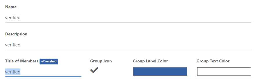
We are then left with no text, but a clearer looking icon
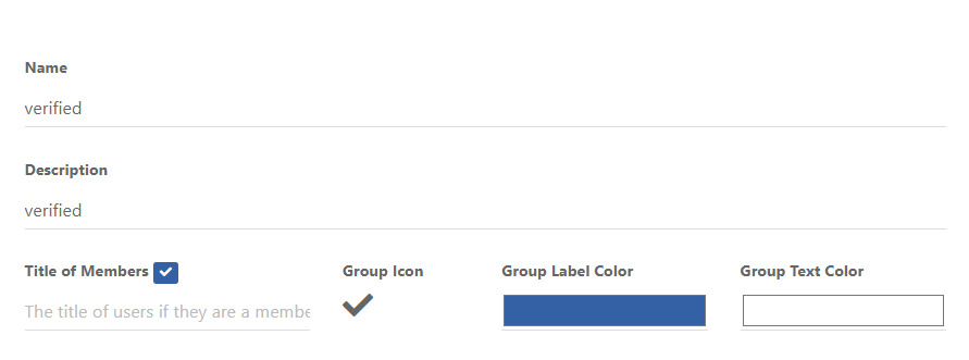
Now remove the previous CSS blocks I provided here
Add replacement CSS
.post-header a[href*="/forum/groups/verified"] {
    margin-right: 3px;
    margin-top: 1px;
    border-radius: 50%;
    line-height: 20px;
    display: inline-block;
    vertical-align: middle;
    text-align: center;
    overflow: hidden;
}
small.label.group-label.inline-block i {
    margin-top: 1px;
    margin-left: 0px;
    vertical-align: middle;
    justify-content: center;
    display: flex;
}
.post-header a[href*="/forum/groups/verified"] .group-label {
    min-width: 20px;
    display: flex;
    justify-content: center;
}
.group-label {
    vertical-align: -6px;
}
You should land up with something like this

As you can see, this forces the stars out of alignment, but I don’t think this is too much of a sacrifice, and could be remediated with additional targeted CSS if need be.
Essentially, because NodeBB doesn’t provide an
idfield (which would be a lot easier), we have to use wildcard CSS such as.post-header a[href*="/forum/groups/verified"]but make it targeted in the sense that it will only fire if it is part of the post stream, hence.post-headerat the beginning.We then use
.post-header a[href*="/forum/groups/verified"] .group-labelto target the actual label (but only when we have a wildcard match in the CSS) meaning we can set a minimum width so that the circle doesn’t look quashed (we need to validate this on Firefox though as additional CSS might be required due to how thewebkitengine will render this in contrast tomozilla).Finally, we use
.group-labelto force alignment in terms of height to prevent it wandering out of theinline-block.This is already active on your forum, so nothing for you to do but (hopefully) admire
Let me know.
@phenomlab said in Custom badges:
@crazycells @DownPW something of a “fresher” approach. Have a look at the below
Using the messenger type view I created, it then becomes possible to place the “verified” group according to the style from the same view.
This does mean some new CSS
.self-post a[href*="/groups/verified"] .group-label {
    position: absolute !important;
    right: 51px;
    top: 44px;
}
.topic-response-post a[href*="/groups/verified"] .group-label {
    position: absolute !important;
    left: 20px;
    top: 44px;
}
.topic-response-post i[component="user/status"] {
    position: absolute;
    left: -1px;
}
And, more importantly, I found a more efficient way of adding classes in the messenger view
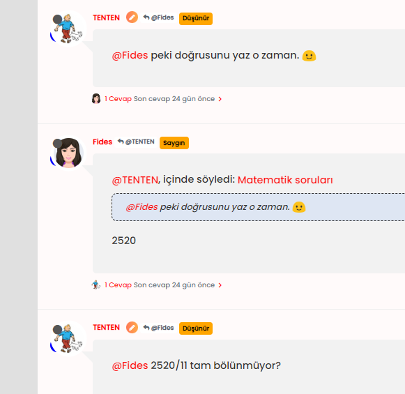
js. The revised code is below// Target those elements already loaded in the DOM $(document).ready(function() { $(window).on('action:ajaxify.end', function(data) { $('li[component="post"]').each(function(i, obj) { if (!$(this).hasClass('self-post') || (!$(this).hasClass('self-post'))) { console.log("Adding required classes for messenger type view"); $(this).addClass('topic-response-post'); } }); }); }); // Target elements dynamically added to the DOM on post load $(document).ready(function() { $(window).on('action:ajaxify.loaded', function(data) { $('li[component="post"]').each(function(i, obj) { if (!$(this).hasClass('self-post') || (!$(this).hasClass('self-post'))) { console.log("Adding required classes for messenger type view"); $(this).addClass('topic-response-post'); } }); }); });My style looks like it with those codes. There isjust seems some blue color of my checked icon
-
 undefined cagatay referenced this topic on
-
@phenomlab said in Custom badges:
@crazycells @DownPW something of a “fresher” approach. Have a look at the below
Using the messenger type view I created, it then becomes possible to place the “verified” group according to the style from the same view.
This does mean some new CSS
.self-post a[href*="/groups/verified"] .group-label {
    position: absolute !important;
    right: 51px;
    top: 44px;
}
.topic-response-post a[href*="/groups/verified"] .group-label {
    position: absolute !important;
    left: 20px;
    top: 44px;
}
.topic-response-post i[component="user/status"] {
    position: absolute;
    left: -1px;
}
And, more importantly, I found a more efficient way of adding classes in the messenger view
js. The revised code is below// Target those elements already loaded in the DOM $(document).ready(function() { $(window).on('action:ajaxify.end', function(data) { $('li[component="post"]').each(function(i, obj) { if (!$(this).hasClass('self-post') || (!$(this).hasClass('self-post'))) { console.log("Adding required classes for messenger type view"); $(this).addClass('topic-response-post'); } }); }); }); // Target elements dynamically added to the DOM on post load $(document).ready(function() { $(window).on('action:ajaxify.loaded', function(data) { $('li[component="post"]').each(function(i, obj) { if (!$(this).hasClass('self-post') || (!$(this).hasClass('self-post'))) { console.log("Adding required classes for messenger type view"); $(this).addClass('topic-response-post'); } }); }); });My style looks like it with those codes. There isjust seems some blue color of my checked icon
@cagatay you should remove those two CSS blocks your referenced as that’s what’s causing the odd looking blue circles over the avatar.
Mark Cutting also advises organisations as a Fractional CIO, Fractional CISO and Executive Advisor, helping boards improve technology governance, cyber resilience and executive decision making. Learn more at Gratmore Ltd
-
@cagatay you should remove those two CSS blocks your referenced as that’s what’s causing the odd looking blue circles over the avatar.
-
@phenomlab which one i should remove?
@cagatay These
.self-post a[href*="/groups/verified"] .group-label {
    position: absolute !important;
    right: 51px;
    top: 44px;
}
.topic-response-post a[href*="/groups/verified"] .group-label {
    position: absolute !important;
    left: 20px;
    top: 44px;
}
.topic-response-post i[component="user/status"] {
    position: absolute;
    left: -1px;
}
Mark Cutting also advises organisations as a Fractional CIO, Fractional CISO and Executive Advisor, helping boards improve technology governance, cyber resilience and executive decision making. Learn more at Gratmore Ltd
-
@cagatay These
.self-post a[href*="/groups/verified"] .group-label { position: absolute !important; right: 51px; top: 44px; } .topic-response-post a[href*="/groups/verified"] .group-label { position: absolute !important; left: 20px; top: 44px; } .topic-response-post i[component="user/status"] { position: absolute; left: -1px; }@phenomlab its not work, nothing changed when i deleted those css.
-
@phenomlab its not work, nothing changed when i deleted those css.
@cagatay what isn’t working?
Mark Cutting also advises organisations as a Fractional CIO, Fractional CISO and Executive Advisor, helping boards improve technology governance, cyber resilience and executive decision making. Learn more at Gratmore Ltd
-
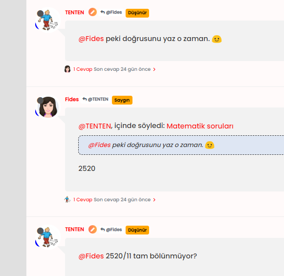
@phenomlab there is no changes after deleted css code;


Hello! It looks like you're interested in this conversation, but you don't have an account yet.
Getting fed up of having to scroll through the same posts each visit? When you register for an account, you'll always come back to exactly where you were before, and choose to be notified of new replies (either via email, or push notification). You'll also be able to save bookmarks and upvote posts to show your appreciation to other community members.
With your input, this post could be even better 💗
Register Login