Page control arrows for PWA
-
I have not tested them in details yet, but I will let you know about any bugs for sure


Additionally, is there any reason that they are in the middle but not close to the bottom? That is usually where the fingers will be
-
I have not tested them in details yet, but I will let you know about any bugs for sure
Additionally, is there any reason that they are in the middle but not close to the bottom? That is usually where the fingers will be
@crazycells They can be anywhere you’d prefer. You can just change the
.arrow.left, .arrow.rightclass to move to the preferred position. Currently, it’s set at 50%, but can be any value you want to reach the desired position. In this case, it would probably be better to substitutetopforbottomand set the position inpxto ensure the placement is the same no matter which screen estate you have.For example
.arrow.left, .arrow.right {
    margin-left: 10px;
    margin-right: 10px;
    align-content: center;
    position: fixed;
    bottom: 120px;
}
That now means the page scroller (the button that appears bottom right) will be in the way, although on thinking about it, we already have a page navigation when you are in the topic, so no point in having another. That would be a minor alteration to the scroll top function to have it not appear on posts.
Mark Cutting also advises organisations as a Fractional CIO, Fractional CISO and Executive Advisor, helping boards improve technology governance, cyber resilience and executive decision making. Learn more at Gratmore Ltd
-
@crazycells They can be anywhere you’d prefer. You can just change the
.arrow.left, .arrow.rightclass to move to the preferred position. Currently, it’s set at 50%, but can be any value you want to reach the desired position. In this case, it would probably be better to substitutetopforbottomand set the position inpxto ensure the placement is the same no matter which screen estate you have.For example
.arrow.left, .arrow.right {
    margin-left: 10px;
    margin-right: 10px;
    align-content: center;
    position: fixed;
    bottom: 120px;
}
That now means the page scroller (the button that appears bottom right) will be in the way, although on thinking about it, we already have a page navigation when you are in the topic, so no point in having another. That would be a minor alteration to the scroll top function to have it not appear on posts.
@phenomlab thanks, yes, I will move them close to the menu bar, but I was asking in case there is a technical detail I was not aware…
-
@phenomlab thanks, yes, I will move them close to the menu bar, but I was asking in case there is a technical detail I was not aware…
@crazycells No, none that I am aware of - move them to where you’d prefer. In fact, I took your advice and moved them on Sudonix, which uses the CSS class I added in the previous post.
Mark Cutting also advises organisations as a Fractional CIO, Fractional CISO and Executive Advisor, helping boards improve technology governance, cyber resilience and executive decision making. Learn more at Gratmore Ltd
-
@crazycells No, none that I am aware of - move them to where you’d prefer. In fact, I took your advice and moved them on Sudonix, which uses the CSS class I added in the previous post.
@phenomlab yes, I believe this looks more natural, they are closer to the fingers and on the top of these, it is not blocking any content in the middle of the screen…
-
@phenomlab yes, I believe this looks more natural, they are closer to the fingers and on the top of these, it is not blocking any content in the middle of the screen…
@crazycells Exactly. i’m going to hire you as a design guru! You have some great ideas on what Sudonix should look like and I’m grateful for any contribution that enhances what I hope is already a good experience.
Mark Cutting also advises organisations as a Fractional CIO, Fractional CISO and Executive Advisor, helping boards improve technology governance, cyber resilience and executive decision making. Learn more at Gratmore Ltd
-
@crazycells Exactly. i’m going to hire you as a design guru! You have some great ideas on what Sudonix should look like and I’m grateful for any contribution that enhances what I hope is already a good experience.
@phenomlab It is nice to hear that I am able to contribute your website

-
@crazycells They can be anywhere you’d prefer. You can just change the
.arrow.left, .arrow.rightclass to move to the preferred position. Currently, it’s set at 50%, but can be any value you want to reach the desired position. In this case, it would probably be better to substitutetopforbottomand set the position inpxto ensure the placement is the same no matter which screen estate you have.For example
.arrow.left, .arrow.right {
    margin-left: 10px;
    margin-right: 10px;
    align-content: center;
    position: fixed;
    bottom: 120px;
}
That now means the page scroller (the button that appears bottom right) will be in the way, although on thinking about it, we already have a page navigation when you are in the topic, so no point in having another. That would be a minor alteration to the scroll top function to have it not appear on posts.
@phenomlab said in Page control arrows for PWA:
That now means the page scroller (the button that appears bottom right) will be in the way, although on thinking about it, we already have a page navigation when you are in the topic, so no point in having another.
Based on the above point made, I have now disabled the scroll to top button inside topics.
Mark Cutting also advises organisations as a Fractional CIO, Fractional CISO and Executive Advisor, helping boards improve technology governance, cyber resilience and executive decision making. Learn more at Gratmore Ltd
-
@phenomlab said in Page control arrows for PWA:
That now means the page scroller (the button that appears bottom right) will be in the way, although on thinking about it, we already have a page navigation when you are in the topic, so no point in having another.
Based on the above point made, I have now disabled the scroll to top button inside topics.
@phenomlab this works great! thanks a lot. And thanks to your JS codes, it is only activated on PWA, not on mobile…
-
@phenomlab this works great! thanks a lot. And thanks to your JS codes, it is only activated on PWA, not on mobile…
@crazycells Not sure if you are using the scroll-top function, but if you are, I have enhanced the position of the button and re-sized it to match the forward and back arrows as below
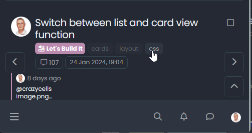
The scroll-top button is located on the bottom right.
Mark Cutting also advises organisations as a Fractional CIO, Fractional CISO and Executive Advisor, helping boards improve technology governance, cyber resilience and executive decision making. Learn more at Gratmore Ltd
-
@crazycells Not sure if you are using the scroll-top function, but if you are, I have enhanced the position of the button and re-sized it to match the forward and back arrows as below
The scroll-top button is located on the bottom right.
@phenomlab yes I used it before but not very frequently… Maybe you should put it above… just because it is more intuitive…
^
< >
v -
@phenomlab yes I used it before but not very frequently… Maybe you should put it above… just because it is more intuitive…
^
< >
v@crazycells Ok, but there’s no “scroll-down”

Mark Cutting also advises organisations as a Fractional CIO, Fractional CISO and Executive Advisor, helping boards improve technology governance, cyber resilience and executive decision making. Learn more at Gratmore Ltd
-
@crazycells Ok, but there’s no “scroll-down”
@phenomlab yeah , I know
not necessary, but “up” should be above right/left buttons I guess… that is how people would think… -
@phenomlab yeah , I know
not necessary, but “up” should be above right/left buttons I guess… that is how people would think…@crazycells Good point, thanks.
-
@crazycells Ok, but there’s no “scroll-down”
@phenomlab but I guess “up” is on mobile, right? not PWA specific?
-
@phenomlab but I guess “up” is on mobile, right? not PWA specific?
@crazycells it is, yes - I think I’ll leave it as there is no specific PWA CSS classes I know of. Well, you could use something like the below, but this means multiple CSS files for different operating systems.
/**
* Determine the mobile operating system.
* This function returns one of 'iOS', 'Android', 'Windows Phone', or 'unknown'.
*
* @returns {String}
*/

function getMobileOperatingSystem()
{
  var userAgent = navigator.userAgent || navigator.vendor || window.opera;
  // Windows Phone must come first because its UA also contains "Android"
  if (/windows phone/i.test(userAgent))
  {
    return  "Windows Phone";
  }

  if (/android/i.test(userAgent))
  {
    return  "Android";
  }

  if (/iPad|iPhone|iPod/.test(userAgent) && !window.MSStream)
  {
    return  "iOS";
  }

  return  "unknown";
  // return “Android” - one should either handle the unknown or fallback to a specific platform, let’s say Android
}
Once you’re in that rabbit hole, it’s impossible to get out of it.



Hello! It looks like you're interested in this conversation, but you don't have an account yet.
Getting fed up of having to scroll through the same posts each visit? When you register for an account, you'll always come back to exactly where you were before, and choose to be notified of new replies (either via email, or push notification). You'll also be able to save bookmarks and upvote posts to show your appreciation to other community members.
With your input, this post could be even better 💗
Register Login