New "messenger style" conversation view
-
anyone can help to me for this style?
-
@cagatay said in New "messenger style" conversation view:
anyone can help to me for this style?
That’ll be me
 I will provide a write up, but it’s not a simple affair. You should try this in a dev environment first.
 -
@cagatay said in New "messenger style" conversation view:
anyone can help to me for this style?
That’ll be me
 I will provide a write up, but it’s not a simple affair. You should try this in a dev environment first.
@phenomlab yes i know that is you
 i dont have dev
  but i think that you know my css and js type coz of fixed iframely.
-
@phenomlab yes i know that is you
 i dont have dev
  but i think that you know my css and js type coz of fixed iframely.
@cagatay I do know it, yes, but this code contains breaking changes so I would not recommend for this to be deployed in live without thorough testing first. It’s possible to inject and test CSS code on the fly, but it’s not reliable and if the site is reloaded, you lose your changes.
You really should consider a DEV environment for things like this.
-
@cagatay I do know it, yes, but this code contains breaking changes so I would not recommend for this to be deployed in live without thorough testing first. It’s possible to inject and test CSS code on the fly, but it’s not reliable and if the site is reloaded, you lose your changes.
You really should consider a DEV environment for things like this.
@phenomlab got the point thank you.
-
@crazycells Do you mean in a messenger type view ? Yes, of course, but the conversation would all be one way woudn’t it ?
@phenomlab said in New "messenger style" conversation view:
@crazycells Do you mean in a messenger type view ? Yes, of course, but the conversation would all be one way woudn’t it ?
oh yes sorry, let me further explain what I meant…
In a normal NodeBB Persona theme, the main problem on pages containing posts lists such as:
/posts
/best
/controversialis that avatar is forced to be on the right side of the page, and since the username and timestamp come after the avatar, there is a dead space created on the right side of the avatar on the mobile version of the website.
I was wondering if this re-ordering that you have just made with the messenger-style theme can be applied to these pages, so the username and timestamp can come before the avatar, just like how I see my posts on a regular thread here under this title…
I guess, in a sense, this is also compatible with your new theme since people will see their posts always with their avatar being on the right side of the page?
And on these posts list pages like
/best,/controversialyou look at your own posts lists anyways… -
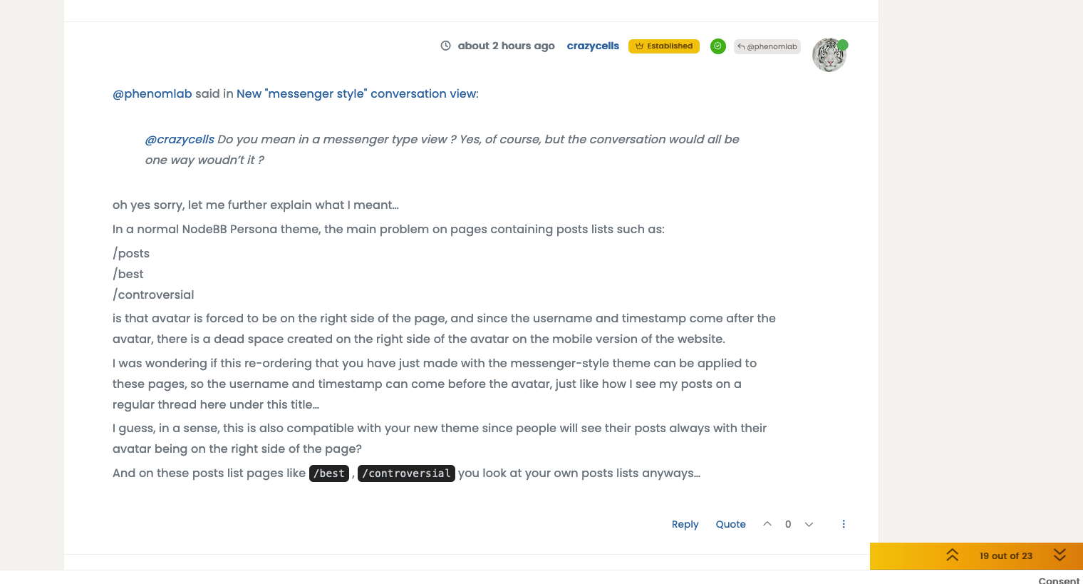
by the way, we have to come up with another solution with the background of own posts… because this white background eliminates “quotes” as well… I cannot distinguish quotes in my post… Do you think keeping the gray border of the quote but not the background will solve the issue?
-
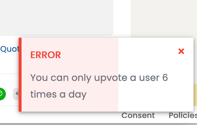
on a side note… you are such a great person
 you should let us upvote you 20 times a day
  6 is too low…
-
on a side note… you are such a great person
 you should let us upvote you 20 times a day
  6 is too low…
@crazycells heh, that limit is set by the extension and hard coded. Not by me I have to add.
-
by the way, we have to come up with another solution with the background of own posts… because this white background eliminates “quotes” as well… I cannot distinguish quotes in my post… Do you think keeping the gray border of the quote but not the background will solve the issue?
@crazycells can you send me a screenshot ? I think I know what you mean - the quote background is close (or perhaps the same) as the reply background, yes ?
-
@crazycells can you send me a screenshot ? I think I know what you mean - the quote background is close (or perhaps the same) as the reply background, yes ?
@phenomlab said in New "messenger style" conversation view:
@crazycells can you send me a screenshot ? I think I know what you mean - the quote background is close (or perhaps the same) as the reply background, yes ?
here it is…
-
@phenomlab said in New "messenger style" conversation view:
@crazycells can you send me a screenshot ? I think I know what you mean - the quote background is close (or perhaps the same) as the reply background, yes ?
here it is…

@crazycells can you reload the page (f5 refresh) and then from the swatch selector, choose the daylight theme and let me know what you see ?
That screenshot you sent doesn’t look like the swatch is fully loaded.
-
@crazycells can you reload the page (f5 refresh) and then from the swatch selector, choose the daylight theme and let me know what you see ?
That screenshot you sent doesn’t look like the swatch is fully loaded.
@phenomlab said in New "messenger style" conversation view:
@crazycells can you reload the page (f5 refresh) and then from the swatch selector, choose the daylight theme and let me know what you see ?
That screenshot you sent doesn’t look like the swatch is fully loaded.
I reloaded the page and after selecting “Daylight” it looks like this:

but right after I reload the page again… the blue color goes away, and it becomes the “default” theme with no color distinction again…
-
@phenomlab said in New "messenger style" conversation view:
@crazycells can you reload the page (f5 refresh) and then from the swatch selector, choose the daylight theme and let me know what you see ?
That screenshot you sent doesn’t look like the swatch is fully loaded.
I reloaded the page and after selecting “Daylight” it looks like this:

but right after I reload the page again… the blue color goes away, and it becomes the “default” theme with no color distinction again…
@crazycells you shouldn’t need to reload the page? (At least, not a hard refresh)
-
@crazycells you shouldn’t need to reload the page? (At least, not a hard refresh)
@phenomlab said in New "messenger style" conversation view:
@crazycells you shouldn’t need to reload the page? (At least, not a hard refresh)
yeah, what I mean is that the “daylight” does not stay on the page as the theme (a bug?), although the rest of the themes stay active when I reload the page.
-
@phenomlab said in New "messenger style" conversation view:
@crazycells you shouldn’t need to reload the page? (At least, not a hard refresh)
yeah, what I mean is that the “daylight” does not stay on the page as the theme (a bug?), although the rest of the themes stay active when I reload the page.
@crazycells does this only happen with daylight ?
-
@crazycells does this only happen with daylight ?
@phenomlab said in New "messenger style" conversation view:
@crazycells does this only happen with daylight ?
Yes, I changed them one by one, it only happens with “daylight”.
Can you please send a screenshot of your page with the daylight theme? -
@phenomlab said in New "messenger style" conversation view:
@crazycells does this only happen with daylight ?
Yes, I changed them one by one, it only happens with “daylight”.
Can you please send a screenshot of your page with the daylight theme?@crazycells I think I see what you mean - do you see something like this, where the CSS does not appear to be applied?
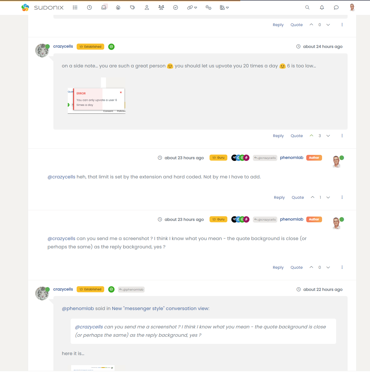
Here’s where it gets interesting - I am using SCSS variable
--self-postfor this specific setting, and it does not seem to be applied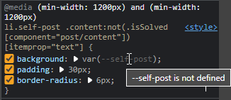
Notice the “–self-post is not defined”. And you are right - this only seems to be happening with the
daylighttheme, which is odd. -
@phenomlab said in New "messenger style" conversation view:
@crazycells does this only happen with daylight ?
Yes, I changed them one by one, it only happens with “daylight”.
Can you please send a screenshot of your page with the daylight theme?@crazycells I think I see the issue - it’s related to caching. Can you open sudonix.com in an incognito session, and let me know if you experience the same issue?
Either way, it’s something I need to fix.
-
@crazycells I think I see the issue - it’s related to caching. Can you open sudonix.com in an incognito session, and let me know if you experience the same issue?
Either way, it’s something I need to fix.
@phenomlab said in New "messenger style" conversation view:
@crazycells I think I see the issue - it’s related to caching. Can you open sudonix.com in an incognito session, and let me know if you experience the same issue?
Either way, it’s something I need to fix.
Yes, incognito session solves the issue

Hello! It looks like you're interested in this conversation, but you don't have an account yet.
Getting fed up of having to scroll through the same posts each visit? When you register for an account, you'll always come back to exactly where you were before, and choose to be notified of new replies (either via email, or push notification). You'll also be able to save bookmarks and upvote posts to show your appreciation to other community members.
With your input, this post could be even better 💗
Register Login