NodeBB customisation
-
@jac said in NodeBB customisation:
@phenomlab said in NodeBB customisation:
@jac Use this
blockquote a {
    color: #ffc557;
}
You’ll need a hover class as well otherwise the text will disappear when hovered over - use this
blockquote a:hover {
    color: #db9716;
}
Worked a treat mate, thank you very much as always, a massive help!

I think all the changes may have affected this.
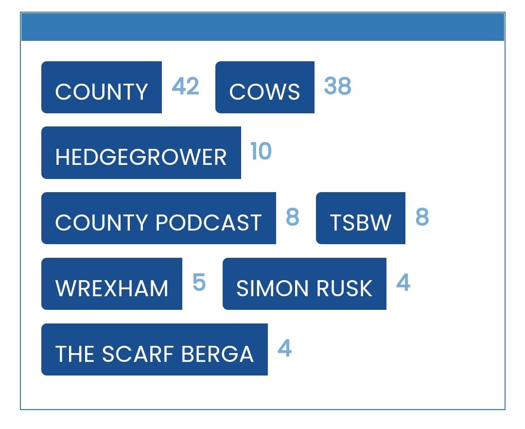
Is there any way to replicate colours on the tags page for the widget?
Sorry to be a pain…

@jac Can you provide a screenshot ? Sorry. Not entirely sure I understand.
Mark Cutting also advises organisations as a Fractional CIO, Fractional CISO and Executive Advisor, helping boards improve technology governance, cyber resilience and executive decision making. Learn more at Gratmore Ltd
-
@phenomlab said in NodeBB customisation:
@jac Can you provide a screenshot ? Sorry. Not entirely sure I understand.
-
@phenomlab said in NodeBB customisation:
@jac Can you provide a screenshot ? Sorry. Not entirely sure I understand.
@jac did you add any additional CSS other than what I provided ? I’m surprised this is impacted as the classes are completely different.
Mark Cutting also advises organisations as a Fractional CIO, Fractional CISO and Executive Advisor, helping boards improve technology governance, cyber resilience and executive decision making. Learn more at Gratmore Ltd
-
@jac did you add any additional CSS other than what I provided ? I’m surprised this is impacted as the classes are completely different.
@phenomlab said in NodeBB customisation:
@jac did you add any additional CSS other than what I provided ? I’m surprised this is impacted as the classes are completely different.
No mate I didn’t.
-
@phenomlab said in NodeBB customisation:
@jac did you add any additional CSS other than what I provided ? I’m surprised this is impacted as the classes are completely different.
No mate I didn’t.
Mark Cutting also advises organisations as a Fractional CIO, Fractional CISO and Executive Advisor, helping boards improve technology governance, cyber resilience and executive decision making. Learn more at Gratmore Ltd
-
@phenomlab said in NodeBB customisation:
@jac I see why. Fixed
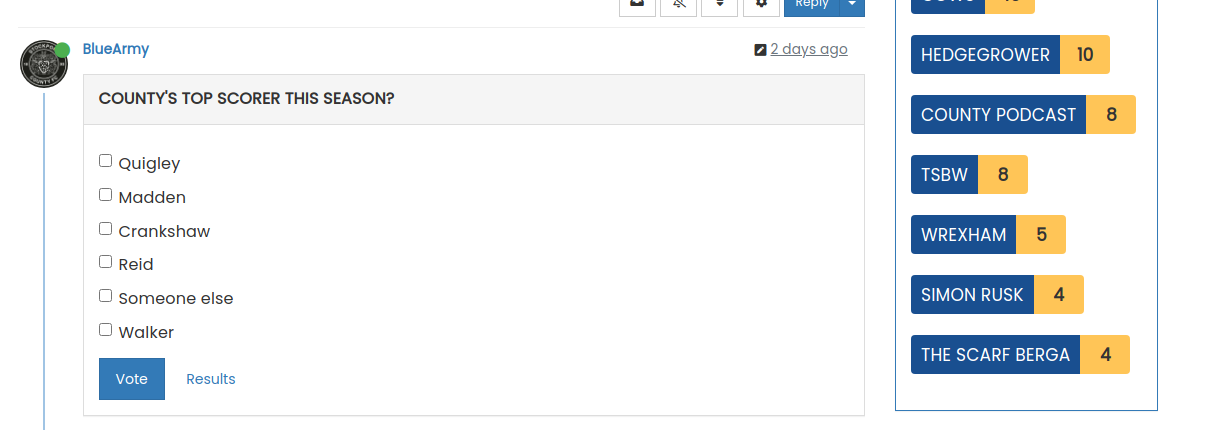
I’ve changed the CSS on your site already, so nothing for you to do

Amazing mate, thank you so much for doing this!!
-
@phenomlab said in NodeBB customisation:
@jac I see why. Fixed
I’ve changed the CSS on your site already, so nothing for you to do
Amazing mate, thank you so much for doing this!!
Was thinking about customising breadcrumbs is this something that is possible? / Where the title is and customise that with some colours?
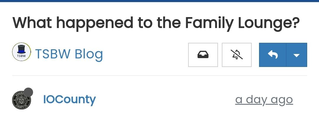
Many thanks as always!
-
Was thinking about customising breadcrumbs is this something that is possible? / Where the title is and customise that with some colours?
Many thanks as always!
@jac there aren’t any breadcrumbs in that screenshot ?
Mark Cutting also advises organisations as a Fractional CIO, Fractional CISO and Executive Advisor, helping boards improve technology governance, cyber resilience and executive decision making. Learn more at Gratmore Ltd
-
@phenomlab said in NodeBB customisation:
@jac there aren’t any breadcrumbs in that screenshot ?
 Ignore me mate. Sorry, I read they can be added in, don’t worry about that.
I was thinking some styling to where the title sits?
-
@phenomlab said in NodeBB customisation:
@jac there aren’t any breadcrumbs in that screenshot ?
Ignore me mate. Sorry, I read they can be added in, don’t worry about that.I was thinking some styling to where the title sits?
@jac what are you looking for ?
Mark Cutting also advises organisations as a Fractional CIO, Fractional CISO and Executive Advisor, helping boards improve technology governance, cyber resilience and executive decision making. Learn more at Gratmore Ltd
-
@phenomlab said in NodeBB customisation:
@jac what are you looking for ?
I’m not on the laptop currently so am unable to do it, but was thinking of maybe moving the message that’s displayed and just showing that for now on the home page only?
As for the titles, maybe a blue background with white writing? May look bad but I’m trying to (with the great help from yourself) make it very much fit in with Stockport colours at every opportunity without overdoing it ;).
-
@phenomlab said in NodeBB customisation:
@jac what are you looking for ?
I’m not on the laptop currently so am unable to do it, but was thinking of maybe moving the message that’s displayed and just showing that for now on the home page only?
As for the titles, maybe a blue background with white writing? May look bad but I’m trying to (with the great help from yourself) make it very much fit in with Stockport colours at every opportunity without overdoing it ;).
@jac Ok. Might make sense to put together a mock up of sorts and I’ll work from that.
Mark Cutting also advises organisations as a Fractional CIO, Fractional CISO and Executive Advisor, helping boards improve technology governance, cyber resilience and executive decision making. Learn more at Gratmore Ltd
-
@jac Ok. Might make sense to put together a mock up of sorts and I’ll work from that.
@phenomlab said in NodeBB customisation:
@jac Ok. Might make sense to put together a mock up of sorts and I’ll work from that.
Thanks mate. Will do
-
@phenomlab said in NodeBB customisation:
@jac Ok. Might make sense to put together a mock up of sorts and I’ll work from that.
Thanks mate. Will do
What I want is where the title is to be blue in the background, with white font?
And then I thought well this will clash with the menu bar that is also blue so I don’t know whether it can be done but maybe a yellow line to separate the menu and the article title?
Many thanks.
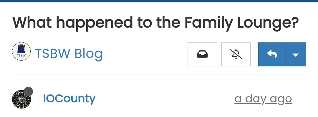
-
What I want is where the title is to be blue in the background, with white font?
And then I thought well this will clash with the menu bar that is also blue so I don’t know whether it can be done but maybe a yellow line to separate the menu and the article title?
Many thanks.
@jac I’m not so sure about this
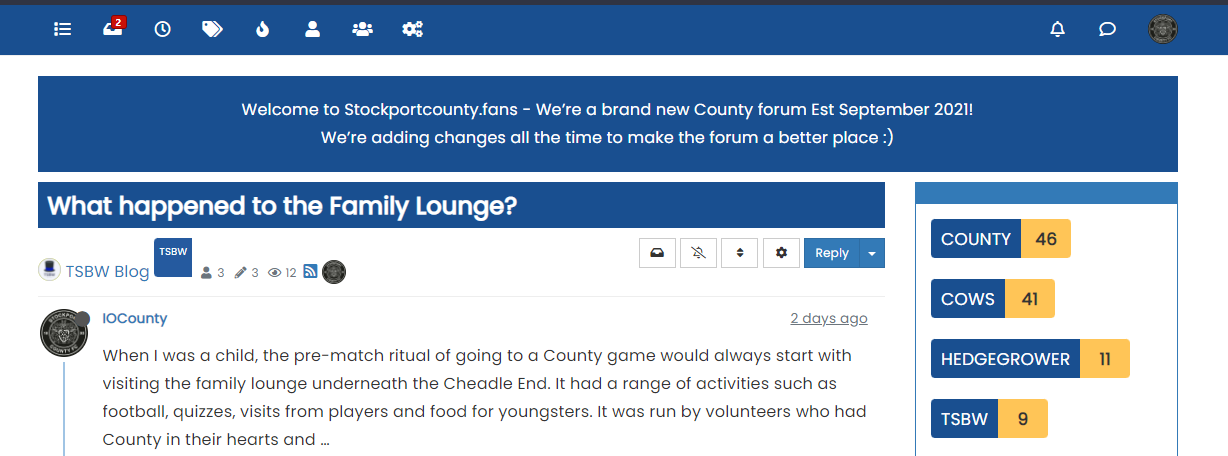
It’s too much blue (my opinion). I’d do this
.topic-title {
    font-weight: 300 !important;
}

.topic [component="post/header"] {
    margin-top: 0;
    background: #ffc557;
    color: #00205c;
    padding-left: 20px;
    padding-bottom: 5px;
}
It’s in keeping with the club colours, and will look like this
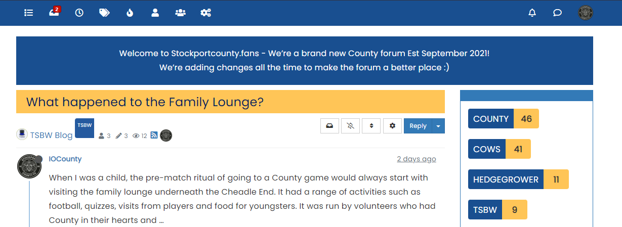
Mark Cutting also advises organisations as a Fractional CIO, Fractional CISO and Executive Advisor, helping boards improve technology governance, cyber resilience and executive decision making. Learn more at Gratmore Ltd
-
@jac I’m not so sure about this
It’s too much blue (my opinion). I’d do this
.topic-title {
    font-weight: 300 !important;
}

.topic [component="post/header"] {
    margin-top: 0;
    background: #ffc557;
    color: #00205c;
    padding-left: 20px;
    padding-bottom: 5px;
}
It’s in keeping with the club colours, and will look like this
@phenomlab said in NodeBB customisation:
@jac I’m not so sure about this
It’s too much blue (my opinion). I’d do this
.topic-title {
    font-weight: 300 !important;
}

.topic [component="post/header"] {
    margin-top: 0;
    background: #ffc557;
    color: #00205c;
    padding-left: 20px;
    padding-bottom: 5px;
}
It’s in keeping with the club colours, and will look like this
Wow that looks great!!!
,
-
@phenomlab said in NodeBB customisation:
@jac I’m not so sure about this
It’s too much blue (my opinion). I’d do this
.topic-title {
    font-weight: 300 !important;
}

.topic [component="post/header"] {
    margin-top: 0;
    background: #ffc557;
    color: #00205c;
    padding-left: 20px;
    padding-bottom: 5px;
}
It’s in keeping with the club colours, and will look like this
Wow that looks great!!!
,
As for the blue one, would that look any better with the blue info block removed at all? Or is it still too much?
Many thanks mate
-
As for the blue one, would that look any better with the blue info block removed at all? Or is it still too much?
Many thanks mate
@jac I think it’s too much because of the header being the same colour. A blue of they shade will only work if there is something in between it. It’s made much worse as the thread gets longer.
When the page is scrolled, the title is set to sticky meaning that it’s always visible at the top of the screen. This means the colour is never out of view and is then dominant.
The yellow is a better choice as it’s not being used anywhere else in the thread and as a result won’t look overdone.
Mark Cutting also advises organisations as a Fractional CIO, Fractional CISO and Executive Advisor, helping boards improve technology governance, cyber resilience and executive decision making. Learn more at Gratmore Ltd
-
@jac I think it’s too much because of the header being the same colour. A blue of they shade will only work if there is something in between it. It’s made much worse as the thread gets longer.
When the page is scrolled, the title is set to sticky meaning that it’s always visible at the top of the screen. This means the colour is never out of view and is then dominant.
The yellow is a better choice as it’s not being used anywhere else in the thread and as a result won’t look overdone.
@phenomlab said in NodeBB customisation:
@jac I think it’s too much because of the header being the same colour. A blue of they shade will only work if there is something in between it. It’s made much worse as the thread gets longer.
When the page is scrolled, the title is set to sticky meaning that it’s always visible at the top of the screen. This means the colour is never out of view and is then dominant.
The yellow is a better choice as it’s not being used anywhere else in the thread and as a result won’t look overdone.
Thanks for the advice mate, no I agree the yellow would be a better choice definitely. I’ll apply now.
-
@phenomlab said in NodeBB customisation:
@jac I think it’s too much because of the header being the same colour. A blue of they shade will only work if there is something in between it. It’s made much worse as the thread gets longer.
When the page is scrolled, the title is set to sticky meaning that it’s always visible at the top of the screen. This means the colour is never out of view and is then dominant.
The yellow is a better choice as it’s not being used anywhere else in the thread and as a result won’t look overdone.
Thanks for the advice mate, no I agree the yellow would be a better choice definitely. I’ll apply now.
@jac said in NodeBB customisation:
@phenomlab said in NodeBB customisation:
@jac I think it’s too much because of the header being the same colour. A blue of they shade will only work if there is something in between it. It’s made much worse as the thread gets longer.
When the page is scrolled, the title is set to sticky meaning that it’s always visible at the top of the screen. This means the colour is never out of view and is then dominant.
The yellow is a better choice as it’s not being used anywhere else in the thread and as a result won’t look overdone.
Thanks for the advice mate, no I agree the yellow would be a better choice definitely. I’ll apply now.
Applied mate, looks great, thank you very much. Is there a way to change the titles to bold at all?
Many thanks as always mate. Don’t forget the Phenomlab footer
 .
.


Hello! It looks like you're interested in this conversation, but you don't have an account yet.
Getting fed up of having to scroll through the same posts each visit? When you register for an account, you'll always come back to exactly where you were before, and choose to be notified of new replies (either via email, or push notification). You'll also be able to save bookmarks and upvote posts to show your appreciation to other community members.
With your input, this post could be even better 💗
Register LoginRelated Topics
-
-
-
-
NodeBB Footer
Solved Customisation -
-
-
-