Custom badges

-
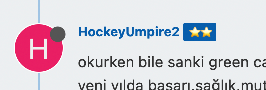
@phenomlab yes, actually, I am using the groups for badges already… it is very similar to the “ranks” you are using here, but rather than words, we went with “stars” , in our forum depending on your post count or upvote count you can get from 1 to 5 stars… and getting 1 star is quite work, because it requires minimum 500 posts or upvotes… for example…
we have 5 stars max.
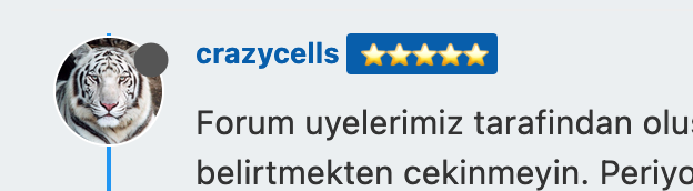
or another member with 2 stars…
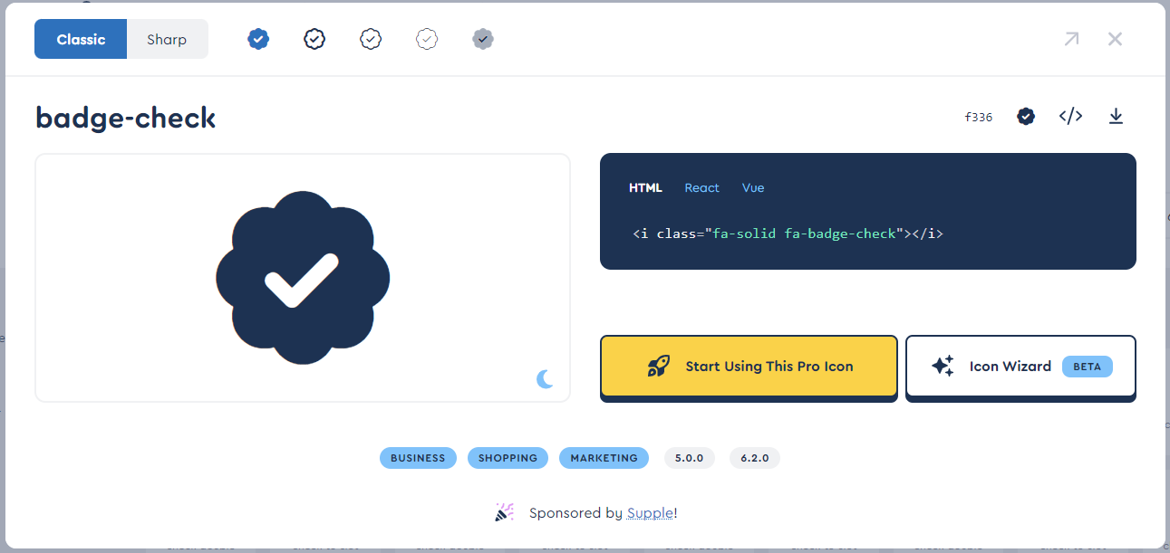
I am still not clear on how to create this badge, but let me first try with CSS codes. I think something similar to a blue check should be enough for us. Unfortunately, we are using the free version of font awesome…
I will get back to you after trying.
@crazycells no issues. Keep me posted. As a side note, would the stars on your forum look better with a transparent background rather than the blue?
Mark – Founder, Phenomlab Ltd
Executive IT & Security Leadership
Phenomlab Ltd -
@crazycells no issues. Keep me posted. As a side note, would the stars on your forum look better with a transparent background rather than the blue?
@phenomlab said in Custom badges:
@crazycells no issues. Keep me posted. As a side note, would the stars on your forum look better with a transparent background rather than the blue?
this color comes from our logo… we have two colors in the logo, blue and red… so we are using this color and red color for all the badges, so it looks compatible with our general theme and most importantly it makes easier to spot the “stars”… this is kind of to encourage more people to contribute and get stars…
gamification works
")
-
@phenomlab said in Custom badges:
@crazycells no issues. Keep me posted. As a side note, would the stars on your forum look better with a transparent background rather than the blue?
this color comes from our logo… we have two colors in the logo, blue and red… so we are using this color and red color for all the badges, so it looks compatible with our general theme and most importantly it makes easier to spot the “stars”… this is kind of to encourage more people to contribute and get stars…
gamification works
@crazycells makes sense !
-
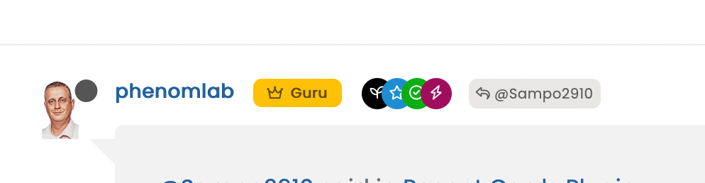
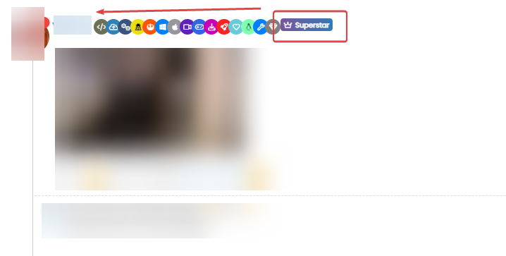
@crazycells I expect the quickest way to do this will be using groups. I do something similar - I have a “verified” group, and once a new member starts engaging, they are added here so I know they are actually who they say they are.
In terms of CSS, I use
.group-label {
    margin-right: -12px;
    margin-top: 1px;
    width: 22px;
    height: 22px;
    border-radius: 11px;
    line-height: 21px;
    display: inline-block;
    vertical-align: middle;
    text-align: center;
    overflow: hidden;
}
small.label.group-label.inline-block i {
    margin-top: 1px;
    margin-left: 0px;
    vertical-align: middle;
    display: flex;
    justify-content: center;
}
It wouldn’t take much effort to get these to look like the blue Twitter check mark.
As a point of interest (and convenience), Font Awesome has something extremely close
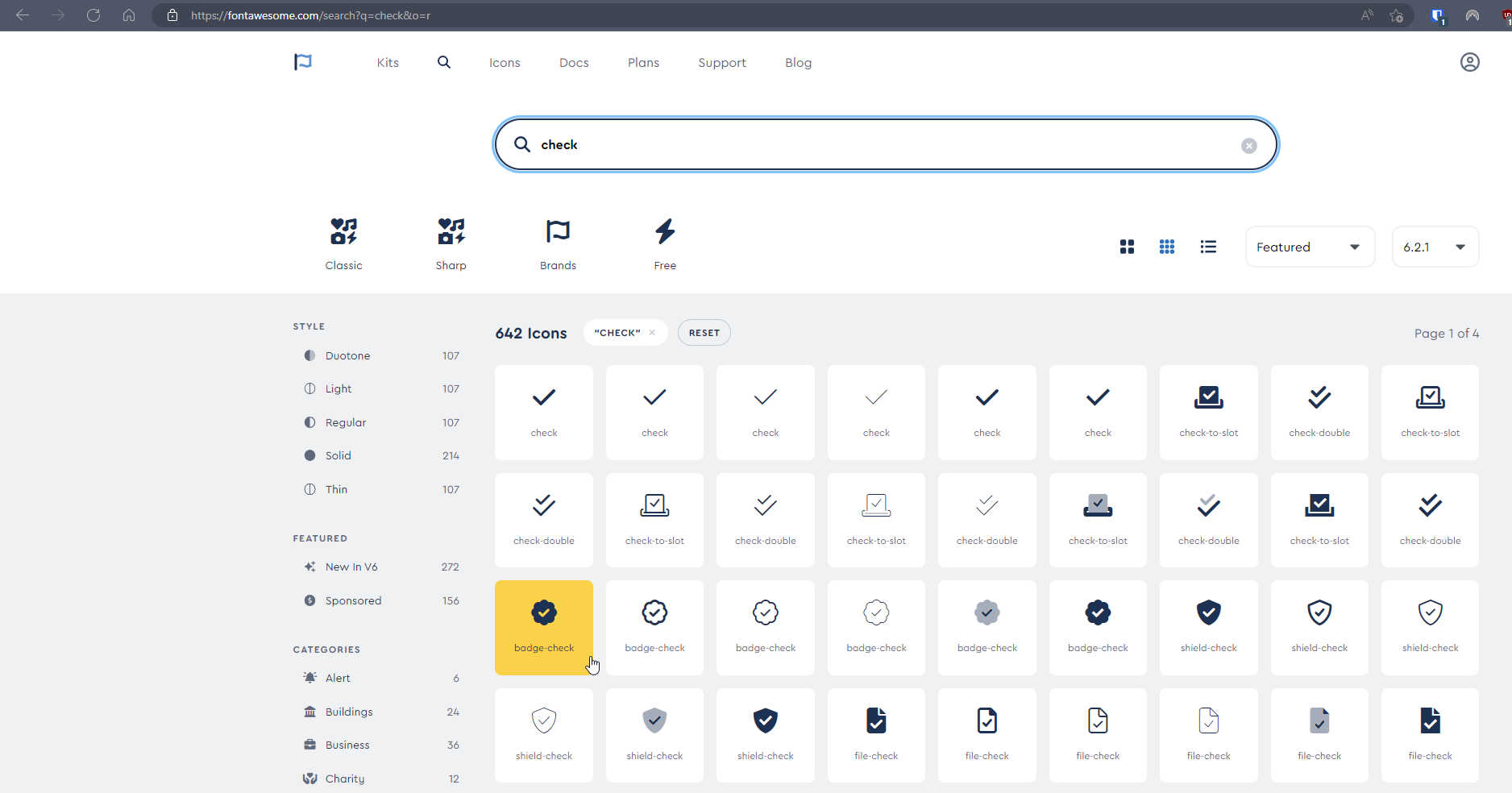
Sadly, it’s part of the PRO set, so unless you have a license, it’s not within reach
However, I have a license, and could easily make a PNG out of this without too much effort for those who don’t (not cheap AT USD 99.00 per year).
If you’d rather not use groups, you can use native CSS, but you are limited in terms of targets. For example, the author badge is easy because you can simply target the
[itemprop="author"]class. However, posts from other users will not have this, and that’s where the groups come to the rescue.If any interest, I can put some code together to show you how this would work.
@phenomlab how can I target one specific group with CSS codes?
With this CSS, other group badges turn into rounds as well. -
@phenomlab how can I target one specific group with CSS codes?
With this CSS, other group badges turn into rounds as well.
actually, it looks very good (quite acceptable for our case
), thanks for the CSS codes; however CSS codes affect other group badges too…group name: verified
how can I restrict CSS codes to this group? I checked the inspector, I can only see group links, but not specific names…
-
@crazycells I expect the quickest way to do this will be using groups. I do something similar - I have a “verified” group, and once a new member starts engaging, they are added here so I know they are actually who they say they are.
In terms of CSS, I use
.group-label {
    margin-right: -12px;
    margin-top: 1px;
    width: 22px;
    height: 22px;
    border-radius: 11px;
    line-height: 21px;
    display: inline-block;
    vertical-align: middle;
    text-align: center;
    overflow: hidden;
}
small.label.group-label.inline-block i {
    margin-top: 1px;
    margin-left: 0px;
    vertical-align: middle;
    display: flex;
    justify-content: center;
}
It wouldn’t take much effort to get these to look like the blue Twitter check mark.
As a point of interest (and convenience), Font Awesome has something extremely close
Sadly, it’s part of the PRO set, so unless you have a license, it’s not within reach
However, I have a license, and could easily make a PNG out of this without too much effort for those who don’t (not cheap AT USD 99.00 per year).
If you’d rather not use groups, you can use native CSS, but you are limited in terms of targets. For example, the author badge is easy because you can simply target the
[itemprop="author"]class. However, posts from other users will not have this, and that’s where the groups come to the rescue.If any interest, I can put some code together to show you how this would work.
Thank you very much for the code.
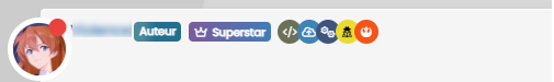
In my case, I would like to display the group labels after the user level label because as it is it’s not very nice
Same for Author Badge
PW and WS Spirit alive
-
Thank you very much for the code.
In my case, I would like to display the group labels after the user level label because as it is it’s not very nice
Same for Author Badge
@DownPW and @crazycells could you let me have URL’s where I can see examples of what you’ve posted?
Mark – Founder, Phenomlab Ltd
Executive IT & Security Leadership
Phenomlab Ltd -
@DownPW and @crazycells could you let me have URL’s where I can see examples of what you’ve posted?
-
@phenomlab Prod server
@DownPW Something like this?
CSS modifications
.topic-owner-post [itemprop="author"] {
    float: left;
}
// Add these to (or edit) the existing classes you have
.user-level-topic {
    float: none;
}
.group-label {
    margin-top: -1px;
}
.topic-owner-post [itemprop="author"]:after {
    margin-top: 1px;
    height: 18px;
}
Mark – Founder, Phenomlab Ltd
Executive IT & Security Leadership
Phenomlab Ltd -
@DownPW Something like this?
CSS modifications
.topic-owner-post [itemprop="author"] { float: left; } // Add these to (or edit) the existing classes you have .user-level-topic { float: none; } .group-label { margin-top: -1px; } .topic-owner-post [itemprop="author"]:after { margin-top: 1px; height: 18px; }yep but I have not the same result as you with this code :
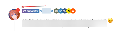
The username is after the userlevel badge

PW and WS Spirit alive
-
yep but I have not the same result as you with this code :
The username is after the userlevel badge
@DownPW Can you put the code back to what I provided? I see you are making changes
Mark – Founder, Phenomlab Ltd
Executive IT & Security Leadership
Phenomlab Ltd -
@DownPW Can you put the code back to what I provided? I see you are making changes
-
@DownPW Thanks. Seems I forgot this
[itemprop="author"] {
    float: left;
}
And this which will fix the overlap on the reply label
.topic [component="post/parent"] {
    margin-left: 15px;
}
Mark – Founder, Phenomlab Ltd
Executive IT & Security Leadership
Phenomlab Ltd -
@DownPW Thanks. Seems I forgot this
[itemprop="author"] {
    float: left;
}
And this which will fix the overlap on the reply label
.topic [component="post/parent"] { margin-left: 15px; }@phenomlab Ha yes very good thanks dude
") You’re the best always
You’re the best always -
actually, it looks very good (quite acceptable for our case
), thanks for the CSS codes; however CSS codes affect other group badges too…group name: verified
how can I restrict CSS codes to this group? I checked the inspector, I can only see group links, but not specific names…
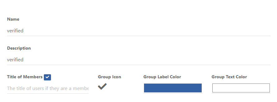
@crazycells Let’s try this
In
/forum/admin/manage/groups/verified, remove the highlighted section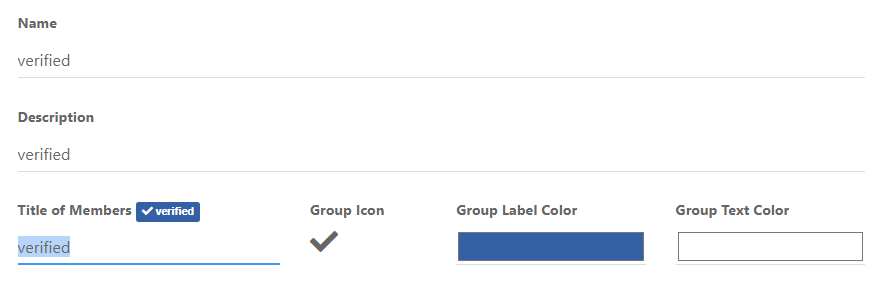
We are then left with no text, but a clearer looking icon
Now remove the previous CSS blocks I provided here
Add replacement CSS
.post-header a[href*="/forum/groups/verified"] {
    margin-right: 3px;
    margin-top: 1px;
    border-radius: 50%;
    line-height: 20px;
    display: inline-block;
    vertical-align: middle;
    text-align: center;
    overflow: hidden;
}
small.label.group-label.inline-block i {
    margin-top: 1px;
    margin-left: 0px;
    vertical-align: middle;
    justify-content: center;
    display: flex;
}
.post-header a[href*="/forum/groups/verified"] .group-label {
    min-width: 20px;
    display: flex;
    justify-content: center;
}
.group-label {
    vertical-align: -6px;
}
You should land up with something like this
As you can see, this forces the stars out of alignment, but I don’t think this is too much of a sacrifice, and could be remediated with additional targeted CSS if need be.
Essentially, because NodeBB doesn’t provide an
idfield (which would be a lot easier), we have to use wildcard CSS such as.post-header a[href*="/forum/groups/verified"]but make it targeted in the sense that it will only fire if it is part of the post stream, hence.post-headerat the beginning.We then use
.post-header a[href*="/forum/groups/verified"] .group-labelto target the actual label (but only when we have a wildcard match in the CSS) meaning we can set a minimum width so that the circle doesn’t look quashed (we need to validate this on Firefox though as additional CSS might be required due to how thewebkitengine will render this in contrast tomozilla).Finally, we use
.group-labelto force alignment in terms of height to prevent it wandering out of theinline-block.This is already active on your forum, so nothing for you to do but (hopefully) admire
Let me know.
Mark – Founder, Phenomlab Ltd
Executive IT & Security Leadership
Phenomlab Ltd -
 undefined phenomlab referenced this topic on
-
@crazycells Let’s try this
In
/forum/admin/manage/groups/verified, remove the highlighted sectionWe are then left with no text, but a clearer looking icon
Now remove the previous CSS blocks I provided here
Add replacement CSS
.post-header a[href*="/forum/groups/verified"] {
    margin-right: 3px;
    margin-top: 1px;
    border-radius: 50%;
    line-height: 20px;
    display: inline-block;
    vertical-align: middle;
    text-align: center;
    overflow: hidden;
}
small.label.group-label.inline-block i {
    margin-top: 1px;
    margin-left: 0px;
    vertical-align: middle;
    justify-content: center;
    display: flex;
}
.post-header a[href*="/forum/groups/verified"] .group-label {
    min-width: 20px;
    display: flex;
    justify-content: center;
}
.group-label {
    vertical-align: -6px;
}
You should land up with something like this
As you can see, this forces the stars out of alignment, but I don’t think this is too much of a sacrifice, and could be remediated with additional targeted CSS if need be.
Essentially, because NodeBB doesn’t provide an
idfield (which would be a lot easier), we have to use wildcard CSS such as.post-header a[href*="/forum/groups/verified"]but make it targeted in the sense that it will only fire if it is part of the post stream, hence.post-headerat the beginning.We then use
.post-header a[href*="/forum/groups/verified"] .group-labelto target the actual label (but only when we have a wildcard match in the CSS) meaning we can set a minimum width so that the circle doesn’t look quashed (we need to validate this on Firefox though as additional CSS might be required due to how thewebkitengine will render this in contrast tomozilla).Finally, we use
.group-labelto force alignment in terms of height to prevent it wandering out of theinline-block.This is already active on your forum, so nothing for you to do but (hopefully) admire
Let me know.
Just one things my friend.
I search a css class for display groupname on group icons mouse over but don’t find it.
if you have that in your hat I’m a takerPW and WS Spirit alive
-
Just one things my friend.
I search a css class for display groupname on group icons mouse over but don’t find it.
if you have that in your hat I’m a taker@DownPW Mmmmm, yes, the fastest way to do that would be to use the
titleattribute. Bootstrap has native support for that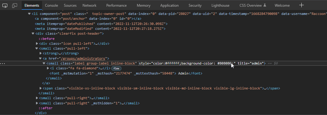
If you added this attribute then hovered over the element, you’d see this
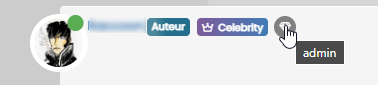
It’s possible to write
jQueryto handle this - aside from that, you’d need to hack into the post template which I wouldn’t recommend. There isn’t any native CSS that will do this for you sadly, so thetitle=""attribute is the best way forward but won’t do anything without custom JS.EDIT - I actually have a requirement for this myself, so will probably write some code to do it over the coming days/weeks (really depending on how much free time I have).
Mark – Founder, Phenomlab Ltd
Executive IT & Security Leadership
Phenomlab Ltd -
@crazycells Let’s try this
In
/forum/admin/manage/groups/verified, remove the highlighted sectionWe are then left with no text, but a clearer looking icon
Now remove the previous CSS blocks I provided here
Add replacement CSS
.post-header a[href*="/forum/groups/verified"] {
    margin-right: 3px;
    margin-top: 1px;
    border-radius: 50%;
    line-height: 20px;
    display: inline-block;
    vertical-align: middle;
    text-align: center;
    overflow: hidden;
}
small.label.group-label.inline-block i {
    margin-top: 1px;
    margin-left: 0px;
    vertical-align: middle;
    justify-content: center;
    display: flex;
}
.post-header a[href*="/forum/groups/verified"] .group-label {
    min-width: 20px;
    display: flex;
    justify-content: center;
}
.group-label {
    vertical-align: -6px;
}
You should land up with something like this
As you can see, this forces the stars out of alignment, but I don’t think this is too much of a sacrifice, and could be remediated with additional targeted CSS if need be.
Essentially, because NodeBB doesn’t provide an
idfield (which would be a lot easier), we have to use wildcard CSS such as.post-header a[href*="/forum/groups/verified"]but make it targeted in the sense that it will only fire if it is part of the post stream, hence.post-headerat the beginning.We then use
.post-header a[href*="/forum/groups/verified"] .group-labelto target the actual label (but only when we have a wildcard match in the CSS) meaning we can set a minimum width so that the circle doesn’t look quashed (we need to validate this on Firefox though as additional CSS might be required due to how thewebkitengine will render this in contrast tomozilla).Finally, we use
.group-labelto force alignment in terms of height to prevent it wandering out of theinline-block.This is already active on your forum, so nothing for you to do but (hopefully) admire
Let me know.
@phenomlab thank you very much
it looks great! -
 undefined crazycells has marked this topic as solved on
-
@DownPW Mmmmm, yes, the fastest way to do that would be to use the
titleattribute. Bootstrap has native support for thatIf you added this attribute then hovered over the element, you’d see this
It’s possible to write
jQueryto handle this - aside from that, you’d need to hack into the post template which I wouldn’t recommend. There isn’t any native CSS that will do this for you sadly, so thetitle=""attribute is the best way forward but won’t do anything without custom JS.EDIT - I actually have a requirement for this myself, so will probably write some code to do it over the coming days/weeks (really depending on how much free time I have).
@phenomlab said in Custom badges:
It’s possible to write jQuery to handle this - aside from that, you’d need to hack into the post template which I wouldn’t recommend. There isn’t any native CSS that will do this for you sadly, so the title=“” attribute is the best way forward but won’t do anything without custom JS.
EDIT - I actually have a requirement for this myself, so will probably write some code to do it over the coming days/weeks (really depending on how much free time I have).very clever the addition of this “Title=” attribute, I would not have thought of it myself !! Cheer !!
This is exactly the result I’m looking for !
I don’t even know why, I’m not amazed at your prowess anymoreExcellent
-
@phenomlab thank you very much
it looks great!@phenomlab lol verified badge changed here as well
is there an easy CSS code to make it look more like a flower, rather than perfectly round? (just like the Twitter one)
Hello! It looks like you're interested in this conversation, but you don't have an account yet.
Getting fed up of having to scroll through the same posts each visit? When you register for an account, you'll always come back to exactly where you were before, and choose to be notified of new replies (either via email, or push notification). You'll also be able to save bookmarks and upvote posts to show your appreciation to other community members.
With your input, this post could be even better 💗
Register LoginDid this solution help you?
Related Topics
-
-
-
-
-
Podcast Share NodeBB
Solved Configure -
-
-