[NODEBB] CSS Style Sheets SelectBox
-
-
@downpw I’ve been able to get somewhere near this with the below custom function I’ve written
	    $(window).on('action:ajaxify.end', function(data) {
	        // Detect if the theme dropdown has been clicked. If it has, change the color to #000000
	        $("#switcher").on("click", function() {
	            $("#switcher i").css("color", "#000000");
	        });
	        // Detect if the theme dropdown has lost focus (clicked something else). If it has, change the color to #FFFFFF
	        $("#switcher").on("focusout", function() {
	            $("#switcher i").css("color", "#ffffff");
	        });
	    });
Test it and let me know ? I’ve already added it, so you don’t need to do anything.
-
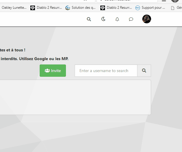
It seems to be better when dropdown
")
But when I lost focus, sometimes the icon don’t back again:Example here :

EDIT : see, I have recorded a gif
The problem came on default theme too but it’s normal because it’s a javascript for all the site
PW and WS Spirit alive
-
It seems to be better when dropdown
But when I lost focus, sometimes the icon don’t back again:Example here :
EDIT : see, I have recorded a gif
The problem came on default theme too but it’s normal because it’s a javascript for all the site
@downpw thanks. Might need some tweaking to get it 100% but it’s a start. Will have a more detailed look at this as time permits. I’m back at work as of Monday
 ️
️Mark – Founder, Phenomlab Ltd
Executive IT & Security Leadership
Phenomlab Ltd -
@downpw thanks. Might need some tweaking to get it 100% but it’s a start. Will have a more detailed look at this as time permits. I’m back at work as of Monday
️ -
@phenomlab Of course it is a very good basis for work.
@downpw Small modification to address the default theme icon bug (displayed white when focus lost, when it should be black)
// Bugfix theme switcher button when dropdown / Focus / Not focus
$(window).on('action:ajaxify.end', function(data) {
    var whichTheme = localStorage.getItem("theme");
    if (whichTheme === '') {
        // Assume default theme and set icon color to #000000
        $("#switcher i").css("color", "#000000");
    }
    if (whichTheme !== '') {
        // Assume color theme and set icon color to #ffffff
        $("#switcher i").css("color", "#ffffff");
    }
    // Detect if the theme dropdown has been clicked. If it has, change the color to #000000
    $("#switcher").on("click", function() {
        $("#switcher i").css("color", "#000000");
    });
    // Detect if the theme dropdown has lost focus (clicked something else). If it has, change the color to #FFFFFF
    $("#switcher").on("focusout", function() {
        $("#switcher i").css("color", "#ffffff");
    });
});
Active now, and should also address the other bug you mentioned.
Mark – Founder, Phenomlab Ltd
Executive IT & Security Leadership
Phenomlab Ltd -
@downpw Small modification to address the default theme icon bug (displayed white when focus lost, when it should be black)
// Bugfix theme switcher button when dropdown / Focus / Not focus
$(window).on('action:ajaxify.end', function(data) {
    var whichTheme = localStorage.getItem("theme");
    if (whichTheme === '') {
        // Assume default theme and set icon color to #000000
        $("#switcher i").css("color", "#000000");
    }
    if (whichTheme !== '') {
        // Assume color theme and set icon color to #ffffff
        $("#switcher i").css("color", "#ffffff");
    }
    // Detect if the theme dropdown has been clicked. If it has, change the color to #000000
    $("#switcher").on("click", function() {
        $("#switcher i").css("color", "#000000");
    });
    // Detect if the theme dropdown has lost focus (clicked something else). If it has, change the color to #FFFFFF
    $("#switcher").on("focusout", function() {
        $("#switcher i").css("color", "#ffffff");
    });
});
Active now, and should also address the other bug you mentioned.
I have tested but sorry it’s the same problem.
PW and WS Spirit alive
-
I have tested but sorry it’s the same problem.
@downpw Can you reload the page and try again.
-
Yeah i delete cache and Ctrl + F5
The problem come when I don’t click on fa-fw but background.
Like this :

On fa-fw = No problem
PW and WS Spirit alive
-
Yeah i delete cache and Ctrl + F5
The problem come when I don’t click on fa-fw but background.
Like this :
On fa-fw = No problem
@downpw Ok, do the default theme issue is fixed, but you still see the white icon when clicking the background and not the icon itself ?
-
Yeah i delete cache and Ctrl + F5
The problem come when I don’t click on fa-fw but background.
Like this :
On fa-fw = No problem
@downpw Try now
-
nope it’s the same even on fa-fw and default theme
but as you are connected you have to see it.
PW and WS Spirit alive
-
nope it’s the same even on fa-fw and default theme
but as you are connected you have to see it.
@downpw Right. I think I finally have this working
")
I’ve added this into your global CSS - don’t delete it
.themeon {
    color: #000000 !important;
}
.themeoff {
    color: #ffffff !important;
}
Final modified JS
// Bugfix theme switcher button when dropdown / Focus / Not focus
	$(document).ready(function () {
	// First, detect which theme is in use
    var whichTheme = localStorage.getItem("theme");
    // Is the target dropdown expanded ? Use aria-expanded for this as it populates into the DOM on change making it easier to work with.
    // If it is expanded, then we set the icon to WHITE with CSS class "themeon"
      if ($('#theme_dropdown').attr('aria-expanded') === "true") {
         $("#switcher i").addClass("themeon");
      }
    // If it is collapsed, then we set the icon to BLACK with CSS class "themeoff"
      if ($('#theme_dropdown').attr('aria-expanded') === "false") {
         $("#switcher i").addClass("themeoff");
      }
      // If we are using the default theme, deploy CSS "themeoff" and set the icon to BLACK
          if (whichTheme === '') {
      // If no other matches, assume the default theme, deploy CSS "themeoff" and set the icon to BLACK
         $("#switcher i").removeClass("themeoff");
    }
});
According to my testing, this works
-
clear and simple explanations.
PerfectI don’t know if I should say this but… I love you ha ha

PW and WS Spirit alive
-
clear and simple explanations.
PerfectI don’t know if I should say this but… I love you ha ha
@downpw Some last changes to address small bugs. The below CSS has been added
/* DO NOT DELETE THESE LINES */
[aria-expanded="true"] a #ticon {
    color: #000000;
}

.themeon {
    color: #ffffff !important;
}
.themeoff {
    color: #000000 !important;
}
And also to the mobile block
/* DO NOT DELETE THESE LINES */
[aria-expanded="true"] a #ticon {
    color: #ffffff;
}
.themeoff {
    color: #ffffff !important;
}
Finally, a new function
// When hovering over the #switcher element, target the i class and add 'themeoff'
  $(document).on('mouseenter','#switcher', function() {
		$('#switcher i').addClass("themeoff");
});
// When leaving the however state, target the i class and remove 'themeoff'
  $(document).on('mouseleave','#switcher', function() {
		$('#switcher i').removeClass("themeoff");
});
This block should be deleted
/* // Bugfix theme switcher button when dropdown / Focus / Not focus $(document).ready(function () { // First, detect which theme is in use // Tout d'abord, on détecte quel thème est utilisé var whichTheme = localStorage.getItem("theme"); // Is the target dropdown expanded ? Use aria-expanded for this as it populates into the DOM on change making it easier to work with. // If it is expanded, then we set the icon to WHITE with CSS class "themeon" // On utilise "aria-expanded" pour savoir si le menu déroulant est actif/dévelopé car la variable se remplit dans le DOM en cas de changement, ce qui facilite le travail avec. // Si le menu est actif/dévelopé, on définit l'icône en BLANC avec la classe CSS "themeon" if ($('#theme_dropdown').attr('aria-expanded') === "true") { $("#switcher i").addClass("themeon"); } // If it is collapsed, then we set the icon to BLACK with CSS class "themeoff" // S'il est réduit/non actif, nous définissons l'icône sur NOIR avec la classe CSS "themeoff" if ($('#theme_dropdown').attr('aria-expanded') === "false") { console.log("Theme selector is not active"); $("#switcher i").addClass("themeoff"); } // If we are using the default theme, deploy CSS "themeoff" and set the icon to BLACK // Si on utilise le thème par défaut, on utilise le CSS "themeoff" et on définit l'icône sur NOIR if (whichTheme === '') { // If no other matches, assume the default theme, deploy CSS "themeoff" and set the icon to BLACK // Si rien ne correspond, on utilise le thème par défaut, on utilise le CSS "themeoff" et on définit l'icône sur NOIR $("#switcher i").removeClass("themeoff"); } }); */ -
 undefined DownPW referenced this topic on
-
It’s possible to add a reload at the end of the script ?
Because, I just saw this:
if certain CSSS variables are declared in one theme and not in the other, when I Switch themes, the CSS was applied but not correctly. If i refresh it’s OK.
I seem to have 2 solutions:
-
Declare all variables in each theme even if they are not used in others (with or without !important)
-
Reload the page after selecting a theme.
Or maybe you have another solution.
PW and WS Spirit alive
-
-
It’s possible to add a reload at the end of the script ?
Because, I just saw this:
if certain CSSS variables are declared in one theme and not in the other, when I Switch themes, the CSS was applied but not correctly. If i refresh it’s OK.
I seem to have 2 solutions:
-
Declare all variables in each theme even if they are not used in others (with or without !important)
-
Reload the page after selecting a theme.
Or maybe you have another solution.
@downpw in most cases, the best way to handle this is to strip one CSS file before you add the other. However, as your CSS file is actually an extension of the main theme (in the sense that stock theme provides default variables and your custom theme overrides these), this will not work as the required CSS for the site to run properly will be missing.
Reloading the site will work, but it’s not really the way to go as all the resources will need to be loaded again, and this defeats the purpose of jQuery in the sense that it is Ajax backed meaning the DOM should already contain the targets to be changed.
If reloading solves the issue, then ok. Admittedly, we have to do this with the default theme when selected to ensure we strip all previously loaded CSS from the custom themes.
-
-
@DownPW as discussed in PM
Seems to have been solved with the new JS code that you added allowing the version CSS file change!!
Cache problem therefore with the JS of the Switcher theme
Based on this, I will close this thread and reference
https://sudonix.com/topic/207/nodebb-help-for-my-custom-css/27 -
 undefined phenomlab locked this topic on
-
undefined DownPW referenced this topic on
-
 undefined elhana fine referenced this topic on
-
 undefined Teemberland referenced this topic on
Hello! It looks like you're interested in this conversation, but you don't have an account yet.
Getting fed up of having to scroll through the same posts each visit? When you register for an account, you'll always come back to exactly where you were before, and choose to be notified of new replies (either via email, or push notification). You'll also be able to save bookmarks and upvote posts to show your appreciation to other community members.
With your input, this post could be even better 💗
Register LoginDid this solution help you?
Related Topics
-
-
-
-
-
Fontawesome 5
Unsolved Customisation -
-
-
NodeBB Footer
Solved Customisation

