problem with search page and copyright in footer
-
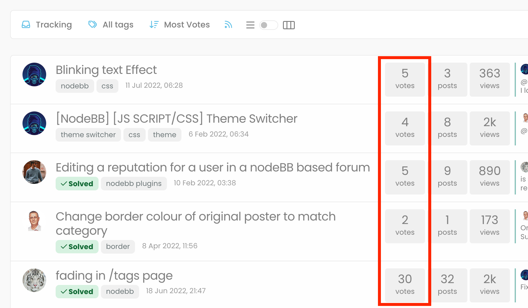
Hi @phenomlab , I cannot click any of the options on the top right side except “tags” button… those buttons cannot be clicked, so I cannot filter the search results…

additionally, it is not that important, it could be nicer if we can see the top of the “search” title on left top corner…
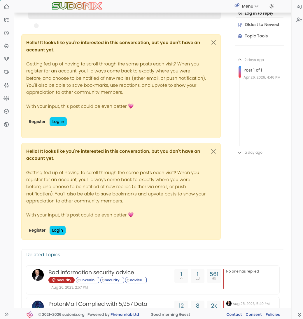
@crazycells additionally, it is still not that important, but I believe the info “
 2021-2023 sudonix.org” at the bottom of the page should be 2024… at some point we should stop living in the past and seize the future lol
-
Hi @phenomlab , I cannot click any of the options on the top right side except “tags” button… those buttons cannot be clicked, so I cannot filter the search results…

additionally, it is not that important, it could be nicer if we can see the top of the “search” title on left top corner…
@crazycells This should be fixed now
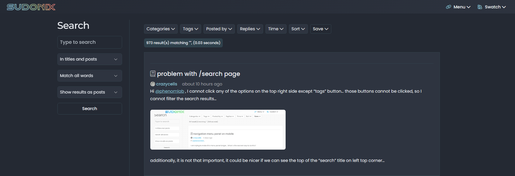
It’s caused by the addition of breadcrumbs into the Harmony theme which alters the page layout. Sudonix uses a heavily customised theme

@crazycells said in problem with /search page:
additionally, it is still not that important, but I believe the info “ 2021-2023 sudonix.org” at the bottom of the page should be 2024… at some point we should stop living in the past and seize the future lol
Good catch. This has been fixed also using
jsto calculate the current year so it will roll forward itself in future.<script> document.getElementById("year").innerHTML = new Date().getFullYear(); </script><div class="copyright">© 2021-<span id="year"></span> sudonix.org</div>
-
i can not do it Mark.
-
@cagatay Which part?
-
this one

-
@cagatay That’s in the footer widget on your site. You need to add the
jsat the bottom of the page including the<script>and</script>tags plus all text in between those, then modify the line I referenced with the updated code. -
code is not working in my js
<script> document.getElementById("year").innerHTML = new Date().getFullYear(); </script> -
code is not working in my js
<script> document.getElementById("year").innerHTML = new Date().getFullYear(); </script>@cagatay Should work now. The code
<script> document.getElementById("year").innerHTML = new Date().getFullYear(); </script>Needs to be placed at the bottom of the footer widget code

-
 undefined phenomlab marked this topic as a question on
-
 undefined phenomlab has marked this topic as solved on
-
mm i added it on js code side ,.) thank you Mark see you did it.
-
@cagatay if you added it into the ‘js’ custom code area you should remove it from there.
-
no deleted nothing there.
-
@crazycells This should be fixed now

It’s caused by the addition of breadcrumbs into the Harmony theme which alters the page layout. Sudonix uses a heavily customised theme

@crazycells said in problem with /search page:
additionally, it is still not that important, but I believe the info “ 2021-2023 sudonix.org” at the bottom of the page should be 2024… at some point we should stop living in the past and seize the future lol
Good catch. This has been fixed also using
jsto calculate the current year so it will roll forward itself in future.<script> document.getElementById("year").innerHTML = new Date().getFullYear(); </script><div class="copyright">© 2021-<span id="year"></span> sudonix.org</div>
@phenomlab yes, search page is fixed
 thanks
Hello! It looks like you're interested in this conversation, but you don't have an account yet.
Getting fed up of having to scroll through the same posts each visit? When you register for an account, you'll always come back to exactly where you were before, and choose to be notified of new replies (either via email, or push notification). You'll also be able to save bookmarks and upvote posts to show your appreciation to other community members.
With your input, this post could be even better 💗
Register Login

