The theme came with space on left side
-
I have been testing a couple of themes and for sure i love the current one that is installed, its called iwata. The problem i am having is the theme has a space on the left side. It’s like a sort of menu that displays date’s e.t.c
This space has been bagging my head since there are some areas where the page do not have the details like for dates and so the page is still squeezed and the left side is empty.
This appears to only be happening when using the site on desktop. I appreciate a better a way if you can figure out the better way we can handle the post page, pages of all site, maybe a css? https://sopriza.com/
-
@phenomlab yes it’s a different theme. The other one was not offering much on editable sidebar. It was like flarum hahah
-
I have been testing a couple of themes and for sure i love the current one that is installed, its called iwata. The problem i am having is the theme has a space on the left side. It’s like a sort of menu that displays date’s e.t.c
This space has been bagging my head since there are some areas where the page do not have the details like for dates and so the page is still squeezed and the left side is empty.
This appears to only be happening when using the site on desktop. I appreciate a better a way if you can figure out the better way we can handle the post page, pages of all site, maybe a css? https://sopriza.com/
@Sala It appears to be caused by the below
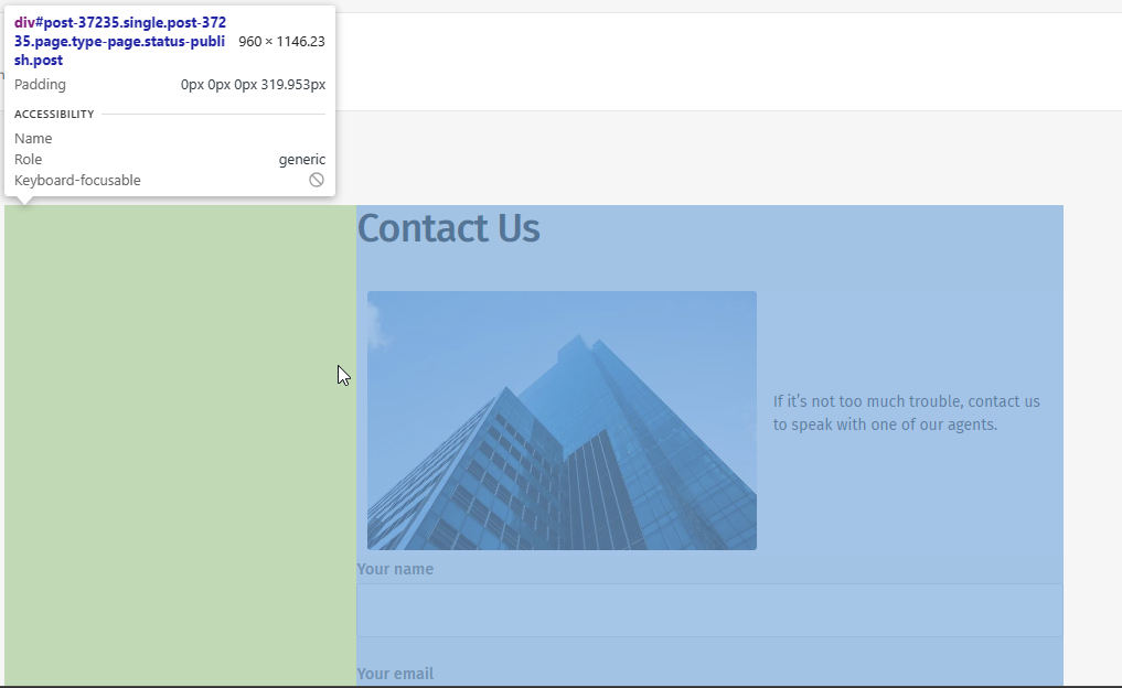
As you can see, there is a large section of empty space to the left, although if you look at the other pages, this area is used (as you indicate) for dates etc. It’s likely that this specific page uses a template which can be changed by accessing the page itself in WordPress and changing the template in use.
I wouldn’t recommend changing anything with CSS without looking at the theme’s structure first as this is likely to have a knock-on effect for the remainder of the site.
Mark Cutting also advises organisations as a Fractional CIO, Fractional CISO and Executive Advisor, helping boards improve technology governance, cyber resilience and executive decision making. Learn more at Gratmore Ltd
-
@Sala It appears to be caused by the below
As you can see, there is a large section of empty space to the left, although if you look at the other pages, this area is used (as you indicate) for dates etc. It’s likely that this specific page uses a template which can be changed by accessing the page itself in WordPress and changing the template in use.
I wouldn’t recommend changing anything with CSS without looking at the theme’s structure first as this is likely to have a knock-on effect for the remainder of the site.
@phenomlab Yes i agree on that, changing the css would affect the alignment of content with the menu buttons for the whole site which will look bad.
From the screenshot i can tell that the #div number is a post number of the page. Now in the situation where you would like to utilize the space maybe by adding a vertical ad only to show for desktop, how you going to do it?
For example
<ins class="adsbygoogle" style="display: inline-block; text-align:center; width: 100%; height: **963px**;" data-ad-client="ca-pub-54985644" data-ad-slot="4577896"></ins>Bdw here is the whole 800kb theme zipped
I also ask myself, how will that ad be placed on the left side for all articles if we’re going to use post numbers?
-
@phenomlab Yes i agree on that, changing the css would affect the alignment of content with the menu buttons for the whole site which will look bad.
From the screenshot i can tell that the #div number is a post number of the page. Now in the situation where you would like to utilize the space maybe by adding a vertical ad only to show for desktop, how you going to do it?
For example
<ins class="adsbygoogle" style="display: inline-block; text-align:center; width: 100%; height: **963px**;" data-ad-client="ca-pub-54985644" data-ad-slot="4577896"></ins>Bdw here is the whole 800kb theme zipped
I also ask myself, how will that ad be placed on the left side for all articles if we’re going to use post numbers?
@Sala Before we do anything else, we need to understand how the Post ID is being generated - see below from the contact page
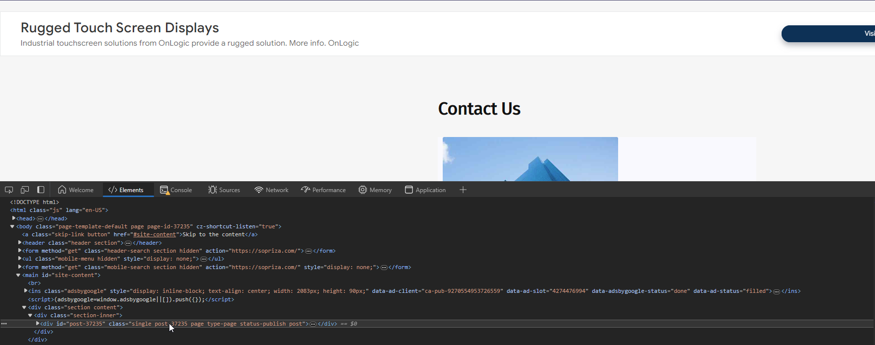
If these are being generated dynamically, they will be difficult to target. However, if they correlate to actual ID’s being stored in the database, then this will be simpler. I will need access to your site as an admin to be able to determine this.
Mark Cutting also advises organisations as a Fractional CIO, Fractional CISO and Executive Advisor, helping boards improve technology governance, cyber resilience and executive decision making. Learn more at Gratmore Ltd
-
@Sala Before we do anything else, we need to understand how the Post ID is being generated - see below from the contact page
If these are being generated dynamically, they will be difficult to target. However, if they correlate to actual ID’s being stored in the database, then this will be simpler. I will need access to your site as an admin to be able to determine this.
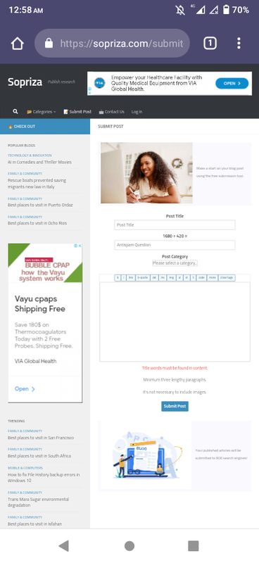
@phenomlab lol, although i used a mobile device, this time i was able to divide the sidebars and came up with something really cool. Check it out
-
@phenomlab lol, although i used a mobile device, this time i was able to divide the sidebars and came up with something really cool. Check it out
@Sala This looks like a different theme?
Mark Cutting also advises organisations as a Fractional CIO, Fractional CISO and Executive Advisor, helping boards improve technology governance, cyber resilience and executive decision making. Learn more at Gratmore Ltd
-
@phenomlab yes it’s a different theme. The other one was not offering much on editable sidebar. It was like flarum hahah
-
 undefined Sala has marked this topic as solved on

Hello! It looks like you're interested in this conversation, but you don't have an account yet.
Getting fed up of having to scroll through the same posts each visit? When you register for an account, you'll always come back to exactly where you were before, and choose to be notified of new replies (either via email, or push notification). You'll also be able to save bookmarks and upvote posts to show your appreciation to other community members.
With your input, this post could be even better 💗
Register Login