Footer bar add center text

-
@phenomlab On floatright ?
-
@DownPW sorry. Try either
display: inline;Or
display: inline-block;You might need
!importantdepending on cascading settingsEdit - for clarity, this should be in the
#floatcenterblockMark – Founder, Phenomlab Ltd
Executive IT & Security Leadership
Phenomlab Ltd -
@DownPW sorry. Try either
display: inline;Or
display: inline-block;You might need
!importantdepending on cascading settingsEdit - for clarity, this should be in the
#floatcenterblockHoura, it’s OK with inline-block
On the other hand, I see that the text is well centered in the div but I notice that the div itself is not centered.
Indeed I see a substantial space between the floatcenter div and floatright div.
You can see it in the screenshot below.
Again my HTML/CSS
<div id="floatcenter"> Some centered text
    </div>
#floatcenter { bottom: 1px; font-size: 90%; line-height: 2.3; font-weight: bold; color: #666666 !important; margin: auto auto; text-align: center; width: 50%; display: inline-block !important; }PW and WS Spirit alive
-
Houra, it’s OK with inline-block
On the other hand, I see that the text is well centered in the div but I notice that the div itself is not centered.
Indeed I see a substantial space between the floatcenter div and floatright div.
You can see it in the screenshot below.Again my HTML/CSS
<div id="floatcenter"> Some centered text
    </div>
#floatcenter { bottom: 1px; font-size: 90%; line-height: 2.3; font-weight: bold; color: #666666 !important; margin: auto auto; text-align: center; width: 50%; display: inline-block !important; }@DownPW strange. I don’t recall seeing that issue when I created this using the console live on your site. This is likely due to
widthconstraints on the parentdiv.In the above CSS you could try to set
widthtoautorather than50%, but then you will need to setwidth: 100%;on the parentdivMark – Founder, Phenomlab Ltd
Executive IT & Security Leadership
Phenomlab Ltd -
@DownPW strange. I don’t recall seeing that issue when I created this using the console live on your site. This is likely due to
widthconstraints on the parentdiv.In the above CSS you could try to set
widthtoautorather than50%, but then you will need to setwidth: 100%;on the parentdivI have test with
width: 50%;, I have the floatright OK with not space like before but the text is not centered.
PW and WS Spirit alive
-
I have test with
width: 50%;, I have the floatright OK with not space like before but the text is not centered.@DownPW ok. Let me have a look at this later. Can you leave everything as it is - I know it doesn’t look right but I want to make sure the right css is provided for the html you are using and it’s easier to do this live.
Perhaps set the floatcenter element to be hidden for the time being?
Mark – Founder, Phenomlab Ltd
Executive IT & Security Leadership
Phenomlab Ltd -
@DownPW ok. Let me have a look at this later. Can you leave everything as it is - I know it doesn’t look right but I want to make sure the right css is provided for the html you are using and it’s easier to do this live.
Perhaps set the floatcenter element to be hidden for the time being?
Yep I will set
display: noneon floatcenter div for waitingI notice I can centered the text when I play with
margin-leftfor example but is not auto-centered according to the textIt’s still better but I would like it to center automatically based on the text rather than manually.
we will get there
PW and WS Spirit alive
-
Yep I will set
display: noneon floatcenter div for waitingI notice I can centered the text when I play with
margin-leftfor example but is not auto-centered according to the textIt’s still better but I would like it to center automatically based on the text rather than manually.
we will get there
@DownPW Ok, try this
#floatcenter {
    bottom: 1px;
    font-size: 90%;
    line-height: 2.3;
    font-weight: bold;
    color: #666666 !important;
    margin: 0 auto;
    text-align: center !important;
    max-width: 50%;
}
#floatright {
    float: right;
    bottom: 1px;
    font-size: 90%;
    line-height: 2.3;
    display: flex;
    position: sticky;
}
Don’t add to the CSS blocks you have - you need to replace them. This should yield the below - see the position markers - the lilac is centered on the screen, whilst the other two
divtags occupy the remainder.
There is a caveat in the sense that this doesn’t scale very well - mostly because of the existing
position: fixed;and the need to setposition: sticky;on the right-most element of#floatright. Based on this, it would be sensible to hide#floatcenteron the mobile breakpoints to prevent the text from overlapping.Mark – Founder, Phenomlab Ltd
Executive IT & Security Leadership
Phenomlab Ltd -
@DownPW Ok, try this
#floatcenter {
    bottom: 1px;
    font-size: 90%;
    line-height: 2.3;
    font-weight: bold;
    color: #666666 !important;
    margin: 0 auto;
    text-align: center !important;
    max-width: 50%;
}
#floatright {
    float: right;
    bottom: 1px;
    font-size: 90%;
    line-height: 2.3;
    display: flex;
    position: sticky;
}
Don’t add to the CSS blocks you have - you need to replace them. This should yield the below - see the position markers - the lilac is centered on the screen, whilst the other two
divtags occupy the remainder.There is a caveat in the sense that this doesn’t scale very well - mostly because of the existing
position: fixed;and the need to setposition: sticky;on the right-most element of#floatright. Based on this, it would be sensible to hide#floatcenteron the mobile breakpoints to prevent the text from overlapping.Ah ok you play with
max-width: 50%;on floatcenter andposition: sticky;on floatrightThat’s smart
") I didn’t necessarily think of that.
I didn’t necessarily think of that.
The result is perfect except on smartphone as you said.
–> I tried this as usual but it doesn’t work. An idea?
@media (max-width: 768px) {
    #floatcenter {
        display: none !important;
    }
}
EDIT: Yep this code works for not display floatcenter div. I must find for floatright div
EDIT2: Ok @phenomlab with floatright div with this code :@media (max-width: 767px) { #floatright { float: right; bottom: 1px; font-size: 90%; line-height: 2.3; display: flex !important; position: static; } }If you have a better solution tell me Mark
A big big thank you bro

PW and WS Spirit alive
-
Ah ok you play with
max-width: 50%;on floatcenter andposition: sticky;on floatrightThat’s smart
I didn’t necessarily think of that.
The result is perfect except on smartphone as you said.
–> I tried this as usual but it doesn’t work. An idea?
@media (max-width: 768px) {
    #floatcenter {
        display: none !important;
    }
}
EDIT: Yep this code works for not display floatcenter div. I must find for floatright div
EDIT2: Ok @phenomlab with floatright div with this code :@media (max-width: 767px) { #floatright { float: right; bottom: 1px; font-size: 90%; line-height: 2.3; display: flex !important; position: static; } }If you have a better solution tell me Mark
A big big thank you bro
@DownPW that should work - unless it’s inherited higher up in the cascade. If you resize the browser to match a mobile device, does it appear in the DOM?
-
Ah ok you play with
max-width: 50%;on floatcenter andposition: sticky;on floatrightThat’s smart
I didn’t necessarily think of that.
The result is perfect except on smartphone as you said.
–> I tried this as usual but it doesn’t work. An idea?
@media (max-width: 768px) {
    #floatcenter {
        display: none !important;
    }
}
EDIT: Yep this code works for not display floatcenter div. I must find for floatright div
EDIT2: Ok @phenomlab with floatright div with this code :@media (max-width: 767px) { #floatright { float: right; bottom: 1px; font-size: 90%; line-height: 2.3; display: flex !important; position: static; } }If you have a better solution tell me Mark
A big big thank you bro
@DownPW said in Footer bar add center text:
If you have a better solution tell me Mark
A big big thank you broNo, that should work and it’s a good mix. Just watch for very large displays as you may get unexpected placing of elements, but I doubt anyone will ever encounter this unless they run their browser using the entire screen estate.
Highly unlikely I think.
Mark – Founder, Phenomlab Ltd
Executive IT & Security Leadership
Phenomlab Ltd -
@DownPW said in Footer bar add center text:
If you have a better solution tell me Mark
A big big thank you broNo, that should work and it’s a good mix. Just watch for very large displays as you may get unexpected placing of elements, but I doubt anyone will ever encounter this unless they run their browser using the entire screen estate.
Highly unlikely I think.
I did the test on my desktop 34-inch screen in browser full screen and it works, then goes on my smartphone. (OnePlus 8T)
Everything is fine unless I missed something
I mark as solved
")
PW and WS Spirit alive
-
 undefined DownPW has marked this topic as solved on
-
I did the test on my desktop 34-inch screen in browser full screen and it works, then goes on my smartphone. (OnePlus 8T)
Everything is fine unless I missed something
I mark as solved
@DownPW that’s great news. Seems to work on my 32" desktop monitor fine, and also on my OnePlus 9 Pro

Mark – Founder, Phenomlab Ltd
Executive IT & Security Leadership
Phenomlab Ltd -
@DownPW that’s great news. Seems to work on my 32" desktop monitor fine, and also on my OnePlus 9 Pro
very odd, there are a bug :
–> floatright text is invisible only on Firefox and is OK on chromium browser with the same code ?!
PW and WS Spirit alive
-
very odd, there are a bug :
–> floatright text is invisible only on Firefox and is OK on chromium browser with the same code ?!
Other bug :
On home page. I must scroll down to see the footerbar.
She’s not appear directlyPW and WS Spirit alive
-
Other bug :
On home page. I must scroll down to see the footerbar.
She’s not appear directlyAnd lasts bugs on firefox Mobile (test with a smartphone, not on an develloper view on desktop) :
-
Like on chromium browser smartphone : On home page. I must scroll down to see the footerbar. She’s not appear directly
-
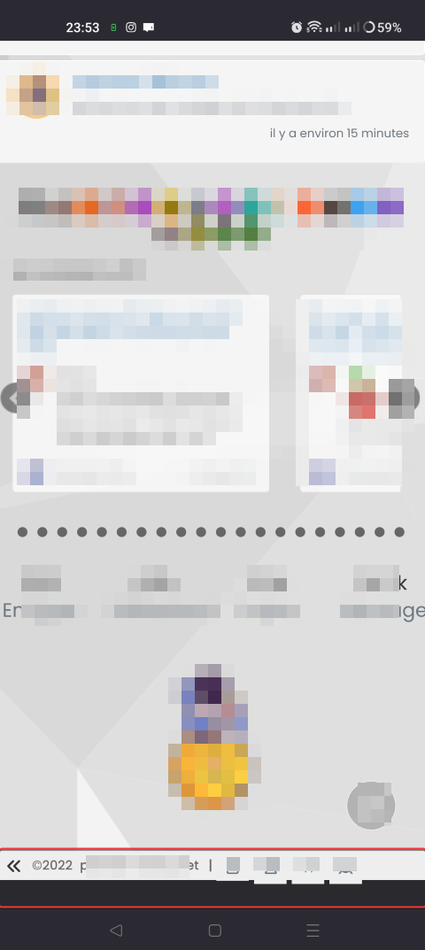
On firefox mobile, I have these when I scroll all the way down and when I scroll up/down:

-
-
undefined DownPW has marked this topic as unsolved on
-
very odd, there are a bug :
–> floatright text is invisible only on Firefox and is OK on chromium browser with the same code ?!
@DownPW said in Footer bar add center text:
floatright text is invisible only on Firefox and is OK on chromium browser with the same code ?!
Typical Mozilla.
Use this instead
#floatright {
  float: right;
  bottom: 1px;
  font-size: 90%;
  line-height: 2.0;
  display: flex;
  position: fixed;
  right: 10px;
}
You might find that this messes with the alignment of text, so you’ll need to adjust
line-heightaccordingly, or make the difference up with eithermarginorpaddingThe
#console-nav-footerelement disappearing on Firefox is due to a bug - see https://bugzilla.mozilla.org/show_bug.cgi?id=1585254 and https://bugzilla.mozilla.org/show_bug.cgi?id=1760924The issue here is that the
.rowclass used in core is set as below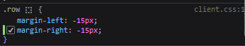
In Firefox, this has the undesired artefact of pushing other
divsdown because the browser interprets this as outside of the margins. You can prove this theory by removing the tick from themargin-rightclass shown above when in DEV mobile view - you should see the footer appear as soon as you remove themargin-rightvalue from.row- in effect, you are setting the margins back to0meaning the content is rendered correctly.You could write a custom JS function to apply the right CSS to resolve this issue, but in fairness, it’s very easy to fake the Browser String, which could lead to more problems that you set out to solve.
There are other ways to address this specific issue, but if it were me, I’d accept the bug until the Mozilla team actually address it.
Mark – Founder, Phenomlab Ltd
Executive IT & Security Leadership
Phenomlab Ltd -
@DownPW said in Footer bar add center text:
floatright text is invisible only on Firefox and is OK on chromium browser with the same code ?!
Typical Mozilla.
Use this instead
#floatright {
  float: right;
  bottom: 1px;
  font-size: 90%;
  line-height: 2.0;
  display: flex;
  position: fixed;
  right: 10px;
}
You might find that this messes with the alignment of text, so you’ll need to adjust
line-heightaccordingly, or make the difference up with eithermarginorpaddingThe
#console-nav-footerelement disappearing on Firefox is due to a bug - see https://bugzilla.mozilla.org/show_bug.cgi?id=1585254 and https://bugzilla.mozilla.org/show_bug.cgi?id=1760924The issue here is that the
.rowclass used in core is set as belowIn Firefox, this has the undesired artefact of pushing other
divsdown because the browser interprets this as outside of the margins. You can prove this theory by removing the tick from themargin-rightclass shown above when in DEV mobile view - you should see the footer appear as soon as you remove themargin-rightvalue from.row- in effect, you are setting the margins back to0meaning the content is rendered correctly.You could write a custom JS function to apply the right CSS to resolve this issue, but in fairness, it’s very easy to fake the Browser String, which could lead to more problems that you set out to solve.
There are other ways to address this specific issue, but if it were me, I’d accept the bug until the Mozilla team actually address it.
@phenomlab Thanks for the information, after research it seems to firefox don’t like sticky position too

I will test tonight your fix, I’m on the office actually
Thanks
PW and WS Spirit alive
-
@phenomlab Thanks for the information, after research it seems to firefox don’t like sticky position too
I will test tonight your fix, I’m on the office actually
Thanks
@DownPW no problems. Let me know how it goes
Mark – Founder, Phenomlab Ltd
Executive IT & Security Leadership
Phenomlab Ltd -
problem resolv for floatright on Firefox desktop with your last css above. thanks
For information, in my research I have seen this link wit hother fix (not tested) : https://stackoverflow.com/questions/27521676/position-sticky-not-working-in-firefox
–> Now, I search to resolve if possible these 2 smartphone bugs (only on Firefox mobile version, OK on Chromium-based browsers ) :
A- if I collapse the footerbar I end up with black space at the bottom :
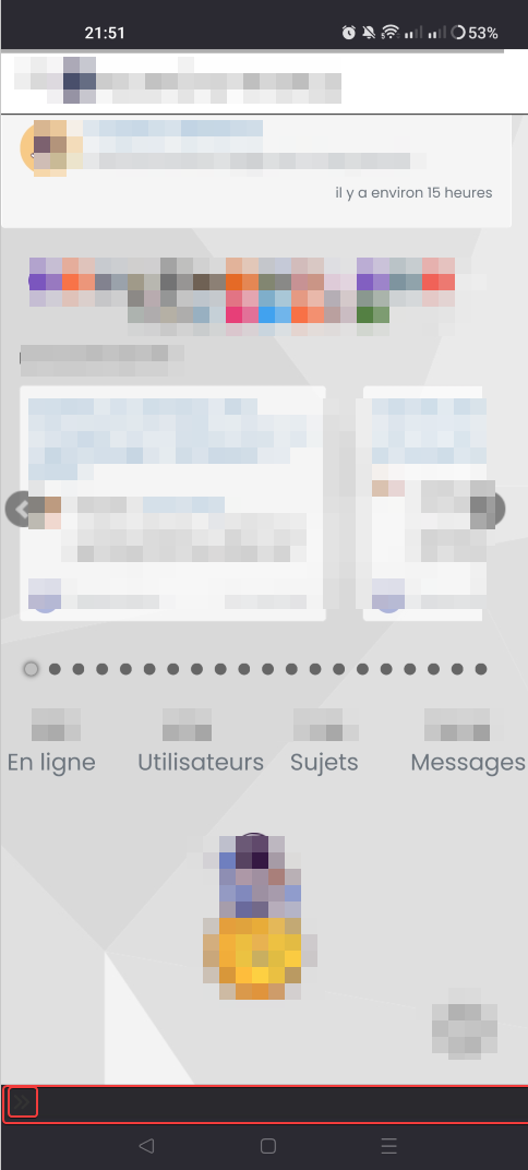
B- In fact, the footerbar remains fixed and does not come down automatically if you zoom in on a page. Ceal works on Chromium-based browsers (vivaldi, brave, etc.)
You have the same bug on sudonix
PW and WS Spirit alive
Hello! It looks like you're interested in this conversation, but you don't have an account yet.
Getting fed up of having to scroll through the same posts each visit? When you register for an account, you'll always come back to exactly where you were before, and choose to be notified of new replies (either via email, or push notification). You'll also be able to save bookmarks and upvote posts to show your appreciation to other community members.
With your input, this post could be even better 💗
Register LoginDid this solution help you?
Related Topics
-
-
-
-
-
-
NodeBB Footer
Solved Customisation -
-
Bug Navbar CSS
Solved Customisation

