chat list navbar
-
Hi @phenomlab
After upgrade of nodebb 3.2.1, I have small bugs that I can’t solve
1 & 2

Can you help me with that ?
3
I search css class and css class hover for new button “Mark all as read” and “All Chats” on chat navbar: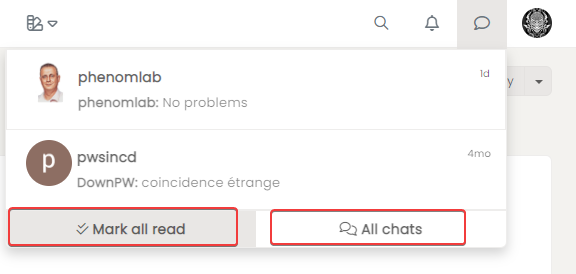
Thanks in advance
-
Hi @phenomlab
After upgrade of nodebb 3.2.1, I have small bugs that I can’t solve
1 & 2

Can you help me with that ?
3
I search css class and css class hover for new button “Mark all as read” and “All Chats” on chat navbar:
Thanks in advance
@DownPW said in chat list navbar:
Can you help me with that ?
Looks like you want to get rid of the border in the highlighted area on the right image, and show the border on the left image ?
@DownPW said in chat list navbar:
I search css class and css class hover for new button “Mark all as read” and “All Chats” on chat navbar:
For “Mark all as read” you should be able to target
btn btn-secondary mark-all-readandbtn btn-secondary mark-all-read:hoverrespectivelyTargeting “All chats” is much harder, as it shares the
btn btn-secondaryclass which is used in multiple places. For it to work how I wanted it, I needed to be more specific in the target, so had to use.btn-group>.btn:last-child:not(:first-child), .btn-group>.dropdown-toggle:not(:first-child) { /* your CSS here */ } -
@DownPW said in chat list navbar:
Can you help me with that ?
Looks like you want to get rid of the border in the highlighted area on the right image, and show the border on the left image ?
@DownPW said in chat list navbar:
I search css class and css class hover for new button “Mark all as read” and “All Chats” on chat navbar:
For “Mark all as read” you should be able to target
btn btn-secondary mark-all-readandbtn btn-secondary mark-all-read:hoverrespectivelyTargeting “All chats” is much harder, as it shares the
btn btn-secondaryclass which is used in multiple places. For it to work how I wanted it, I needed to be more specific in the target, so had to use.btn-group>.btn:last-child:not(:first-child), .btn-group>.dropdown-toggle:not(:first-child) { /* your CSS here */ }@phenomlab said in chat list navbar:
@DownPW said in chat list navbar:
Can you help me with that ?
Looks like you want to get rid of the border in the highlighted area on the right image
in fact I would like the menu not to overflow on the navbar because it was not the case before
@phenomlab said in chat list navbar:
and show the border on the left image
Yes exactly

@phenomlab said in chat list navbar:
For “Mark all as read” you should be able to target
btn btn-secondary mark-all-read and btn btn-secondary mark-all-read:hover respectively
Targeting “All chats” is much harder, as it shares the btn btn-secondary class which is used in multiple places. For it to work how I wanted it, I needed to be more specific in the target, so had to useI wil test that and let you know
-
@phenomlab said in chat list navbar:
@DownPW said in chat list navbar:
Can you help me with that ?
Looks like you want to get rid of the border in the highlighted area on the right image
in fact I would like the menu not to overflow on the navbar because it was not the case before
@phenomlab said in chat list navbar:
and show the border on the left image
Yes exactly

@phenomlab said in chat list navbar:
For “Mark all as read” you should be able to target
btn btn-secondary mark-all-read and btn btn-secondary mark-all-read:hover respectively
Targeting “All chats” is much harder, as it shares the btn btn-secondary class which is used in multiple places. For it to work how I wanted it, I needed to be more specific in the target, so had to useI wil test that and let you know
@DownPW said in chat list navbar:
in fact I would like the menu not to overflow on the navbar because it was not the case before
Ah, that makes sense. You can probably do that with a simple
marginCSS command. Is your test instance up ? -
@DownPW said in chat list navbar:
in fact I would like the menu not to overflow on the navbar because it was not the case before
Ah, that makes sense. You can probably do that with a simple
marginCSS command. Is your test instance up ?@phenomlab yes
-
@phenomlab said in chat list navbar:
btn btn-secondary mark-all-read and btn btn-secondary mark-all-read:hover respectively
Not work with that for example:
.btn .btn-secondary .mark-all-read {
	color: red !important;
}

.btn .btn-secondary .mark-all-read:hover {
  background: #212427;
	color: #ccc !important;
}
And
.btn-group>.btn:last-child:not(:first-child), .btn-group>.dropdown-toggle:not(:first-child):telephone_receiver:not too
-
@phenomlab said in chat list navbar:
@DownPW said in chat list navbar:
Can you help me with that ?
Looks like you want to get rid of the border in the highlighted area on the right image
in fact I would like the menu not to overflow on the navbar because it was not the case before
@phenomlab said in chat list navbar:
and show the border on the left image
Yes exactly

@phenomlab said in chat list navbar:
For “Mark all as read” you should be able to target
btn btn-secondary mark-all-read and btn btn-secondary mark-all-read:hover respectively
Targeting “All chats” is much harder, as it shares the btn btn-secondary class which is used in multiple places. For it to work how I wanted it, I needed to be more specific in the target, so had to useI wil test that and let you know
@DownPW said in chat list navbar:
in fact I would like the menu not to overflow on the navbar because it was not the case before
That’s being caused by deliberate negative padding. This will fix it
.chat-list { margin-top: 0px; } -
@phenomlab said in chat list navbar:
btn btn-secondary mark-all-read and btn btn-secondary mark-all-read:hover respectively
Not work with that for example:
.btn .btn-secondary .mark-all-read {
	color: red !important;
}

.btn .btn-secondary .mark-all-read:hover {
  background: #212427;
	color: #ccc !important;
}
And
.btn-group>.btn:last-child:not(:first-child), .btn-group>.dropdown-toggle:not(:first-child):telephone_receiver:not too
@DownPW said in chat list navbar:
Not work with that for example:
Seems to work for me on your site, but (sorry), it should be
a.btn .btn-secondary .mark-all-read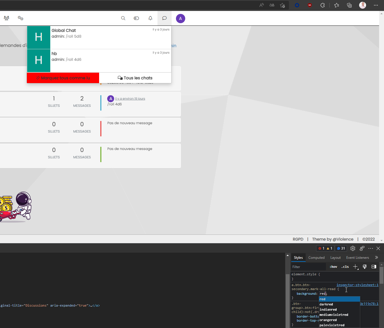
-
yeah great…
Can you test All chats button hover ?
Because.btn-group>.btn:last-child:not(:first-child), .btn-group>.dropdown-toggle:not(:first-child):hovernot work -
yeah great…
Can you test All chats button hover ?
Because.btn-group>.btn:last-child:not(:first-child), .btn-group>.dropdown-toggle:not(:first-child):hovernot work@DownPW Works for me ?
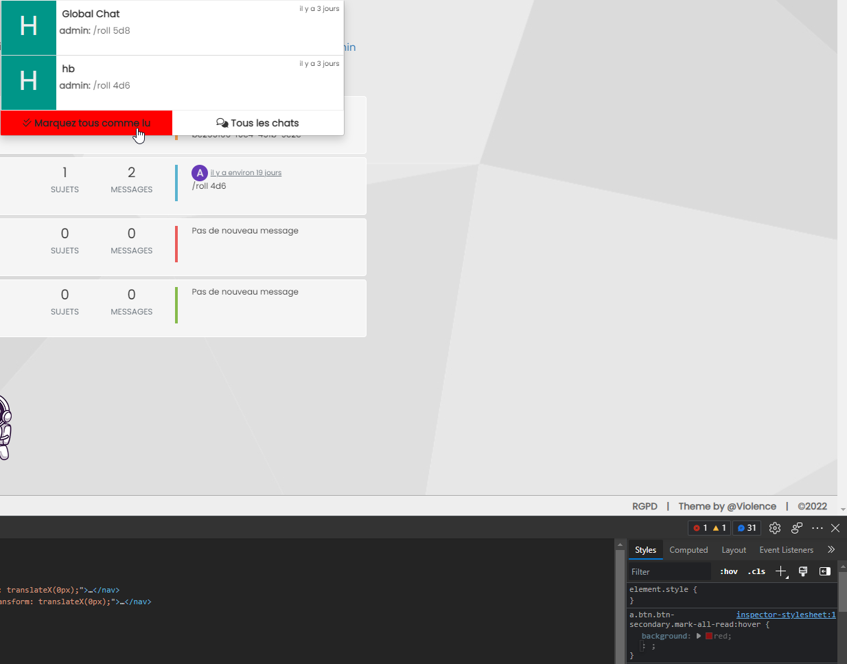
-
Yeah good for “Mark all as read” but not All chats button:
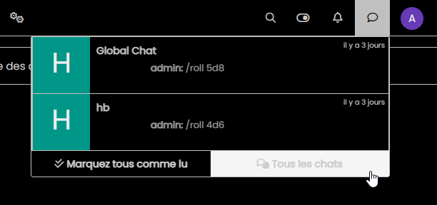
@DownPW said in chat list navbar:
yeah great…
Can you test All chats button hover ?
Because.btn-group>.btn:last-child:not(:first-child), .btn-group>.dropdown-toggle:not(:first-child):hovernot work -
Yeah good for “Mark all as read” but not All chats button:

@DownPW said in chat list navbar:
yeah great…
Can you test All chats button hover ?
Because.btn-group>.btn:last-child:not(:first-child), .btn-group>.dropdown-toggle:not(:first-child):hovernot work@DownPW said in chat list navbar:
Yeah good for “Mark all as read” but not All chats button:
Yes, sadly, that element is in use in several other places. You could target it directly, but it will also mean changing it in multiple places which won’t be the desired effect. The most effective way would be to target a
divID, but you’d need something likejQueryto target that specific element and add an ID to it. -
@DownPW said in chat list navbar:
Yeah good for “Mark all as read” but not All chats button:
Yes, sadly, that element is in use in several other places. You could target it directly, but it will also mean changing it in multiple places which won’t be the desired effect. The most effective way would be to target a
divID, but you’d need something likejQueryto target that specific element and add an ID to it.hmm hard for just an effect.
It’s a problem for my dark themesIn sudonix I see this :

and Hover:
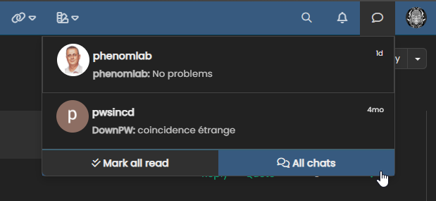
I think it’s a better way, how achieve this effect (with different color) ?
-
hmm hard for just an effect.
It’s a problem for my dark themesIn sudonix I see this :

and Hover:

I think it’s a better way, how achieve this effect (with different color) ?
@DownPW Ah, yes, I remember this one now - it was a nightmare to target, and I landed up using the pseudo class which unfortunately does include the border, but it’s subtle enough to still look good
Try this
.btn-group.btn-group-justified:hover { /* Your css here */ } -
I resolve with this
.btn-group>.btn:last-child:not(:first-child), .btn-group>.dropdown-toggle:not(:first-child) { color: #ccc; } a.btn.btn-secondary:hover { color: #ccc; background: #212427; } .caret { color: #000; } a.btn.btn-secondary.mark-all-read { color: #ccc !important; } a.btn.btn-secondary.mark-all-read:hover { background: #212427; color: #ccc !important; } -
 undefined DownPW has marked this topic as solved on
-
I have a problem on my themes.
Example I Have this on my css files :
.btn-group>.btn:last-child:not(:first-child), .btn-group>.dropdown-toggle:not(:first-child) {
    color: var(--first-color) !important;
}
But this code is not taken into account

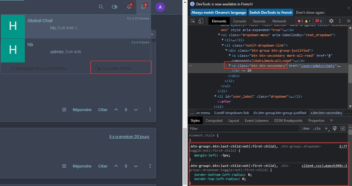
if i change in dev console (in live) it’s ok
Can you help me with that ?
-
Maybe a problem with theme switcher & nodeBB 3.2.1 ?
-
@DownPW no, this works independently of NodeBB as it uses jQuery and CSS. The issue you have is the below
var(--first-color)In CSS,
varis a variable defined atrootlevel and probably doesn’t exist in your CSS file. Essentially, it’s LESS. If you change the line so it looks (for example) like the below, it will probably then work#ffffff;The newer version of the theme switcher uses LESS variables as it’s more efficient but if these don’t exist then it looks like it’s being ignored when I’m fact it just returns a null value.
-
yes i know for var all the theme is coded with var.
It’s the same things with #XXXXXX
-
I have a problem on my themes.
Example I Have this on my css files :
.btn-group>.btn:last-child:not(:first-child), .btn-group>.dropdown-toggle:not(:first-child) {
    color: var(--first-color) !important;
}
But this code is not taken into account


if i change in dev console (in live) it’s ok
Can you help me with that ?
@DownPW this sounds more like a caching issue to me. Do you get the same thing in an incognito session ?
Hello! It looks like you're interested in this conversation, but you don't have an account yet.
Getting fed up of having to scroll through the same posts each visit? When you register for an account, you'll always come back to exactly where you were before, and choose to be notified of new replies (either via email, or push notification). You'll also be able to save bookmarks and upvote posts to show your appreciation to other community members.
With your input, this post could be even better 💗
Register LoginDid this solution help you?
Related Topics
-
navbar
Solved Customisation -
-
-
-
-
-
-

