Switch between list and card view function
-
Found a small bug already which is CSS related

I’ll fix this tomorrow and provide an update

-
So I tested and here are my remarks:
-
Pay attention to the name of the JSS file in the Javascript code. I put underscores and the CSS was not taken into account.
-
The topic selection check box is difficult to check: most of the time I enter the topic rather than checking the box :

- I still have the problem displaying tags :

- For my part, in French, the boxes are a little tight here, I’ll see what I can do :

- If you have a pinned topic with the pinned label, the line is visible behind the label
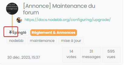
–> For this, maybe add a background color to this loke this ? :
[component="topic/pinned"].border-gray-300 { background: var(--bs-body-navbar) !important; }- Why not take the same width as the toolbar here ? :

Many thanks again Mark
-
-
So I tested and here are my remarks:
-
Pay attention to the name of the JSS file in the Javascript code. I put underscores and the CSS was not taken into account.
-
The topic selection check box is difficult to check: most of the time I enter the topic rather than checking the box :

- I still have the problem displaying tags :

- For my part, in French, the boxes are a little tight here, I’ll see what I can do :

- If you have a pinned topic with the pinned label, the line is visible behind the label

–> For this, maybe add a background color to this loke this ? :
[component="topic/pinned"].border-gray-300 { background: var(--bs-body-navbar) !important; }- Why not take the same width as the toolbar here ? :

Many thanks again Mark
@DownPW All good comments, thanks. Don’t forget that your CSS is also very customized over the stock that comes with NodeBB, but I’m quite surprised by this
@DownPW said in Switch between list and card view function:
The topic selection check box is difficult to check: most of the time I enter the topic rather than checking the box
Perhaps I missed some final modifications here, but I cannot reproduce that - will need to check
@DownPW said in Switch between list and card view function:
I still have the problem displaying tags :
Again, surprised by that as it was addressed in the final code. Will need to check
@DownPW said in Switch between list and card view function:
If you have a pinned topic with the pinned label, the line is visible behind the label
Yes, I’m aware of that one - the CSS you propose would work, but not for those without custom CSS
@DownPW said in Switch between list and card view function:
Why not take the same width as the toolbar here ?
Because you cannot fit 32% into 100% even with simple math
 It needs either
 paddingormargin- both of which will be negative, but I’ve done it here
I’m going to release a vanilla harmony CSS file (working on it now) shortly. This will be the starting point that will fit most users, but obvously, the more customized CSS you have, the more work it needs.
-
-
no problem,
I noticed that as soon as I make changes to the CSS file, I have to empty the cache and close the browser so that the changes are taken into account even in incognito mode.
-
no problem,
I noticed that as soon as I make changes to the CSS file, I have to empty the cache and close the browser so that the changes are taken into account even in incognito mode.
@DownPW Yes, I have a fix for that also going forward. Will supply that once I’m done with testing.
-
@DownPW Yes, I have a fix for that also going forward. Will supply that once I’m done with testing.
@phenomlab said in Switch between list and card view function:
@DownPW Yes, I have a fix for that also going forward. Will supply that once I’m done with testing.
No worries my friend :), I’m just making the comments to make this code concrete because I find it excellent.
Now that I have seen that I have to close the browser each time I make a change, this seems OK to me except for the last 2 points mentioned which you are currently working on.
@phenomlab said in Switch between list and card view function:
Because you cannot fit 32% into 100% even with simple math It needs either padding or margin - both of which will be negative, but I’ve done it here
-
@phenomlab said in Switch between list and card view function:
@DownPW Yes, I have a fix for that also going forward. Will supply that once I’m done with testing.
No worries my friend :), I’m just making the comments to make this code concrete because I find it excellent.
Now that I have seen that I have to close the browser each time I make a change, this seems OK to me except for the last 2 points mentioned which you are currently working on.
@phenomlab said in Switch between list and card view function:
Because you cannot fit 32% into 100% even with simple math It needs either padding or margin - both of which will be negative, but I’ve done it here
@DownPW thanks. I have an almost stable vanilla harmony version I’ll be posting this weekend.
-
Here’s a stable version based on stock Harmony
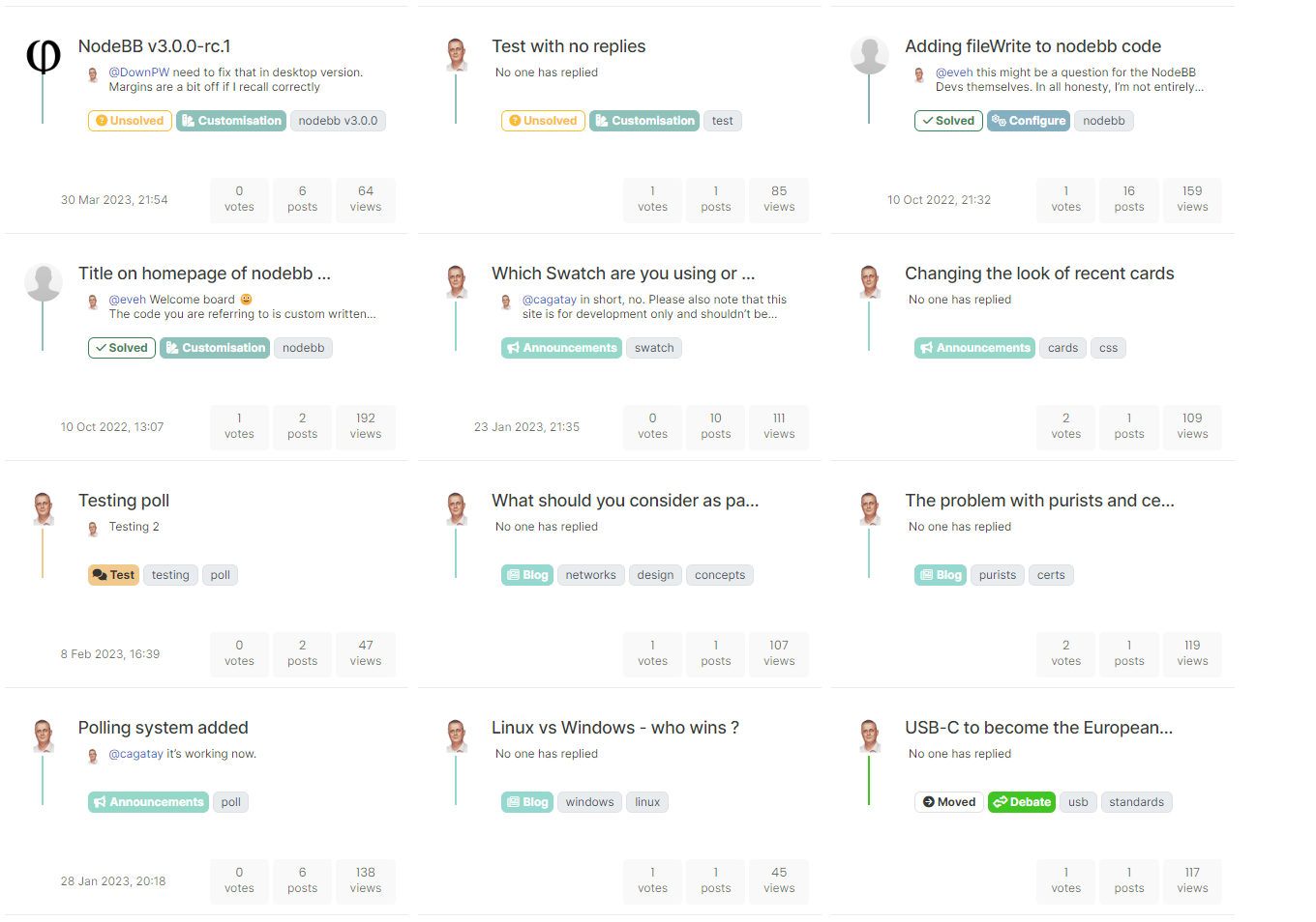
Note that there are a lot of changes here, so if you have previously deployed this code, you need to update it. Also note that the CSS is based on stock harmony - if you have any customised theme, you’ll need to add this yourself (obviously, I cannot possibly factor in custom styles).
-
@DownPW All good comments, thanks. Don’t forget that your CSS is also very customized over the stock that comes with NodeBB, but I’m quite surprised by this
@DownPW said in Switch between list and card view function:
The topic selection check box is difficult to check: most of the time I enter the topic rather than checking the box
Perhaps I missed some final modifications here, but I cannot reproduce that - will need to check
@DownPW said in Switch between list and card view function:
I still have the problem displaying tags :
Again, surprised by that as it was addressed in the final code. Will need to check
@DownPW said in Switch between list and card view function:
If you have a pinned topic with the pinned label, the line is visible behind the label
Yes, I’m aware of that one - the CSS you propose would work, but not for those without custom CSS
@DownPW said in Switch between list and card view function:
Why not take the same width as the toolbar here ?
Because you cannot fit 32% into 100% even with simple math
 It needs either
 paddingormargin- both of which will be negative, but I’ve done it here
I’m going to release a vanilla harmony CSS file (working on it now) shortly. This will be the starting point that will fit most users, but obvously, the more customized CSS you have, the more work it needs.
@phenomlab said in Switch between list and card view function:
If you have a pinned topic with the pinned label, the line is visible behind the label
I decided to leave this as is. It’s transparent in the stock harmony CSS, so if you want to change it to suit your needs, then feel free. The categories and tags have been moved to the right anyway in this modified version of code, therefore, the “bug” (it’s not really, but…) is no longer present.
-
Great
I put the code on prod.
I see this bug on a few topics but impossible to know why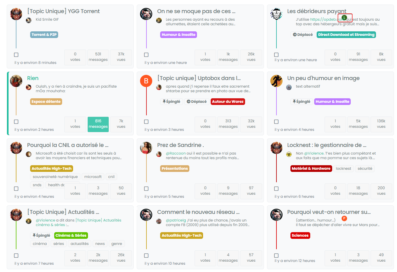

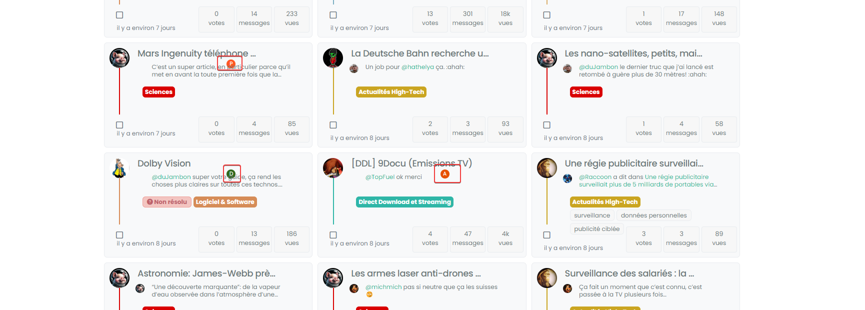
-
Great
I put the code on prod.
I see this bug on a few topics but impossible to know why


@DownPW does it resolve itself if you click the home button again? I’ve seen this in dev but can’t reproduce it in prod.
-
@DownPW does it resolve itself if you click the home button again? I’ve seen this in dev but can’t reproduce it in prod.
@phenomlab said in Switch between list and card view function:
@DownPW does it resolve itself if you click the home button again? I’ve seen this in dev but can’t reproduce it in prod.
nope, the bug persist.
it seem problem with
.category-card .lastpost a imgbut what’s strange is that it doesn’t do it for all topics -
@phenomlab said in Switch between list and card view function:
@DownPW does it resolve itself if you click the home button again? I’ve seen this in dev but can’t reproduce it in prod.
nope, the bug persist.
it seem problem with
.category-card .lastpost a imgbut what’s strange is that it doesn’t do it for all topics@DownPW yes, it seems to be an issue with the
ajaxcallback but not sure where currently it originates from.Does it happen on page load also?
-
@DownPW yes, it seems to be an issue with the
ajaxcallback but not sure where currently it originates from.Does it happen on page load also?
@phenomlab said in Switch between list and card view function:
@DownPW yes, it seems to be an issue with the
ajaxcallback but not sure where currently it originates from.Does it happen on page load also?
can you be more specific?
If I refresh the page while keeping Card View activated it’s the same.
Same if I deactivate/reactivate Card ViewHere, we see, we have not
.category-card .lastpost a imgadd to class
-
@phenomlab said in Switch between list and card view function:
@DownPW yes, it seems to be an issue with the
ajaxcallback but not sure where currently it originates from.Does it happen on page load also?
can you be more specific?
If I refresh the page while keeping Card View activated it’s the same.
Same if I deactivate/reactivate Card ViewHere, we see, we have not
.category-card .lastpost a imgadd to class
@DownPW the class you’re referring to in the screenshot isn’t supposed to be applied to that specific element, as there is no
imgto be applied against.What I meant about the
ajaxcallback is that not all of the styles seem to be applied. It’s almost as though they are being added to the DOM when they aren’t loaded yet. -
Arf Ok sorry.
For information, I have the same things on my test server (actually, it’s a clone of prod) if you want to see in details or play -
Arf Ok sorry.
For information, I have the same things on my test server (actually, it’s a clone of prod) if you want to see in details or play@DownPW thanks. The really odd thing here is that I can’t reproduce this issue at all in prod - where I developed it originally in fact.
I think I’m missing something somewhere, but unsure as to where it is currently.
-
no problem dude. I’m not sure I’ll be much help on this one.
-
@DownPW no problems. Your review and findings are a great help already.
-
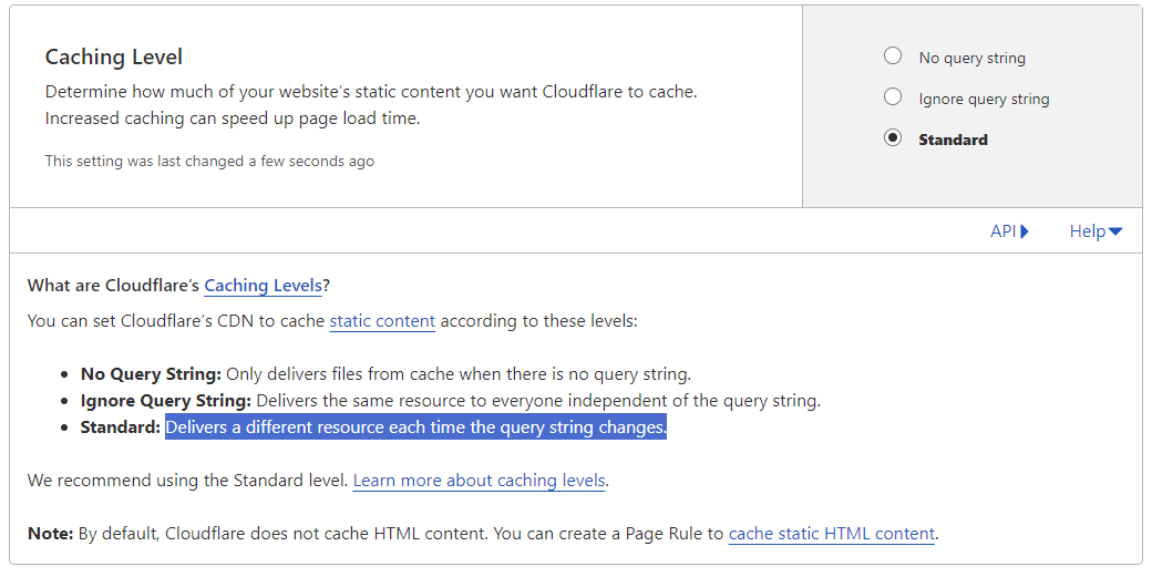
@DownPW I found the bug. It’s CloudFlare


Setting the cache to bypass resolves the issue. This explains why I cannot replicate it in PROD (for me) as I only use CF for DNS resolution.
I have modified the CSS file slightly also, so you’ll need to pick up the latest code.
https://github.com/phenomlab/harmony-card-view/blob/main/card.css
Not entirely sure why CF seems to think this file never changes - it’s different on each page load and suffixed with a random string! The setting in CF should also respect that - but doesn’t. So much for that
Hello! It looks like you're interested in this conversation, but you don't have an account yet.
Getting fed up of having to scroll through the same posts each visit? When you register for an account, you'll always come back to exactly where you were before, and choose to be notified of new replies (either via email, or push notification). You'll also be able to save bookmarks and upvote posts to show your appreciation to other community members.
With your input, this post could be even better 💗
Register Login

