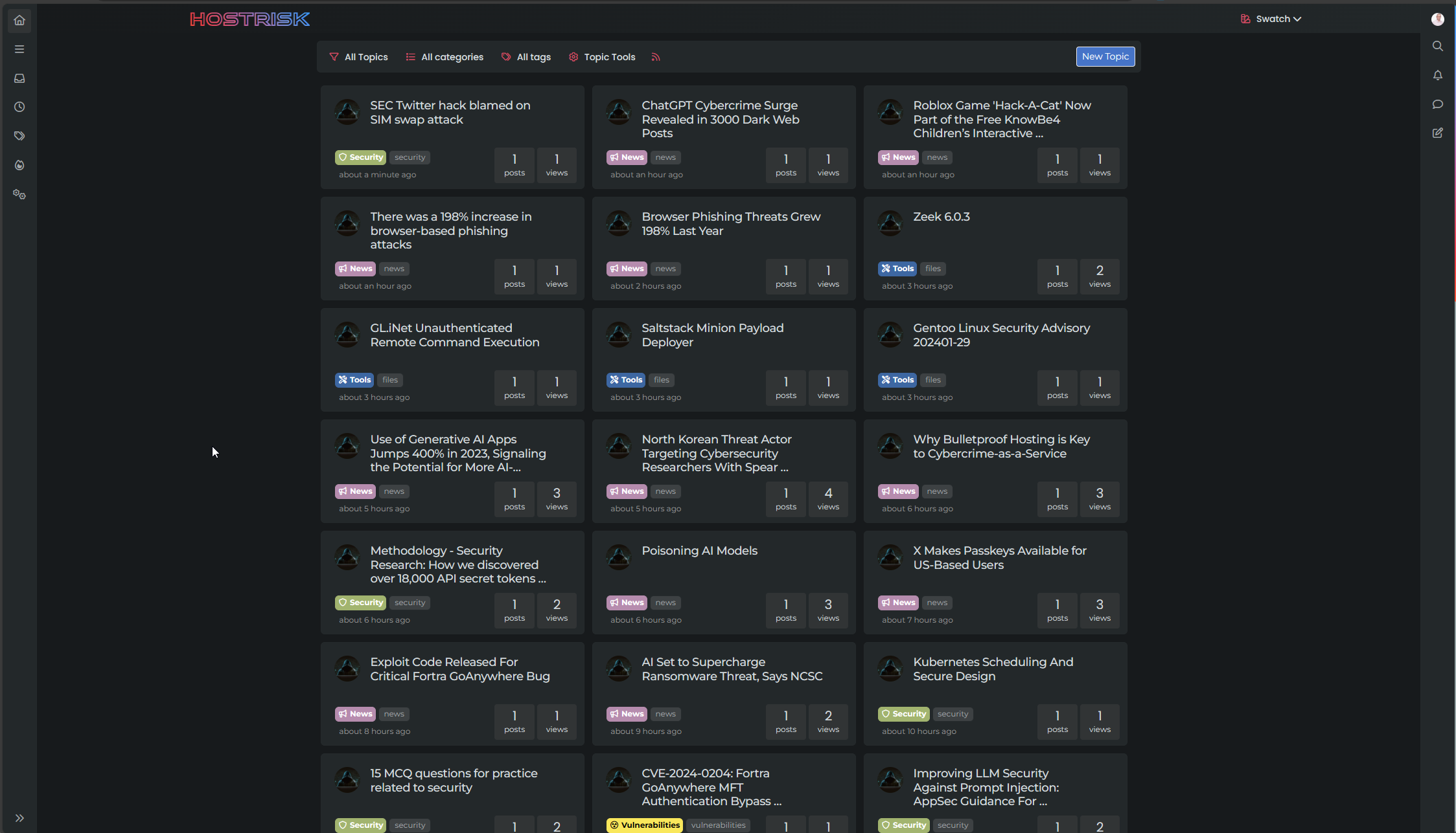
Switch between list and card view function
-
worked thank you Mark.
-
Hi Mark, I am having some bugs on my laptop screen (Firefox , OS 13.6.4) , fyi…

-
Hi Mark, I am having some bugs on my laptop screen (Firefox , OS 13.6.4) , fyi…

@crazycells thanks. What resolution are you running?
-
@crazycells thanks. What resolution are you running?
@phenomlab ~1285 px
-
@phenomlab ~1285 px
@crazycells thanks. I’ll need to check this
-
Hi Mark, I am having some bugs on my laptop screen (Firefox , OS 13.6.4) , fyi…

@crazycells Thanks for reporting this. It’s fixed here, and should look like the below (you’ll need to reload the browser)
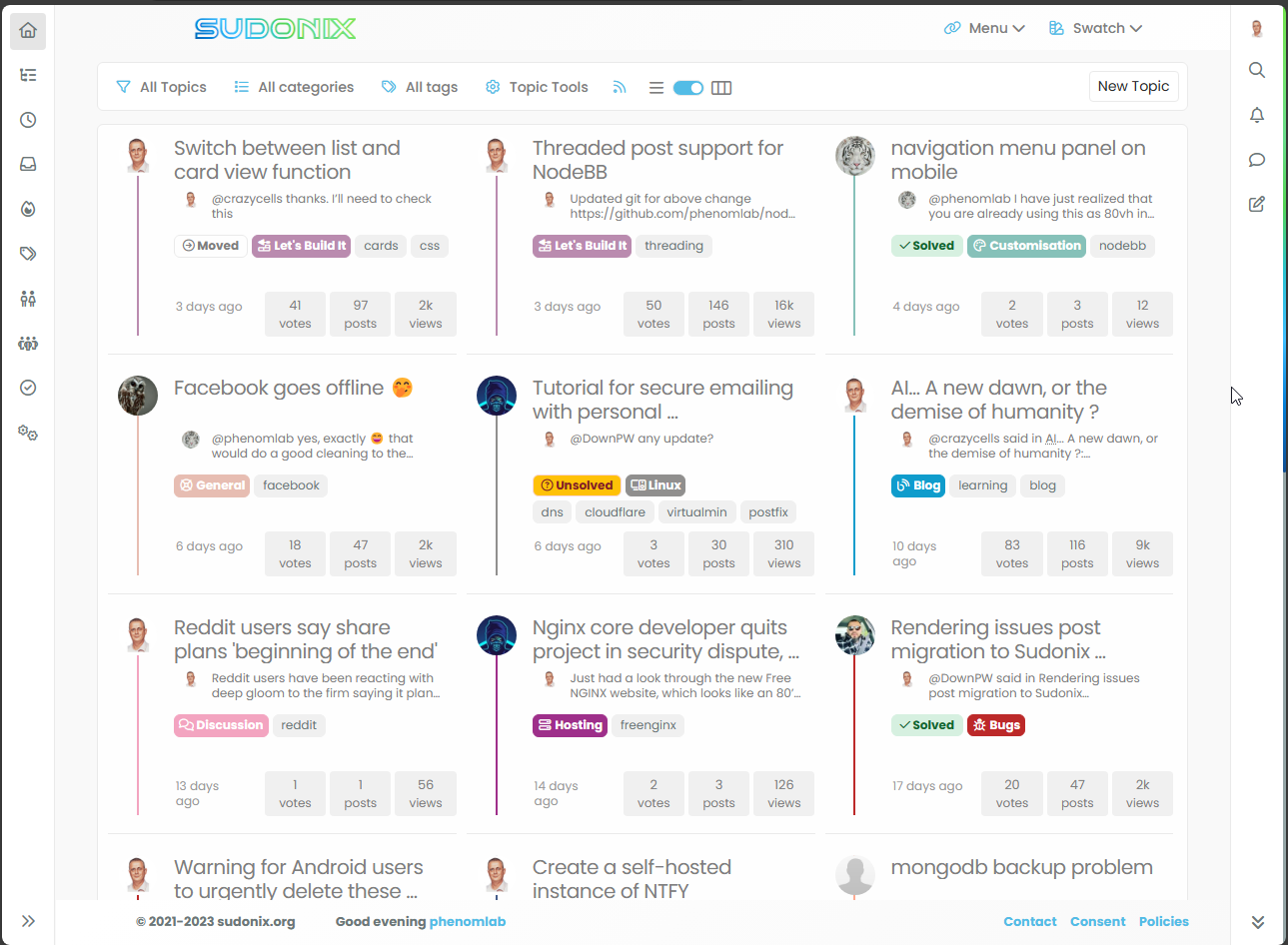
This uses customised CSS when this viewport size is detected, and also needs to remove one of the tags to prevent them spilling out of the DIV
    [component="topic/tags"] a:nth-child(2) {
        display: none;
    }
It’s a bit of a hack, but necessary to accommodate this screen size. Let me know if it looks good and I’ll commit it.
-
@crazycells Thanks for reporting this. It’s fixed here, and should look like the below (you’ll need to reload the browser)

This uses customised CSS when this viewport size is detected, and also needs to remove one of the tags to prevent them spilling out of the DIV
    [component="topic/tags"] a:nth-child(2) {
        display: none;
    }
It’s a bit of a hack, but necessary to accommodate this screen size. Let me know if it looks good and I’ll commit it.
@phenomlab can you please check the borders agains? I think it is going well up until ~1290 px, but then, it is disrupted, and it is fixed again after ~1400 px
-
@phenomlab can you please check the borders agains? I think it is going well up until ~1290 px, but then, it is disrupted, and it is fixed again after ~1400 px
@crazycells hmm. Thought that might happen. Let me have a look.
-
@phenomlab can you please check the borders agains? I think it is going well up until ~1290 px, but then, it is disrupted, and it is fixed again after ~1400 px
@crazycells said in Switch between list and card view function:
can you please check the borders agains? I think it is going well up until ~1290 px, but then, it is disrupted, and it is fixed again after ~1400 px
Should be resolved now? Obviously, no site will cater for odd browser sizes or screen resolutions - that’s not a realistic expectation, but the issue you reported should be fixed.
-
@crazycells said in Switch between list and card view function:
can you please check the borders agains? I think it is going well up until ~1290 px, but then, it is disrupted, and it is fixed again after ~1400 px
Should be resolved now? Obviously, no site will cater for odd browser sizes or screen resolutions - that’s not a realistic expectation, but the issue you reported should be fixed.
@phenomlab yes, it is fixed now

-
@phenomlab yes, it is fixed now

@crazycells thanks. I’ll commit the updated css code over the next few days.
-
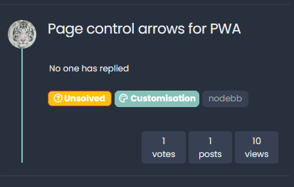
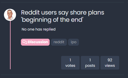
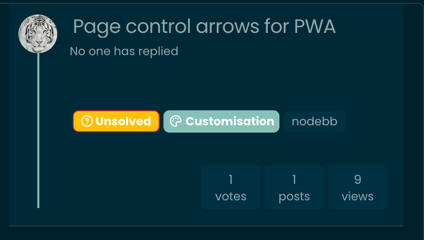
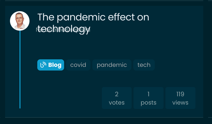
hi @phenomlab , there is a bug when there is no reply on the topic… it says “no one has replied” but when the title is spanning two lines, then it overlaps… please see below…
-
hi @phenomlab , there is a bug when there is no reply on the topic… it says “no one has replied” but when the title is spanning two lines, then it overlaps… please see below…


@crazycells ok, thanks. I thought that might happen. Will resolve later.
EDIT - just done it. It’s a bit rough perhaps as done in a hurry!
-
Hello! It looks like you're interested in this conversation, but you don't have an account yet.
Getting fed up of having to scroll through the same posts each visit? When you register for an account, you'll always come back to exactly where you were before, and choose to be notified of new replies (either via email, or push notification). You'll also be able to save bookmarks and upvote posts to show your appreciation to other community members.
With your input, this post could be even better 💗
Register LoginRelated Topics
-
-
-
-
-
-
-
-
[NODEBB] CSS Style Sheets SelectBox
Locked Solved Customisation
