Heading text on NodeBB forum
-
@mventures That code you have is very bespoke, and designed for v2. If you upgrade to v3, it won’t work anymore without significant modification (which I do not support as it’s dropped completely in v3)
@phenomlab Oh, I see. I can see the banner still on my website after the upgrade but it’s completely left-justified and cut off at the beginning of the bar. So, do you recommend, I don’t have an introduction bar at all? I just wanted something up at the top, that tells people what the site is about. If I have to get a designer to do some custom work, what kind of person should I look for - UI designer, CSS stylist?
-
@phenomlab Oh, I see. I can see the banner still on my website after the upgrade but it’s completely left-justified and cut off at the beginning of the bar. So, do you recommend, I don’t have an introduction bar at all? I just wanted something up at the top, that tells people what the site is about. If I have to get a designer to do some custom work, what kind of person should I look for - UI designer, CSS stylist?
@mventures My recommendation here would be to have an “about” page for this sort of stuff. Keep the site layout to a minimum. You don’t need a designer - I can help you with that.
-
@mventures My recommendation here would be to have an “about” page for this sort of stuff. Keep the site layout to a minimum. You don’t need a designer - I can help you with that.
@phenomlab
(1) I think there should be 1 banner right above the categories just like the one you have. Basically, a phrase/tagline as to what the site is about.
(2) Yes, ABOUT page is one of the pages I would like, and I can see you have grouped it under the “link”/paperclip symbol on the top menu. I am trying to figure out how you got that in the first place. -
@phenomlab
(1) I think there should be 1 banner right above the categories just like the one you have. Basically, a phrase/tagline as to what the site is about.
(2) Yes, ABOUT page is one of the pages I would like, and I can see you have grouped it under the “link”/paperclip symbol on the top menu. I am trying to figure out how you got that in the first place.@mventures said in Title on homepage of nodebb forum:
I think there should be 1 banner right above the categories just like the one you have. Basically, a phrase/tagline as to what the site is about.
Be careful with this one. The text is being added via
Javascriptso crawlers will not see this content anyway - in essence, it’s cosmetic for the user. You’d be better placed having a well-worded about page that explains everything.@mventures said in Title on homepage of nodebb forum:
Yes, ABOUT page is one of the pages I would like, and I can see you have grouped it under the “link”/paperclip symbol on the top menu. I am trying to figure out how you got that in the first place.
You can add that using the
navigationsettings shown below/admin/settings/navigation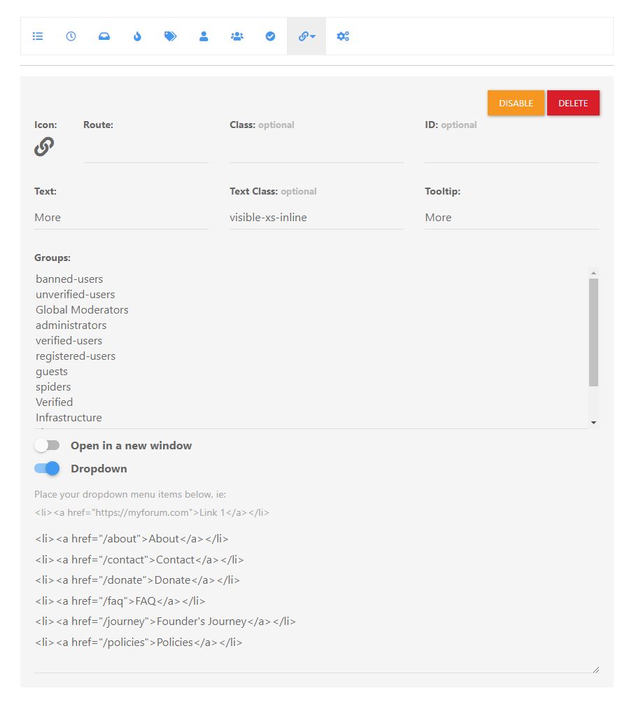
Again, this is for v2, and has changed in v3.

I’d recommend you have a look around https://sudonix.dev for inspiration. Registration is disabled, as this is a test site and not for public access, so let me know if you’d like access and I’ll create you an account.
-
@mventures said in Title on homepage of nodebb forum:
I think there should be 1 banner right above the categories just like the one you have. Basically, a phrase/tagline as to what the site is about.
Be careful with this one. The text is being added via
Javascriptso crawlers will not see this content anyway - in essence, it’s cosmetic for the user. You’d be better placed having a well-worded about page that explains everything.@mventures said in Title on homepage of nodebb forum:
Yes, ABOUT page is one of the pages I would like, and I can see you have grouped it under the “link”/paperclip symbol on the top menu. I am trying to figure out how you got that in the first place.
You can add that using the
navigationsettings shown below/admin/settings/navigation
Again, this is for v2, and has changed in v3.

I’d recommend you have a look around https://sudonix.dev for inspiration. Registration is disabled, as this is a test site and not for public access, so let me know if you’d like access and I’ll create you an account.
@phenomlab
(1) That’s right, it’s purely cosmetic and not for SEO/crawlers.(2) For the ABOUT page in the top menu link:
I just checked the NAVIGATION in V3 and can see the exact settings as seen on your screenshot. So, I toggled the DROPDOWN to ON and added the line:
<li><a href=“/about> About </a></li>
Nothing appeared on the page.
Is this because of what you mentioned about V3 being different to V2?(3) Sudonix.dev: You mean access to the ACP to see how you’ve set it all up and I can just mirror those for my own site? If so, YES PLEASE! That would be super helpful for me. Thank you!
-
@phenomlab
(1) That’s right, it’s purely cosmetic and not for SEO/crawlers.(2) For the ABOUT page in the top menu link:
I just checked the NAVIGATION in V3 and can see the exact settings as seen on your screenshot. So, I toggled the DROPDOWN to ON and added the line:
<li><a href=“/about> About </a></li>
Nothing appeared on the page.
Is this because of what you mentioned about V3 being different to V2?(3) Sudonix.dev: You mean access to the ACP to see how you’ve set it all up and I can just mirror those for my own site? If so, YES PLEASE! That would be super helpful for me. Thank you!
@mventures
UPDATEI placed this script in the GLOBAL HEADER widget, a remake of the existing Footer class script

<header id="header" class="container header">
	<div>
		<a target="_blank" href="https://MYSITE.COM/about">About</a> |
<a target="_blank" href="https://MYSITE.COM/meetups">Meetups</a> |
	</div>
</header>
And I got the below:
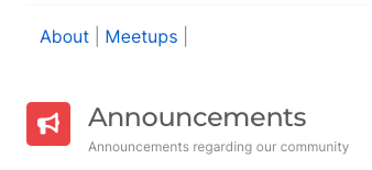
Not exactly the dropdown Menu Link you have, but it serves the purpose for now

-
@phenomlab
(1) That’s right, it’s purely cosmetic and not for SEO/crawlers.(2) For the ABOUT page in the top menu link:
I just checked the NAVIGATION in V3 and can see the exact settings as seen on your screenshot. So, I toggled the DROPDOWN to ON and added the line:
<li><a href=“/about> About </a></li>
Nothing appeared on the page.
Is this because of what you mentioned about V3 being different to V2?(3) Sudonix.dev: You mean access to the ACP to see how you’ve set it all up and I can just mirror those for my own site? If so, YES PLEASE! That would be super helpful for me. Thank you!
@mventures said in Title on homepage of nodebb forum:
(2) For the ABOUT page in the top menu link:
I just checked the NAVIGATION in V3 and can see the exact settings as seen on your screenshot. So, I toggled the DROPDOWN to ON and added the line:
<li><a href=“/about> About </a></li>
Nothing appeared on the page.
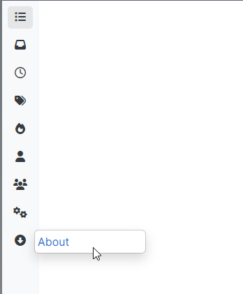
Is this because of what you mentioned about V3 being different to V2?Be careful what you alter, as you’ve changed the behaviour of the
categoriespage so now it does this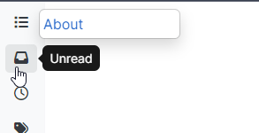
The way this works is as below
You drag the custom route to the navbar
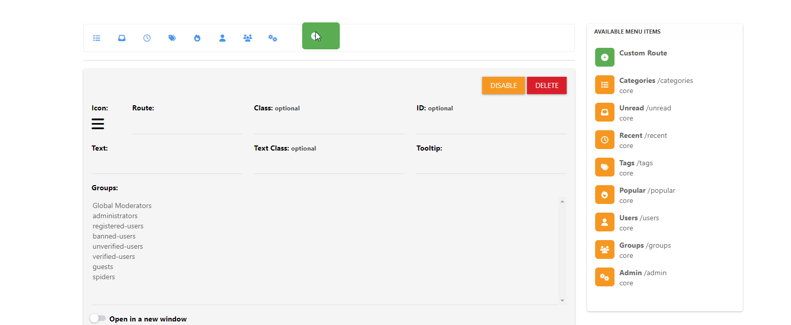
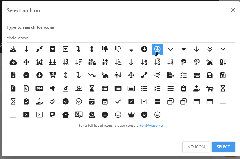
Select an icon
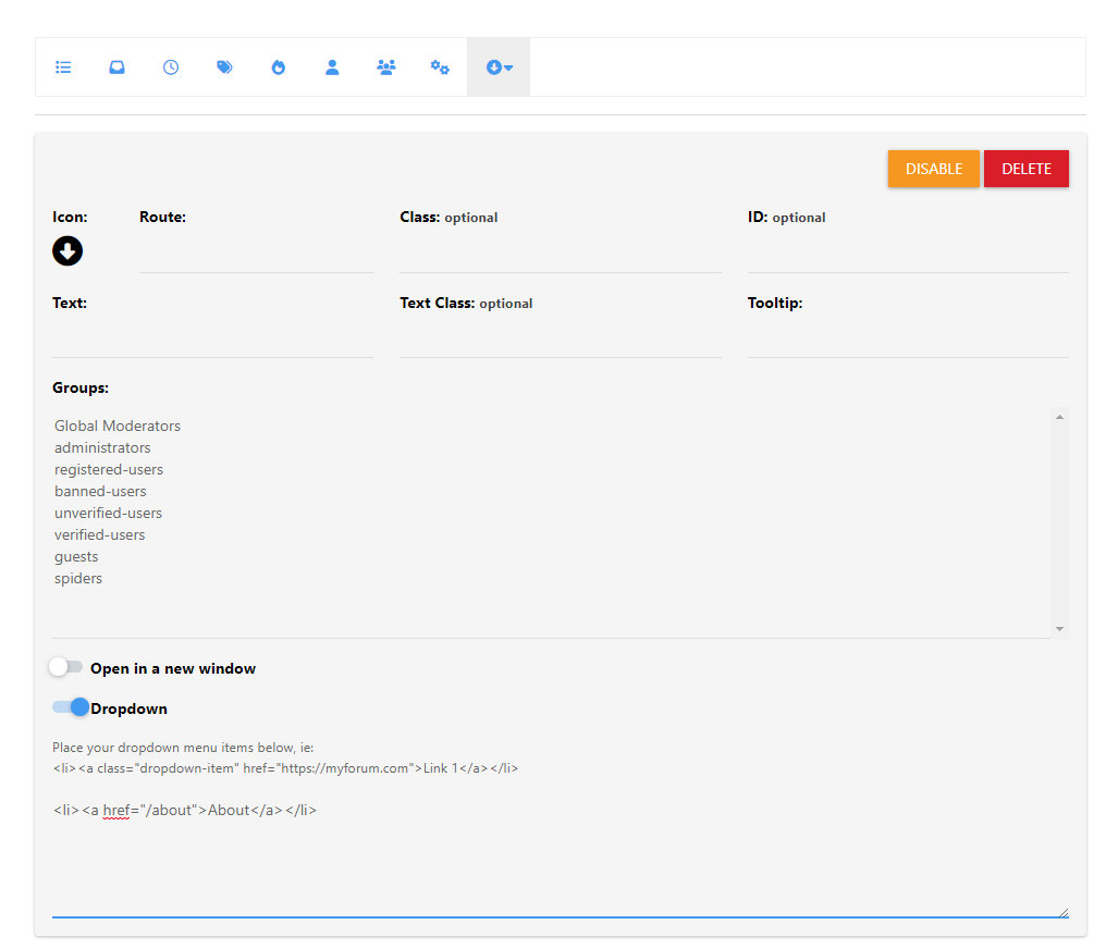
Enable the dropdown, and add the code
Save
Reload the page, and you’ll see an additional menu created
-
@phenomlab
(1) That’s right, it’s purely cosmetic and not for SEO/crawlers.(2) For the ABOUT page in the top menu link:
I just checked the NAVIGATION in V3 and can see the exact settings as seen on your screenshot. So, I toggled the DROPDOWN to ON and added the line:
<li><a href=“/about> About </a></li>
Nothing appeared on the page.
Is this because of what you mentioned about V3 being different to V2?(3) Sudonix.dev: You mean access to the ACP to see how you’ve set it all up and I can just mirror those for my own site? If so, YES PLEASE! That would be super helpful for me. Thank you!
@mventures said in Title on homepage of nodebb forum:
(3) Sudonix.dev: You mean access to the ACP to see how you’ve set it all up and I can just mirror those for my own site? If so, YES PLEASE! That would be super helpful for me. Thank you!
No, an account that has access to the site so you can see how it is laid out. No access to the ACP is granted, because it isn’t needed.
-
@mventures said in Title on homepage of nodebb forum:
(2) For the ABOUT page in the top menu link:
I just checked the NAVIGATION in V3 and can see the exact settings as seen on your screenshot. So, I toggled the DROPDOWN to ON and added the line:
<li><a href=“/about> About </a></li>
Nothing appeared on the page.
Is this because of what you mentioned about V3 being different to V2?Be careful what you alter, as you’ve changed the behaviour of the
categoriespage so now it does this
The way this works is as below
You drag the custom route to the navbar

Select an icon

Enable the dropdown, and add the code

Save

Reload the page, and you’ll see an additional menu created

@phenomlab I shall go through this tomorrow and check what the issue on Categories is about, although I can’t see any issue at my end on Chrome and Safari.
By the way, how do you upload a full-length image/photo onto a page like what you have on the ABOUT page?
-
@phenomlab I shall go through this tomorrow and check what the issue on Categories is about, although I can’t see any issue at my end on Chrome and Safari.
By the way, how do you upload a full-length image/photo onto a page like what you have on the ABOUT page?
@mventures said in Title on homepage of nodebb forum:
I shall go through this tomorrow and check what the issue on Categories is about, although I can’t see any issue at my end on Chrome and Safari.
You won’t do now as I rectified it

-
@mventures said in Title on homepage of nodebb forum:
I shall go through this tomorrow and check what the issue on Categories is about, although I can’t see any issue at my end on Chrome and Safari.
You won’t do now as I rectified it

@phenomlab Oh wow! Thanks again, so much! I can see the page menu in the “down” arrow on the left navigation bar now.
How do I get that one small tagline bar up at the top, perhaps next to the logo, as its a white blank space, since the menu is to the left now? I can create a JPG/PNG image of my statement which can be loaded there. If that’s a bad idea, then something I can type up there.
-
@phenomlab Oh wow! Thanks again, so much! I can see the page menu in the “down” arrow on the left navigation bar now.
How do I get that one small tagline bar up at the top, perhaps next to the logo, as its a white blank space, since the menu is to the left now? I can create a JPG/PNG image of my statement which can be loaded there. If that’s a bad idea, then something I can type up there.
@mventures I think I know what you’re after, but could you explain and clarify? Perhaps a mock-up sketch would help.
-
@mventures I think I know what you’re after, but could you explain and clarify? Perhaps a mock-up sketch would help.
@phenomlab Here is an example of what I meant:

Basically, having the tagline in the header, where the logo is.
The tagline can be a JPEG banner that I can create and upload or it can be a text that can appear there. -
@phenomlab Here is an example of what I meant:

Basically, having the tagline in the header, where the logo is.
The tagline can be a JPEG banner that I can create and upload or it can be a text that can appear there.@mventures You could achieve this effect with a
:psuedoCSS class. Let me have a look at this -
@phenomlab Here is an example of what I meant:

Basically, having the tagline in the header, where the logo is.
The tagline can be a JPEG banner that I can create and upload or it can be a text that can appear there.@mventures I forked this into it’s own topic as it deviates from the original thread.
-
@phenomlab Here is an example of what I meant:

Basically, having the tagline in the header, where the logo is.
The tagline can be a JPEG banner that I can create and upload or it can be a text that can appear there.@mventures How’s this ?

To achieve this look
- Create a Brand Header widget
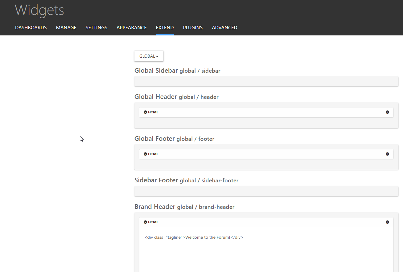
Save
- Go to
admin/appearance/customise#custom-css - Add the below CSS
[data-widget-area="brand-header"] {
    display: contents;
}
.tagline {
    position: relative;
    margin-left: 10px;
    margin-top: 20px;
}
Save
-
 undefined phenomlab has marked this topic as solved on
-
@mventures How’s this ?

To achieve this look
- Create a Brand Header widget

Save
- Go to
admin/appearance/customise#custom-css - Add the below CSS
[data-widget-area="brand-header"] {
    display: contents;
}
.tagline {
    position: relative;
    margin-left: 10px;
    margin-top: 20px;
}
Save
@phenomlab That’s awesome! Keen to give that a try right now! Thank you
 I shall be back.
 -
UPDATE: It worked
 Thank you again. I added a few sentences and had to do a hard refresh for everything to appear and its exactly how I need it to be.
Was that BRAND HEADER widget always there or did you create it just now?? -
UPDATE: It worked
 Thank you again. I added a few sentences and had to do a hard refresh for everything to appear and its exactly how I need it to be.
Was that BRAND HEADER widget always there or did you create it just now??@mventures The brand widget is part of the Harmony theme, so it already exists.
Also, I added another CSS class so that the tagline is hidden on mobiles. With all that text, it’ll wrap and take half of the mobile screen estate, which will look awful.
@media (max-width: 576px) { .tagline { display: none; } } -
@mventures The brand widget is part of the Harmony theme, so it already exists.
Also, I added another CSS class so that the tagline is hidden on mobiles. With all that text, it’ll wrap and take half of the mobile screen estate, which will look awful.
@media (max-width: 576px) { .tagline { display: none; } }@phenomlab That’s a great idea! I didn’t think of that. Thank you.
Hello! It looks like you're interested in this conversation, but you don't have an account yet.
Getting fed up of having to scroll through the same posts each visit? When you register for an account, you'll always come back to exactly where you were before, and choose to be notified of new replies (either via email, or push notification). You'll also be able to save bookmarks and upvote posts to show your appreciation to other community members.
With your input, this post could be even better 💗
Register LoginDid this solution help you?
Related Topics
-
-
-
-
-
-
NodeBB Footer
Solved Customisation -
-
Customising NodeBB
Locked Customisation
