Quote design CSS
-

Hi I would like to change quote on my forum like this because I find it more logical but I break my head for not much with blockquote:after
Any help would be appreciated

Thanks in advance
-

Hi I would like to change quote on my forum like this because I find it more logical but I break my head for not much with blockquote:after
Any help would be appreciated

Thanks in advance
@DownPW Something like this ?

Here’s some CSS you can play with
blockquote:after { border-top: 20px solid #eee; top: 9px; /* changes to top position negates original bottom */ content: ""; position: absolute; left: -19px; /* changes to left position negates original right */ } blockquote { font-size: inherit; border-left: 5px solid #eee; background: #eeeeee; border-radius: 6px; margin: 0 auto 40px; padding: 15px; position: relative; margin-left: 50px; /* move to the right to allow space for speech bubble */ } -
@DownPW Something like this ?

Here’s some CSS you can play with
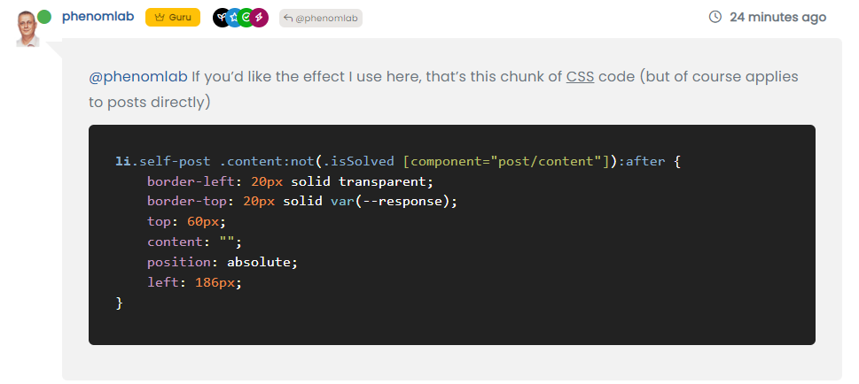
blockquote:after { border-top: 20px solid #eee; top: 9px; /* changes to top position negates original bottom */ content: ""; position: absolute; left: -19px; /* changes to left position negates original right */ } blockquote { font-size: inherit; border-left: 5px solid #eee; background: #eeeeee; border-radius: 6px; margin: 0 auto 40px; padding: 15px; position: relative; margin-left: 50px; /* move to the right to allow space for speech bubble */ }@phenomlab If you’d like the effect I use here, that’s this chunk of CSS code (but of course applies to posts directly)
li.self-post .content:not(.isSolved [component="post/content"]):after { border-left: 20px solid transparent; border-top: 20px solid var(--response); top: 60px; content: ""; position: absolute; left: 186px; } -
@DownPW Something like this ?

Here’s some CSS you can play with
blockquote:after { border-top: 20px solid #eee; top: 9px; /* changes to top position negates original bottom */ content: ""; position: absolute; left: -19px; /* changes to left position negates original right */ } blockquote { font-size: inherit; border-left: 5px solid #eee; background: #eeeeee; border-radius: 6px; margin: 0 auto 40px; padding: 15px; position: relative; margin-left: 50px; /* move to the right to allow space for speech bubble */ }@phenomlab said in Quote design CSS:
@DownPW Something like this ?

Here’s some CSS you can play with
blockquote:after {
    border-top: 20px solid #eee;
    top: 9px; /* changes to top position negates original bottom */
    content: "";
    position: absolute;
    left: -19px; /* changes to left position negates original right */
}
blockquote {
    font-size: inherit;
    border-left: 5px solid #eee;
    background: #eeeeee;
    border-radius: 6px;
    margin: 0 auto 40px;
    padding: 15px;
    position: relative;
    margin-left: 50px; /* move to the right to allow space for speech bubble */
}
yes exactly that

-
 undefined phenomlab has marked this topic as solved on
-
@phenomlab If you’d like the effect I use here, that’s this chunk of CSS code (but of course applies to posts directly)
li.self-post .content:not(.isSolved [component="post/content"]):after { border-left: 20px solid transparent; border-top: 20px solid var(--response); top: 60px; content: ""; position: absolute; left: 186px; }@phenomlab said in Quote design CSS:
@phenomlab If you’d like the effect I use here, that’s this chunk of CSS code (but of course applies to posts directly)
li.self-post .content:not(.isSolved [component="post/content"]):after {
    border-left: 20px solid transparent;
    border-top: 20px solid var(--response);
    top: 60px;
    content: "";
    position: absolute;
    left: 186px;
}
What does he does ?
-
@phenomlab said in Quote design CSS:
@phenomlab If you’d like the effect I use here, that’s this chunk of CSS code (but of course applies to posts directly)
li.self-post .content:not(.isSolved [component="post/content"]):after {
    border-left: 20px solid transparent;
    border-top: 20px solid var(--response);
    top: 60px;
    content: "";
    position: absolute;
    left: 186px;
}
What does he does ?
@DownPW This

-
Ak ok

Thanks Mark !!! -
 undefined phenomlab referenced this topic on
-
@phenomlab said in Quote design CSS:
blockquote:after {
border-top: 20px solid #eee;
top: 9px; /* changes to top position negates original bottom /
content: “”;
position: absolute;
left: -19px; / changes to left position negates original right /
}
blockquote {
font-size: inherit;
border-left: 5px solid #eee;
background: #eeeeee;
border-radius: 6px;
margin: 0 auto 40px;
padding: 15px;
position: relative;
margin-left: 50px; / move to the right to allow space for speech bubble */
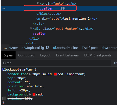
}I can’t move the blockquote:after to the left


@DownPW did you add this line into
blockquote?margin-left: 50px; /* move to the right to allow space for speech bubble */You have to change this margin otherwise the
:aftersudonym won’t display as it needs to occupy the space left by the above CSS change. -
@DownPW did you add this line into
blockquote?margin-left: 50px; /* move to the right to allow space for speech bubble */You have to change this margin otherwise the
:aftersudonym won’t display as it needs to occupy the space left by the above CSS change.If I use your code :
blockquote:after {
    border-top: 20px solid #eee;
    top: 9px; /* changes to top position negates original bottom */
    content: "";
    position: absolute;
    left: -19px; /* changes to left position negates original right */
}
blockquote {
    font-size: inherit;
    border-left: 5px solid #eee;
    background: #eeeeee;
    border-radius: 6px;
    margin: 0 auto 40px;
    padding: 15px;
    position: relative;
    margin-left: 50px; /* move to the right to allow space for speech bubble */
}
I have this :

-
If I use your code :
blockquote:after {
    border-top: 20px solid #eee;
    top: 9px; /* changes to top position negates original bottom */
    content: "";
    position: absolute;
    left: -19px; /* changes to left position negates original right */
}
blockquote {
    font-size: inherit;
    border-left: 5px solid #eee;
    background: #eeeeee;
    border-radius: 6px;
    margin: 0 auto 40px;
    padding: 15px;
    position: relative;
    margin-left: 50px; /* move to the right to allow space for speech bubble */
}
I have this :

@DownPW is this in production ?
-
@phenomlab nope
-
PM to you
-
It’s Ok with this code

blockquote { font-size: inherit; border-left: 5px solid #eee; background: #eeeeee; border-radius: 6px; margin: 0 auto 40px; padding: 15px; position: relative; margin-left: 20px; /* move to the right to allow space for speech bubble */ } blockquote:after { border-left: 20px solid transparent; border-top: 20px solid #eee; top: 10px; content: ""; position: absolute; left: -20px; } -
It’s Ok with this code

blockquote { font-size: inherit; border-left: 5px solid #eee; background: #eeeeee; border-radius: 6px; margin: 0 auto 40px; padding: 15px; position: relative; margin-left: 20px; /* move to the right to allow space for speech bubble */ } blockquote:after { border-left: 20px solid transparent; border-top: 20px solid #eee; top: 10px; content: ""; position: absolute; left: -20px; }@DownPW yes, that does make sense actually. I forgot to mention the layout of Sudonix is custom so that would have an impact on the positioning.
Good spot

Hello! It looks like you're interested in this conversation, but you don't have an account yet.
Getting fed up of having to scroll through the same posts each visit? When you register for an account, you'll always come back to exactly where you were before, and choose to be notified of new replies (either via email, or push notification). You'll also be able to save bookmarks and upvote posts to show your appreciation to other community members.
With your input, this post could be even better 💗
Register LoginDid this solution help you?
Related Topics
-
-
-
-
-
-
-
Bug Navbar CSS
Solved Customisation -
[NODEBB] CSS Style Sheets SelectBox
Locked Solved Customisation


