[NODEBB] Help for my custom CSS
-
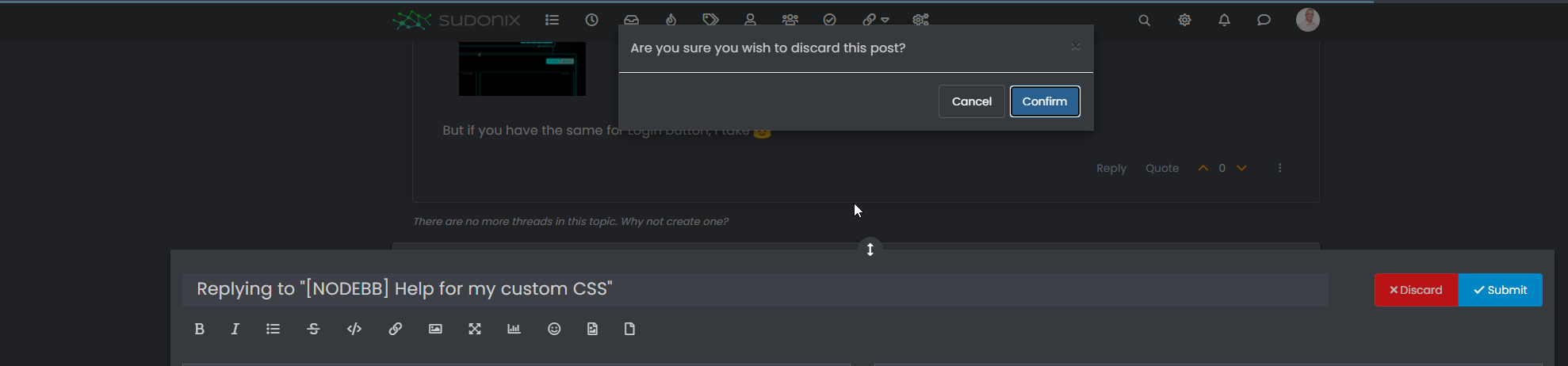
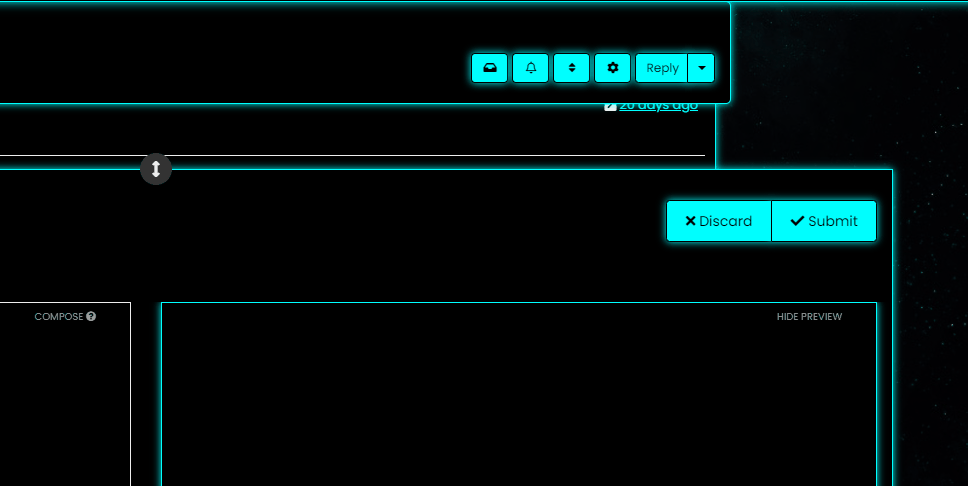
@downpw So (for example) do you want the Discard button to turn red if you you click Confirm, or am I off track here ? Not entirely sure what you’re after
")
Mark – Founder, Phenomlab Ltd
Executive IT & Security Leadership
Phenomlab Ltd -
@downpw So (for example) do you want the Discard button to turn red if you you click Confirm, or am I off track here ? Not entirely sure what you’re after
-
@phenomlab Never mind already found the right CSS property would be nice
@downpw Do you mean this one
button.btn.btn-default.composer-discard:focus {
    background: red;
}
Or another ?
Mark – Founder, Phenomlab Ltd
Executive IT & Security Leadership
Phenomlab Ltd -
@downpw Do you mean this one
button.btn.btn-default.composer-discard:focus {
    background: red;
}
Or another ?
@phenomlab Another I think
-
It seem to be a btn-default problem
PW and WS Spirit alive
-
PW and WS Spirit alive
-
Mark – Founder, Phenomlab Ltd
Executive IT & Security Leadership
Phenomlab Ltd -
@downpw said in [NODEBB] Help for my custom CSS:
But if you have the same for Login button, I take
Use this
button#login { background: green; border: 1px solid green; } -
@phenomlab said in [NODEBB] Help for my custom CSS:
@downpw Think I might have it
.composer-discard:disabled { background: red !important; }That’s works too
-
Other things, I would like to change progress bar color of Windows alert like welcome message, palcement user banner etc…:

PW and WS Spirit alive
-
Other things, I would like to change progress bar color of Windows alert like welcome message, palcement user banner etc…:
-
@phenomlab No idea ?
@downpw yes, I’ve done the same on sudonix but not in front of a pc presently. If you switch to dark mode on this platform, you’ll see the changes i made to the alert message.
-
I see how to change background color, text color, border color but not the progress bar with transition value.
It’s too fast to see the code on console
I see this in “element style” :
transition: width 5450ms linear 0s, background-color 5450ms ease-in 0s;But I don’t no what to do with this
PW and WS Spirit alive
-
I see how to change background color, text color, border color but not the progress bar with transition value.
It’s too fast to see the code on console
I see this in “element style” :
transition: width 5450ms linear 0s, background-color 5450ms ease-in 0s;But I don’t no what to do with this
@downpw Seems like it’s contained in this block

<div id="alert_button_1643376464937" class="alert alert-dismissable alert-success clearfix animate" component="toaster/toast" timeoutid="172" style="transition: width 5450ms linear 0s, background-color 5450ms ease-in 0s;">
	<button type="button" class="close" data-dismiss="alert" aria-hidden="true">×</button>
	<strong>Welcome Back  phenomlab!</strong>
	<p>You have successfully logged in</p>
</div>
For info, you can actually pause the execution of Javascript as follows
-
Open Developer tools, Go to Sources tab and keep it ready
-
Now, go back and perform the actions on the App to get it to the state where it needs to be frozen.
-
Click on the ‘Pause Script Execution’ button (first button in the list of buttons on the right corner of Sources tab) to pause the page.
This will force the debugger to pause the execution, meaning you’ll see the below
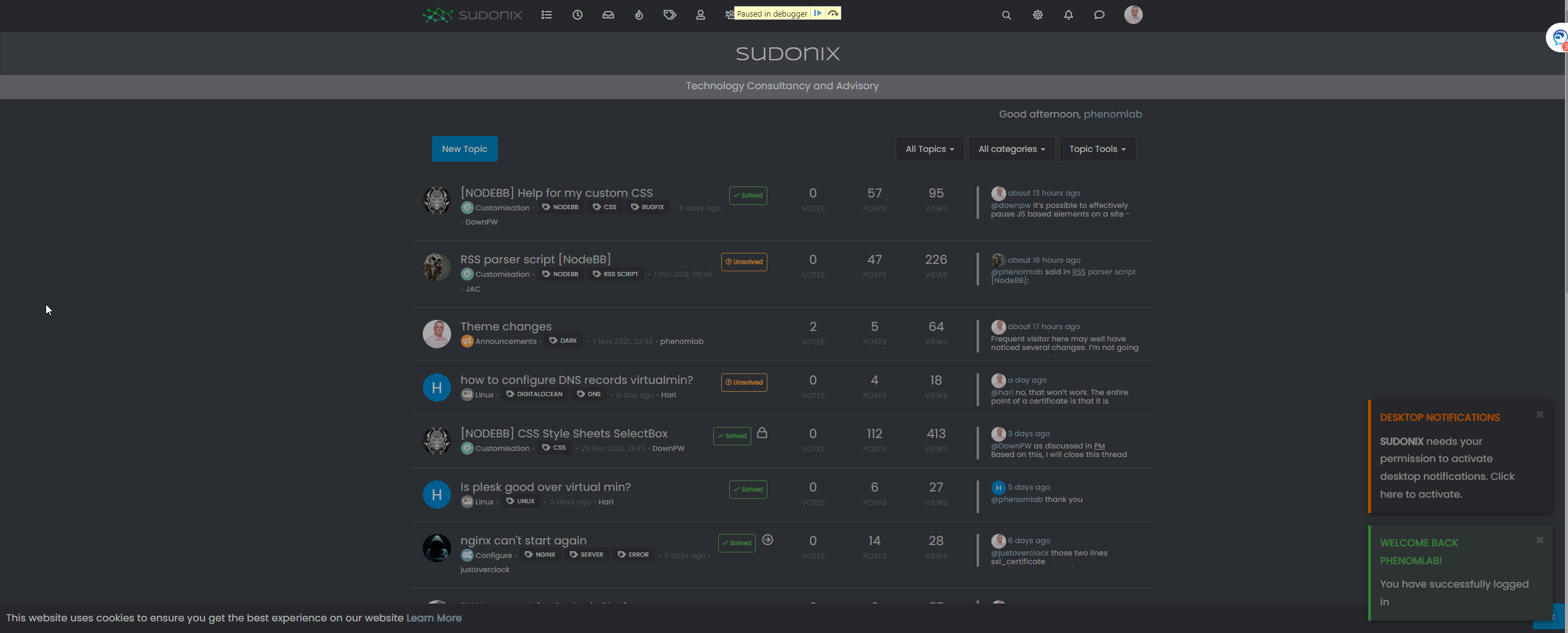
This will then allow you to expose the elements you need
Mark – Founder, Phenomlab Ltd
Executive IT & Security Leadership
Phenomlab Ltd -
-
@downpw Seems like it’s contained in this block
<div id="alert_button_1643376464937" class="alert alert-dismissable alert-success clearfix animate" component="toaster/toast" timeoutid="172" style="transition: width 5450ms linear 0s, background-color 5450ms ease-in 0s;">
	<button type="button" class="close" data-dismiss="alert" aria-hidden="true">×</button>
	<strong>Welcome Back  phenomlab!</strong>
	<p>You have successfully logged in</p>
</div>
For info, you can actually pause the execution of Javascript as follows
-
Open Developer tools, Go to Sources tab and keep it ready
-
Now, go back and perform the actions on the App to get it to the state where it needs to be frozen.
-
Click on the ‘Pause Script Execution’ button (first button in the list of buttons on the right corner of Sources tab) to pause the page.
This will force the debugger to pause the execution, meaning you’ll see the below
This will then allow you to expose the elements you need
Yeah I test that and I find and modify these code :
.alert-window .alert {

    background-color: black;
    color: aqua;
}

.alert-window .alert.alert-success {
    color: aqua;
    border-color: aqua;
}

.alert-window .alert.animate.alert-success::before {
    background-color: red !important;
}

.alert-window .alert.animate::before {
    width: calc(100% + 50px);
}
For example, what i want here are just have animate progress bar on red but doesn’t work, she’s black.
I close the topic on nodebb communauty. no one respond
PW and WS Spirit alive
-
-
Yeah I test that and I find and modify these code :
.alert-window .alert {

    background-color: black;
    color: aqua;
}

.alert-window .alert.alert-success {
    color: aqua;
    border-color: aqua;
}

.alert-window .alert.animate.alert-success::before {
    background-color: red !important;
}

.alert-window .alert.animate::before {
    width: calc(100% + 50px);
}
For example, what i want here are just have animate progress bar on red but doesn’t work, she’s black.
I close the topic on nodebb communauty. no one respond
@downpw said in [NODEBB] Help for my custom CSS:
no one respond
Only me
I’ll have a look this weekend to see if I can identify the js class but I do think this is based off another CSS value and an alpha rgba used as an overlay.
-
.alert-window .alert.animate.alert-success::before {
    background-color: red !important;
}
I have test with white background and It seems to work.
But the red come at the middle/end (maybe a settings CSS transition) :
But with black background, the red is here (we see it at the end) we see nothing at all.
Seems the background overall the animate effect :

PW and WS Spirit alive
-
.alert-window .alert.animate.alert-success::before {
    background-color: red !important;
}
I have test with white background and It seems to work.
But the red come at the middle/end (maybe a settings CSS transition) :But with black background, the red is here (we see it at the end) we see nothing at all.
Seems the background overall the animate effect :
@downpw I’ve a feeling this night be related to
z-index. Try setting with a high value, as this will force the animation to the front. -
possible to delete border radius at the bottom left and right ?
Just border radius at the top of the first div and at the last Div bottom ?
I would like a entirely bloc with four border radiusPossible ?
I play with .categories>li, .category>ul>li but it’s not what I wantI would like to move chat bubbles and WYSIWYG at the left bottom if it’s possible, I tetst with this bit it’s not perfect :
.taskbar .navbar-nav {
    padding-right: 1840px;
    padding-bottom: 15px;
    position: relative;
    bottom: 25px !important;
}
Thanks for your help in advance Mark
PW and WS Spirit alive
-
possible to delete border radius at the bottom left and right ?
Just border radius at the top of the first div and at the last Div bottom ?
I would like a entirely bloc with four border radiusPossible ?
I play with .categories>li, .category>ul>li but it’s not what I wantI would like to move chat bubbles and WYSIWYG at the left bottom if it’s possible, I tetst with this bit it’s not perfect :
.taskbar .navbar-nav {
    padding-right: 1840px;
    padding-bottom: 15px;
    position: relative;
    bottom: 25px !important;
}
Thanks for your help in advance Mark
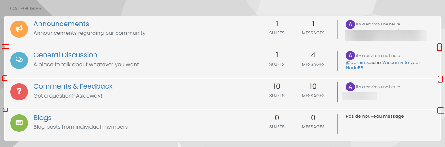
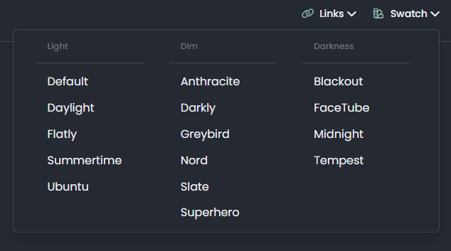
@DownPW Definitely possible, yes. This will work
.categories>li, .category>ul>li {
    border-radius: 0px;
}
.categories>li:first-of-type {
    border-top-left-radius: 4px;
    border-top-right-radius: 4px;
}
.categories>li:last-of-type {
    border-bottom-left-radius: 4px;
    border-bottom-right-radius: 4px;
}
Looks like this
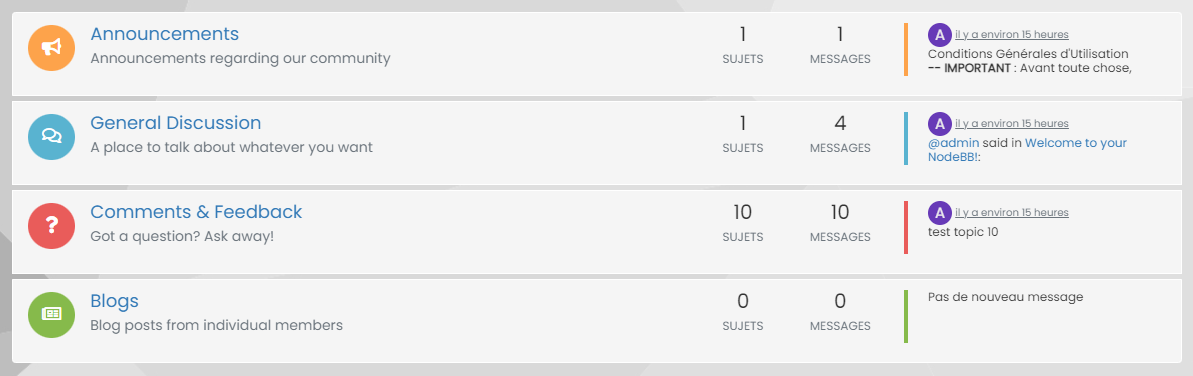
You could then close the gaps between if you really wanted it as one block
.categories>li, .category>ul>li {
    border: none;
    margin-top: 0px;
    background: #F5F5F5;
}
That gives you

Mark – Founder, Phenomlab Ltd
Executive IT & Security Leadership
Phenomlab Ltd

Hello! It looks like you're interested in this conversation, but you don't have an account yet.
Getting fed up of having to scroll through the same posts each visit? When you register for an account, you'll always come back to exactly where you were before, and choose to be notified of new replies (either via email, or push notification). You'll also be able to save bookmarks and upvote posts to show your appreciation to other community members.
With your input, this post could be even better 💗
Register LoginDid this solution help you?
Related Topics
-
-
-
-
-
-
-
[NODEBB] CSS Style Sheets SelectBox
Locked Solved Customisation -