@Panda You’ll need to do that with js. With some quick CSS changes, it looks like this
d619844f-fbfe-4cf1-a283-6b7364f6bf18-image.png
The colour choice is still really hard on the eye, but at least you can now read the text
@DownPW very odd. I’ll have a look at this directly on your dev site tomorrow morning to see why this is.
EDIT - this is now fixed. I looked at the code, and I was right that it should work, and only execute once  - not sure what happened there.

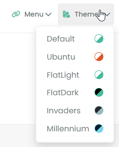
EDIT2 - I absolutely love this design, and am stealing it  Such a clever way of depicting colour in the theme, and I’m going to make it dynamic also so that the colours change if the theme
 css does.
@phenomlab said in [NODEBB] Help for my custom CSS:
EDIT - this is now fixed. I looked at the code, and I was right that it should work, and only execute once - not sure what happened there.
 ️ hmmm not, almost fixed @phenomlab !
It’s ok for duplicate ajax problem but not fixed for the the footer image : It’s appear one time and if you go to another section (like recent or unread for example), the image on footer don’t appear
Same in incognito mode.

@phenomlab said in [NODEBB] Help for my custom CSS:
EDIT2 - I absolutely love this design, and am stealing it Such a clever way of depicting colour in the theme, and I’m going to make it dynamic also so that the colours change if the theme css does.
Thank you !
–> I already told you, my code is your code 
Thinking about it, I found this idea elsewhere but I don’t really know where 
I just added a rotation effect on it and adapted it to the dropdown of the brand menu widget.
You talk about making it dynamic but I don’t really see what you mean since the theme colors represented do not change.
Unless you want to automate it. Genre detects the 2 main color types of the theme according to 2 values/declarations present in the css file.
@DownPW said in [NODEBB] Help for my custom CSS:
It’s ok for duplicate ajax problem but not fixed for the the footer image : It’s appear one time and if you go to another section (like recent or unread for example), the image on footer don’t appear
I kind of expected that because the footer image relies on an ajax reload to determine the time, then work out which image to display based on that. The real problem here is that the prepend is being called on each request, and because it’s an prepend, you are seeing multiple copies.
One way to fix this is to delete the element and recreate it, but that is horribly inefficient 
I’ve modified the function to include a check to see if the containing div is empty or not - if it is, we add the icon and message - if it’s already there, we skip it
    // Test to see if the DIV containing the icon and message is empty. If it is, insert icon and message
    if ($('#busername').length === 0) {
        $('.getUsername').prepend("<div id='busername'><i id='thisicon' class='" + theicon + "'></i></div>" + themessage);
    } else {
        // nothing to do here :)
    }
(Note that this has been added to the existing function)
And some minor css which allows us to float the new div so that it displays inline
// Inline display fix for Welcome DIV
div#busername {
    display: inline;
}
@DownPW said in [NODEBB] Help for my custom CSS:
You talk about making it dynamic but I don’t really see what you mean since the theme colors represented do not change.
Unless you want to automate it. Genre detects the 2 main color types of the theme according to 2 values/declarations present in the css file.
Simple enough -you just reference the variables, but admittedly, you’d need to refactor some code to make this work transiently, so it’s probably not a very good idea. I suppose it really depends on how often you decide to revamp your themes - in which case, it would make sense.
I just don’t like static variables 
@phenomlab said in [NODEBB] Help for my custom CSS:
I just don’t like static variables
It doesn’t bother me too much personally because I’m not ready to modify the themes in depth, especially the main colors, but what you say makes sense.
It’s always better to automate when you can.
I’ll see what you can do ha ha 
In any case, I’m happy to bring my stone to the building 
Hello @phenomlab
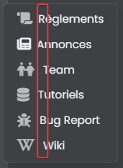
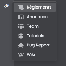
I have a dropdown menu with manu different left icons and I want to align vertically the <a> text
I don’t know why I can’t do it. Fatigue maybe? 
Here the code of my menu :
<li><a id="menubrand" class="dropdown-item rounded-1" href="https://xxxxxxxxxxxxxxxx"><i id="menubrand" class="fa-solid fa-lg fa-scroll text-primary"></i> Règlements</a></li>
<li><a id="menubrand" class="dropdown-item rounded-1" href="https://xxxxxxxxxxxxxxxx"><i id="menubrand" class="fa-solid fa-lg fa-newspaper"></i> Annonces</a></li>
<li><a id="menubrand" class="dropdown-item rounded-1" href="https://xxxxxxxxxxxxxxxx"><i id="menubrand" class="fa-solid fa-lg fa-people text-primary"></i> Team</a></li>
<li><a id="menubrand" class="dropdown-item rounded-1" href="https://xxxxxxxxxxxxxxxx""><i id="menubrand" class="fa-solid fa-lg fa-database text-primary"></i> Tutoriels</a></li>
<li><a id="menubrand" class="dropdown-item rounded-1" href="https://xxxxxxxxxxxxxxxx"><i id="menubrand" class="fa-solid fa-lg fa-bug text-primary"></i> Bug Report</a></li>
<li><a id="menubrand" class="dropdown-item rounded-1" href="https://xxxxxxxxxxxxxxxx"><i id="menubrand" class="fa-solid fa-lg fa-brands fa-wikipedia-w text-primary"></i> Wiki</a></li>
Resut :
Many thanks 
@DownPW You’ll need to restructure the HTML first - don’t use nbsp; - you should always use margin or padding  Also, you are using the same ID multiple times which will cause you problems with markup as it is not unique.
Try this
<li><a class="menubrand dropdown-item rounded-1" href="https://xxxxxxxxxxxxxxxx"><i class="fa-solid fa-lg fa-scroll text-primary menubrand"></i>Règlements</a></li>
<li><a class="dropdown-item rounded-1" href="https://xxxxxxxxxxxxxxxx"><i class="fa-solid fa-lg fa-newspaper menubrand"></i>Annonces</a></li>
<li><a class="dropdown-item rounded-1" href="https://xxxxxxxxxxxxxxxx"><i class="fa-solid fa-lg fa-people text-primary menubrand"></i>Team</a></li>
<li><a class="dropdown-item rounded-1" href="https://xxxxxxxxxxxxxxxx""><i class="fa-solid fa-lg fa-database text-primary menubrand"></i>Tutoriels</a></li>
<li><a class="dropdown-item rounded-1" href="https://xxxxxxxxxxxxxxxx"><i class="fa-solid fa-lg fa-bug text-primary menubrand"></i>Bug Report</a></li>
<li><a class="dropdown-item rounded-1" href="https://xxxxxxxxxxxxxxxx"><i class="fa-solid fa-lg fa-brands fa-wikipedia-w text-primary menubrand"></i>Wiki</a></li>
Then use this CSS
i.menubrand {
    max-width: 25px;
    width: 25px;
    margin-right: 10px;
    text-align: center;
    vertical-align: middle;
}
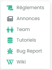
Should give you this
hmmm ok I will test asap thanks 
Why have you the second icon with no colors : odd no ?
Edit :
Ok, find the problem, second line have no text-primary and the first line have a different a class.
– Better like this I think :
<li><a class="dropdown-item rounded-1" href="https://xxxxxxxxxxxxxxxx"><i class="fa-solid fa-lg fa-scroll text-primary menubrand"></i>Règlements</a></li>
<li><a class="dropdown-item rounded-1" href="https://xxxxxxxxxxxxxxxx"><i class="fa-solid fa-lg fa-newspaper text-primary menubrand"></i>Annonces</a></li>
<li><a class="dropdown-item rounded-1" href="https://xxxxxxxxxxxxxxxx"><i class="fa-solid fa-lg fa-people text-primary menubrand"></i>Team</a></li>
<li><a class="dropdown-item rounded-1" href="https://xxxxxxxxxxxxxxxx""><i class="fa-solid fa-lg fa-database text-primary menubrand"></i>Tutoriels</a></li>
<li><a class="dropdown-item rounded-1" href="https://xxxxxxxxxxxxxxxx"><i class="fa-solid fa-lg fa-bug text-primary menubrand"></i>Bug Report</a></li>
<li><a class="dropdown-item rounded-1" href="https://xxxxxxxxxxxxxxxx"><i class="fa-solid fa-lg fa-brands fa-wikipedia-w text-primary menubrand"></i>Wiki</a></li>
Thank you my friend
@DownPW I was just going to say that 

Just this bug.
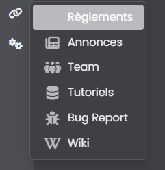
How can I change the icon color of the active page? as you can see, the icon is not visible when we are on the selected page
I don’t want to change background active primary color but for example change icon to white like the text or other color
@DownPW I just checked this, and it looks as though you are using using a transparent colour to work around the hover issue?
Not at all 
The problem occurs on the left sidebar but not in the Brand menu.
@DownPW This is what I see in the left side bar. I am using the Metallic theme?
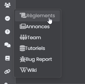
You must have a cache problem because the CSS is not even active on your image 
The problem appears on the current page and not the hover
For example, use the menu to go to the Rules page. Once on the rules page, reuse the menu to see the bug
@DownPW Cache cleared, but…
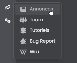
re test and click on a link ?
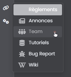
@DownPW I see it in an incognito session - looks like I’ve got some browser related issues 
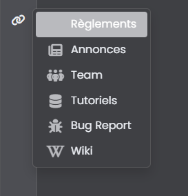
So it’s not hover, but :active
I’d ne inclined to use transparency here as it’s much less effort
.dropdown-item.active, .dropdown-item:active {
    --bs-dropdown-link-active-bg: #b9babe38;
}
That will give you (for this swatch at least)
@DownPW said in [NODEBB] Help for my custom CSS:
Just this bug.
How can I change the icon color of the active page