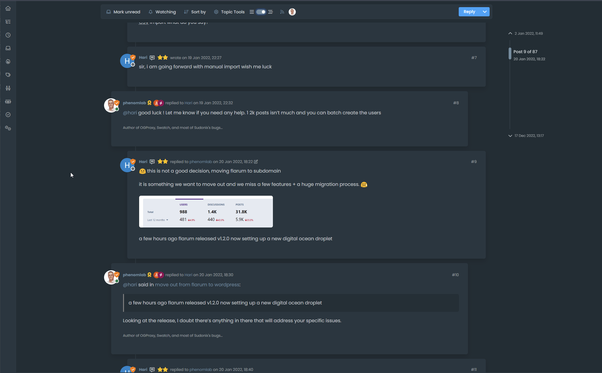
Material View Support for Stock NodeBB
-
@phenomlab said in Material View Support foir Stock NodeBB:
@DownPW Did you review the classes as I mentioned?
yes but added the wrong class name, it’s better now.
I’m here at the moment.
JS :
// ------------------------------------------
// material View Mode
// ------------------------------------------

function material() {
    $(document).ready(function () {
        // Check if the screen width is 460px or more
        if ($(window).width() >= 460) {
            // Check if the custom thread view button already exists
            if ($('#materialThreadViewButton').length === 0) {
                // Create the button for custom thread view mode with custom IDs
                var threadViewButton = $('<div class="material-threads-wrapper"><form class="form"><div class="form-check form-switch material-threads-wrapper"> \
                    <input class="form-check-input" id="materialThreadViewButton" type="checkbox" data-field="materialThreadView"> \
                    <label class=" d-none d-md-inline fw-semibold" for="materialThreadViewButton"></label> \
                </div></form></div>');

                // Append the button to the right sidebar
                $('[component="sidebar/right"]').append(threadViewButton);
            }

            // Check if there's a stored state for the checkbox and update it
            var storedState = localStorage.getItem('materialThreadViewState');
            if (storedState === 'true') {
                $('#materialThreadViewButton').prop('checked', true);
            }

            // Toggle the class 'material' on or off when the checkbox changes state
            $('#materialThreadViewButton').on('change', function () {
                var isChecked = $(this).is(':checked');
                var theTooltip = isChecked ? "Material Thread View Off" : "Material Thread View On"; // Update tooltip message

                // Toggle CSS rules when the button is turned on or off
                if (isChecked) {
                    console.log('Material Thread view is active.');
                    // Apply your CSS rules here
                    $('[component=post]').addClass('material');
                    $('[component="category/topic"]').addClass('material');
                    $('[component="categories/category"]').addClass('material');
                } else {
                    console.log('Material Thread view is inactive.');
                    // Remove the CSS rules here
                    $$('[component=post]').removeClass('material');
                    $('[component="category/topic"]').removeClass('material');
                    $('[component="categories/category"]').removeClass('material');
                }

                // Store the checkbox state in localStorage
                localStorage.setItem('materialThreadViewState', isChecked);

                // Update the tooltip title
                $(this).attr('data-original-title', theTooltip).tooltip('dispose').tooltip({
                    placement: 'bottom',
                    title: theTooltip,
                    trigger: 'hover'
                });
            });

            // Check for changes in the checkbox state when the page loads
            $('#materialThreadViewButton').trigger('change');
        }
    });
}

// Attach the material function to relevant events
$(window).on('action:ajaxify.end', function (data) {
    material();
});

$(window).on('action:posts.edited', function (data) {
    material();
});

$(window).on('action:posts.loaded', function (data) {
    material();
});
CSS :
.material-threads-wrapper {
    display: flex;
    left: 5px !important;
    position: relative !important;
}

@media (min-width:460px) {

[component=post].material, [component="category/topic"].material, [component="categories/category"].material {
    background: #F7F7F7 !important;
    border-radius: 0.375rem;
    margin-bottom: 20px;
    padding-left: 20px;
    border: 1px solid var(--bs-border-color);
}

}
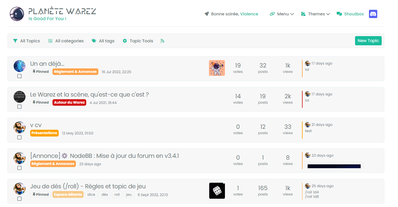
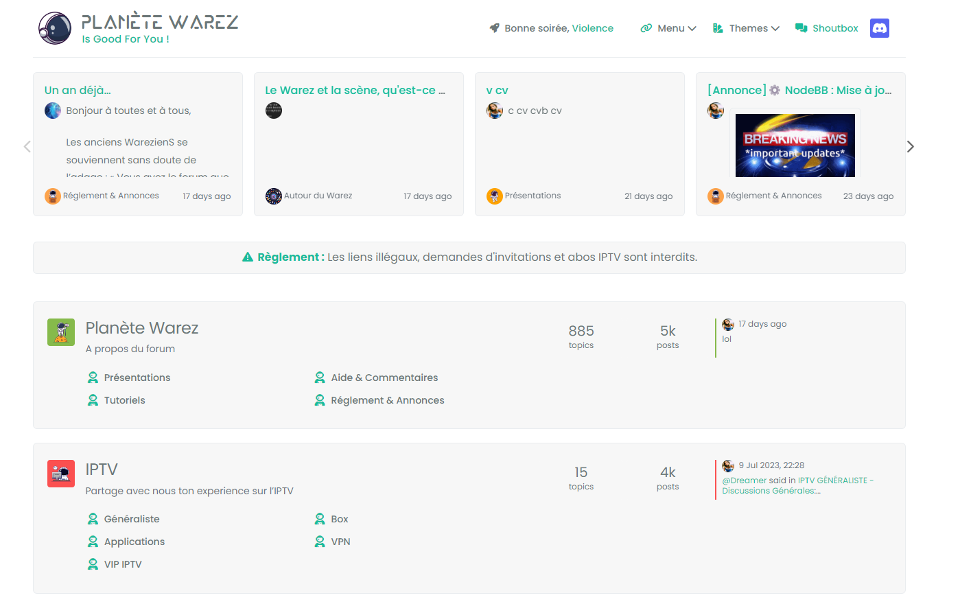
– There are quite a few things left, for example:
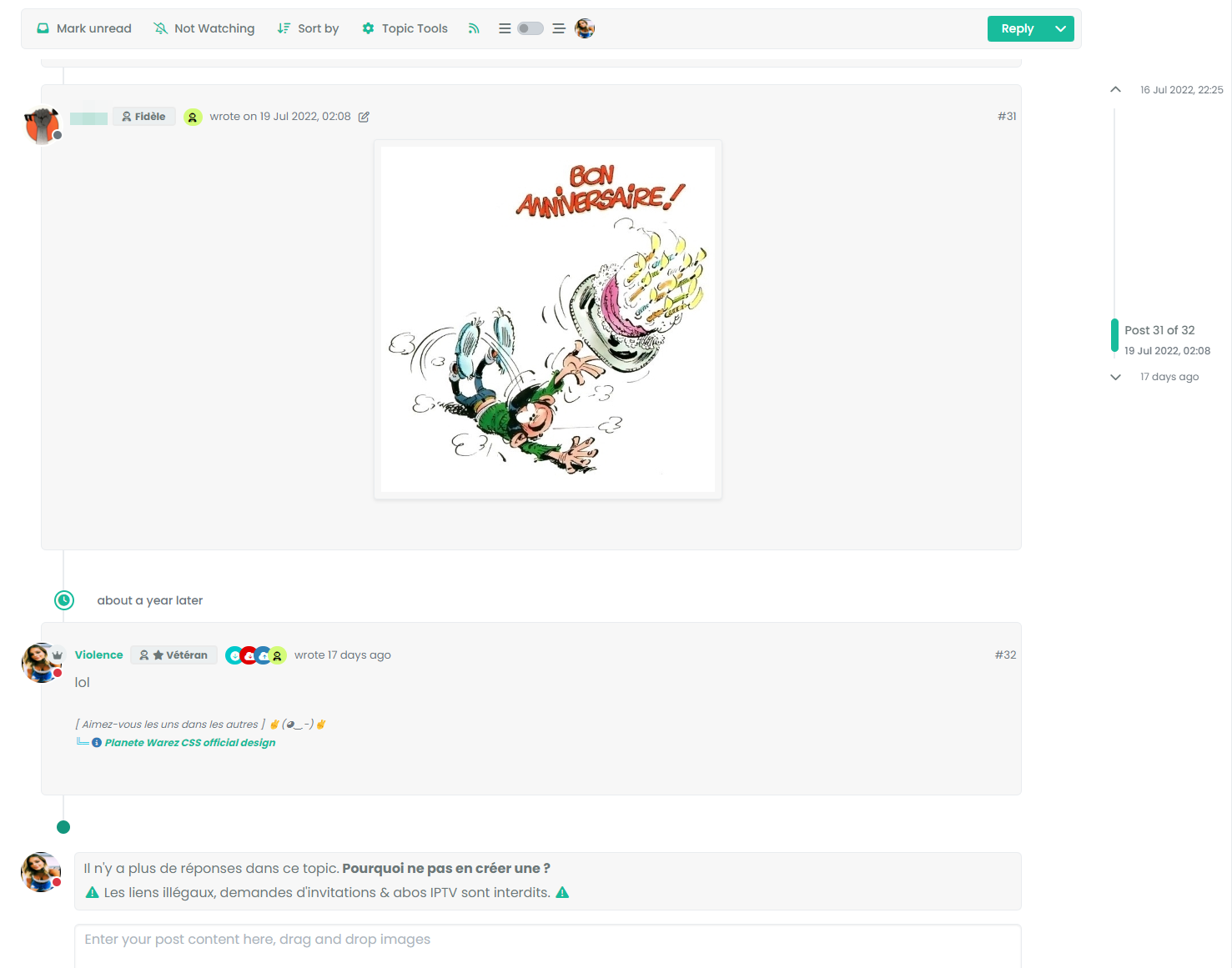
- if we scan the recent or unread ones, the rest is not in the background :
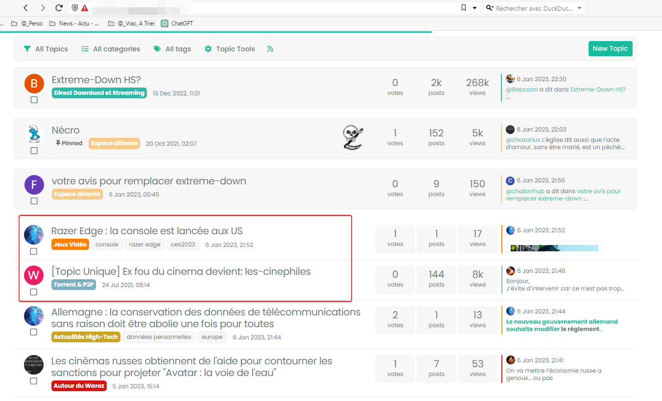
- And the block + timeline in the topics :
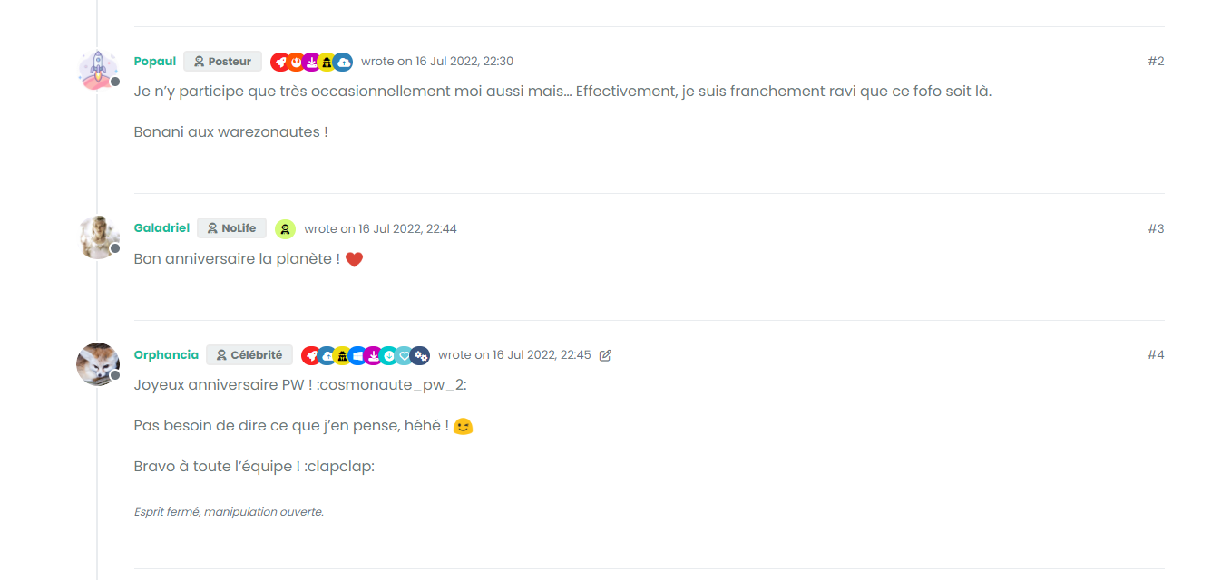
I would also like to change the button which is not suitable for a vertical display
For the moment, I haven’t found for all of that but I’m looking for.
-
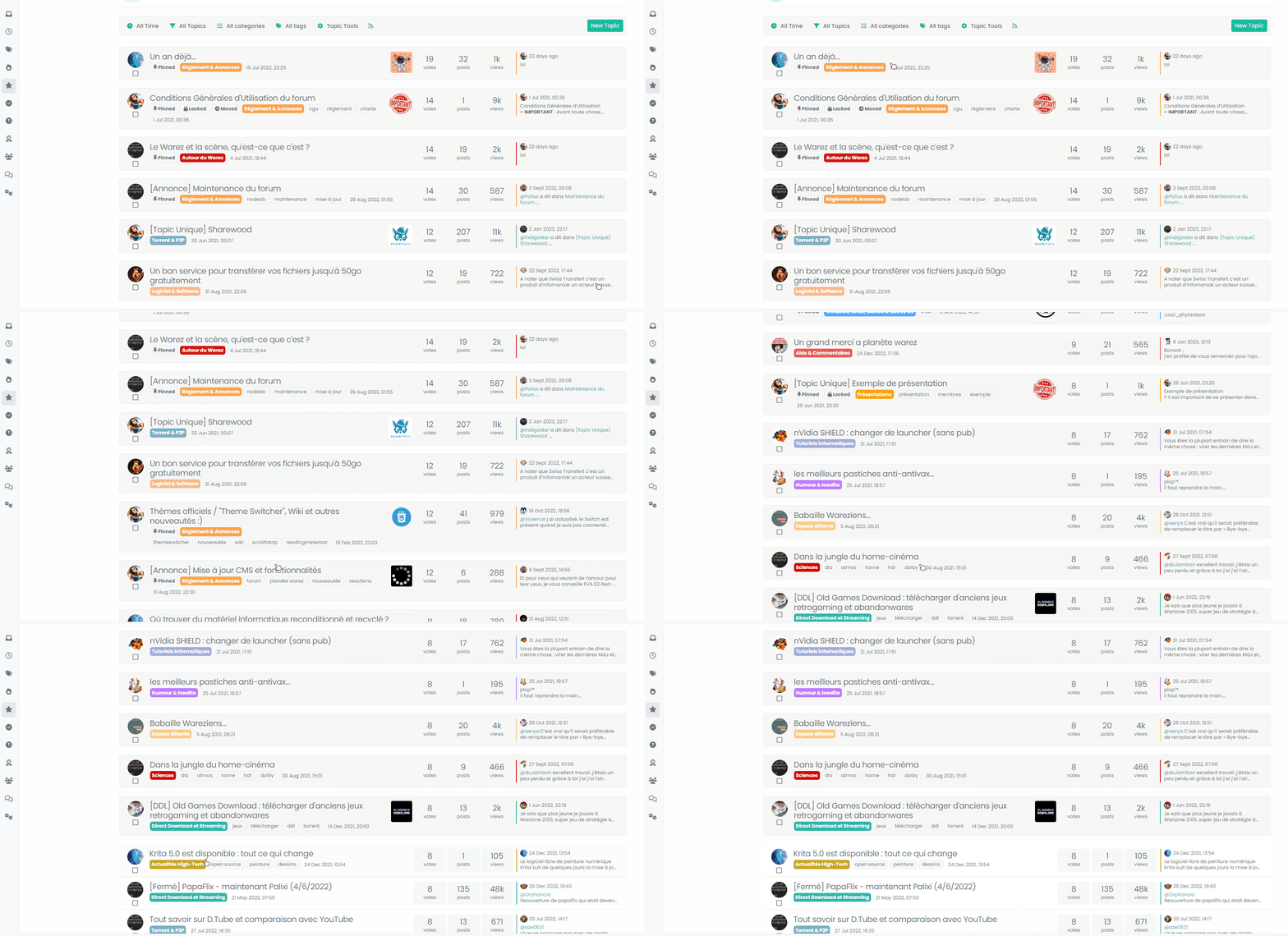
better with video :
-
@DownPW You’re missing a hook

I’ve added this
$(window).on('action:topics.loaded', function (data) {
    material();
});
Works now !
-
@phenomlab said in Material View Support foir Stock NodeBB:
@DownPW Did you review the classes as I mentioned?
yes but added the wrong class name, it’s better now.
I’m here at the moment.
JS :
// ------------------------------------------
// material View Mode
// ------------------------------------------

function material() {
    $(document).ready(function () {
        // Check if the screen width is 460px or more
        if ($(window).width() >= 460) {
            // Check if the custom thread view button already exists
            if ($('#materialThreadViewButton').length === 0) {
                // Create the button for custom thread view mode with custom IDs
                var threadViewButton = $('<div class="material-threads-wrapper"><form class="form"><div class="form-check form-switch material-threads-wrapper"> \
                    <input class="form-check-input" id="materialThreadViewButton" type="checkbox" data-field="materialThreadView"> \
                    <label class=" d-none d-md-inline fw-semibold" for="materialThreadViewButton"></label> \
                </div></form></div>');

                // Append the button to the right sidebar
                $('[component="sidebar/right"]').append(threadViewButton);
            }

            // Check if there's a stored state for the checkbox and update it
            var storedState = localStorage.getItem('materialThreadViewState');
            if (storedState === 'true') {
                $('#materialThreadViewButton').prop('checked', true);
            }

            // Toggle the class 'material' on or off when the checkbox changes state
            $('#materialThreadViewButton').on('change', function () {
                var isChecked = $(this).is(':checked');
                var theTooltip = isChecked ? "Material Thread View Off" : "Material Thread View On"; // Update tooltip message

                // Toggle CSS rules when the button is turned on or off
                if (isChecked) {
                    console.log('Material Thread view is active.');
                    // Apply your CSS rules here
                    $('[component=post]').addClass('material');
                    $('[component="category/topic"]').addClass('material');
                    $('[component="categories/category"]').addClass('material');
                } else {
                    console.log('Material Thread view is inactive.');
                    // Remove the CSS rules here
                    $$('[component=post]').removeClass('material');
                    $('[component="category/topic"]').removeClass('material');
                    $('[component="categories/category"]').removeClass('material');
                }

                // Store the checkbox state in localStorage
                localStorage.setItem('materialThreadViewState', isChecked);

                // Update the tooltip title
                $(this).attr('data-original-title', theTooltip).tooltip('dispose').tooltip({
                    placement: 'bottom',
                    title: theTooltip,
                    trigger: 'hover'
                });
            });

            // Check for changes in the checkbox state when the page loads
            $('#materialThreadViewButton').trigger('change');
        }
    });
}

// Attach the material function to relevant events
$(window).on('action:ajaxify.end', function (data) {
    material();
});

$(window).on('action:posts.edited', function (data) {
    material();
});

$(window).on('action:posts.loaded', function (data) {
    material();
});
CSS :
.material-threads-wrapper {
    display: flex;
    left: 5px !important;
    position: relative !important;
}

@media (min-width:460px) {

[component=post].material, [component="category/topic"].material, [component="categories/category"].material {
    background: #F7F7F7 !important;
    border-radius: 0.375rem;
    margin-bottom: 20px;
    padding-left: 20px;
    border: 1px solid var(--bs-border-color);
}

}
– There are quite a few things left, for example:
- if we scan the recent or unread ones, the rest is not in the background :

- And the block + timeline in the topics :

I would also like to change the button which is not suitable for a vertical display
For the moment, I haven’t found for all of that but I’m looking for.
@DownPW said in Material View Support foir Stock NodeBB:
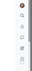
I would also like to change the button which is not suitable for a vertical display
You could rotate it?
.material-threads-wrapper {
    display: flex;
    left: 5px !important;
    position: relative !important;
    transform: rotate(45deg);
    margin-left: -2px;
    margin-top: 5px;
}
-
@DownPW could you pls share updated and enclosed codes for css and js?
-
@cagatay The code is not mature yet. There is still work to be done and phenomlab will have to validate it because I am not a developer
@phenomlab said in Material View Support foir Stock NodeBB:
You could rotate it?
yep sure it’s better

but I was thinking of a 2-state radio button like the form-switch because I believe Bootstrap offers it if I don’t say bullsh*t. -
@cagatay The code is not mature yet. There is still work to be done and phenomlab will have to validate it because I am not a developer
@phenomlab said in Material View Support foir Stock NodeBB:
You could rotate it?
yep sure it’s better

but I was thinking of a 2-state radio button like the form-switch because I believe Bootstrap offers it if I don’t say bullsh*t.@DownPW said in Material View Support foir Stock NodeBB:
but I was thinking of a 2-state radio button like the form-switch because I believe Bootstrap offers it if I don’t say bullsh*t.
Something like this?
-
yes maybe, I had thought about that but just one button not two but why not :

https://getbootstrap.com/docs/5.0/forms/checks-radios/
I’m not closed off I’m trying to see what could be better.
-
see this @phenomlab
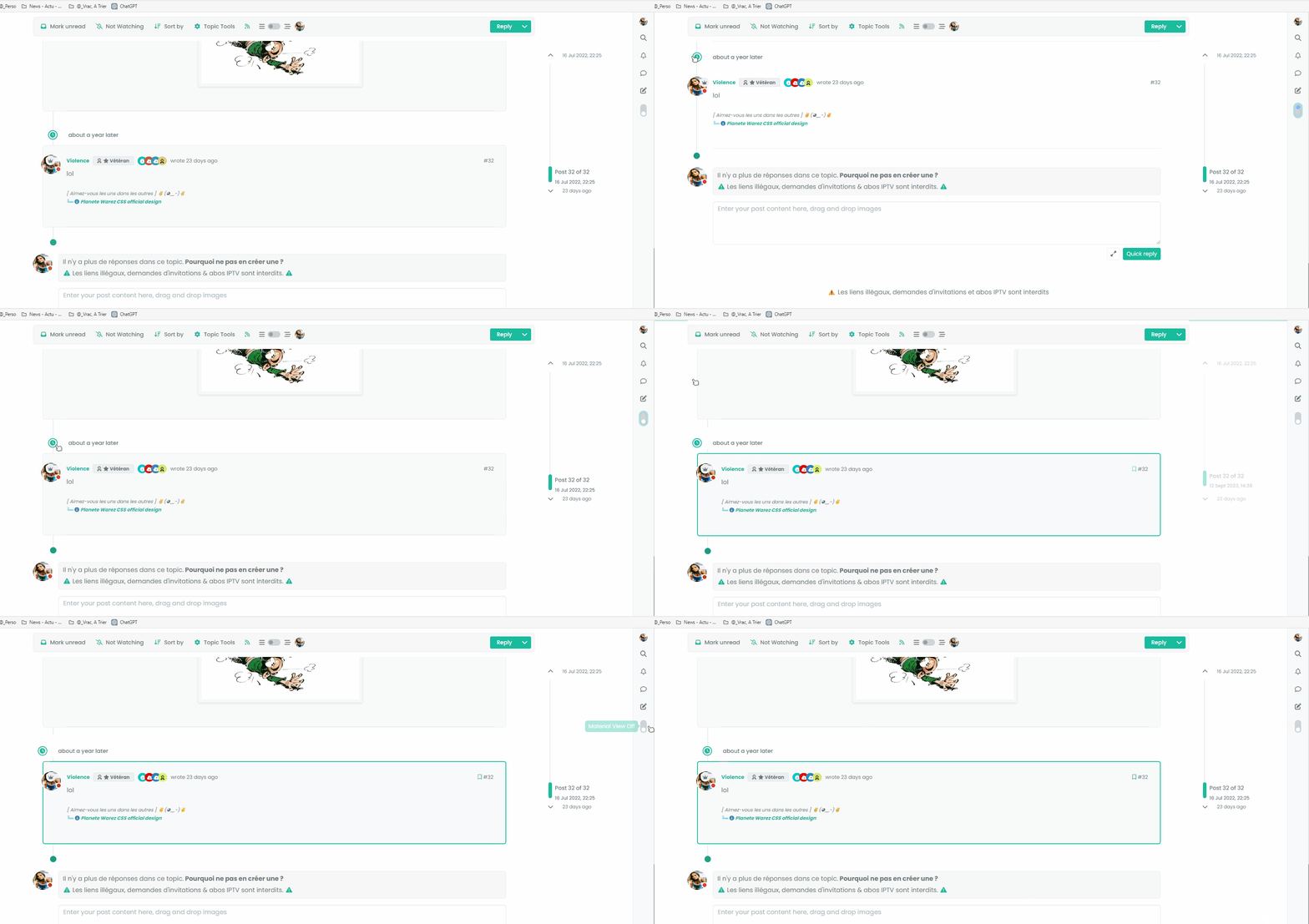
the element is perfect regardless of the mode engaged but a refresh does not replace it correctly.
A missing hook? -
see this @phenomlab

the element is perfect regardless of the mode engaged but a refresh does not replace it correctly.
A missing hook?@DownPW No. More likely a CSS class is not being applied on load.
-
hmm that doesn’t help me much

-
@DownPW Add this to your existing css class of
.page-topic .topic .posts.timeline [component="topic/event"].timeline-event, .page-topic .topic .posts.timeline [component="topic/necro-post"].timeline-eventmargin-left: 52px;So you land up with
.page-topic .topic .posts.timeline [component="topic/event"].timeline-event, .page-topic .topic .posts.timeline [component="topic/necro-post"].timeline-event {
    margin-bottom: 10px;
    margin-left: 52px;
}
That will fix it.
-
no it’s worse

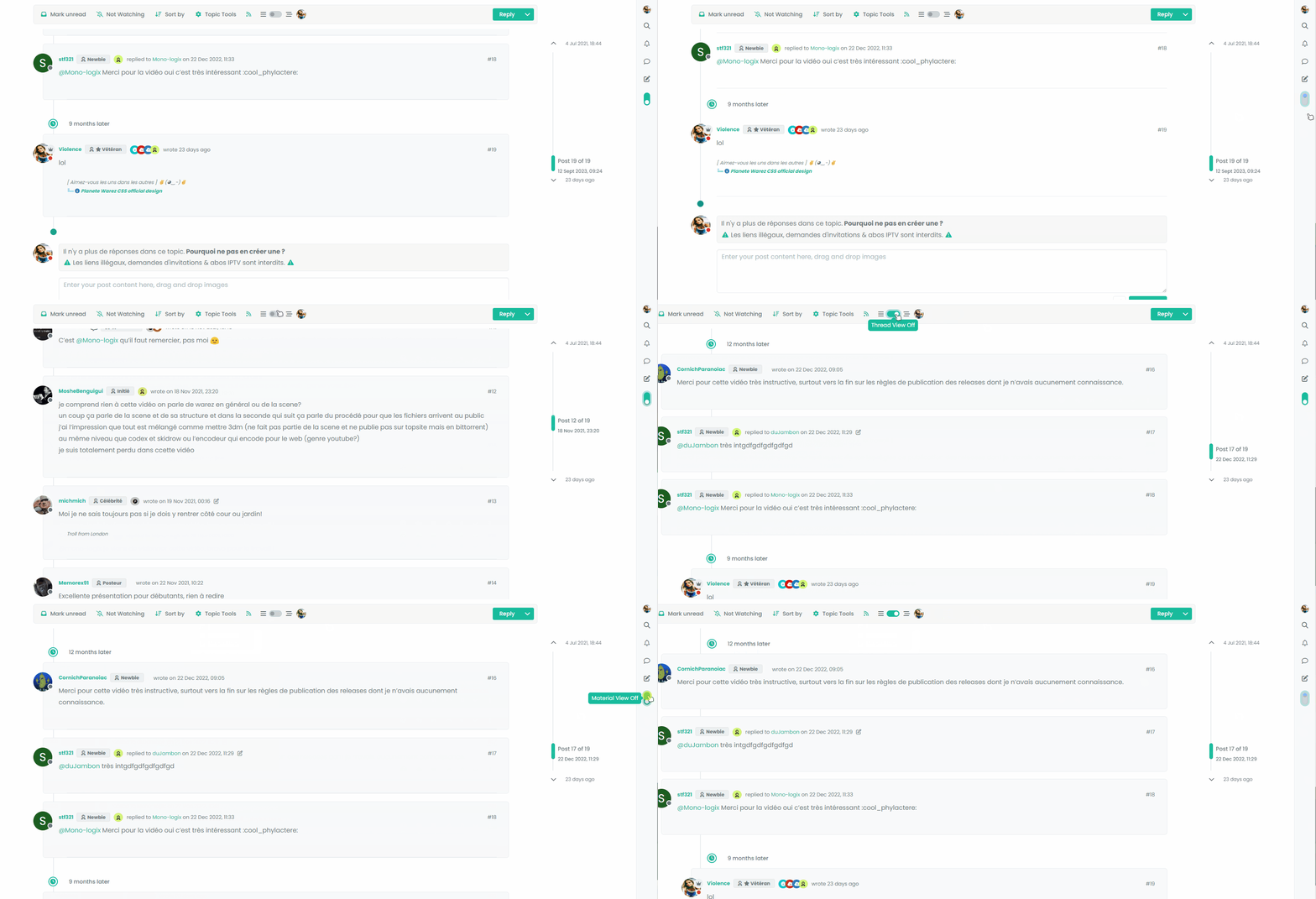
Maybe, the best would be to add a .material class but I can’t do it at the moment
-
no it’s worse


Maybe, the best would be to add a .material class but I can’t do it at the moment
@DownPW I remember this same issue now when I came across it whilst writing the
threadedfunction. The problem here is that[component="topic/necro-post"]actually isn’t present in the DOM on page load, but added afterwards. This is why once the page has loaded, you can target the element with the toggle switch because it is in the DOM at the time. Because the this specific element is loaded afterwards, you cannot target it if it doesn’t exist.This effectively means you cannot add a class to an element that is not there. To work around this, you’d either have to wait for the page to load, add the
necroelement, then target it.Or, use the CSS I provided, and then “counter” it using other CSS when the class is removed. This is what I do in thwe
threadedfunction.Raised this as an issue here
https://community.nodebb.org/topic/17590/necro-function-dom-changes
EDIT - should work now

I’ve added a loop in your
materialfunction that looks specifically for the necro post$('[component="topic/necro-post"]').each(function () { // Add the 'material' class to matching elements if ($(this).hasClass('timeline-event')) { $(this).addClass('material'); } });And also (on the advice of Baris) added a new hook as below
$(window).on('action:topic.loaded', function (data) {
    material();
});
There are two separate hooks that look very much the same, but do different things (one has an “s” at the end, whilst the other doesn’t - “action:topic.loaded” and “action:topic%(#fa0000)[s].loaded”
Now it works as intended

-
ohh yes better

I undersxtand for adding .each(function () for [component=“topic/necro-post”]
I have read the thread on nodeBB communauty. On the other hand, I don’t really understand the difference for the hook in topic and topicS
-
ohh yes better

I undersxtand for adding .each(function () for [component=“topic/necro-post”]
I have read the thread on nodeBB communauty. On the other hand, I don’t really understand the difference for the hook in topic and topicS
@DownPW I think the difference is that the
topichook is for single, andtopicsfor a selection. Makes sense, but not very well explained in the documentation! -
Thanks for explain. Make sense, indeed but it’s not easy to know without Baris help

Still with the idea of improving the code, I’m going to focus now on making the selection button appear on Smartphone.
Indeed, currently, it does not appear because it seems that on Smartphone another component is used

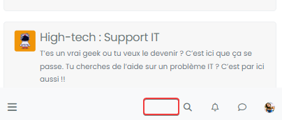
-
I test this :
// ------------------------------------------ // material View Mode // ------------------------------------------ function material() { $(document).ready(function () { var $buttonContainer = null; // Check if the screen width is 460px or more if ($(window).width() >= 991) { // Check if the custom thread view button already exists in the right sidebar $buttonContainer = $('[component="sidebar/right"]'); } if ($(window).width() <= 991) { // Check if the custom thread view button already exists in the bottom bar $buttonContainer = $('[component="bottombar"]'); } -
I test this :
// ------------------------------------------ // material View Mode // ------------------------------------------ function material() { $(document).ready(function () { var $buttonContainer = null; // Check if the screen width is 460px or more if ($(window).width() >= 991) { // Check if the custom thread view button already exists in the right sidebar $buttonContainer = $('[component="sidebar/right"]'); } if ($(window).width() <= 991) { // Check if the custom thread view button already exists in the bottom bar $buttonContainer = $('[component="bottombar"]'); }@DownPW yes, the same methodology is used for the theme switcher in NodeBB v2.x

-
ohh yes, don’t see that to be honest.
Button appear but hard to position it correctly for all resolution.
The button moves according to the resolution. it is not fixed
Hello! It looks like you're interested in this conversation, but you don't have an account yet.
Getting fed up of having to scroll through the same posts each visit? When you register for an account, you'll always come back to exactly where you were before, and choose to be notified of new replies (either via email, or push notification). You'll also be able to save bookmarks and upvote posts to show your appreciation to other community members.
With your input, this post could be even better 💗
Register LoginRelated Topics
-
-
-
-
-
-
-
-
Fontawesome 5
Unsolved Customisation

