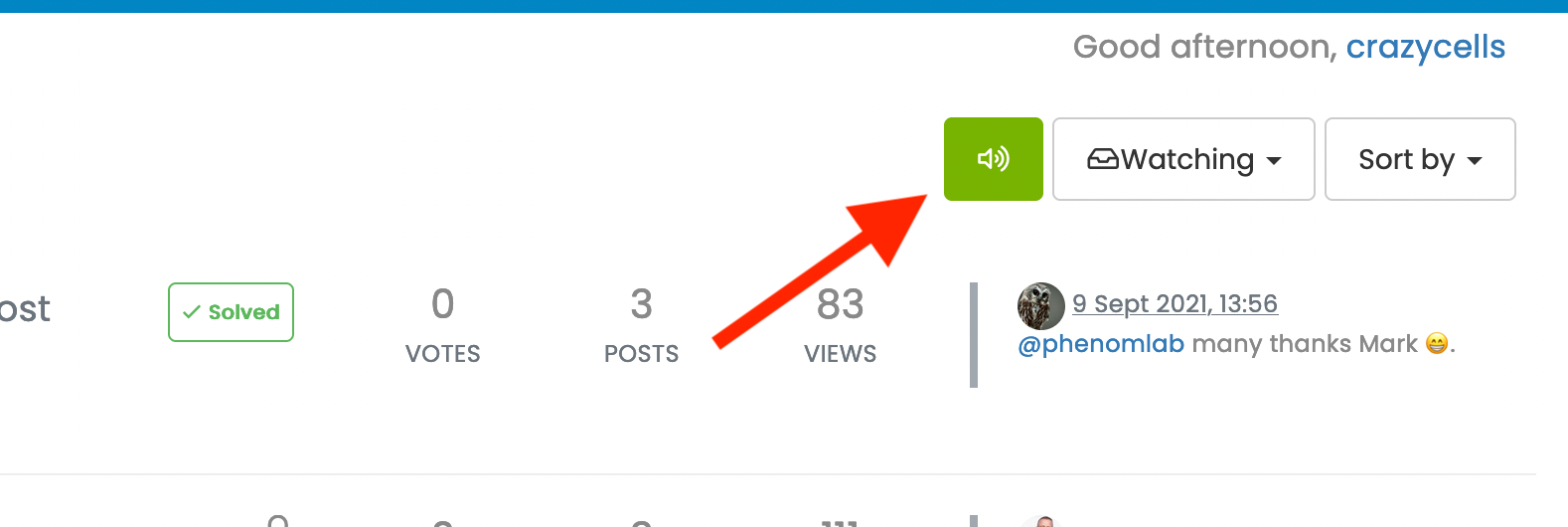
what does sound/mute button do?
-
but since email subscriptions won the battle over RSS many years ago, you provide a more modern solution

poor RSS…
-
@phenomlab said in what does sound/mute button do?:
@crazycells Yes. If you follow it (subscribe), you’ll get a notification each time someone posts a new topic.
is it achieved by a plugin?
so, can we say that it does the same function as this RSS button does?

@crazycells It’s a plugin, yes - see
https://github.com/NodeBB/nodebb-plugin-category-notifications#readme
It’s not the same thing as the RSS button - this will only show new topics if you are in fact subscribed to that specific feed with an RSS reader that auto updates.
-
@crazycells It’s a plugin, yes - see
https://github.com/NodeBB/nodebb-plugin-category-notifications#readme
It’s not the same thing as the RSS button - this will only show new topics if you are in fact subscribed to that specific feed with an RSS reader that auto updates.
@phenomlab maybe you can use the “newsletter” icon?
-
@phenomlab maybe you can use the “newsletter” icon?
@crazycells Yes, or the bell icon…
-
but since email subscriptions won the battle over RSS many years ago, you provide a more modern solution

poor RSS…
@crazycells well, RSS still has it’s uses. As an example, I have a script that can pull RSS feeds from anywhere and make NodeBB posts out of them

-
@crazycells well, RSS still has it’s uses. As an example, I have a script that can pull RSS feeds from anywhere and make NodeBB posts out of them

@phenomlab said in what does sound/mute button do?:
@crazycells well, RSS still has it’s uses. As an example, I have a script that can pull RSS feeds from anywhere and make NodeBB posts out of them

of course
 I am still using RSS personally with Thunderbird to follow several news websites and government agencies… I still find it very useful. But I was talking more about the general public
But I guess recently they started to call “podcasts subscriptions” as “RSS audio subscriptions”… I remember seeing this expression somewhere

-
@phenomlab said in what does sound/mute button do?:
@crazycells well, RSS still has it’s uses. As an example, I have a script that can pull RSS feeds from anywhere and make NodeBB posts out of them

of course
 I am still using RSS personally with Thunderbird to follow several news websites and government agencies… I still find it very useful. But I was talking more about the general public
But I guess recently they started to call “podcasts subscriptions” as “RSS audio subscriptions”… I remember seeing this expression somewhere

@crazycells yes, I’ve seen this widely used in podcasts also. RSS might be old, but it’s still extremely useful.
-
@crazycells I’ve changed this in DEV so it looks like the below
Subscribed

Unsubscribed

I think this is much clearer now.
-
@crazycells I’ve changed this in DEV so it looks like the below
Subscribed

Unsubscribed

I think this is much clearer now.
@phenomlab said in what does sound/mute button do?:
I think this is much clearer now.
this is much clearer

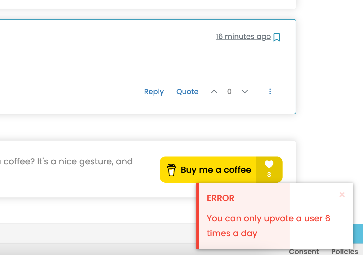
I would upvote this, but apparently I cannot upvote you more than 6 times a day

-
@phenomlab said in what does sound/mute button do?:
I think this is much clearer now.
this is much clearer

I would upvote this, but apparently I cannot upvote you more than 6 times a day

@crazycells I can soon change that

-
@crazycells I can soon change that

@phenomlab said in what does sound/mute button do?:
@crazycells I can soon change that


I would upvote this too
-
@phenomlab said in what does sound/mute button do?:
@crazycells I can soon change that


I would upvote this too
@crazycells Try it ?
-
@crazycells Try it ?
-
@crazycells Yeah, looking at the plugin itself, that’s a hard coded limit

I’ll probably remove that… eventually…
Hello! It looks like you're interested in this conversation, but you don't have an account yet.
Getting fed up of having to scroll through the same posts each visit? When you register for an account, you'll always come back to exactly where you were before, and choose to be notified of new replies (either via email, or push notification). You'll also be able to save bookmarks and upvote posts to show your appreciation to other community members.
With your input, this post could be even better 💗
Register Login