[NODEBB] CSS Style Sheets SelectBox
-
@downpw no issues. It’ll work across upgrades as it’s a standard function and doesn’t rely on any NodeBB components. If you can just ensure that the VM is available around the same time each day, that would also help.
@phenomlab said in [NODEBB] CSS Style Sheets SelectBox:
If you can just ensure that the VM is available around the same time each day, that would also help.
Ok no problem Sir

PW and WS Spirit alive
-
@phenomlab said in [NODEBB] CSS Style Sheets SelectBox:
If you can just ensure that the VM is available around the same time each day, that would also help.
Ok no problem Sir
@downpw Right. I think I have this working the way you’d like
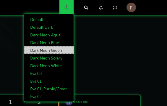
This uses the below CSS I have placed into your ACP. It should not be deleted
// PLEASE DO NOT DELETE THIS

.header #theme_dropdown {
    padding: 9px 15px;
    padding-top: 9px;
    padding-bottom: 9px;
    margin-top: -4px;
    padding-top: 14px;
    padding-bottom: 16px;
}
#switcher{
    position: absolute;
    right: 33%;
}
The
:hoverclass is always going to look like the below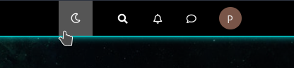
The reason for this is because you have it hard coded in the ACP CSS as below
/*VIOLENCE: Couleur du background au survol souris */
.navbar-default .navbar-nav>li>label:hover {
    background: #555555;
}
You should remove this, and set it based on the color you want in each external CSS file. This way, it will display correctly.
The slight caveat with this is that it has to use
absolutepositioning meaning that if you resize the browser, the theme switcher icon will use a percentage to work out where it needs to be, and won’t be governed by the<ul><li>it sits inside. This is the only way to get the effect you are looking for.Mark Cutting also advises organisations as a Fractional CIO, Fractional CISO and Executive Advisor, helping boards improve technology governance, cyber resilience and executive decision making. Learn more at Gratmore Ltd
-
@downpw Right. I think I have this working the way you’d like
This uses the below CSS I have placed into your ACP. It should not be deleted
// PLEASE DO NOT DELETE THIS

.header #theme_dropdown {
    padding: 9px 15px;
    padding-top: 9px;
    padding-bottom: 9px;
    margin-top: -4px;
    padding-top: 14px;
    padding-bottom: 16px;
}
#switcher{
    position: absolute;
    right: 33%;
}
The
:hoverclass is always going to look like the belowThe reason for this is because you have it hard coded in the ACP CSS as below
/*VIOLENCE: Couleur du background au survol souris */
.navbar-default .navbar-nav>li>label:hover {
    background: #555555;
}
You should remove this, and set it based on the color you want in each external CSS file. This way, it will display correctly.
The slight caveat with this is that it has to use
absolutepositioning meaning that if you resize the browser, the theme switcher icon will use a percentage to work out where it needs to be, and won’t be governed by the<ul><li>it sits inside. This is the only way to get the effect you are looking for.@phenomlab said in [NODEBB] CSS Style Sheets SelectBox:
@downpw Right. I think I have this working the way you’d like
This uses the below CSS I have placed into your ACP. It should not be deleted
// PLEASE DO NOT DELETE THIS

.header #theme_dropdown {
    padding: 9px 15px;
    padding-top: 9px;
    padding-bottom: 9px;
    margin-top: -4px;
    padding-top: 14px;
    padding-bottom: 16px;
}
#switcher{
    position: absolute;
    right: 33%;
}
The
:hoverclass is always going to look like the belowThe reason for this is because you have it hard coded in the ACP CSS as below
/*VIOLENCE: Couleur du background au survol souris */
.navbar-default .navbar-nav>li>label:hover {
    background: #555555;
}
You should remove this, and set it based on the color you want in each external CSS file. This way, it will display correctly.
The slight caveat with this is that it has to use
absolutepositioning meaning that if you resize the browser, the theme switcher icon will use a percentage to work out where it needs to be, and won’t be governed by the<ul><li>it sits inside. This is the only way to get the effect you are looking for.Hmmm, it’s problematic. It’s not very aesthetic.
I am amazed because it works very well on your site or with night mode.

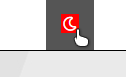
I see red background too on fa -faw ???
PW and WS Spirit alive
-
@phenomlab said in [NODEBB] CSS Style Sheets SelectBox:
@downpw Right. I think I have this working the way you’d like
This uses the below CSS I have placed into your ACP. It should not be deleted
// PLEASE DO NOT DELETE THIS

.header #theme_dropdown {
    padding: 9px 15px;
    padding-top: 9px;
    padding-bottom: 9px;
    margin-top: -4px;
    padding-top: 14px;
    padding-bottom: 16px;
}
#switcher{
    position: absolute;
    right: 33%;
}
The
:hoverclass is always going to look like the belowThe reason for this is because you have it hard coded in the ACP CSS as below
/*VIOLENCE: Couleur du background au survol souris */
.navbar-default .navbar-nav>li>label:hover {
    background: #555555;
}
You should remove this, and set it based on the color you want in each external CSS file. This way, it will display correctly.
The slight caveat with this is that it has to use
absolutepositioning meaning that if you resize the browser, the theme switcher icon will use a percentage to work out where it needs to be, and won’t be governed by the<ul><li>it sits inside. This is the only way to get the effect you are looking for.Hmmm, it’s problematic. It’s not very aesthetic.
I am amazed because it works very well on your site or with night mode.
I see red background too on fa -faw ???
@downpw said in [NODEBB] CSS Style Sheets SelectBox:
Hmmm, it’s problematic. It’s not very aesthetic.
I am amazed because it works very well on your site or with night mode.The theme switcher you have doesn’t work the same way as the night mode plugin. What you have is a dropdown which is not the same as the toggle selection hence it will behave differently.
What isn’t aesthetic exactly ?
@downpw said in [NODEBB] CSS Style Sheets SelectBox:
I see red background too on fa -faw ???
Yes, that comes from the below class on line 415 of your CSS in the ACP
/*VIOLENCE: Couleur du background de l'icone de recherche au survol souris */ .navbar-default .btn-link:hover { background: red; } -
@DownPW another way…
Remove
#switcher{
    position: absolute;
    right: 33%;
}
Add
.navbar-default {
    height: 50px;
}
This way, it’s aesthetic…I just set the changes. Let me know what you think.
Mark Cutting also advises organisations as a Fractional CIO, Fractional CISO and Executive Advisor, helping boards improve technology governance, cyber resilience and executive decision making. Learn more at Gratmore Ltd
-
@DownPW another way…
Remove
#switcher{
    position: absolute;
    right: 33%;
}
Add
.navbar-default {
    height: 50px;
}
This way, it’s aesthetic…I just set the changes. Let me know what you think.
It’s better.
I have just to set space between icon
For the red, i have disable CSS on line number 415, it’s not that
PW and WS Spirit alive
-
It’s better.
I have just to set space between icon
For the red, i have disable CSS on line number 415, it’s not that
@downpw said in [NODEBB] CSS Style Sheets SelectBox:
For the red, i have disable CSS on line number 415, it’s not that
Odd. This will stop it
#switcher .btn-link:hover { background: none !important; } -
-
@downpw Great. I think we’re done, yes ?
-
Hmm I search to reducs space between Icon search bar and notification icon
PW and WS Spirit alive
-
@downpw Can you provide a screenshot to explain what you are looking for ?
-
off course @phenomlab
I search to reducs space between Icon search bar and notification icon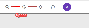
PW and WS Spirit alive
-
off course @phenomlab
I search to reducs space between Icon search bar and notification icon@downpw Try
#switcher { margin-right: -15px; margin-left: -15px; } -
@phenomlab said in [NODEBB] CSS Style Sheets SelectBox:
#switcher {
margin-right: -15px;
margin-left: -15px;
}Yes very Good !!!
Like this The button is well : Thanks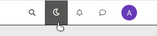
PW and WS Spirit alive
-
@phenomlab said in [NODEBB] CSS Style Sheets SelectBox:
#switcher {
margin-right: -15px;
margin-left: -15px;
}Yes very Good !!!
Like this The button is well : ThanksRight. I moved the custom HTML to a HTML based global widget, and that works
 Give it a try
Also, not sure why you are using the
htmlclass for the background images. You should usebody. I just tried it, and it works fine -
@DownPW some additional advice. The images you are calling remotely should be hosted on your own server. This will prevent unnecessary remote calls, and will also load faster. I’m seeing delay times of up to a second before the wallpaper appears
-
Ok if I understood, I can’t use custom ACP Header for HTML code. I must use an HTML widgets.
For background, I use the code on NodeBB forum but if you have a code working great on desktop and mobile. II want it a lot
PW and WS Spirit alive
-
Ok if I understood, I can’t use custom ACP Header for HTML code. I must use an HTML widgets.
For background, I use the code on NodeBB forum but if you have a code working great on desktop and mobile. II want it a lot
@downpw
If you move the background CSS you are using out of the htmlelement and into thebodyfor each stylesheet, it’ll work.Not sure why the custom HTML works fine in a widget, but… well - it works !
-
For Wallpaper, i will test your solution. That solutino work on mobile ?
PW and WS Spirit alive
-
@downpw Yes, it does.


Hello! It looks like you're interested in this conversation, but you don't have an account yet.
Getting fed up of having to scroll through the same posts each visit? When you register for an account, you'll always come back to exactly where you were before, and choose to be notified of new replies (either via email, or push notification). You'll also be able to save bookmarks and upvote posts to show your appreciation to other community members.
With your input, this post could be even better 💗
Register LoginDid this solution help you?
Related Topics
-
-
-
-
-
-
-
NodeBB Footer
Solved Customisation -