Bug Navbar CSS
-
Hi,
I have this bug on my navbar with Night Mode Plugin.
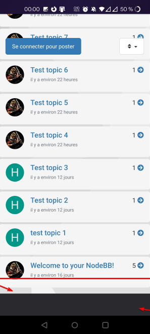
A space appears between bottom border and higlight/active icon :

Here is my CUSTOM CSS
.navbar-default {
    background-color: black;
    border-color: 2px solid silver;
    box-shadow: 0 0 5px 0 silver;
    opacity: 1;
}
I’m oblige to add this for fix this bug:
.navbar-default {
...
...
...
....
height: 50px;
}
Can we do better than that?
PW and WS Spirit alive
-
Hi,
I have this bug on my navbar with Night Mode Plugin.
A space appears between bottom border and higlight/active icon :
Here is my CUSTOM CSS
.navbar-default {
    background-color: black;
    border-color: 2px solid silver;
    box-shadow: 0 0 5px 0 silver;
    opacity: 1;
}
I’m oblige to add this for fix this bug:
.navbar-default {
...
...
...
....
height: 50px;
}
Can we do better than that?
@downpw It’s because of the drop shadow you are using. If you set the below CSS, then this will counteract it
.navbar-default {
    height: 50px;
}
Or, you could use
.navbar-default { max-height: 50px; } -
Not better way.
Thanks.
-
 undefined DownPW has marked this topic as solved on
Hello! It looks like you're interested in this conversation, but you don't have an account yet.
Getting fed up of having to scroll through the same posts each visit? When you register for an account, you'll always come back to exactly where you were before, and choose to be notified of new replies (either via email, or push notification). You'll also be able to save bookmarks and upvote posts to show your appreciation to other community members.
With your input, this post could be even better 💗
Register Login