Widget | CSS customization
-
@phenomlab Sometimes you don’t remember to ask questions until you actually see them. Like onto every page I created, there is a space between the images that I would like to remove using CSS. It was built with a code that looks like this:
<!-- wp:media-text {"align":"wide","mediaId":673,"mediaLink":"https://wordpress.org/patterns/pear-half/","mediaType":"image","verticalAlignment":"center","style":{"color":{"background":"#BE035C"}}} -->
<div class="wp-block-media-text alignwide is-stacked-on-mobile is-vertically-aligned-center has-background" style="background-color:#BE035C"><figure class="wp-block-media-text__media"><img src="/wp-content/uploads/2023/01/sign-in.jpg" alt="Account" class="wp-image-673 size-full"/></figure><div class="wp-block-media-text__content"><!-- wp:group {"style":{"spacing":{"padding":{"top":"2em","right":"2em","bottom":"2em","left":"2em"}}}} -->
<div class="wp-block-group" style="padding-top:2em;padding-right:2em;padding-bottom:2em;padding-left:2em"><!-- wp:html -->
<p class="has-text-align-center" style="font-size:20px;line-height:1.3"><p class="has-text-align-center" style="font-size:20px;color:#ffffff;line-height:1.2">Bring your .. to fruition!</p></p>
<!-- /wp:html --></div>
<!-- /wp:group --></div></div>
<!-- /wp:media-text -->
Space

@Sala That is in the below class
#single .main-article {
    position: relative;
    z-index: 1;
    background: #fff;
    padding: 50px 60px;
    -webkit-box-shadow: 0 3px 12px -1px rgba(7,10,25,.1), 0 22px 27px -30px rgba(7,10,25,.1);
    box-shadow: 0 3px 12px -1px rgba(7,10,25,.1), 0 22px 27px -30px rgba(7,10,25,.1);
}
You should experiment with the
padding: 50px 60px;to get the spacing you need.Changing to
padding: 0px 60px;ought to do it
Before

After

Mark Cutting also advises organisations as a Fractional CIO, Fractional CISO and Executive Advisor, helping boards improve technology governance, cyber resilience and executive decision making. Learn more at Gratmore Ltd
-
@Sala That is in the below class
#single .main-article {
    position: relative;
    z-index: 1;
    background: #fff;
    padding: 50px 60px;
    -webkit-box-shadow: 0 3px 12px -1px rgba(7,10,25,.1), 0 22px 27px -30px rgba(7,10,25,.1);
    box-shadow: 0 3px 12px -1px rgba(7,10,25,.1), 0 22px 27px -30px rgba(7,10,25,.1);
}
You should experiment with the
padding: 50px 60px;to get the spacing you need.Changing to
padding: 0px 60px;ought to do itBefore
After
@phenomlab i tried with 0; and 60; padding, it works fine on desktop but not on mobile version. Somehow on the content on mobile are also squeezed at the center,

Probably @media can be a good thought
-
@phenomlab i tried with 0; and 60; padding, it works fine on desktop but not on mobile version. Somehow on the content on mobile are also squeezed at the center,
Probably @media can be a good thought
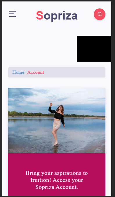
@Sala Yes, try
@media screen and (max-width: 767px) {
#single .main-article {
    padding: 0px 20px 20px 20px;
   }
}
Result
Mark Cutting also advises organisations as a Fractional CIO, Fractional CISO and Executive Advisor, helping boards improve technology governance, cyber resilience and executive decision making. Learn more at Gratmore Ltd
-
@Sala Yes, try
@media screen and (max-width: 767px) {
#single .main-article {
    padding: 0px 20px 20px 20px;
   }
}
Result
-
@phenomlab it’s applied
@Sala Working? From what I see, it is
Mark Cutting also advises organisations as a Fractional CIO, Fractional CISO and Executive Advisor, helping boards improve technology governance, cyber resilience and executive decision making. Learn more at Gratmore Ltd
-
@phenomlab I was expecting you would need my login information for this one, but you solved it without needing to log in! Congratulations! Another thing is that the website appeared to have been zoomed in when I viewed it once using a friend’s laptop, which I believe had a 14 or 15-inch screen. Do you experience this similar problem? Is it possible to make it that you can see a lot when you visit? Just like many forums
“Late reply, my phone became really hot when applying that css” 🥵
-
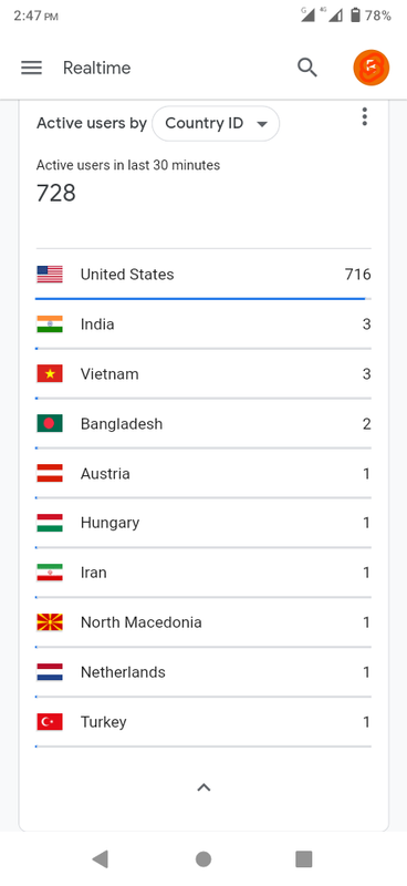
Sometime back, it handled huge traffic without lag, wordpress is just superb!
-
@Sala impressive!
-
@phenomlab I was expecting you would need my login information for this one, but you solved it without needing to log in! Congratulations! Another thing is that the website appeared to have been zoomed in when I viewed it once using a friend’s laptop, which I believe had a 14 or 15-inch screen. Do you experience this similar problem? Is it possible to make it that you can see a lot when you visit? Just like many forums
“Late reply, my phone became really hot when applying that css” 🥵
@Sala hmm - are you sure that your friend isn’t using zoom at the browser level? There’s nothing that would make your site zoom by default. Your friend may also be using large fonts which can make sites already to look larger than they actually are.
Mark Cutting also advises organisations as a Fractional CIO, Fractional CISO and Executive Advisor, helping boards improve technology governance, cyber resilience and executive decision making. Learn more at Gratmore Ltd
-
@Sala hmm - are you sure that your friend isn’t using zoom at the browser level? There’s nothing that would make your site zoom by default. Your friend may also be using large fonts which can make sites already to look larger than they actually are.
@phenomlab i suspect the ads inside the content in articles , are not benefiting from full width of the article div container, probably they’re in some other container? Bcoz all the time (on mobile) they’re positioned at center and with a small width
-
I will inspect next time, and take some screenshots of the zoom issue.
-
@phenomlab i suspect the ads inside the content in articles , are not benefiting from full width of the article div container, probably they’re in some other container? Bcoz all the time (on mobile) they’re positioned at center and with a small width
Mark Cutting also advises organisations as a Fractional CIO, Fractional CISO and Executive Advisor, helping boards improve technology governance, cyber resilience and executive decision making. Learn more at Gratmore Ltd
-
@phenomlab we break that container, when some time ever comes. Full width has potential of increasing chance of click, tho could sound annoying, i know
-
@Sala said in Widget | CSS customization:
In additional css, i’ve iframe { width 100% and height 315 but without important. If i add important, it affects the height of the ads
It will do, yes, because you have this CSS present
div.text img {
    width: 100%;
    height: 315px;
}
You’d need to be more specific here in terms of CSS target. The below would work
.perfmatters-lazy-youtube img { height: 500px !important; }@phenomlab it appears this css didn’t take effect, despite using ! important. If you able to see the path, i could change it from cpanel. Google reported the same issue today.
.perfmatters-lazy-youtube img{height:315px!important}Page example: view-source:https://sopriza.com/how-kenya-can-use-films-to-attract-more-tourists/
-
@phenomlab it appears this css didn’t take effect, despite using ! important. If you able to see the path, i could change it from cpanel. Google reported the same issue today.
.perfmatters-lazy-youtube img{height:315px!important}Page example: view-source:https://sopriza.com/how-kenya-can-use-films-to-attract-more-tourists/
@Sala Try locating the CSS block
div.text imgAnd replace it with
div.text img:not([data-perfmatters-preload])So, you land up with
@media (min-width: 800px) {
div.text img:not([data-perfmatters-preload]) {
    width: 100%;
    height: 315px;
   }
}
Mark Cutting also advises organisations as a Fractional CIO, Fractional CISO and Executive Advisor, helping boards improve technology governance, cyber resilience and executive decision making. Learn more at Gratmore Ltd
-
@Sala Try locating the CSS block
div.text imgAnd replace it with
div.text img:not([data-perfmatters-preload])So, you land up with
@media (min-width: 800px) { div.text img:not([data-perfmatters-preload]) { width: 100%; height: 315px; } }@phenomlab 480*360 its being read from the ytimage so it could be a background img? I have attempted to apply the last css 2 mins ago, and it did not work
-
@phenomlab 480*360 its being read from the ytimage so it could be a background img? I have attempted to apply the last css 2 mins ago, and it did not work
@Sala Works for me - are you testing this on a desktop? The mobile CSS is a different class

Mark Cutting also advises organisations as a Fractional CIO, Fractional CISO and Executive Advisor, helping boards improve technology governance, cyber resilience and executive decision making. Learn more at Gratmore Ltd
-
@Sala Works for me - are you testing this on a desktop? The mobile CSS is a different class
@phenomlab i am refreshing the view:source url using mobile, please let me have the class for mobile, i apply
-
@phenomlab i am refreshing the view:source url using mobile, please let me have the class for mobile, i apply
@Sala In mobile view, it looks fine already
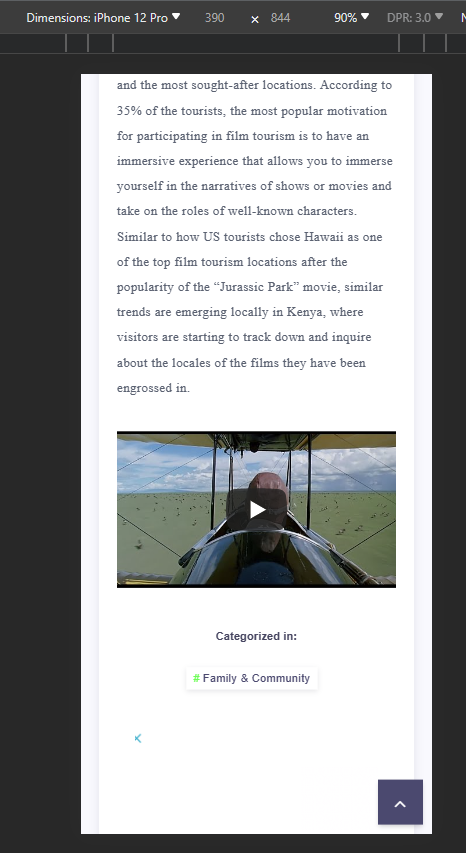
Mark Cutting also advises organisations as a Fractional CIO, Fractional CISO and Executive Advisor, helping boards improve technology governance, cyber resilience and executive decision making. Learn more at Gratmore Ltd
-
@phenomlab surprisingly on source code the yt thumbnail is still width=“480” height=“360”


Hello! It looks like you're interested in this conversation, but you don't have an account yet.
Getting fed up of having to scroll through the same posts each visit? When you register for an account, you'll always come back to exactly where you were before, and choose to be notified of new replies (either via email, or push notification). You'll also be able to save bookmarks and upvote posts to show your appreciation to other community members.
With your input, this post could be even better 💗
Register Login