hover link effect
-
Hello @phenomlab
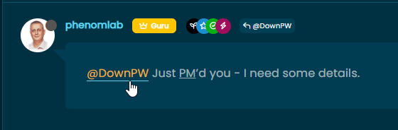
I see this effect on link here.
I research how to do this or other effect and i found this code for example on css tricks
a {
  position: relative;
}

a::before {
    content: '';
    position: absolute;
    width: 100%;
    height: 2px;
    border-radius: 2px;
    background-color: red;
    bottom: 0;
    left: 0;
    transform-origin: right;
    transform: scaleX(0);
    transition: transform .3s ease-in-out;
  }

a:hover::before {
    color: red;
  transform-origin: left;
  transform: scaleX(1);
}

a:focus, a:hover {
    color: red;
}
The effect is good but he is active on reply button, quote, reply to, username and I don’t want that… Just on post (url, @mention)
And you, what is your code ?
PW and WS Spirit alive
-
Hello @phenomlab
I see this effect on link here.
I research how to do this or other effect and i found this code for example on css tricks
a {
  position: relative;
}

a::before {
    content: '';
    position: absolute;
    width: 100%;
    height: 2px;
    border-radius: 2px;
    background-color: red;
    bottom: 0;
    left: 0;
    transform-origin: right;
    transform: scaleX(0);
    transition: transform .3s ease-in-out;
  }

a:hover::before {
    color: red;
  transform-origin: left;
  transform: scaleX(1);
}

a:focus, a:hover {
    color: red;
}
The effect is good but he is active on reply button, quote, reply to, username and I don’t want that… Just on post (url, @mention)
And you, what is your code ?
PW and WS Spirit alive
-
@DownPW I also had some issues with this effect showing on unwanted elements, and off the top of my head I can’t recall the CSS I used, but will check.
Mark Cutting also advises organisations as a Fractional CIO, Fractional CISO and Executive Advisor, helping boards improve technology governance, cyber resilience and executive decision making. Learn more at Gratmore Ltd
-
@DownPW I also had some issues with this effect showing on unwanted elements, and off the top of my head I can’t recall the CSS I used, but will check.
.posts .contentseems to be pretty good for me
PW and WS Spirit alive
-
.posts .contentseems to be pretty good for me@DownPW said in hover link effect:
.posts .contentseems to be pretty good for meit not worked on my web site.
-
Hello @phenomlab
I see this effect on link here.
I research how to do this or other effect and i found this code for example on css tricks
a {
  position: relative;
}

a::before {
    content: '';
    position: absolute;
    width: 100%;
    height: 2px;
    border-radius: 2px;
    background-color: red;
    bottom: 0;
    left: 0;
    transform-origin: right;
    transform: scaleX(0);
    transition: transform .3s ease-in-out;
  }

a:hover::before {
    color: red;
  transform-origin: left;
  transform: scaleX(1);
}

a:focus, a:hover {
    color: red;
}
The effect is good but he is active on reply button, quote, reply to, username and I don’t want that… Just on post (url, @mention)
And you, what is your code ?
@DownPW My CSS is as below
.content p a:not(.noanimate):after {
  background: none repeat scroll 0 0 transparent;
  bottom: 0;
  content: "";
  display: block;
  height: 1px;
  left: 0%;
  position: absolute;
  background: var(--link);
  transition: width 0.3s ease 0s, left 0.3s ease 0s;
  width: 0;
}
.content p a:hover:after {
  width: 100%;
  left: 0;
}
Mark Cutting also advises organisations as a Fractional CIO, Fractional CISO and Executive Advisor, helping boards improve technology governance, cyber resilience and executive decision making. Learn more at Gratmore Ltd
-
@DownPW My CSS is as below
.content p a:not(.noanimate):after { background: none repeat scroll 0 0 transparent; bottom: 0; content: ""; display: block; height: 1px; left: 0%; position: absolute; background: var(--link); transition: width 0.3s ease 0s, left 0.3s ease 0s; width: 0; } .content p a:hover:after { width: 100%; left: 0; }And here is mine with mirror effect on the text (for default theme)
.posts .content a {
  background-image: linear-gradient(to right, #54b3d6, #54b3d6 50%, #337ab7 50%);
  background-size: 200% 100%;
  background-position: -100%;
  display: inline-block;
  padding: 5px 0;
  position: relative;
  -webkit-background-clip: text;
  -webkit-text-fill-color: transparent;
  transition: all 0.3s ease-in-out;
}

.posts .content a:before {
  content: '';
  background: #54b3d6;
  display: block;
  position: absolute;
  bottom: 1px;
  left: 0;
  width: 0;
  height: 1px;
  transition: all 0.3s ease-in-out;
}

.posts .content a:hover {
 background-position: 0;
}

.posts .content a:hover::before{
  width: 100%;
}
PW and WS Spirit alive
-
 undefined DownPW has marked this topic as solved on
-
And here is mine with mirror effect on the text (for default theme)
.posts .content a { background-image: linear-gradient(to right, #54b3d6, #54b3d6 50%, #337ab7 50%); background-size: 200% 100%; background-position: -100%; display: inline-block; padding: 5px 0; position: relative; -webkit-background-clip: text; -webkit-text-fill-color: transparent; transition: all 0.3s ease-in-out; } .posts .content a:before { content: ''; background: #54b3d6; display: block; position: absolute; bottom: 1px; left: 0; width: 0; height: 1px; transition: all 0.3s ease-in-out; } .posts .content a:hover { background-position: 0; } .posts .content a:hover::before{ width: 100%; }With my code the only problem is I have the same effect on images (on mouse hover) that contain a url.
Do you have a solution to fix this @phenomlab ?
-
@DownPW I had exactly the same issue. Before I provide my solution, from recollection, you are using Fancybox ?
Mark Cutting also advises organisations as a Fractional CIO, Fractional CISO and Executive Advisor, helping boards improve technology governance, cyber resilience and executive decision making. Learn more at Gratmore Ltd
-
@DownPW I had exactly the same issue. Before I provide my solution, from recollection, you are using Fancybox ?
-
@DownPW in that case, you’ll need to add the below
jQueryfunction just after the one you should already have$(window).on('action:posts.loaded', function(data) { console.log("Polling DOM for lazyLoaded images to apply Fancybox"); $(document).ready(function() { $('a').not('.forum-logo').not(".avatar").not(".emoji").not(".bmac-noanimate").each(function() { $('a[href*=".jpg"], a[href*=".jpeg"], a[href*=".png"], a[href*=".gif"], a[href*=".webp"]').addClass("noanimate"); }); }); });What we are doing here is polling the
DOMlooking for any new images as posts are being loaded (hence the hookaction:posts.loaded, and then it we get a match, we add new class.noanimate. You’ll need to modify your existing class block you are using for the hover effect so that it is not being executed against any HTML that contains this class - see below for an example (in your use case).posts .content a:not(.noanimate) { background-image: linear-gradient(to right, #54b3d6, #54b3d6 50%, #337ab7 50%); background-size: 200% 100%; background-position: -100%; display: inline-block; padding: 5px 0; position: relative; -webkit-background-clip: text; -webkit-text-fill-color: transparent; transition: all 0.3s ease-in-out; }Mark Cutting also advises organisations as a Fractional CIO, Fractional CISO and Executive Advisor, helping boards improve technology governance, cyber resilience and executive decision making. Learn more at Gratmore Ltd
-
@DownPW in that case, you’ll need to add the below
jQueryfunction just after the one you should already have$(window).on('action:posts.loaded', function(data) { console.log("Polling DOM for lazyLoaded images to apply Fancybox"); $(document).ready(function() { $('a').not('.forum-logo').not(".avatar").not(".emoji").not(".bmac-noanimate").each(function() { $('a[href*=".jpg"], a[href*=".jpeg"], a[href*=".png"], a[href*=".gif"], a[href*=".webp"]').addClass("noanimate"); }); }); });What we are doing here is polling the
DOMlooking for any new images as posts are being loaded (hence the hookaction:posts.loaded, and then it we get a match, we add new class.noanimate. You’ll need to modify your existing class block you are using for the hover effect so that it is not being executed against any HTML that contains this class - see below for an example (in your use case).posts .content a:not(.noanimate) { background-image: linear-gradient(to right, #54b3d6, #54b3d6 50%, #337ab7 50%); background-size: 200% 100%; background-position: -100%; display: inline-block; padding: 5px 0; position: relative; -webkit-background-clip: text; -webkit-text-fill-color: transparent; transition: all 0.3s ease-in-out; }Thanks dude I will test that
-
@DownPW in that case, you’ll need to add the below
jQueryfunction just after the one you should already have$(window).on('action:posts.loaded', function(data) { console.log("Polling DOM for lazyLoaded images to apply Fancybox"); $(document).ready(function() { $('a').not('.forum-logo').not(".avatar").not(".emoji").not(".bmac-noanimate").each(function() { $('a[href*=".jpg"], a[href*=".jpeg"], a[href*=".png"], a[href*=".gif"], a[href*=".webp"]').addClass("noanimate"); }); }); });What we are doing here is polling the
DOMlooking for any new images as posts are being loaded (hence the hookaction:posts.loaded, and then it we get a match, we add new class.noanimate. You’ll need to modify your existing class block you are using for the hover effect so that it is not being executed against any HTML that contains this class - see below for an example (in your use case).posts .content a:not(.noanimate) { background-image: linear-gradient(to right, #54b3d6, #54b3d6 50%, #337ab7 50%); background-size: 200% 100%; background-position: -100%; display: inline-block; padding: 5px 0; position: relative; -webkit-background-clip: text; -webkit-text-fill-color: transparent; transition: all 0.3s ease-in-out; }@phenomlab said in hover link effect:
.posts .content a:not(.noanimate) {
  background-image: linear-gradient(to right, #54b3d6, #54b3d6 50%, #337ab7 50%);
  background-size: 200% 100%;
  background-position: -100%;
  display: inline-block;
  padding: 5px 0;
  position: relative;
  -webkit-background-clip: text;
  -webkit-text-fill-color: transparent;
  transition: all 0.3s ease-in-out;
}it’s worked, thank you.
-
@phenomlab said in hover link effect:
.posts .content a:not(.noanimate) {
  background-image: linear-gradient(to right, #54b3d6, #54b3d6 50%, #337ab7 50%);
  background-size: 200% 100%;
  background-position: -100%;
  display: inline-block;
  padding: 5px 0;
  position: relative;
  -webkit-background-clip: text;
  -webkit-text-fill-color: transparent;
  transition: all 0.3s ease-in-out;
}it’s worked, thank you.
Hello

I play with URL/Link CSS Trick for topic on nodebb V3
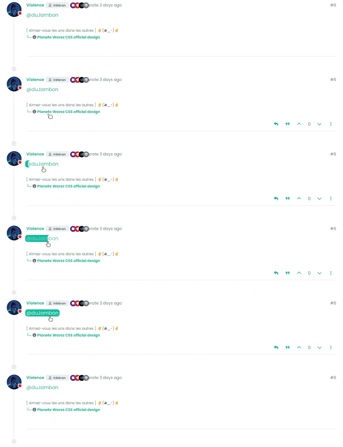
Here are 3 effects I love that I share with you I love the first one and I think it’s the one I’d keep in production.
– Style 1 :
.posts .content a {
    box-shadow: inset 0 0 0 0 var(--bs-link-color);
    color: var(--bs-link-color);
    padding: 0 .25rem;
    margin: 0 -.25rem;
    transition: color .3s ease-in-out, box-shadow .3s ease-in-out;
    border-radius: 0.5rem;
}

.posts .content a:hover {
    color: #fff;
    box-shadow: inset 200px 0 0 0 var(--bs-link-color);
    border-radius: 0.5rem;
}

.posts .content a:hover::before{
    width: 100%;
}
– Style 2 :
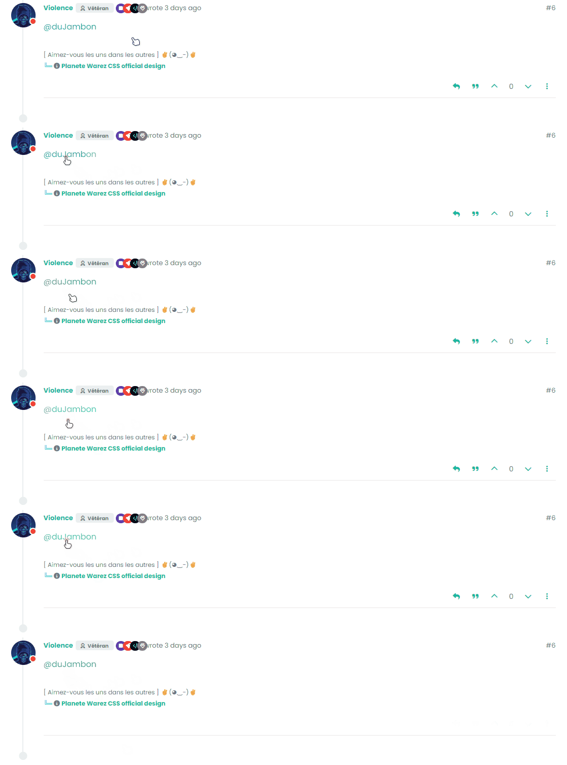
 .posts .content a {
    color: var(--bs-link-color);
    background-image: linear-gradient(to right, var(--bs-link-color), var(--bs-link-color) 50%, var(--bs-link-hover-color) 50%);
    background-size: 200% 100%;
    background-position: -100%;
    display: inline-block;
    padding: 5px 0;
    position: relative;
    -webkit-background-clip: text;
    -webkit-text-fill-color: transparent;
    transition: all 0.3s ease-in-out;
}

.posts .content a:hover {
 background-position: 0;
}

.posts .content a:hover::before{
    width: 100%;
}
– Style 3 :
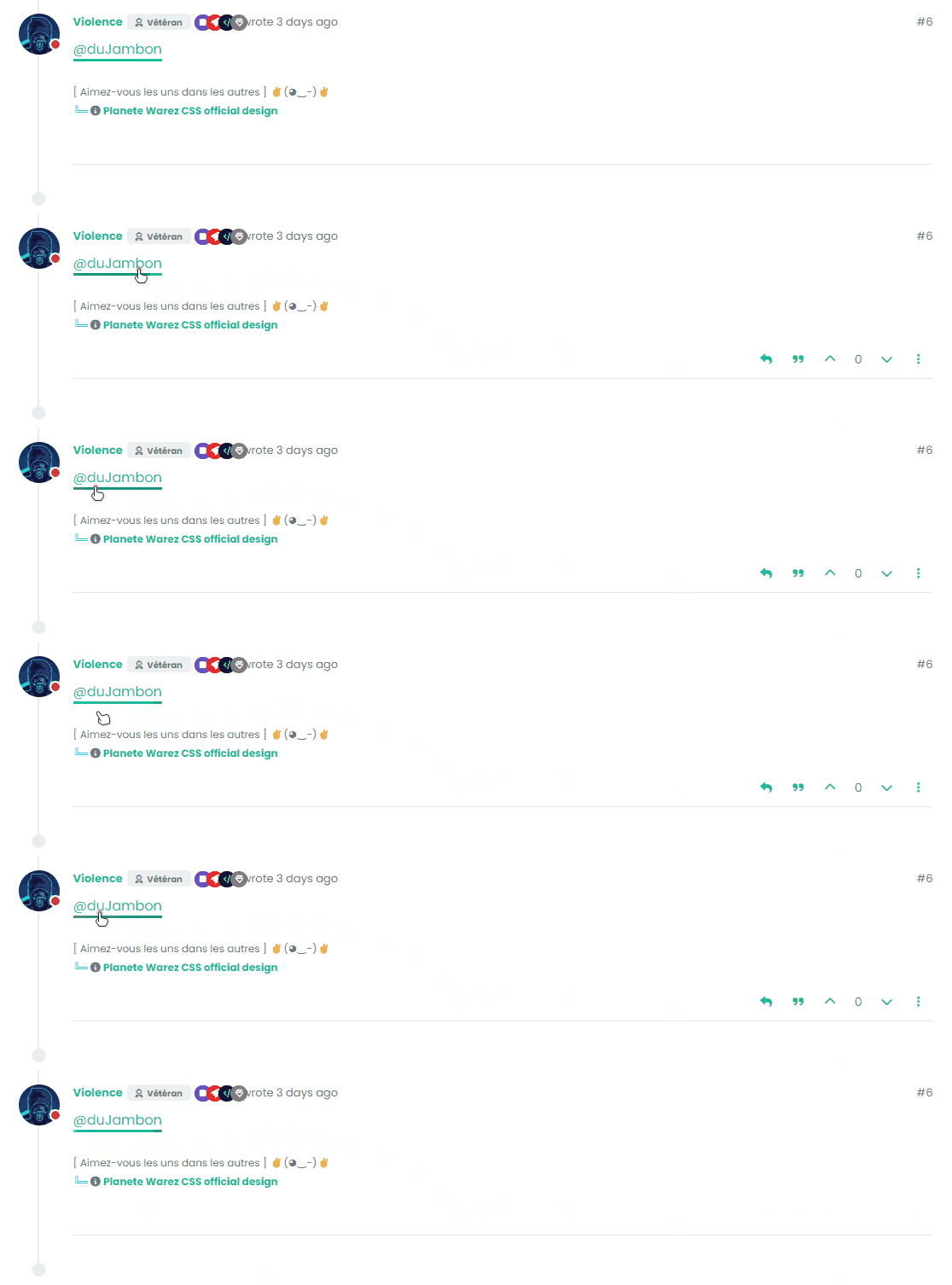
.posts .content a {
    color: var(--bs-link-color);
    text-decoration: none;
    background: linear-gradient(to right, var(--bs-link-color), var(--bs-link-color)), linear-gradient(to right, var(--bs-link-hover-color), var(--bs-link-hover-color), var(--bs-link-hover-color));
    background-size: 100% 3px, 0 3px;
    background-position: 100% 100%, 0 100%;
    background-repeat: no-repeat;
    transition: background-size 400ms;
    padding-bottom: 3px;
}

.posts .content a:hover {
 background-size: 0 3px, 100% 3px;
}

.posts .content a:hover::before{
    width: 100%;
}
–> It’s up to you to play with colors, adapt the code to your environment etc.
Have fun
PW and WS Spirit alive
-
Hello
I play with URL/Link CSS Trick for topic on nodebb V3
Here are 3 effects I love that I share with you I love the first one and I think it’s the one I’d keep in production.
– Style 1 :
.posts .content a {
    box-shadow: inset 0 0 0 0 var(--bs-link-color);
    color: var(--bs-link-color);
    padding: 0 .25rem;
    margin: 0 -.25rem;
    transition: color .3s ease-in-out, box-shadow .3s ease-in-out;
    border-radius: 0.5rem;
}

.posts .content a:hover {
    color: #fff;
    box-shadow: inset 200px 0 0 0 var(--bs-link-color);
    border-radius: 0.5rem;
}

.posts .content a:hover::before{
    width: 100%;
}
– Style 2 :
 .posts .content a {
    color: var(--bs-link-color);
    background-image: linear-gradient(to right, var(--bs-link-color), var(--bs-link-color) 50%, var(--bs-link-hover-color) 50%);
    background-size: 200% 100%;
    background-position: -100%;
    display: inline-block;
    padding: 5px 0;
    position: relative;
    -webkit-background-clip: text;
    -webkit-text-fill-color: transparent;
    transition: all 0.3s ease-in-out;
}

.posts .content a:hover {
 background-position: 0;
}

.posts .content a:hover::before{
    width: 100%;
}
– Style 3 :
.posts .content a {
    color: var(--bs-link-color);
    text-decoration: none;
    background: linear-gradient(to right, var(--bs-link-color), var(--bs-link-color)), linear-gradient(to right, var(--bs-link-hover-color), var(--bs-link-hover-color), var(--bs-link-hover-color));
    background-size: 100% 3px, 0 3px;
    background-position: 100% 100%, 0 100%;
    background-repeat: no-repeat;
    transition: background-size 400ms;
    padding-bottom: 3px;
}

.posts .content a:hover {
 background-size: 0 3px, 100% 3px;
}

.posts .content a:hover::before{
    width: 100%;
}
–> It’s up to you to play with colors, adapt the code to your environment etc.
Have fun
@DownPW these look great! Thanks for sharing.
-
Hello
I play with URL/Link CSS Trick for topic on nodebb V3
Here are 3 effects I love that I share with you I love the first one and I think it’s the one I’d keep in production.
– Style 1 :
.posts .content a {
    box-shadow: inset 0 0 0 0 var(--bs-link-color);
    color: var(--bs-link-color);
    padding: 0 .25rem;
    margin: 0 -.25rem;
    transition: color .3s ease-in-out, box-shadow .3s ease-in-out;
    border-radius: 0.5rem;
}

.posts .content a:hover {
    color: #fff;
    box-shadow: inset 200px 0 0 0 var(--bs-link-color);
    border-radius: 0.5rem;
}

.posts .content a:hover::before{
    width: 100%;
}
– Style 2 :
 .posts .content a {
    color: var(--bs-link-color);
    background-image: linear-gradient(to right, var(--bs-link-color), var(--bs-link-color) 50%, var(--bs-link-hover-color) 50%);
    background-size: 200% 100%;
    background-position: -100%;
    display: inline-block;
    padding: 5px 0;
    position: relative;
    -webkit-background-clip: text;
    -webkit-text-fill-color: transparent;
    transition: all 0.3s ease-in-out;
}

.posts .content a:hover {
 background-position: 0;
}

.posts .content a:hover::before{
    width: 100%;
}
– Style 3 :
.posts .content a {
    color: var(--bs-link-color);
    text-decoration: none;
    background: linear-gradient(to right, var(--bs-link-color), var(--bs-link-color)), linear-gradient(to right, var(--bs-link-hover-color), var(--bs-link-hover-color), var(--bs-link-hover-color));
    background-size: 100% 3px, 0 3px;
    background-position: 100% 100%, 0 100%;
    background-repeat: no-repeat;
    transition: background-size 400ms;
    padding-bottom: 3px;
}

.posts .content a:hover {
 background-size: 0 3px, 100% 3px;
}

.posts .content a:hover::before{
    width: 100%;
}
–> It’s up to you to play with colors, adapt the code to your environment etc.
Have fun
@DownPW good job

-
Hello !!!
I search to have this hover link effect on nodebb without success.
If anyone has an idea, I’m a taker.go to the download button
PW and WS Spirit alive
-
Hello !!!
I search to have this hover link effect on nodebb without success.
If anyone has an idea, I’m a taker.go to the download button
@DownPW Looking at the underlying code, class
startis being added on hover byjQueryin this functiondocument.querySelectorAll(".button-gradient, .button-transparent").forEach((button) => { const style = getComputedStyle(button); const lines = document.createElement("div"); lines.classList.add("lines"); const groupTop = document.createElement("div"); const groupBottom = document.createElement("div"); const svg = createSVG( button.offsetWidth, button.offsetHeight, parseInt(style.borderRadius, 10) ); groupTop.appendChild(svg); groupTop.appendChild(svg.cloneNode(true)); groupTop.appendChild(svg.cloneNode(true)); groupTop.appendChild(svg.cloneNode(true)); groupBottom.appendChild(svg.cloneNode(true)); groupBottom.appendChild(svg.cloneNode(true)); groupBottom.appendChild(svg.cloneNode(true)); groupBottom.appendChild(svg.cloneNode(true)); lines.appendChild(groupTop); lines.appendChild(groupBottom); button.appendChild(lines); button.addEventListener("pointerenter", () => { button.classList.add("start"); }); svg.addEventListener("animationend", () => { button.classList.remove("start"); }); }); })The CSS for
startis below.button-gradient.start .lines svg, .button-transparent.start .lines svg { animation: stroke 0.3s linear; }And this is the corresponding
keyframe@keyframes stroke { 30%, 55% { opacity: 1; } 100% { stroke-dashoffset: 5; opacity: 0; } }It’s using both CSS and SVG, so might not be a simple affair to replicate without the SVG files.


Hello! It looks like you're interested in this conversation, but you don't have an account yet.
Getting fed up of having to scroll through the same posts each visit? When you register for an account, you'll always come back to exactly where you were before, and choose to be notified of new replies (either via email, or push notification). You'll also be able to save bookmarks and upvote posts to show your appreciation to other community members.
With your input, this post could be even better 💗
Register Login