icon is missing for alternative logins

-
@phenomlab said in icon is missing for alternative logins:
@crazycells I went ahead and added the custom CSS. I think you’ll like it, but you probably need to reload the browser to pick up the new code.
wow, that feels nice

now it is more like a conversation. But your account is not always on the right side, right? only the “author” looks on the right side, everyone else is on the left ?
@crazycells That’s correct. The HTML layout is limited to specific classes, so you have to follow them unless you fancy hacking the underlying HTML. To me, this is a nice compromise, and could easily be expanded with some clever
jQuery -
@phenomlab said in icon is missing for alternative logins:
@crazycells I went ahead and added the custom CSS. I think you’ll like it, but you probably need to reload the browser to pick up the new code.
wow, that feels nice
now it is more like a conversation. But your account is not always on the right side, right? only the “author” looks on the right side, everyone else is on the left ?
@crazycells said in icon is missing for alternative logins:
But your account is not always on the right side, right? only the “author” looks on the right side, everyone else is on the left ?
Just re-reading this, and I think I see your point. Do you think that “you” should always be on the right-hand side (based on the screenshot from META you provided) ?
Mark – Founder, Phenomlab Ltd
Executive IT & Security Leadership
Phenomlab Ltd -
@crazycells said in icon is missing for alternative logins:
But your account is not always on the right side, right? only the “author” looks on the right side, everyone else is on the left ?
Just re-reading this, and I think I see your point. Do you think that “you” should always be on the right-hand side (based on the screenshot from META you provided) ?
@phenomlab said in icon is missing for alternative logins:
@crazycells said in icon is missing for alternative logins:
But your account is not always on the right side, right? only the “author” looks on the right side, everyone else is on the left ?
Just re-reading this, and I think I see your point. Do you think that “you” should always be on the right-hand side (based on the screenshot from META you provided) ?
yeah, I believe this is what chat apps do… They always put you on the right side, and change colors, so you can focus on what others write…
-
@phenomlab said in icon is missing for alternative logins:
@crazycells said in icon is missing for alternative logins:
But your account is not always on the right side, right? only the “author” looks on the right side, everyone else is on the left ?
Just re-reading this, and I think I see your point. Do you think that “you” should always be on the right-hand side (based on the screenshot from META you provided) ?
yeah, I believe this is what chat apps do… They always put you on the right side, and change colors, so you can focus on what others write…
@crazycells Got it. Leave it with me. I like this idea, and will probably implement, but need to review the HTML structure first.
-
@phenomlab said in icon is missing for alternative logins:
@crazycells said in icon is missing for alternative logins:
But your account is not always on the right side, right? only the “author” looks on the right side, everyone else is on the left ?
Just re-reading this, and I think I see your point. Do you think that “you” should always be on the right-hand side (based on the screenshot from META you provided) ?
yeah, I believe this is what chat apps do… They always put you on the right side, and change colors, so you can focus on what others write…
-
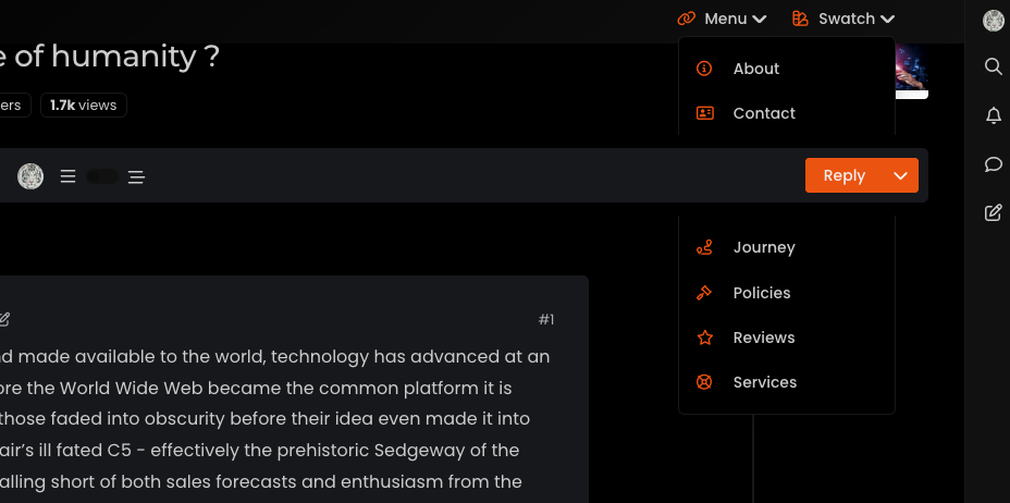
@crazycells I’ve been playing with some concepts, which are enclosed below. I think you’re right - this does look much better
Example 1 - fixed width content
@phenomlab said in icon is missing for alternative logins:
@crazycells I’ve been playing with some concepts, which are enclosed below. I think you’re right - this does look much better
Example 1 - fixed width content
Hi @phenomlab , I can see these videos on Google Chrome right now
sorry, I did not realize Firefox was the problem before…I think both version 1 and version 2 have different feelings. Is it easy to switch between the two?
-
@phenomlab said in icon is missing for alternative logins:
@crazycells I’ve been playing with some concepts, which are enclosed below. I think you’re right - this does look much better
Example 1 - fixed width content
Hi @phenomlab , I can see these videos on Google Chrome right now
sorry, I did not realize Firefox was the problem before…I think both version 1 and version 2 have different feelings. Is it easy to switch between the two?
@crazycells sadly, no. It’s one or the other. As this leverages global CSS it would mean maintaining individual classes that are necessary to create the different view types.
Mark – Founder, Phenomlab Ltd
Executive IT & Security Leadership
Phenomlab Ltd -
@crazycells sadly, no. It’s one or the other. As this leverages global CSS it would mean maintaining individual classes that are necessary to create the different view types.
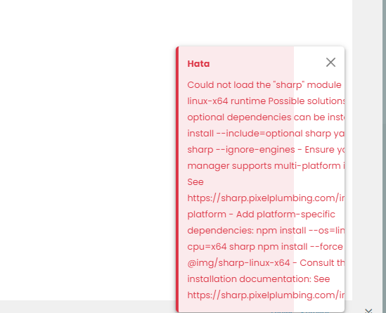
hi @phenomlab , I am having a hard time seeing what is written in code boxes… I believe that is not intended?
This is how it looks, and actually taking a screenshot made the codes more visible… it normally does not even look as good.
-
hi @phenomlab , I am having a hard time seeing what is written in code boxes… I believe that is not intended?
This is how it looks, and actually taking a screenshot made the codes more visible… it normally does not even look as good.
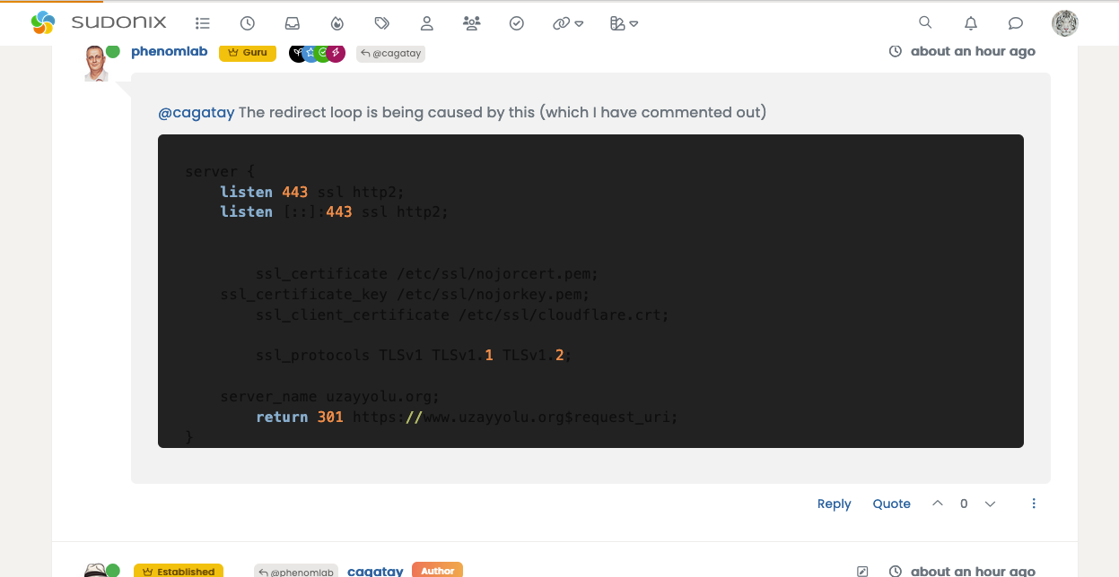
@crazycells That’s a caching issue - it should look like this
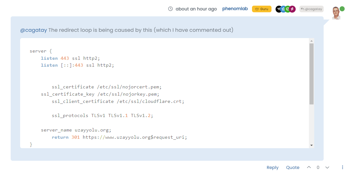
And in an incognito session
Can you clear your browser cache and try again?
Thanks
Mark – Founder, Phenomlab Ltd
Executive IT & Security Leadership
Phenomlab Ltd -
@crazycells That’s a caching issue - it should look like this
And in an incognito session
Can you clear your browser cache and try again?
Thanks
@phenomlab yes you are right
it is fixed now… thanks.
Hello! It looks like you're interested in this conversation, but you don't have an account yet.
Getting fed up of having to scroll through the same posts each visit? When you register for an account, you'll always come back to exactly where you were before, and choose to be notified of new replies (either via email, or push notification). You'll also be able to save bookmarks and upvote posts to show your appreciation to other community members.
With your input, this post could be even better 💗
Register LoginRelated Topics
-
-
-
-
-
-
-
-
Debian 11 root Login
Solved Linux